
iPhone 16 Pro Review: The Tale of the Absent Elephant
Rarely is a phone too hard to review
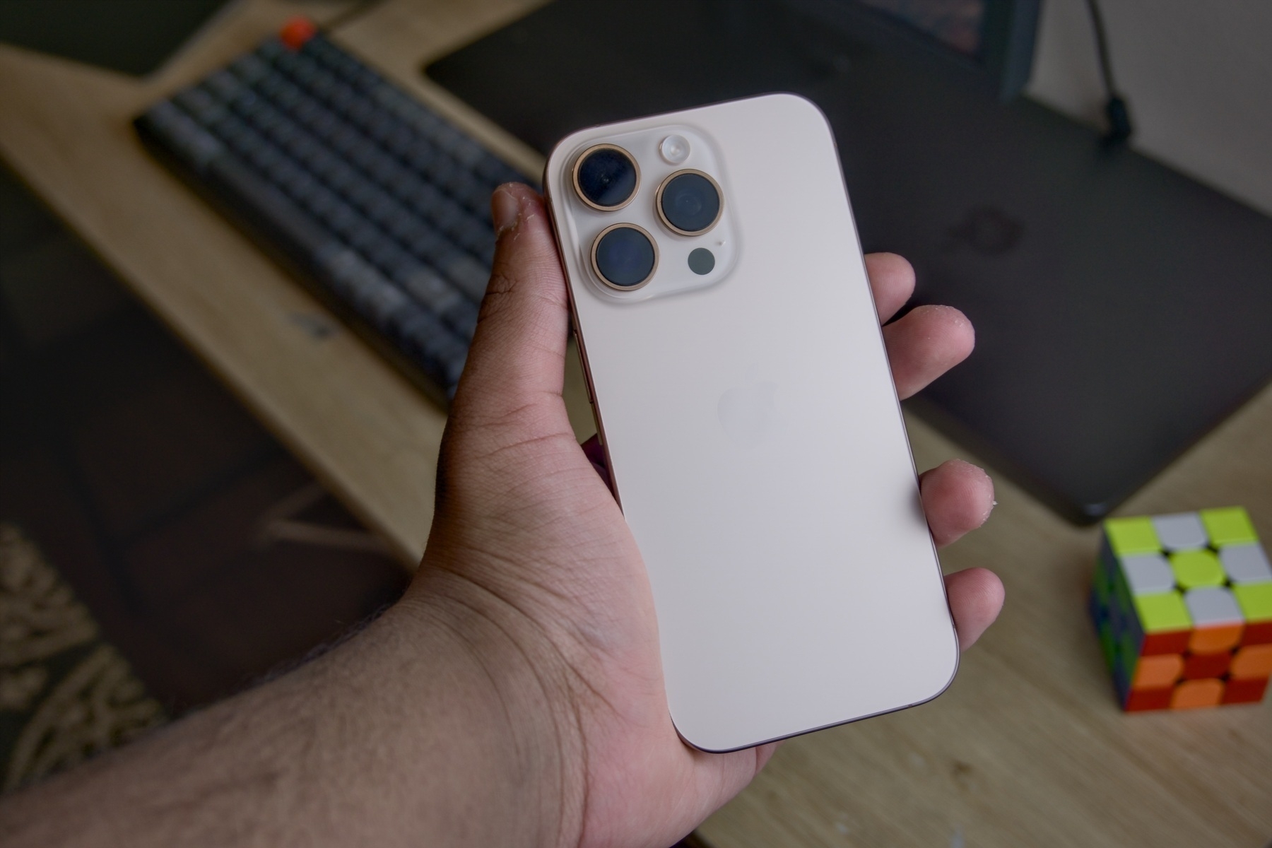
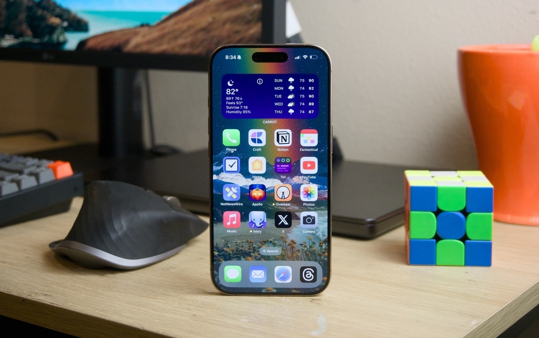 iPhone 16 Pro.
If you take a look at a visual timeline of the various generations of the Porsche 911, from its conception in 1963 to the latest redesign in 2018, the resemblance is almost uncanny: the rear has the same distinctive arc shape, the hood is curved almost the same way, and the side profile of the vehicle remains unmistakable. From a mile away, a 1963 and 2018 Porsche 911 are instantly recognizable all over the world. For many, it is their dream car, and no matter how Porsche redesigns it next, it’ll distinctly still be a Porsche.
Nobody complains about the Porsche 911’s design because it is timeless, beautiful, elegant, and functional. There is something truly spectacular about a car design lasting 60 years because rarely any other consumer product has lived that long. As the pages on the calendar turn, designs change and adapt to the times, and Porsche, of course, has adapted the 911 to the modern era; the latest model has all the niceties and creature comforts one would expect from a car that costs as much as a house. It swaps out the colors, upgrades the engine, and makes it feel up-to-date, but ultimately, it is the 911 from 60 years ago, and if Porsche rolled out a radically new design, there would be riots on the streets.
The Porsche 911 is a testament to good design. Truly good design never goes out of date, yet it doesn’t change all that much. Good design isn’t boring; it is awe-inspiring — a standard for every designer to meet. Every product class should have at least one model that has truly good design. The Bic Cristal, for example, is the most-bought pen in the world. For 74 years, its design has essentially remained unchanged, yet nobody bickers about how the Bic Cristal is overdue for a design overhaul. It is a quality product — there’s nothing else like it; the Bic Cristal is the Porsche 911 of pens.
Similarly, the iPhone is the Porsche 911 of not just smartphones but consumer electronics entirely. Its design is astonishingly mundane: the same three cameras at the top left, the same matte-finished back, and the same metallic rails that compose the body. Apple swaps out the colors to match the trends, adds a new engine every year to make it perform even better, and makes the phone the most up-to-date it can be for people who want the best version of their beloved iPhone — but if the iPhone changes too much, it is not the iPhone anymore, and Apple is cognizant of this.
For this reason, I find it irksome when technology reviewers and pundits describe the iPhone’s annual upgrade as “inconsequential” or “insignificant.” Nobody complains when Porsche comes out with a new 911 with slightly curvier body panels, but that otherwise looks the same because it’s a Porsche 911. No wonder why it hasn’t changed — that design is timeless. There is no need for it to change — it shouldn’t change ever because good design is good design, and good design never has to change. A lack of a new radical redesign of the Porsche 911 every year isn’t perceived as a lack of innovation, and anyone who insinuated that would be laughed at like a fool.
What the world misses is not good design, exemplified by the Porsche 911, Bic Cristal, and iPhone, but Steve Jobs. Jobs, Apple’s late founder, had a certain way of doing things. The first iPhone, iPhone 3G, and iPhone 3Gs appeared identical aside from some slight material and finish changes, yet no one complained Apple had “stopped innovating” because of Jobs, who had a way with words so as to imprint in people’s brains that the iPhone was the Porsche 911 of consumer technology. The iPhone post-2007 doesn’t have to be innovative anymore — it just has to be good. A billion people around the globe use the iPhone, and it shouldn’t reinvent the wheel every 12 months.
iPhone 15 Pro, as I wrote last year, is the true perfection of the form and function of the iPhone. For 15 years, Apple had envisioned the iPhone, and iPhone 15 Pro, I feel, was the final hurrah in its relentless quest to make that picturesque iPhone. The iPhone, from here, won’t nor shouldn’t flip or fold or turn into a sausage; it won’t turn heads at the Consumer Electronics Show; it won’t make the front page of The New York Times or The Wall Street Journal. And neither does it have to, so long as it continues to be a dependable, everyday carry-type product for the billions who rely on it. The iPhone is no longer a fancy computer gadget for the few — it is the digital equivalent of a keychain, wallet, and sunglasses. Always there, always dependable. (Unless you lose it, for which there is always Find My iPhone.)
iPhone 16 Pro boils down to two main additions to last year’s model: Camera Control and Photographic Styles, two features that further position the iPhone as the world’s principal camera. Samsung will continue to mock Apple for not making a folding phone that is a goner as soon as it is met with the sight of a beach, but that criticism is about as good as Ford telling Porsche the 911 doesn’t have as much cargo room as an F-150. No one is buying a 911 because it has cargo space, they’re buying it because it is a fashionable icon. The iPhone, despite all the flips and folds — or lack thereof — is unquestionably fashionable and iconic. It works, it always has worked, and it always will work, both for its users and Apple’s bottom line.
Over my few weeks with iPhone 16 Pro, it hasn’t felt drastically different than my iPhone 15 Pro I have been carrying for the last year. It lasts a few hours longer, is a bit cooler, charges faster, is unnecessarily a millimeter or two longer, and has a new button on the side. But that is the point — it’s a Porsche 911. The monotony isn’t criticism but praise of its timelessness. iPhone 16 Pro is, once again, the true perfection of the form and function of the iPhone, even if it might be a little boring and missing perhaps its most important component at launch.
Camera Control
 The new Camera Control has a chamfer around it.
For years, Apple has been slowly removing buttons and ports on iPhones. In 2016, it brazenly removed the headphone jack; in 2017, it removed the Home Button and Touch ID sensor; and since the 2020 addition of MagSafe, it was rumored Apple would remove the charging port entirely. That rumor ended up being false, but for a year, it sure appeared as if Apple would remove all egress ports on the device. The next year, a new rumor pointed to iPhone 15 not having physical volume buttons at all, with them being replaced by haptic buttons akin to Mac trackpads, but by August, the rumor mill pointed to some supply chain delays that prevented the haptic buttons from shipping; iPhone 15 shipped with physical volume controls.
Then, something mysterious happened: Apple added an Action Button to iPhone 15 Pro, replacing the mute switch and bringing a new, more versatile control over from the Apple Watch Ultra. One of the Action Button’s main advertised functionalities — aside from muting the phone, the obvious feature — was launching the Camera app. But there are already two ways of getting to the camera from the Lock Screen: tapping the Camera icon at the bottom right post-iPhone X or swiping left. I have never understood the redundancy of having now three ways to get to the camera, but many enjoyed having easy access to it for quick shots. The phone wouldn’t even have to be awoken to launch the camera with the button, and that made it immensely attractive so as to not miss any split-second photos.
Apple clearly envisioned the camera as a major Action Button use case, which is presumably why it added a dedicated Camera Control to all iPhone models this year — not just the iPhone Pro. (The Action Button has also come to the standard iPhone this year, and the Camera app is still a predefined Action Button shortcut in Settings.) At its heart, Camera Control is a physical actuator that opens a camera app of choice. Once the app is open, it can be pressed again to capture a photo, mimicking the volume-up-to-capture functionality stemming from the original iPhone. But Apple doesn’t want it to be viewed as a simple Action Button for photos, so it doesn’t even describe it as a button on its website or in interviews. It really is, in Apple’s eyes, a control. Maybe that has something to do with the fact that it can open any camera app but also that it is exclusive to controlling the camera; other apps cannot use it for any other purpose.
When Jobs, Apple’s founder, introduced the iPhone, he famously described it as three devices in one: an iPod, a phone, and an internet communicator. For the time, this made sense since streaming music from the internet via a subscription service hadn’t existed yet, but the description is now rather archaic. In the modern age, I would describe the iPhone as, first and foremost, an internet communicator, then a digital camera, and finally, a telephone. Smartphones have all but negated the need for real cameras with detachable lenses — and killed point-and-shoots and camcorders in the process. The iPhone whittled the everyday carry of thousands down to two products from three: the iPhone and a point-and-shoot. (There was no need for an iPod anymore.) But now it is a rarity to see anyone carrying around a real camera unless they’re on vacation or at a party or something.
Thus, the camera is one of the most essential parts of the iPhone, and it needs to be accessed easily. The iPhone really is a real camera — it isn’t just a camera phone anymore — and Camera Control further segments its position as the most popular camera. The iPhone is reliable and shoots great pictures to the point where they’re almost indiscernible from a professional camera’s shots, so why not add a button to get to it anywhere?
Camera Control is meant to emulate the shutter button, focus ring, and zoom ring on a professional camera, but it does all three haphazardly, requiring some getting used to. In supported camera applications, light-pressing the button allows dialing in of a specific control, like zoom, exposure, or the camera lens. If the “light press” gesture sounds foreign, try pressing down the Side Button of an older iPhone without fully depressing the switch. It’s a weird feeling, isn’t it? It is exactly like that with Camera Control, except the Haptic Engine does provide some tactile feedback. It isn’t like pressing a real button, though, and it does take significant force.
Once a control is displayed, swiping left and right on Camera Control allows it to be modified, similar to a mouse’s scroll wheel. An on-screen pop-up is displayed when a finger is detected on the control, plus a few seconds after. There is no way to immediately dismiss it from the button itself, but when it is displayed, all other controls except the shutter button are removed from the viewfinder in the Camera app. To see them again, tap the screen. This simplification of the interface can be disabled in Settings → Camera → Camera Control, but it shows how Apple encourages users to use Camera Control whenever possible.
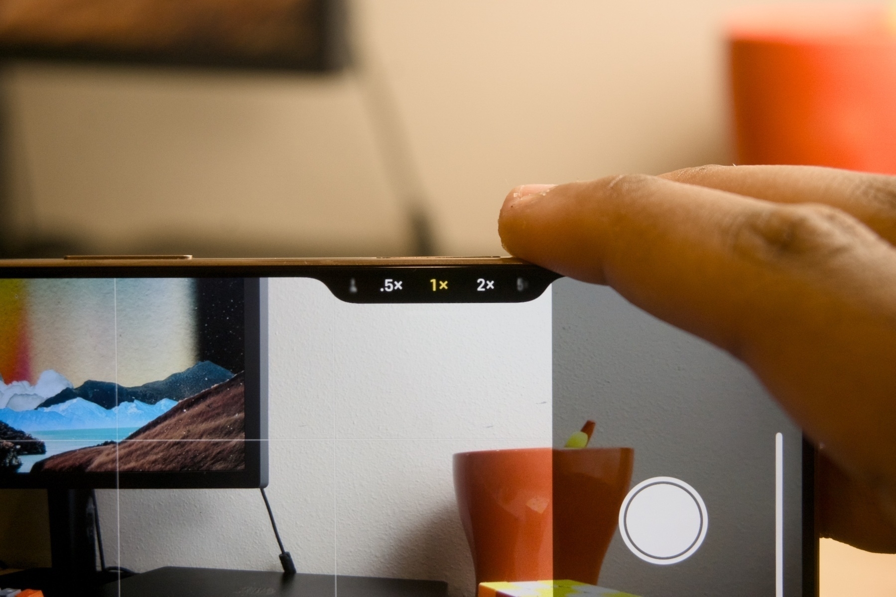 The first level of Camera Control adjustment.
To switch to a different control, double-light-press Camera Control and swipe to select a new mode — options include Exposure, Depth, Zoom, Cameras, Styles, and Tone. (Zoom allows freeform selection of zoom length, whereas Cameras snaps to the default lenses: 0.5×, 1×, 2×, and 5×; I prefer Cameras because I always want the best image quality.) Again, this double-light-press gesture is uncanny and awkward, and the first few times I tried it, I ended up accidentally fully pressing the button down and inadvertently taking a photo. It is entirely unlike any other gesture in iOS, which adds to the learning curve. I recommend changing the force required to light press by navigating to Settings → Accessibility → Camera Control → Light Press Force and switching it to Lighter. This mode reduces the likelihood of accidental depression of the physical button.
 The second level of Camera Control adjustment.
Qualms about software aside, the physical button is also difficult to actuate, so much so that pressing it causes the entire phone to move and shake slightly for me, sometimes resulting in blurry shots. On a real camera, the shutter button is intentionally designed to be soft and spongy to reduce camera shake, but I feel like Camera Control is actually firmer than other buttons on the iPhone, though that could be a figment. Camera Control is also recessed, not protruding, unlike other iPhone buttons, which makes it harder to grip and press — though the control is surrounded by a chamfer. I also find the location of Camera Control to be awkward, especially during one-handed use — Apple appears to have wanted to strike a balance between comfort in vertical and horizontal orientations, but I find the button to be too low when the phone is held vertically and too far to the left when held horizontally; it should have just settled on one orientation. (The bottom-right positioning of the button is also unfortunate for left-handed users, a rare example of right-hand-focused design from Apple.)
To make matters worse, Camera Control does not function when the iPhone is in a pocket, when its screen is turned off, or in always-on mode. The former makes sense to prevent accidental presses — especially since it does not have to be held down, unlike the Action Button — but to open the Camera app while the iPhone is asleep, it must be pressed twice: once to wake the display and another to launch the Camera app. In iOS 18.1, however, I have noticed that when the phone is asleep and in landscape mode, a single press provides access to the Camera app, but I can’t tell if this is a bug or not since iOS 18.1 is still in beta. But holding the phone in its vertical orientation or using the latest shipping version of iOS still yields the annoying double-press-to-launch behavior, making Camera Control more useless than simply assigning the Action Button to the Camera.
Overall, I am utterly conflicted about Camera Control. I appreciate Apple adding new hardware functionality to align with its software goals, and I am in awe at how the company has packed so much functionality into such a tiny sensor by way of its 3D Touch pressure-sensing technology — but Camera Control is a very finicky, fiddly hardware control that could easily be mistaken as something out of Samsung’s design lab. It doesn’t feel like an Apple feature — Apple’s additions are usually thoughtfully designed, intuitive straight out of the box, and require minimal thought when using them. Camera Control, by contrast, is slower than opening the Camera app from the Lock Screen without first learning how to use it and sometimes feels like an extra added piece of clutter to an already convoluted camera interface.
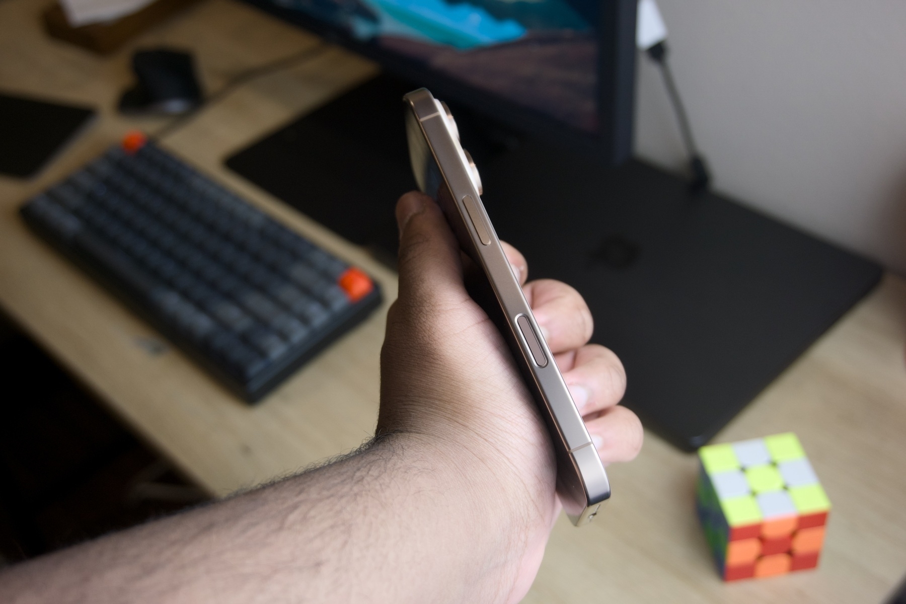 Camera Control replaces the 5G millimeter-wave antenna.
Most of my complaints about Camera Control stem from the software, but its position on the phone and difficult-to-press actuator are also inconveniences that distract from its positives. And, perhaps even more disappointingly, the light-press-to-lock-focus and Visual Intelligence features are still slated for release “later this year,” with no sign of them appearing in iOS 18.1. Camera Control doesn’t do anything the Action Button doesn’t do in a less-annoying or more intuitive way, and that makes it a miss I once thought would be my favorite feature of iPhone 16 Pro. I bet it will improve over time, but for now, it is still missing some marquee features and design cues. I will still use it as my main method of launching the Camera app from the Lock Screen — I was able to undo years of built-up Camera-launching muscle memory and replace it with one press of Camera Control, which is significantly quicker than any on-screen swipes and taps — but I don’t blame those who have disabled it or its swipe gestures entirely.
Photographic — err — Styles
Photographic Styles were first introduced in 2021 with iPhone 13, not as a replacement for standard filters but as a complement to modify photo processing while it was being taken — filters, by contrast, only applied a color change post-processing. While the latitude for changes was much less significant because the editing had to be built into the iPhone’s image processing pipeline, as it is called, Photographic Styles were the best way to customize the way iPhone photos looked from the get-go before any other edits. Many people, for example, prefer the contrast of photos shot with the Google Pixel or vibrance found in Samsung Galaxy photos, and Photographic Styles gave users the ability to dial those specifics in. To put it briefly, Photographic Styles were simply a set of instructions to tell iOS how to process the image.
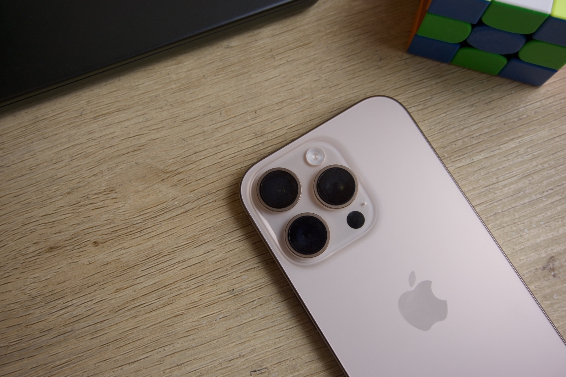 The cameras remain unchanged.
With iPhone 16, Photographic Styles vaguely emulate and completely replace the standard post-shot filters from previous versions of iOS and are now significantly more customizable. Fifteen preset styles are available and separated into two categories: undertones and mood. Standard, Amber, Gold, Rose Gold, Neutral, and Cool Rose are undertones; Vibrant, Natural, Luminous, Dramatic, Quiet, Cozy, Ethereal, Muted B&W, and Stark B&W are mood styles. I find the bifurcation to be unreasoned — I think Apple wanted to separate the filter-looking ones from styles that keep the image mostly intact, but Cool Rose is very artificial-looking to me, while Natural seems like it should be placed in the undertones category. I digress, but the point is that each of the styles gives the image a radically different look, à la filters, while concurrently providing natural-looking image processing since they’re context- and subject-aware and built into the processing pipeline. The old filters look cartoonish by comparison.
 Shot with the Vibrant style on iPhone 16 Pro.
 Shot with the Stark B&W style on iPhone 16 Pro.
I initially presumed I wouldn’t enjoy the new Photographic Styles because I never used them on my previous iPhones, but the more I have been shooting with iPhone 16 Pro, I realize styles are my favorite feature of this year’s model. They’re so fun to shoot with and, upon inspection, aren’t like filters at all. Quick-and-dirty Instagram-like filters make photographers cringe because of how stark they look — they’re not tailored to a given image and often look tacky and out of place. Some styles, like Muted B&W, Quiet, and Cozy, do look just like Instagram filters, but others, like Natural, Gold, and Amber, look simply stunning. For instance, shooting a sunset with the Gold filter on doesn’t take away from the actual sunset and surrounding scene but makes it feel more natural and vibrant. They’re great for 99 percent of iPhone users who don’t care to fiddle around with editing shots after they’ve been taken and photographers who want a lifelike yet gorgeous, accentuated image.
 Shot with the Gold style on iPhone 16 Pro.
Photographic Styles make shooting on the iPhone so amusing because of how they change images yet retain the overall colors. They really do change how the photos are processed without modifying every color globally throughout the entire image. The Gold style is attractive and makes certain skin tones pop, beautiful for outdoor landscapes during the golden hour. Rose Gold is cooler, making it more apt for indoor images, while Amber is fantastic for shots of people, allowing photos to appear more vibrant and warmer. Stark B&W is striking, which has made it artsy for moody shots of people, plants, or cityscapes. As I have shot with iPhone 16 Pro, I kept finding myself choosing a Photographic Style for every snap, finding one that still kept the overall mood of the scene while highlighting the parts I found most attractive. The Vibrant style, for example, made colors during a sunset pop, turning the image more orange and red as the sun slowly dipped below the horizon. I don’t like all of the styles, but some of them are truly fascinating.
 Shot with the Cozy style on iPhone 16 Pro.
What prominently distinguishes styles from the filters of yore is that they are non-destructive, meaning they can be modified or removed after a photo has been taken. Photographic Styles are still baked into the image processing pipeline, but iOS now captures an extra piece of data when a photograph is taken to later manipulate the processing. Details are scant about how this process works, in typical Apple fashion, but Photographic Styles require shooting in the High-Efficiency Image File Format, or HEIF, which is standard on all of the latest iPhones. Images taken in HEIF use the HEIC file extension, with the C standing for “container,” i.e., multiple bits of data can accompany the image, including the Photographic Style data. iOS uses this extra morsel of data to reconstruct the processing pipeline and add a new style, and the result is that every attribute of a Photographic Style can be changed after the fact on any device running iOS 18, iPadOS 18, or macOS 15 Sequoia.
Photographic Styles have three main axes: Tone, Color, and Palette. Palette reduces the saturation of the style, Color changes the vibrance, and Tone is perhaps the most interesting, as it is short for “tone mapping,” or the high dynamic range processing iOS uses to render photos. While Color and Palette are applied unevenly, depending on the subject of a photo, Tone is actively changing how much the iPhone cares about those subjects. iOS analyzes a photo’s subjects to determine how much it should expose and color certain elements: skin tones should be natural, shadows should be lifted if the image is dark, and the sky should be bright. These concepts are clear to humans, but for a computer, they’re all important, separate decisions. By adjusting the aggressiveness of tone mapping, iOS becomes more or less sensitized to the objects in a photo.
iPhones, for the last couple of years, have prioritized boosting shadows wherever possible to create an evenly lit, well-exposed photograph in any circumstance. If a person is standing beside a window with the bright sun blasting in the background of a shot taken in indoor lighting, iOS has to prioritize the person, lift the shadows indoors, and de-emphasize the outside lighting. By decreasing Tone, in this instance, the photo will appear darker because that is the true nature of the image. With the naked eye, obviously, that person is going to appear darker than the sun — everyone and everything is darker than the sun — but suddenly, in a photo, they both look well exposed. That is due to the magical nature of tone mapping and image processing. Tone simply reduces that processing for pictures to appear lifelike and dimmer, just like in real life.
 Shot with the Natural style on iPhone 16 Pro.
Nowhere is the true nature of the Tone adjustment more apparent than in Apple’s Natural Photographic Style, which ducks Tone down to -100, the lowest amount possible. Shots taken with this style are darker than the standard mode but appear remarkably more pleasing to the eyes after getting used to it. Side-by-side, they will look less attractive because naturally, humans are more allured by more vibrant colors, even if they aren’t natural — but after shooting tens of photos in the Natural style, I find they more accurately depict what my eyes saw in that scene at that time. Images are full of contrast, color, and detail; shadows aren’t overblown, and colors aren’t over-saturated. There is a reason our eyes don’t boost the color of everything by n times: because natural colors just look better. They’re so much more pleasing because they look how they’re supposed to without any artsy effects added. By allowing Tone to be customized on the fly or after the fact, Apple is effectively handing the burden of image processing down to the user — it can be left at zero for the system to handle it, but if dialed in, photos depict tones and colors the user finds more appealing, not the system.
 Shot with the Standard style.
 The same shot, but with the Natural style applied.
Tone doesn’t affect color — only shadows — but the contrast of a photo is, I have found, directly proportional to the perceived intensity of colors. iPhones, at least since the launch of Deep Fusion in 2019, have had the propensity to lift shadows, then, in response, increase so-called vibrance to compensate for the washed-out look — but by decreasing Tone, both of those effects disappear. While Google and Samsung have over-engineered their image pipelines to accurately depict a wide variety of skin tones, Apple just lets users pick their own skin tone, both with styles and Tone. The effects of tone become most striking in a dark room, where everything seems even darker when Tone is decreased, leading me to disable it whenever I use Night Mode. Granted, that is an accurate recreation of what I am seeing in a dark room, but in that case, that isn’t what I am looking for. For most other scenes, I adjust Tone to -0.5 or -0.25, and I can easily adjust it via Camera Control, as I often do for every shot.
Tone, like styles, is meant to be adjusted spontaneously and in post, which is why I have tentatively kept my iPhone on the Natural style since I think it produces the best images. I am comfortable with this because I know I can always go back to another style, tone down the effect, or remove the Photographic Style entirely afterward if I find it doesn’t look nice later, and that added flexibility has found me using Photographic Styles a lot more liberally than I thought I would. Most of the time, I keep the style the same, but I like having the option to change it later down the line. By default, iOS switches back to the standard, style-less mode after every launch of the Camera app, including Tone adjustment, but that can and should be disabled in Settings: Settings → Camera → Preserve Settings → Photographic Style. (This menu is also handy for enabling the preservation of other settings like exposure or controls.)
 Shot with the Cozy style on iPhone 16 Pro.
A default Photographic Style can also be selected via a new wizard in Settings → Camera → Photographic Styles. iOS prompts the user to select four distinct photos they took with this iPhone, then displays the images in a grid and a selection of Photographic Styles in the Undertones section. Swiping left and right applies a new style to the four images to compare; once the user has found a style they like, they can select it as their default. The three style axes — Tone, Color, and Palette — are also adjustable from the menu, so a personalized style can also be chosen as the default. This setup assistant doesn’t require the Preserve Photographic Style setting to be selected, so whenever a new style is selected within the Camera app, it will automatically revert to the style chosen in Settings after a relaunch.
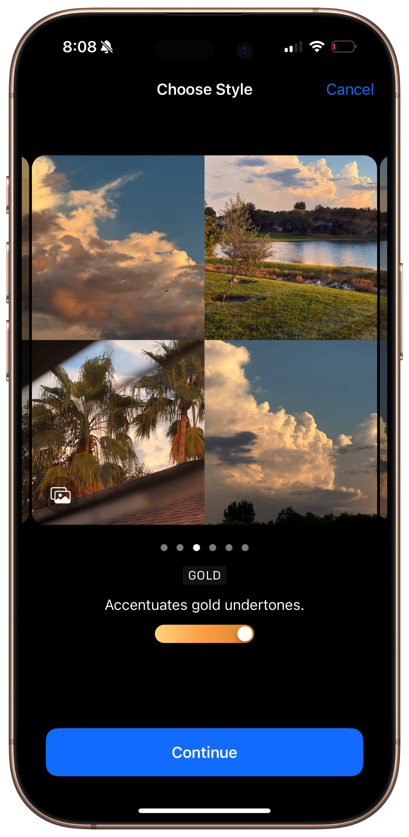 The new Photographic Styles menu in Settings.
A small, trackpad-like square control is used to adjust the Tone and Color of a style, displayed in both the Camera app and the Photographic Styles wizard in Settings. The control is colored with a gradient depending on the specific style selected and displays a grid of dots, similar to the design of dot-grid paper, to make adjustments. These dots, I have found, are mostly meaningless since the selector does not intuitively snap to them — they’re more akin to the guides that appear when moving a widget around on the desktop on macOS or like the color swatch in Markup but with an array of predefined dots. It is difficult to describe but mildly irritating to use, which is why I recommend using the Photos app on the Mac, which displays a larger picker that can be controlled with the mouse pointer, a much more precise measurement. (I have not been able to adjust Palette on the Mac app, though.)
This Photographic Style adjuster, for lack of a better term, is even more peculiar because it is relatively small, only about the size of a fingertip, which makes it difficult to see where the selector is on the array of dots. I presume this choice is intentional, though irritating, because Apple wants people to fiddle with the swatch while looking at the picture or viewfinder, not while looking at the swatch itself, which is practically invisible while using it. The adjuster is very imprecise — there isn’t even haptic feedback when selecting a dot — which is maddening to photographers like myself accustomed to precise editing controls, but it is engineered for a broader audience who doesn’t necessarily care about the amount displayed on the swatch as much as the overall image’s look. If a precise measurement is really needed, there is always the Mac app, but the effect of the adjuster is so minuscule anyway that minor movements, i.e., one dot to the left or right of the intended selection, aren’t going to make much of a difference.
 The Photographic Style adjuster is interesting.
The Photos and Camera apps display precise numerical values for Tone, Color, and Palette at the top of the screen when editing a style, but the values aren’t directly modifiable nor tappable from there. Again, as a photographer, this is slightly disconcerting since there is an urge to dial in exact numbers, but Apple does not want users entering values to edit Photographic Styles, presumably because the measurements are entirely arbitrary without a scale. Each one goes from -100 to 100, with zero being the default, but the amount of Color added, for example, is subjective and depends on the picture. All of this is to say Photographic Styles are nothing like traditional filters, like those found on Instagram, because they are dynamically adjusted based on image subjects. This explains the Photographic Styles wizard in Settings: Apple wants people to find a style that works for them based on their favorite photos, adjust them on the fly with Camera Control, and edit them after the fact if they’re dissatisfied.
 Shot with the Stark B&W style on iPhone 16 Pro.
Photographic Styles aren’t a feature of iPhone 16 Pro — they’re the feature. They add a new level of fun to the photography process that no camera has ever been able to because no camera is as intelligent as the iPhone’s. Ultimately, photography is an art: those who want to take part in it can, but those who want their iPhone to take care of it can leave the hard work to the system. The Standard style — the unmodified iPhone photography mode — is even more processed this year than ever before, but most iPhone users like processed photos1. What photographers bemoan as unnatural or over-processed is delightfully simple for the vast majority of iPhone users — think of the photo beside the window as an example. But by allowing people to not only decrease the processing but tune how the photo is processed, even after the fact, Apple is making photo editing approachable for the masses. iOS still takes care of the scutwork, but now people can choose how they want to be represented in their photos. Skin tones, landscapes, colors, and shadows are all customizable, almost infinitely, without a hassle. That is the true power of computational photography. Photographic Styles are the best feature Apple has added to the iPhone’s best-in-class camera in years.
 Shot with the Vibrant style on iPhone 16 Pro.
Miscellaneous
Apple has made some minor changes to this year’s iPhone that didn’t fit nicely within the bounds of this carefully constructed account, so I will discuss them here.
-
iPhone 16 Pro’s bezels aren’t just thinner, but the phone is physically taller than last year’s iPhone 15 Pro to achieve the new 6.3-inch display. The corner radius of this year’s model has also been modified slightly, and while the change isn’t much apparent side by side, it is after using the new iPhone for a bit and going back to the old one.
-
Desert Titanium, to my eyes in most lighting conditions, looks like a riff on Rose Gold and the Gold color from iPhone Xs. I think it is a gorgeous finish, especially in sunlight, though it does look like silver sometimes in low-light conditions.
 Desert Titanium is gorgeous.
-
Apple’s new thermal architecture, combined with the A18 Pro processor, is excellent at dissipating heat, even while charging in the sun. The device does warm when the camera is used and while wireless charging, predictably, but it doesn’t overheat when just using an app on cellular data like iPhone 15 Pro did.
-
I am still disappointed that iPhone 16 Pro doesn’t charge at 45 watts, despite the rumors, though it does charge at 30 watts via the USB Type C port and 25 watts using the new MagSafe charger. It is noticeably faster than last year’s 25-watt wired charging limit — 50 percent in under 30 minutes, in my testing.
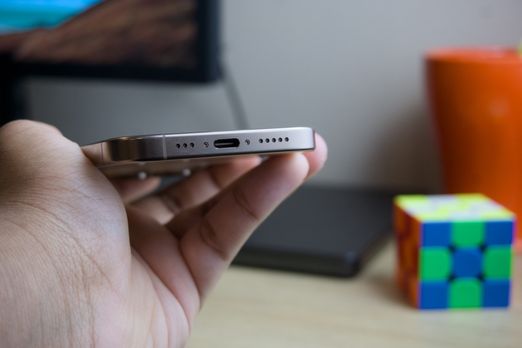 The USB-C port now accepts 30 watts of power.
-
The new ultra-wide camera is higher in resolution: it can now shoot 48-megapixel photos, just like the traditional Fusion camera, previously named the main camera, but the sensor is the same size, leading to dark, blurry, and noisy images because it isn’t able to capture as much light as the other two lenses. There is still a major discrepancy between the image quality of the 1×, 2×, and 5× shooting modes and the ultra-wide lens, and that continues to be a major reason why I never resort to using it.
-
The 5× telephoto lens is spectacular and might be one of my favorite shooting modes on the iPhone ever, beside the 2× 48-megapixel, 48-millimeter-equivalent crop mode, which alleviates unpleasing lens distortion due to its focal length2. I like it much more than I thought I would. The 3× mode from last year’s smaller iPhone Pro was too tight for human portraits and not close enough for intricate framing of faraway subjects, whereas the 5× is perfect for landscapes and close-ups — just not of people. The sensor quality is fantastic, too, even featuring an impressive amount of natural bokeh — the background blur behind a focused subject.
-
As the rumors suggested, Apple added the JPEG-XL image format to its list of supported ProRaw formats alongside JPEG Lossless, previously the only option. JPEG-XL — offered in two flavors, lossless and lossy — is a much smaller format that compresses images more efficiently while retaining image fidelity. Apple labels JPEG Lossless as “Most Compatible,” but JPEG-XL is supported almost everywhere, including in Adobe applications, and the difference in quality isn’t perceivable. The difference in file size is, though, so I have opted to use JPEG-XL while shooting in ProRaw.
-
Apple’s definition of photography continues to be the one that aligns the most with my views and stands out from the rest of the industry. This quote from Nilay Patel’s iPhone 16 Pro review at The Verge says it all:
Here’s our view of what a photograph is. The way we like to think of it is that it’s a personal celebration of something that really, actually happened.
Whether that’s a simple thing like a fancy cup of coffee that’s got some cool design on it, all the way through to my kid’s first steps, or my parents’ last breath, It’s something that really happened. It’s something that is a marker in my life, and it’s something that deserves to be celebrated.
And that is why when we think about evolving in the camera, we also rooted it very heavily in tradition. Photography is not a new thing. It’s been around for 198 years. People seem to like it. There’s a lot to learn from that. There’s a lot to rely on from that.
The first example of stylization that we can find is Roger Fenton in 1854 — that’s 170 years ago. It’s a durable, long-term, lasting thing. We stand proudly on the shoulders of photographic history.
“We stand proudly on the shoulders of photographic history.” What an honorable, memorable quote.
 Sometimes, Desert Titanium looks like Silver.
The Notably Absent Elephant
In my lede for this review, I mentioned at the very end that iPhone 16 Pro is “the true perfection of the form and function of the iPhone, even if it might be a little boring and missing perhaps its most important component at launch.” About 6,000 words and three sections later, the perfection of the form and function is over, and the reality of this device slowly begins to sink in: I don’t really know how to review this iPhone. Camera Control is fascinating but needs some work in future iterations of the iPhone and iOS, and Photographic Styles are exciting and creative, but that is about it. But one quick scanning of the television airwaves later, and it becomes obvious, almost starkly, that neither of these features is the true selling point of this iPhone. Apple has created one advertisement for Camera Control — just one — and none for Photographic Styles. We need to discuss the elephant missing from the room: Apple Intelligence, Apple’s suite of artificial intelligence features.
To date, Apple has aired three advertisements for Apple Intelligence on TV and social media, all specifically highlighting the new iPhone, not the new version of iOS. On YouTube, the first, entitled “Custom Memory Movies,” has 265,000 views; the second, titled “Email Summary,” has 5.1 million; and the third, named “More Personal Siri,” 5.6 million. By comparison, the Camera Control ad has a million, though it is worth noting that one is relatively new. Each one of the three ends with a flashy tagline: “iPhone 16 Pro: Hello, Apple Intelligence.” These advertisements all were made right after Apple’s “It’s Glowtime” event three weeks ago, yet Apple Intelligence is (a) not exclusive to iPhone 16 Pro — or this generation of the iPhone at all, for that matter — and (b) not even available to the public, aside from a public beta. One of the highlighted features, the new powerful Siri, isn’t coming until February, according to reputable rumors.
iPhone 16 Pro units in Apple Stores feature the new Siri animation, which wraps around the border of the screen when activated, yet turning on the phone and actually trying Siri yields the past-generation Siri animation, entirely unchanged. Apple employees at its flagship store on Fifth Avenue in New York were gleefully cheering on iPhone launch day: “When I say A, you say I! AI, AI!” For all intents and purposes, neither Camera Control nor Photographic Styles are the reason to buy this iPhone — Apple Intelligence is. Go out on the street and ask people what they think of iPhone 16 Pro, and chances are they’ll say something about Apple Intelligence. There isn’t a person who has read the news in the last month who doesn’t know what Apple Intelligence is; they just do not exist. By contrast, I am not so confident people know what Photographic Styles or Camera Control are.
Apple Intelligence — or the first iteration of it, at least, featuring notification and email summaries, memory movies, and Writing Tools — is, again, not available to the public, but the silly optics of that mishap are less frustrating to me than the glaringly obvious fact that Apple Intelligence is not an iPhone 16 series-exclusive feature. People who have an iPhone 15 Pro, who I assume are in the millions, will all get access to the same quick Apple Intelligence coming to iPhone 16 buyers, yet it is notably and incorrectly being labeled as an iPhone 16-exclusive feature. Apple incorrectly proclaims these devices are the first ones made for Apple Intelligence when anyone who has studied Apple’s product lifecycle for more than 15 minutes knows these iPhones have been designed long before ChatGPT’s introduction. To market Apple Intelligence as a hardware feature when it certainly isn’t is entirely disingenuous, yet reviewing the phones without Apple Intelligence is perhaps also deceiving, though not equally.
Indeed, the primary demographic for the television ads isn’t people with newly discontinued iPhones 15 Pro, but either way, I am perturbed by how the literal tagline for iPhone 16 Pro is “Hello, Apple Intelligence.” iPhone 16 Pro is not introducing Apple Intelligence, for heaven’s sake — it doesn’t even come with it out of the box. The “more personal Siri” isn’t even coming for months and is not exclusive to any of the new devices, yet it is actively being marketed as the marquee reason why someone should go out and buy a new iPhone 16. Again, that feature is not here — not in shipping software, not in a public beta, not even in a developer beta. Nobody in the entire world but a few Apple engineers in Cupertino have ever tried the feature, yet it is being used to sell new iPhones. If someone went out and bought a refurbished iPhone 15 Pro, they would get the same amount of Apple Intelligence as a new iPhone 16 Pro buyer: absolutely zero.
I understand Apple’s point: that iPhone 16 and iPhone 16 Pro are the only new iPhones you can buy from Apple with Apple Intelligence support presumably coming “later this fall.” But that technicality is quite substantial because it makes this phone impossible to review. Reviewing hardware based on software, let alone software that doesn’t exist, is hard enough, and when that software isn’t even exclusive to the hardware, the entire test is nullified. I really don’t want to talk about Apple Intelligence because it is unrelated to this iPhone — I wrote about it before iPhone 16 Pro was introduced, and none of my thoughts have changed. Even with Apple Intelligence, my review of this phone wouldn’t differ — it is a maturation of an ageless design, nothing more and nothing less. I think Apple Intelligence is entirely irrelevant to the discussion about this device. That doesn’t mean my initial opinion won’t or couldn’t change, but I think it is nonsensical to grade a hardware product based on software.
Conversely, Apple Intelligence is the entire premise of iPhone 16 Pro from Apple’s marketing perspective, and my job is to grade Apple’s claims and evaluate them with my own anecdotes. I cannot ignore the elephant in the room, but it just happens to be that the elephant is not tangible nor present. Apple Intelligence, Apple Intelligence, Apple Intelligence, it keeps eating away from the phone part of iPhone 16 Pro. I cannot think of a software feature Apple has marketed in this way, so much that it feels somehow untrue to refer to it as a software exclusivity. The Apple Intelligence paradox is impossible to probe or solve because it barely exists because Apple Intelligence doesn’t exist. The new Siri product is nonexistent, and yet 5.6 million people on YouTube are being gaslit into thinking it is an iPhone 16 Pro feature. It is not a feature, and it certainly isn’t a feature of iPhone 16 Pro. I cannot sharply rebuke Apple enough for thinking it is morally acceptable to market this phone this way.
In every other way, iPhone 16 Pro is the best smartphone ever made: Camera Control and Photographic Styles are features that iterate on the iPhone’s timeless design, and the minor details make it feel polished and nice to use. That is all more than enough to count as the next iteration of the Porsche 911, circling back to the lede of this article. Right there, without any further caveats, is exactly where I want to end my multi-thousand-word spiel about this smartphone because, at the time of writing, there is nothing more to say about it. But this nagging anomaly keeps haunting me: this Apple Intelligence concept Apple keeps incessantly and relentless pushing.
I don’t hate Apple Intelligence; I just think this is an inappropriate place to discuss it. Apple Intelligence and iPhone 16 Pro do not have any significant correlation, and whatever relation there is perceived to be was handcrafted by Apple’s cunning marketing department. That one glitch in the matrix throws a wrench into the conclusion of not just my review but everyone else’s. It is impossible, irrational, undoable, and nonviable to look at this smartphone and not see traces of Apple Intelligence all over it, yet the math just doesn’t add up. Apple Intelligence does not belong here, and neither do Visual Intelligence and Camera Control’s lock-to-focus feature, both of which are also reportedly coming in a future software update. Point blank, this year’s overarching theme is what is missing.
iPhone 16 Pro suffers from the wrath of Apple’s own marketing. That makes it an entirely complicated device to asses, not because of what it has or what it lacks, but what it is supposed to have. So goes the tale of the elephant absent from the room.
-
Anecdotally speaking. ↩︎