
The New Fox Sports Score Bug is Awful
The iOS 7 of on-screen graphics
On Sunday, Fox Sports debuted an all-new, redesigned score bug during Super Bowl 59. A score bug is, as defined by Wikipedia, a “digital on-screen graphic… displayed… during a broadcast of a sporting event in order to display the current score and other statistics.” Fox’s score bug has been center-aligned for years to accommodate vertical videos posted to the internet, and I generally liked the network’s old design for myriad reasons. The new one breaks everything good about its predecessor, and I think the reasons for criticizing it are more complicated than the innate nature of humans to dislike change. For context, here are the two items in question — first new, second old:
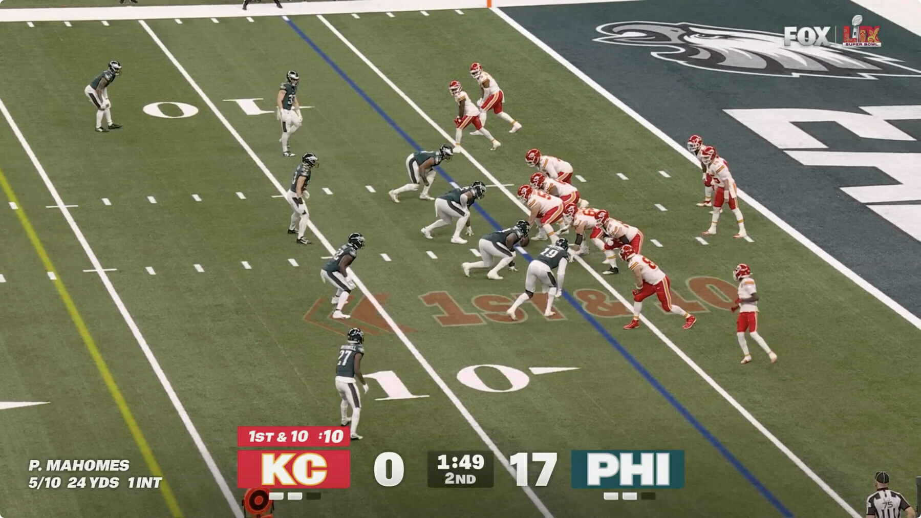 Fox Sports’ new score bug, first debuted during Super Bowl 59.
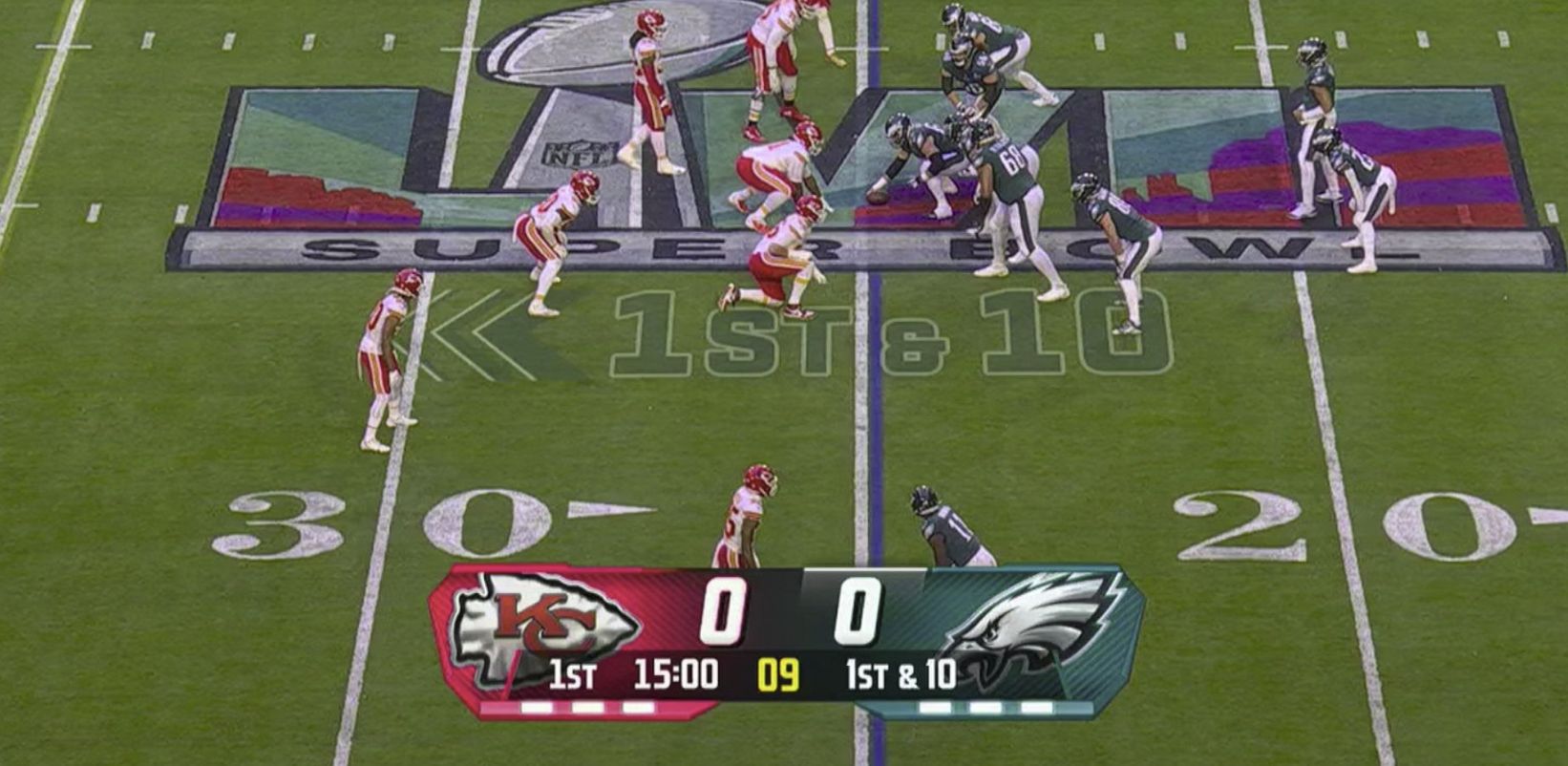 Fox Sports’ old score bug, first debuted during Super Bowl 58.
For me, every score bug on television must meet the following criteria:
- It must have high contrast. Black text on a white background is preferred, but white text on black is also acceptable.
- The font must be in boldface with clear, sans-serif numerals.
- It must emphasize color to differentiate teams rather than flags or logos, which are indiscernible or hard to decipher from faraway distances or odd angles.
- It must occupy as little vertical and horizontal space as possible while maintaining a large font size.
- It must clearly emphasize which team or player has possession of the ball at all times.
Fox’s old chyron accomplished most of these objectives well enough for my liking. The numbers were white on a black, gradient background, which was great — a remarkable change from tennis score bugs, which are tiny with bad contrast. The logos of the teams were surrounded by their colors, which made it easy to check the score without looking too hard. It was clear enough which team had possession by the white line that appeared above the score. And perhaps most importantly, the score bug was compact while retaining readability, which made it less distracting while providing ample utility. My only complaint was that I felt the design looked too busy, almost like it was made for the 2010-to-2015 era of user interface design. I don’t think there was a doubt in any designer’s mind that the Fox chyron could do with bold gut and redo.
So, on Sunday, the update came, and it was horrendous. From the moment I laid my eyes on it, it looked like it wasn’t rendered properly or that half the chyron was missing. The timer in the center with the translucent gray background is by far the laziest design I’ve seen on national television in recent history, and while I think the contrast between the text and background is acceptable, I at least think the corners should be rounded. And Fox practically gave up when designing the numbers, which are aggravating beyond belief. It’s not the size that bugs me; it’s that they have no background color at all. It might be that I’m especially persnickety about contrast, but the subtle gradient on the numerals isn’t enough for me. They should have a color background or, even better, a near-pitch-black surface like Apple TV+’s Friday Night Baseball score bug.
I actually think Apple’s score bug nails it, albeit I think it could do with more color to differentiate between teams. (Jason Snell at Six Colors has good images on his post about Friday Night Baseball from a few years ago.) The numerals are bold and clear, the graphic isn’t too large, and it uses varying amounts of transparency to guide the eyes to the most important information first. It perfectly exemplifies my biggest gripe with Fox’s new chyron: it’s laid out unnaturally for English readers. English is read left to right and top to bottom, and thus, the most important information in any graphic should be at the top left because that’s where our eyes are most inclined to look first. Because Fox’s new score bug is so large, it’s unnatural to begin at the center; I start reading from left to right. Suddenly, the score bug isn’t so glanceable anymore. Apple’s design maximizes design versatility by center-aligning information at the top.
The new Fox chyron has no information density or architecture whatsoever; it’s entirely unclear what someone should pay attention to at just a glance. The team names are highlighted in their colors, but that’s not the most important part of the bug: the score is. The score and teams have no continuity; they’re almost on separate lines due to the horizontal line gap. The only way to read the new graphic is from left to right: Kansas City, 0, 1:49 remaining, second quarter, 17, Philadelphia. A good score bug should place the scoring information first, at the top, hierarchically: Kansas City, 0, 17, Philadelphia. The current down is important in football, but nothing trumps the score, which must always reign supreme. The layout of the new score bug is too horizontally focused, which has the unfortunate side effect of making the graphic too large. It’s almost always easier to lay text out vertically than horizontally to preserve screen real estate — it’s just a more compact layout.
There are elements of the new design that I appreciate, like the letters representing the teams over the logos that casual viewers don’t seem to remember, or the highlight color behind the down number to instantly relay which team has possession, which is significantly more readable than the previous design. But mostly, I believe the few strengths outweigh the numerous shortcomings: the layout is awful, it’s lacking in contrast, and the minimalist design just doesn’t fit with the theme of the broadcast. On the third point: I contend the previous score bug was too flashy and carried too much 2010s aesthetic, but the new one is arguably worse. It reminds me of iOS 7, when Jony Ive, Apple’s ex-chief designer, flattened all of the life out of iOS and made the operating system scream monotony. Again, minimalism isn’t a bad thing: look at Apple’s Friday Night Baseball chyron for an example. But the hard 90-degree angles and boxy backgrounds aren’t elegant or tasteful and are too bland for my liking.
Perhaps I’m asking too much from a mediocre sports broadcaster, but it’s evident that the new design is a significant regression from the previous version. I don’t think Fox should eliminate the new design, however. Here are my proposals to improve the existing design, ranked in order of importance:
-
Place the scores at the top and everything else one level below the main data. The old chyron accomplished this perfectly: Use translucency and color to separate the two levels and establish a hierarchy.
-
Use gradients instead of solid color blocks. The entire score bug should be one continuous piece, not floating tiles hovering over the field with hard, uninviting corners. Use a large enough rounded rectangle with gradients for the team’s colors, being sure to keep the initialisms over the un-discernible logos.
-
Retain transparency where it’s needed. The colors can be slightly translucent so long as they don’t impact contrast. Prefer solid-colored numerals over gray gradients, but use translucency in the background to make the score bug less conspicuous overall. The current version, again, has two floating tiles of color suspended in mid-air. It doesn’t look like a chyron — it looks out of place.
Interface design is difficult, and even Apple took years to perfect iOS’ design post-iOS 7. But the way Apple addressed iOS 7’s shortcomings was by slowly incorporating shadows, depth, and textures into its operating systems in the coming years. Notably, this wasn’t a pivot back into skeuomorphism as much as it was an introduction of basic digital-first materials in software design. The Dynamic Island’s rounded corners and whimsical animations don’t necessarily model a real-world object, but they add character to the operating system after crossfades and harsh transitions took over in 2013. macOS 11 Big Sur re-introduced rounded corners after macOS 10.10 Yosemite removed them, creating a stoic, business-like design. iOS now uses three shades of certain system colors — primary, secondary, and tertiary — to designate importance.
Fox’s new score bug is an iOS 7-style pivot from the textual design of the previous graphic. That sets it up for a long career in the 2020s, but Fox needs to bring humanity back into the design, incorporating curves, hierarchy, depth, and texture into a more pleasing, sensible chyron. Describing a score bug like this might seem inappropriate for such a simple, almost unimportant element when the primary focus should be on the game, but it’s important to make information glanceable when so many people need to look at it for hours. The best designs are the ones that go unnoticed except for when they change, and Fox’s latest design is too distracting and attracts too much attention. A score bug should be subdued and easy on the eyes, and the new one is anything but.