
Thoughts on Liquid Glass, Apple’s AI Strategy, and iPadOS 26
WWDC 2025 was a story of excitement and caveats
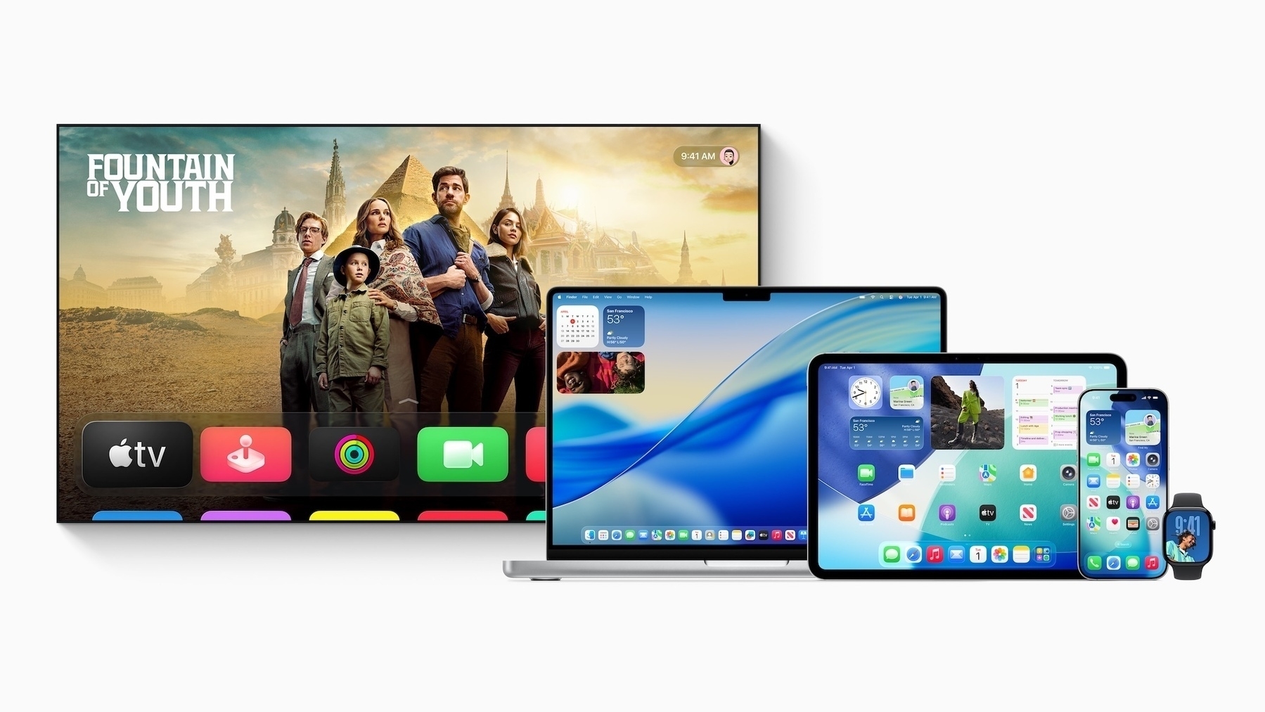 Apple announced major design updates across all of its platforms at WWDC. Image: Apple.
Apple on Monday at its Worldwide Developers Conference announced a cavalcade of updates to its latest operating systems in a clear attempt to deflect from the mire of the company’s Apple Intelligence failures throughout the year. During the keynote address, held at Apple Park in Cupertino, California, Apple’s choice to focus on what the company has historically been the best at — user interface design — over its half-hearted Apple Intelligence strategy became obvious. It very clearly doesn’t want to discuss artificial intelligence because it knows it can’t compete with the likes of OpenAI, Anthropic, or its archenemy, Google, whose Google I/O developer conference a few weeks ago was a downright embarrassment for Apple.
So, Apple skirted around the obvious. While Craig Federighi, its senior vice president of software, briefly mentioned Apple Intelligence at the beginning of the keynote, the new “more personalized Siri” demonstrated 12 months ago was nowhere to be found. Nothing from the new update, not even a screenshot, made it into the final presentation. It was remarkable, but the shock only lasted so long because Federighi and his company had something else planned to entertain people: a full-blown redesign and renaming of all of the company’s influential software platforms. The new design paradigm is called “Liquid Glass,” inspired by a semi-transparent material scattered throughout the operating systems, flowing like a viscous liquid. Tab bars now have an almost melted-ice look to them when touched, and nearly every native switch has been overhauled throughout the OS, from buttons to toggles to sliders.
When you pick up a device running iOS 26, iPadOS 26, or macOS 26 — in Apple’s all-new, year-based naming scheme — it instantly feels familiar yet so new. (And buggy — these are some of the worst first betas in over a decade.) Interactions like swiping up to go to the Home Screen have a new fluid animation; app icons are now slightly more rounded and glisten around the edges, with the light changing angles as the device’s gyroscopes detect motion; and all overlays are translucent, made of Liquid Glass. At its core, it’s still iOS — the post-iOS 7 flattening of user interface design remains. But instead of being all flat, this year’s operating systems have hints of glass sprinkled throughout. They’re almost like crystal accents on designer furniture. Apps like Mail look the same at first glance, but everything is just a bit more rounded, a bit more shiny, and a bit more three-dimensional.
The allure of this redesign provided an (intended) distraction from Apple’s woes: The company’s reputation among developers is at an all-time low thanks to recent regulation in the European Union and court troubles in the United States. Apple Intelligence still hasn’t shipped in its full form yet, and the only way to use truly good AI natively on iOS is by signing into ChatGPT, which has now been integrated into Image Playground, a minor albeit telling concession from Apple that its AI efforts are futile compared to the competition. Something is still rotten in the state of Cupertino, and it’s telling that Apple’s executives weren’t available to answer for it Tuesday at “The Talk Show Live,” but in the meantime, we have something new to think about: a redesign of the most consequential computer operating systems in the world.
It’s not to say Apple didn’t touch AI this year at WWDC. It did — it introduced a new application programming interface for developers to access Apple’s on-device and cloud large language models for free to integrate into their own apps, just like in Apple’s own, and it even exposed Shortcuts actions to let users prompt the models themselves. Apple’s cloud model, according to the company, is as powerful as Meta’s open-source Llama 4 Scout and has been fine-tuned to add even more safety features, bringing it on par with low-end frontier models from competitors like Google. Time will tell how good the model is, however; it hasn’t been subjected to the usual benchmarks yet.
And perhaps the most surprising update at this year’s WWDC was iPadOS 26, which now comes closer to being a real computer than ever before. It now includes a proper cursor, just like the Mac, as well as true freeform windows, background tasks, and a menu bar in certain supported apps, just as I predicted a few months ago. Files now has support for choosing default apps, and Preview, the hallmark Mac app, finally comes to the iPad (and iPhone) for the first time. Audio apps can now integrate with the system to allow users to choose individual audio inputs and outputs, like an external microphone and headphones, and new APIs also allow audio and video recording for podcasts. As someone who has been disgruntled by the pace of improvements on iPadOS since the 2018 iPad Pro refresh, the new update truly did shock me. I was even writing it off as a nothingburger until background tasks were announced, and only then was I truly blown away. iPadOS 26 might just be the ultimate distraction from Apple’s woes.
I don’t want this to sound like I’m beating a dead horse. Everyone knows Apple is behind in AI and struggling with developer relations, and nobody needs yet another blogger reminding them Apple is on a downward trajectory. But I feel like the allure of the redesign and iPadOS improvements has clouded my judgment over the past day. When I sat down to gather my thoughts at the end of the presentation, I felt this familiar excitement rush through my body — I just didn’t know why. It felt like iOS 7 again, or maybe even macOS Yosemite. Perhaps even macOS Big Sur, which I was enthused about until I installed it and felt abject horror over the squircle app icons. But I quickly stopped myself because I had to think hard about this: Will this strategy work? It’s one thing if Apple itself redesigns its apps, but developers need to be on board too. Users have to take Apple seriously.
In 2013, Apple was riding high like no one else. After the fallout of Scott Forstall, Apple’s previous software chief, it really only had Apple Maps to worry about. It recruited Jony Ive, its designer at the time, and Federighi to build an interface that would last and that, most importantly, was easy to build for. The “skeuomorphic” design of older Apple operating systems required some design ingenuity to work. The Game Center app had a gorgeous green felt background with wood lining the screen, like a nice pool table. The Voice Memos app had a beautifully rendered microphone front and center, mesh lines and all. Every app needed a designer, and one-person projects just looked out of place. iOS 7 changed that by flattening the design and trading some of the character for usability. It worked for developers because it was easy to implement, and it worked for Apple because it still looked stunning.
Now, Apple has a developer relations crisis, and major companies like Meta — vital to the health of iOS — aren’t gassed about following Apple’s lead. Whereas Facebook was late to mobile back in 2013, it now controls some of the most important apps on people’s phones. It now has the leverage to sabotage Apple’s redesign plans. Does anyone seriously think Facebook, a historically tasteless company, is interested in adopting the gorgeous new Liquid Glass design for Instagram and WhatsApp? I wouldn’t bet money on it. Now, Apple is subjugated to its developers, not vice versa, and it requires their cooperation to make Liquid Glass anything but a failure. If only a few developers adopt it, iOS will look like a hodgepodge of disagreeing apps where everything looks out of place, and it’ll be miserable.
Apple needed a distraction from Apple Vision Pro, Apple Intelligence, and the legal crisis, and that’s not even mentioning the tariff situation in the United States. I get why it decided to take a leap forward and do a redesign. It gets headlines, steers attention away from the company’s AI problems, and puts it back in the spotlight again. In more than one way, it’s a beacon of hope — a promise Apple can overcome its current difficulties and regain the dominance over consumer technology it once commanded 12 years ago. But it’s also an alarming exposé of how its control has slipped away thanks to its systemic failures over those 12 years, culminating in what amounts to a standoff between Apple, which has thought it controls iOS, and its developers and users, who have turned Apple into the tech media’s laughingstock in the last year.
I really didn’t want this to be a drab piece, because truthfully, I’ve done too many of those recently. But as I felt myself whisked away by the event and Liquid Glass redesign, I had a nagging feeling at the back of my head asking why any of this was important at all. Developer and consumer adoption concerns me this year more than any other factor in the redesigned operating systems. I think Apple can iron out most of the bugs before release day, and I find the software development kits to be mostly stable. I even like the strategy for encouraging adoption: Apps compiled with Xcode 26 — which will soon become compulsory for future app updates — automatically adopt Liquid Glass, and Apple will soon disable the opt-out control buried in the project settings, effectively forcing all developers into the redesign. But that doesn’t mention the countless popular apps that use non-native frameworks, like Uber or Instagram. When will they adopt Liquid Glass? Probably never.
There’s a lot to touch on this year from WWDC, and this is only the start of it — my preliminary thoughts post-event. And they’re conflicting: On one hand, I think Liquid Glass is stunning and I yearn to sing its praises; on the other, my more cynical side is concerned about adoption and Apple Intelligence, which still doesn’t meaningfully exist yet. As the summer progresses, I’m sure my thoughts will converge into something more coherent, but for now, I’m living between two worlds in this complicated picture Apple has painted. For each exciting, hope-laden part of this year’s WWDC, there’s a catch. Liquid Glass? Adoption. Apple Intelligence? Nascent. iPadOS? Not a computer for everyone. I guess there really always is a catch.
Liquid Glass
 A close-up look at Liquid Glass in iOS 26. Image: Apple.
When the Liquid Glass interface was first unveiled by Alan Dye, Apple’s software design chief, I was honestly conflicted about how to feel. I think the anticipation of something big got the better of me as I watched the interface slowly being revealed. Dye illustrated the fluidity yet translucency of Liquid Glass with these large glass pebbles he had lying on the desk in front of him, one of the many just like it at Apple Park. They weren’t completely clear, but also not opaque — light passing through it was still distorted, unlike a pair of glasses, but akin to a clear slab of ice. They looked like crystals, and they might as well have been if Apple were in the business of selling jewelry. They reminded me of the crystal gear shifter in the BMW 7 Series: complementary, but non-intrusive, and adding a gorgeous finish to an already excellent design.
That’s exactly what Liquid Glass feels like in iOS 26. The core of iOS remains familiar because, in some way, it has to. Table views are still flat with rounded padding, albeit with more whitespace and a cranked-up corner radius. The system iconography remains largely unchanged, and so do core interfaces in Mail, Notes, and Safari. The iOS 6 to iOS 7 transition was stark because everything in iOS was modeled after a real-life object. The Notes app in iOS 6, for instance, was literally a yellow legal pad. iOS 7 scrapped all of that, but there’s not much to scrap in iOS 18. It’s ostensibly a barebones interface by itself. So instead of stripping down the UI, Apple added these crystal, “Liquid Glass” elements for some character and depth. This goes for every app: once-desolate UIs now come to life with the Liquid Glass pieces. They add a gorgeous touch to a timeless design.
Search bars have now been moved to the bottom in all apps, which not only improves reachability but also allows them to live alongside the content being searched. Liquid Glass isn’t transparent, as that would impede contrast, but it’s possible to read the text behind it. In Notes, as a person scrolls through the list of notes, the titles and previews are legible behind the Liquid Glass search field. They get blurrier, perhaps more stretched out and illegible, as the text approaches the fringes of the glass, emulating light refracting as it scrolls in and out of view. In Music, it’s even more beautiful, as colorful album art peeks through the crystalline glass. To maintain contrast, the glass tints itself light or dark, and while I don’t think it does quite a good job yet — this has been belabored all over the internet, especially about notifications — I’m sure improvements to the material to increase contrast will come as the betas progress. It’s not a design issue; it’s the unfinished implementation.
In previous versions of iOS, Gaussian and progressive blurs handled visual separation of distinct elements. Think back to the pre-iOS 18 Music “Now Playing” bar at the bottom of the screen. It was blurred and opaque while the main “For You” screen remained clear. iOS 26 accomplishes the same visual separation via distinct, reflective edges. Nearly every Liquid Glass element has a shimmer around the edge, and some, such as Home Screen icons, reflect light at different angles as the phone’s gyroscope detects movement. They feel like pieces of real glass with polished edges. Button border shapes are now back: previously text-only buttons in navigation bars now have capsule-shaped borders around them, complete with reflective edges and a Liquid Glass background.
I thought all of this intricacy would be distracting because, thinking about it, it does sound like a lot of visual overload. In practice, though, I find it mostly pleasant as it lives in the periphery, complementing the standard interface. In Notes, it’s not like individual notes are plastered in Liquid Glass. Aside from the search field and toolbars, it’s hardly there. It’s only noticeable when it’s being interacted with, such as to open context windows, which are now redesigned and look stunning. The text loupe is made from Liquid Glass and has a delightful animation when moved around, and tapping the arrow in the text selection menu now opens a vertically scrolling list of options — no more thumbing around to find an option through the dreaded horizontal list. It’s the little things like this that make Liquid Glass such a joy to use.
The new Liquid Glass keyboard is far from the one on visionOS, where “translucency” is key to blend in with the background. On iOS, there is no background, but it almost feels like there is, thanks to the chamfered edges that glisten in the light. The font has changed, too: it’s now using a bolder version of SF Compact, the version of San Francisco (obviously) used in watchOS. There’s no longer a Done or Return key at the bottom right; it’s replaced with an icon for the appropriate action. It’s little tweaks like these littered throughout iOS 26 that make it feel special and almost luxurious. I really do think Apple nailed the Liquid Glass aesthetic’s position in the UI hierarchy: it occupies a space where it isn’t overbearing, taking up all available interfaces, but it’s also more than just an accent.
I can see where the rumor mill got the idea to call the redesign “visionOS-like,” but after seeing it, I disagree with that. visionOS is still quite blur-heavy: it uses relatively opaque materials to convey depth, and the best way to turn a transparent background opaque is by blurring and tinting it. visionOS’ “glass” windows are blurred, darkened rectangles, and it’s impossible to see behind them. They allow ambient light in, but they’re hardly transparent. Liquid Glass is transparent — as I wrote earlier, it’s possible to read text behind a button or toolbar while scrolling. It maintains the fluidity of visionOS, but the two aren’t exactly neighbors. visionOS still lives in the iOS 18 paradigm of software design, but is adapted for a spatial interface where claustrophobia is concerning.
visionOS doesn’t have light reflections, and whatever light it does have is real light coming from either an Environment or the cameras via Passthrough. While glass is how UIs are made on visionOS, Liquid Glass is an accent to the otherwise standard iOS lists, text entry fields, and media views. I’m not saying the general interface hasn’t changed, it’s just that it’s what you’d expect from a smaller redesign: corner radii are more rounded, toggles are wider, and there is generally more padding everywhere. (Perhaps the latter will change in future betas.) But when the UI becomes interactive, Liquid Glass springs to life. When a toggle is held down, a little glass ornament pops up, just as an added touch. When you swipe down to Notification Center, chromatic aberration makes the icons shimmer a little, like they’re under a waterfall. Perhaps the most egregious example is when you tap a tab element: a large reflective orb comes out and lays back down over the newly selected tab. I don’t think half of this will exist three betas from now, but it’s neat to see now.
On iPadOS and macOS, Liquid Glass does look more like a sibling to visionOS than a cousin. Sidebars float with an inset border, and opaque backgrounds are used throughout the operating systems. But there are drawbacks, too, like how the menu bar on both platforms is now entirely transparent, receding into the background. macOS 26 Tahoe has many regressions from previous macOS versions that bring it more in line with iOS and iPadOS, stripping the Mac of its signature character and showiness. App icons can no longer extend beyond the boundaries of the squircle — apps with these ligaments are inset in a gray squircle until they’re updated. I find macOS Tahoe to be so tasteless, not because of Liquid Glass, but because the Mac always had a charm that’s no longer there. I fumed at macOS Big Sur five years ago for this same reason, and I’m upset that Dye, Apple’s software designer, thought that wasn’t enough. The Mac doesn’t look like the Mac anymore. It doesn’t feel like home. Liquid Glass helps add some of that character back to the OS, but I don’t believe it’s enough.
As much as Liquid Glass adds to iOS rather than subtracting — that’s the beauty of it, after all — it isn’t difficult to get the new elements in existing apps, whether they’re written in SwiftUI, UIKit, or AppKit — Apple’s three native UI frameworks for iOS and macOS. When an app is first compiled (run) using Xcode 26, all native UI elements are rendered using Liquid Glass. Temporarily, there’s a value developers can add to their app’s property list file to disable the redesign, but Apple says it’ll be removed in a future “major release.” This means most if not all native iOS and macOS apps will adopt the new Liquid Glass identity come September, when the operating systems ship, but it’s up to developers to fine-tune that implementation — a step I see most developers ignoring. Apps that use non-native UI frameworks, however, have it harder, as Liquid Glass isn’t currently supported there. That’s why I think apps like Uber and Instagram, which use React Native, will just never be redesigned.
Either way, the result will be a patchwork of apps using markedly different UI frameworks, each with its own design. Marquee iPhone and Mac apps like Fantastical, ChatGPT, Overcast, and Mimestream will fit in on Day 1 just by compiling on Xcode 26, perhaps with some extra design work to integrate custom Liquid Glass elements because they use native controls. Some apps, like X, Duolingo, or Threads, use a mix of native and custom interfaces, so even though they’re written in native UIKit and SwiftUI, they might not fit in. Apple’s UI frameworks expose a variety of elements, like toggles, lists, text views, and tab bars, and Liquid Glass only redesigns those controls when compiled with Xcode 26. The App Store is filled with popular apps that, while native, refuse to use the native controls, and thus, are left either switching to native controls (unlikely) or adding Liquid Glass manually to their custom views. Good apps, like Fantastical, use native controls for most UI and custom views when needed, and they adopt new UI designs quickly. Bad apps choose to leave their custom design in place because they think it’s better.
A great example of custom design that will clash with Liquid Glass is Duolingo. The app is entirely written in native Swift and UIKit, but it’s hard to believe because it looks so different from an app like Notes. That’s because Notes uses native tools like UITableViewController for lists and UINavigationViewController for navigation, while Duolingo pushes custom views everywhere. This makes sense: Apple’s native tools are no good for a language-learning app like Duolingo, which has a variety of different quizzes and games that would just be impossible to create natively. Duolingo is a really well-designed app — it’s just not native-feeling because it can’t be without sacrificing the core product’s quality. So if Duolingo wants to implement Liquid Glass, it needs to decide where it wants it and how it will tastefully add it to its interface. Large companies with tens of developers per team just don’t expend resources on redesigns, so Duolingo and apps like it will probably never be redone for iOS 26.
Developer relations catastrophe aside, that’s the double-edged sword of Liquid Glass. It’s deceptively easy for apps that have used Apple’s design parlance for years to get started — all it takes is a quick compile and some minor tweaks. I got my SwiftUI app redesigned in about an hour, after some fixes to buttons and icons that didn’t look great in Liquid Glass on their own. But apps that implement their own custom UI — which, hint, is practically every major app on the App Store — won’t redo their views to jibe well with the rest of the system. They don’t care what the rest of iOS looks like. To them, they’re operating on another company’s platform, where the only incentive to develop on it is money. And redesigns don’t make money, they hoover it up. And when users see all of their apps unchanged in the fall while the rest of the OS looks radically different, they’ll feel weird about it. It makes it look like Apple changes up iOS or macOS every few years for no reason, when in actuality, this is the largest redesign since iOS 7.
I don’t know what the solution to this conundrum is, or if there even is one. But it comes back to what I said in my lede: WWDC this year was a story of caveats. While the redesign served as an innocuous distraction from Apple’s multitude of problems, it comes with the drawback of potentially ruining the design cohesiveness of Apple’s operating systems. Android and Windows catch flak for their lack of cohesion because they’re built from a mélange of frameworks and interfaces. Apple’s operating systems are all cut from the same cloth, and it’s a strength of iOS and macOS that all apps generally look the same. An iMessage user downloading WhatsApp for the first time won’t find it jarring because both apps have similar UIs: table views of messages, a tab bar at the bottom, and a search field at the top. But if Apple can’t get developers on board by next year, that continuity will slowly fade. I love Liquid Glass and think it’s a stunning step forward for iOS and macOS, but I just can’t get over how messy an OS redesign can get in 2025.
Apple Intelligence
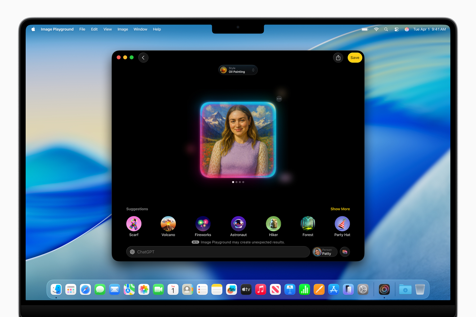 Image Playground now uses ChatGPT, a telling admission from Apple. Image: Apple.
Ahead of WWDC this year, I didn’t expect to write about Apple Intelligence at all post-keynote. It feels disingenuous to even talk about it because of how badly the last year went. So let’s keep this short: While Apple didn’t discuss the “more personalized Siri,” or even so much as give it a release date, it did announce a series of new foundation models that, for the first time in Apple’s history, are available to developers and the public. Federighi opened his address with the announcement, which I was briefly surprised by, but I truly didn’t take it seriously until I toyed around with it in the betas. I didn’t even need to write a single line of code because the models are exposed in Shortcuts through some new actions. Users can choose either the Private Cloud Compute model or the on-device one and have a conversation or send data to it for processing. For a second, I felt like I was using Android — and I mean that positively.
Apple’s latest Private Cloud Compute model is on par with Llama 4 Scout, according to preliminary benchmarks, and just speaking with it, I got a sense that it was quite capable. It can even search the web or call tools, including through the API, making it competitive with the free ChatGPT model most people use anyway. So I wonder: Why doesn’t Apple put this model into Siri, maybe give it a new name so it’s obvious it’s generative artificial intelligence, and make a competitor to “Assistant with Bard” from a few years ago? That would still put Apple behind Google now, but it would be pretty close to what Google had. It could answer questions from the web — something Siri is pretty bad at currently — and it could perform all the usual on-device Siri functions like before. I think that would get pretty close to Gemini, and when (if?) the “more personalized Siri” launches, that could be akin to Project Mariner. I think the cloud model is more than capable of running like a personal assistant, and I don’t think it would be that hard to build, either, especially using Apple’s own API.
Similarly, Apple brought Circle to Search to iOS, powered by ChatGPT. The screenshot interface now has a Visual Intelligence button to ask ChatGPT (or Apple’s own machine learning-powered Look Up feature) about anything on the screen, which is virtually a one-to-one knockoff of the Gemini-powered Circle to Search. I think it works great, especially since the screenshots don’t automatically save to the photo library anymore, and I’ve already found a few uses for it. But what really struck me was not the feature itself — it was that I was surprised by it. Why was I surprised that Apple finally built a feature into iOS that Android has had for over a year? There’s a saying in the Apple world that Apple is late to features because it does them best. That’s fallen apart in recent years, but I always think about it when something from Android comes to iOS at WWDC. I was surprised because Visual Intelligence proves that Apple isn’t bad at AI — it just doesn’t want to try. And it makes me ponder what would happen if it did try.
Apple could build an AI-powered Siri using its foundation models, web search, and existing Siri infrastructure, but it chooses not to. It could integrate ChatGPT more gracefully in iOS, allowing back-and-forth conversations through Siri or even asking OpenAI to build the advanced voice mode into iOS, but it chooses not to. Maybe Apple’s models aren’t as good as Gemini, but OpenAI’s certainly are, and they’re given to Apple free of charge. Visual Intelligence and the new LLM API are proof Apple can succeed in the AI space, especially with the new Siri update, but it actively dismisses AI development wherever it can because it doesn’t think it’s important. Swift Assist might’ve fallen apart last year, but ChatGPT is now in Xcode, along with an option to run any on-device model, just like Cursor or Windsurf. That’s a real, viable competitor to those other services, and it’s free, unlike them, so why doesn’t Apple embrace that?
Apple could be an AI company if it wanted to. Instead of spending all this time on a redesign distraction, it could’ve finished the personal context features, rolled out the App Intents-powered Siri, exposed the personal context to a larger version of the Private Cloud Compute models, and put all of that into a new voice assistant. For safety, it could’ve even used the “beta” nomenclature. Visual Intelligence would pick up the Circle to Search slack, and OpenAI’s Whisper model could power dictation transcripts in Voice Memos, Notes, or even Siri. Writing Tools could be integrated into the system’s native grammar and spell checker. Xcode could have support for more third-party models, and Apple could work out a deal with OpenAI to improve Codex for iOS app development. Imagine just asking Siri on iOS to make a change to a repository and having it automatically update in Xcode on the Mac. That would blow people’s minds at WWDC, and Apple has the technology and business deals to make it happen today. But it chose not to.
Apple’s choices are the caveat here. It would need developer support, but it could make that happen, too. Apple can win back support from even the largest developers by acquiescing to their needs. Large corporations, like Apple, want control over payment providers, APIs, and communication with their users. Apple has historically blocked all of this, but now that it’s the law for it not to, it should just accept its fate and make amends. Apple needs its developers, and making a video of a man singing App Store reviews doesn’t placate their concerns. (The video was catchy, though, I’ll admit.) Give developers access to the personal context. Let them set up external payment processors. Let them communicate offers to their users. This isn’t 2009 and Apple is no longer the leader of iOS. For Apple Intelligence to work, Apple must start signing deals, getting developers on board, and building products in line with Google. It has the resources, just not the willpower, and I can’t tell if that’s apathy, laziness, or incompetence.
‘What’s a Computer?’ The iPad, Apparently
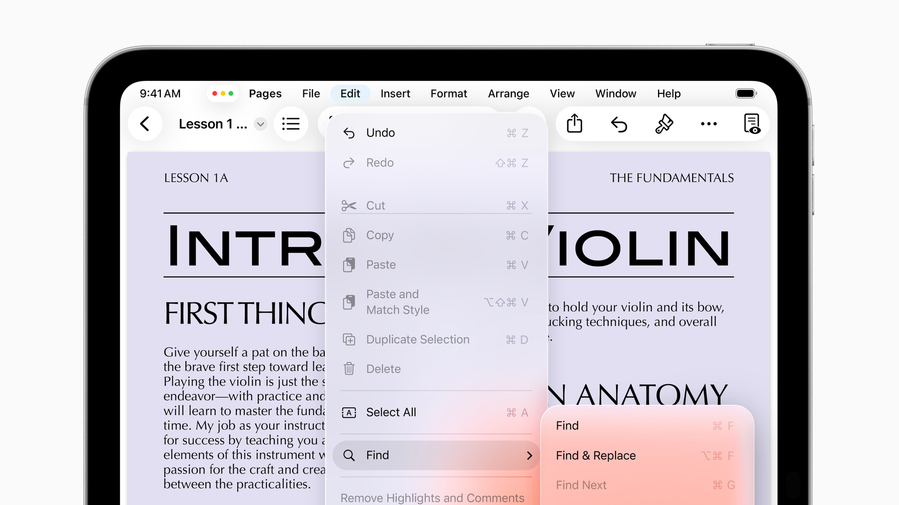 iPadOS 26 now has menu bar support. Image: Apple.
Rumors pointed to this year being monumental for the iPad, and I believed them for the most part, though I expressed skepticism about how much it would matter. Before Monday, I was jaded by the iPad’s years of lackluster features that made it inferior to a computer. Here’s what I wrote in mid-April:
This is completely out on a whim, but I think iPadOS 19 will allow truly freeform window placement independent of Stage Manager, just like the Mac in its native, non-Stage Manager mode. It’ll have a desktop, Dock, and maybe even a menu bar for apps to segment controls and maximize screen space like the Mac… That’s as Mac-like as Apple can get within reason, but I’m struggling to understand how that would help.
No, the problem with the iPad isn’t multitasking. It hasn’t been since iPadOS 17. The issue is that iPadOS is a reskinned, slightly modified version of the frustratingly limited iOS. There are no background items, screen capture utilities, audio recording apps, clipboard managers, terminals, or any other tools that make the Mac a useful computer.
Indeed, there are still none of those features. Power users still can’t use the iPad to write code, run background daemons, or capture the screen in the background. The iPad still isn’t a Mac, but after Monday, I believe it’s a computer. That’s not because I can do some of my work on it, but because the vast majority will find it as powerful as a MacBook Air. In addition to the true freeform windowing — complete with traffic light buttons — the audio and video capture APIs open the iPad up to a breadth of professions. Podcasters, musicians, photographers, cinematographers — almost anyone who deals with audio and video daily can use the iPad to manage their files and record content. The iPad now has a real PDF viewer, Preview, just like the Mac, and you’d be hard-pressed to know how many people’s lives are in PDFs.
But as Apple demonstrated all of these features, I still wasn’t convinced until background tasks were announced. In previous versions of iPadOS, an app doing any compute-intensive work had to be in the foreground, just like iOS, because the system would allocate all of its power to that one app. iPadOS 26 allows developers to specify tasks to run in the background, as a user is doing something else on their iPad, just like the Mac. When background tasks are requested, Apple is managing the load automatically, which I find unnecessary since modern iPad Pros have Mac-level processors, but it’s still a massive leap forward for the iPad. Background tasks make “pro-level” work like video editing possible on the iPad, remedying perhaps my biggest gripe with the iOS-level control iPadOS had over iPad hardware.
But as much as the average person can now use the iPad for daily tasks, it’s still not a computer for power users. It’s impossible to write code other than maybe basic Swift on the iPad since there isn’t a terminal. There’s no Xcode or any integrated programming environment because running code on the iPad is still cumbersome. And the Mac still has a suite of powerful apps and productivity tools that will never come to the iPad because they’re still API-limited, like Xscope or CleanShot X, which require accessibility and screen recording permissions — tools still unavailable on the iPad. The new background tasks need a hard start and stop, eliminating any hope of long-running asynchronous processes. So while the iPad is a computer for the masses, don’t expect professionals to use it anytime soon, even with background tasks and the menu bar, which makes an appearance for the first time on the iPad, albeit only for supported apps with no third-party applets.
The iPad isn’t the Mac, and I don’t want it to be, either. I’ve wanted it to be a lightweight alternative to the Mac with longer battery life and a touchscreen for easier handheld computing. Until Monday, though, it wasn’t that — it was just a tablet with no computing prowess at all. Now, the iPad is a true companion to the Mac. I could even write this article on the iPad if I wanted to. Not that I would, of course, because I’m at home and at my desk where a Mac is the most powerful tool available to me, but if I were anywhere else, chances are I’d give the iPad a shot. It’s a remarkable tone shift from a year ago, when I said Apple had practically forgotten about the iPad. And I don’t think I was wrong at the time; it doesn’t take seven years to make this. It comes back to willpower: Did Apple have the courage to make the iPad a computer? Not until iPadOS 26.
But this, like every other tale in this article, comes back to a caveat: The iPad still has room for improvement. I’m happy that it’s the lightweight, easy-to-use computer of my dreams, but I think it could be more than that. Again, I don’t think the iPad should ever run macOS, not only because that would be dismissive of the Mac’s unique capabilities and hardware, but because the iPad is a touch-first device. It’s the same reason I don’t ever wish for a touchscreen Mac: the Mac is a pointer-first computer, and the iPad is a touch-first tablet. But Apple still, in the back of its mind, thinks the touchscreen should be a limiting factor. I think that’s wrong. Why shouldn’t iPad users be able to have a terminal, IDEs, or a way to run code?
There are lots of jobs beyond the iPad’s pay grade, still. I don’t want to diminish Apple’s accomplishments with iPadOS 26, and I still think it’s a great update, but the iPad isn’t a computer for lots of people. But unlike before, I’m not expecting Apple to add a terminal or Xcode to the iPad because that would eclipse the Mac in too many ways. If Apple didn’t do it this year, I have a hard time believing it’ll ever make the iPad suitable for app development. I’d be happy if it did, but it won’t. But for the first time in a while, I’m content with the iPad and where it sits in Apple’s lineup. It might be a bit pricey, but it’s a gorgeous piece of hardware coupled with now-adequate software. I think it agrees with the Mac in a way it didn’t pre-WWDC. It’s a pleasant middle-ground device — a “third space” for the computing world, if you will.
WWDC this year was a story of caveats and distractions. It’s unmistakably true that Apple is in trouble on all sides of its business, from hardware manufacturing to legal issues to developer relations. I’d even argue it has a problem with its own customers, who are largely dissatisfied with the truly nonsensical Apple Intelligence summaries peppering their phones over the last year. WWDC was Apple’s chance to rethink its relationship with its users, developers, and regulators around the world, and it didn’t do much of that. It put on the same artificial happy face it always did years prior, except this year, it felt insincere for the first time in a while.
I don’t want to make it sound like WWDC was a bust — it was far from one. Liquid Glass is some of the most gorgeous design work from Cupertino since the Dynamic Island nearly three years ago. iPadOS 26 makes the iPad a computer for the many, and the promise of Apple Intelligence burns bright for another year. But it’s the fine print that brings out the cynic in me, which I guess is my job, but I’m not happy about it. I miss — I’m maybe even nostalgic for — the time when a redesign meant a redesign, or when I didn’t have to keep my expectations in check for when Apple misses a deadline. Maybe that carefree time in Apple’s history is my memory playing with me, but I feel like it’s gone. I’ve always had a knack for thinking critically about Apple, but not this critically. I’m second-guessing its every move, and I just don’t like living like that.
I’m excited to write about Liquid Glass in the coming months and see all of the wonderful apps people make with it. I’m thrilled to use my iPad in a professional capacity for the first time ever, and I’m intrigued to see what Apple Intelligence can do if and when it finally comes out. On one hand, Apple’s future is still bright, but I can’t help but wonder how much brighter today would be if it just had some new leadership.