
Apple Launches the MapKit for Automotive SDK, First With Ford
Apple and Ford today announced that Apple Maps will be integrated directly into Ford’s upcoming Universal Electric Vehicle (UEV) Platform through Apple’s new MapKit for Automotive SDK. Coming to Ford’s UEV Platform in 2027, this integration will deliver a beautiful and easy-to-use navigation experience powered by Apple Maps directly to the vehicle’s displays. Road-level Maps information will also enable Ford’s Latitude AI team to build a seamless hands-free driving experience.
Leveraging Apple’s new MapKit for Automotive SDK, Ford’s Universal Electric Vehicle Platform will offer drivers turn-by-turn directions using natural language, real-time traffic and incident information, intuitive search featuring detailed place cards, and routing options to help users easily find the best route to their destination. Additionally, Ford UEV drivers will benefit from an intelligent EV routing functionality, including battery preconditioning. Ford will also use road-level information from Apple Maps as part of the development of its next-generation BlueCruise hands-free highway driving capability to deliver a more seamless on-ramp-to-off-ramp experience.
Apple services have historically been sold as complements to Apple hardware: Apple Maps, for a decade, had been limited to Apple devices, replacing Google Maps. That is no longer the case; Apple TV is a canonical example of Apple’s interest in broadening the Apple services market. Similarly, this new MapKit SDK — short for software development kit — is an intentional expansion of Apple’s services market following the abject failure of CarPlay Ultra, a version of CarPlay meant to consume the entire car software experience. Even CarPlay’s most fervent supporters, like BMW and Ford, haven’t adopted CarPlay Ultra because it exerts too much control over a driver’s experience. The CarPlay Ultra gambit was clearly an effort to make something out of the Apple Car project, also a failure.
Ultimately, I think the CarPlay Ultra fiasco is indicative of the two opposing yet symbiotic forces within Apple: the product people and the services people. The product people want Apple to own as much of the “stack” as possible: the hardware, the software that hardware runs, and the services that software sells. They wanted to build a car, make software for it, and sell services through that software: that was Project Titan, the car project, in a nutshell. That is fundamentally the same strategy that governs the Apple Watch, MacBook Neo, even the iPhone. The services people, like those in charge of Apple TV and its content acquisitions like Formula 1 and Major League Soccer, don’t believe in that because they’d rather make money through advertisements and subscriptions. They paid hundreds of millions of dollars in upfront costs for MLS and F1 to sell more subscriptions, even to people who have never owned an Apple device.
The services people won here, largely because the product-driven CarPlay Ultra / Project Titan strategy — to own as much of the software experience as possible — failed. No car manufacturer was interested in that. Perhaps consumers would’ve been, since CarPlay by itself is overwhelmingly popular by Apple’s numbers, but it didn’t matter anyway because the difference in experience for iPhone users and non-iPhone users was too stark. (Not to mention, it was too much work for very little tangible benefit on the manufacturers’ end.) So now, Apple Maps — just like Apple Music in Tesla, General Motors, and Rivian vehicles — is a service built to make money independently. It doesn’t matter whether someone owns an iPhone or not, because they’ll still be forced to use Apple Maps in their Ford vehicle. And most importantly, they’ll be forced to look at Apple’s advertisements coming to Apple Maps soon.
The ads part is a tragedy because it signals a definite end to Apple’s product-driven mindset. Before Apple started putting ads in Apple services, they were also Apple products — you buy a subscription to Apple Music. Now, Apple services are partially ad-driven enterprises, where your use of the service itself draws revenue. In creating the MapKit for Automotive SDK, Apple doesn’t care about people spending money at the Apple Store or on in-app purchases. Apple isn’t delivering a product to consumers as much as it’s guaranteeing engagement to ad buyers. The consumers are not the primary consumers; corporations who pay Apple are. This is against the very philosophy Apple in many ways was founded upon: making high-quality products for consumers willing to pay premium prices. Modern Apple would probably object to the characterization that ads in Apple services cheapen the experience, but it’s true: ads in Apple Maps do not make for a premium experience.
The new Apple doesn’t seem to care about that. It’s uninterested in delivering a premium experience, and it’s uninterested in asking for your money to deliver that experience. Ergo, the MapKit for Automotive SDK.
U.S. Threatens to Sanction China Over AI Distillation
Ashley Capoot, reporting for CNBC:
U.S. Treasury Secretary Scott Bessent on Tuesday said the Trump administration will look into whether Chinese artificial intelligence models have been distilled from American models, stating that the government does not support “IP theft.”
Chinese open-weight models are gaining steam against leading offerings from American companies like OpenAI and Anthropic, sparking concerns from tech executives and government officials about the durability of the U.S. lead in the AI race. Moonshot AI, a Chinese startup, released a model called Kimi K3 earlier this month that outperforms those companies across some industry benchmarks. Open weight refers to models whose final trained parameters are publicly released for download, while the underlying code and training data remain private.
“If we see, especially that overseas models are stealing from our great companies, we have the ability to sanction them because of this theft,” Bessent told Fox Business’ “Mornings with Maria” on Tuesday.
Bessent said the technical term for this theft is called distillation, which is an AI training method where a smaller, less capable model is built using outputs from an existing, stronger model. Anthropic sent a letter to the U.S. Senate Committee on Banking, Housing, and Urban Affairs last month alleging that the Chinese tech company Alibaba had carried out the “the largest known distillation attack” against it to date.
If distillation — training on data that doesn’t belong to the Chinese labs — is a sanctionable offense, then why isn’t pre-training? How is it fully legal for Chinese companies to use training data published by American citizens on the internet? This whole argument is bogus, and it’s quite evident that Bessent knows very little, if anything, about what he’s talking about. AI models are built on the idea that training a computer on the open internet is fair use — that pre-training is transformative enough under fair use doctrine, not “stealing.” American companies can train their models on Chinese text and vice versa because pre-training is inherently transformative, an argument I’m quite sympathetic to. I think that if we built a time machine back to 2022, a permission or compensation structure should’ve been created, but alas, this is the system we’re stuck with. The world’s copyright system is not suited for AI pre-training.
Back to the Bessent argument. Anthropic, and perhaps OpenAI, are perturbed that Chinese models — like Moonshot’s Kimi K3 open-weight large language model — were trained via distillation. Kimi K3 is cheaper than Claude Opus 4.8 and GPT-5.6 Sol, yet almost matches GPT-5.6 Sol in overall intelligence and beats Opus 4.8 entirely. Kimi K3 comes just shy of Claude Fable 5, a model over three times the price. While Anthropic can’t even be compelled to offer Fable 5 access to some of its paying customers, Kimi K3 offers similar performance at a fraction of the cost — but it was built by distilling Anthropic’s models. Anthropic’s view, which it has surely expressed to the government, is that this is an adversarial nation subsidizing AI development, stealing the secrets of American AI labs, and building a compelling product for much cheaper. From that perspective, Moonshot and China look guilty.
But that’s a pacifist view; Anthropic is wailing for pity from a government that has treated it abysmally. Just Tuesday, a judge approved a billion-dollar settlement between Anthropic and a litany of authors after it pirated books to train its models on — is that not “stealing?” Is Anthropic not one of the most blatant copyright infringers of the modern era? It’s quite obvious here that Anthropic is crying wolf not because China gained some unfair advantage in its training process, but because Anthropic is so upset that it wasted perhaps billions of dollars in subsidized tokens all for its users to prefer a foreign competitor’s clearly superior model. The problem here was never about morality or copyright or distillation; the AI labs are morally bankrupt, and they know that. If they didn’t, they wouldn’t be cutting billion-dollar checks to authors.
So where do we go from here? I think the solution is quite obvious: Anthropic must start distilling its own models. Train a massively expensive competitor to Fable 5, distill a new version of Opus on that model’s reasoning traces, and ship the new Opus at a much lower cost. We’re reaching a point in the AI industry where cost is a massive factor in the models enterprises and individuals use, as reasoning traces become more expensive. Yes, pre-training is currently the most expensive part of releasing a new model, but we’re already seeing the shift toward inference and post-training. New model releases nowadays are not new pre-training runs; GPT-5, the last “major” AI model from OpenAI, was a heavily post-trained GPT-4o from spring 2024. As LLMs mature and reasoning tokens become more valuable, inference will be the biggest operating cost, not pre-training. Train one model and distill three others, then offer inference at a competitive price. Distillation — from China and by the American labs themselves — is in the AI industry’s best interests. It saves on pre-training costs and leaves more room to make healthy margins on inference.
Apple Is Looking Into Buying AI Chip Companies for Private Cloud Compute
Marcus Mendes, reporting for 9to5Mac:
According to The Information, Apple has been exploring potential acquisitions of semiconductor startups to “boost its efforts to build server chips for running AI.”
From the report:
In recent months, the iPhone maker has talked with bankers about possible deals. It has also approached semiconductor startups to gauge their interest in selling themselves, the people said. Apple’s hunt for chip acquisitions comes as the company struggles with the performance of its own internal AI servers, which currently run on internally designed M2 Ultra chips.
The Information says Apple’s next-generation server chip, code-named Baltra, has slipped past its planned 2026 debut. In the meantime, Apple is using M2 Ultra-based systems for some of its own AI processing, while the more demanding tasks are handled by the Gemini-based model powering the new Siri, which runs on Nvidia GPUs in Google Cloud.
A big acquisition would be a departure from Apple’s usual M.O. of buying smaller startups from time to time, but it wouldn’t be unprecedented.
It would indeed be unusual for Apple to purchase a Silicon Valley start-up specializing in artificial intelligence processors, when Apple arguably makes the best consumer AI chips. As Bloomberg has reported extensively, Apple’s consumer processor strategy — for high-end Mac models, at least — has shifted considerably toward AI. People like buying Mac Studios and Mac minis to do local AI inference — they’ve become popular as cloud computers and mini data centers. Per The Information’s reporting, Apple’s internal processors are also on that trajectory, albeit delayed for unclear reasons. Apple’s processors aren’t just fast and capable of AI inference, but they’re extremely efficient, which makes them relatively inexpensive to use in the long run. It’s no wonder why Apple has retaken the No. 1 market capitalization, surpassing Nvidia on Friday.
Regardless, this news is quite interesting because it proves Apple is intent on shipping more powerful, capable models in the future — perhaps ones that can write code or perform agentic tasks. It wants people to be able to run those models on their own devices — hence why the company is testing Mac Studios with 1.5 terabytes of memory and skipping high-end M6-generation chips entirely — and to eliminate its reliance on Google Cloud, or maybe even Google altogether. If Apple were to buy such a company, it could probably pre-train its own models: a lack of compute was one of the key limitations that led to the Google partnership. Apple’s new leadership doesn’t see AI as a fleeting trend. It is finally taking it seriously, something we couldn’t say about the AI team under John Giannandrea, the machine learning chief who was stripped of his responsibilities and replaced by Mike Rockwell, the executive previously in charge of Apple Vision Pro.
I think Apple should lean into efficient, low-cost AI inference on both the hardware and software fronts. Siri AI clearly emphasizes on-device processing, and the company’s future Apple silicon plans do, too. Readers of this blog know that my single biggest qualm with the AI industry for now is that its economics aren’t rooted in logic. Anthropic is compute-constrained, so much so that they’re under heavy competition from Chinese AI labs that can offer inexpensive tokens and relatively the same performance as Anthropic’s best models. OpenAI is deathly unprofitable, leading some pundits to believe that its economics will spell its demise. Compute is the biggest story of Silicon Valley this summer, whether it’s skyrocketing memory prices for consumer products or unusual deals like Meta selling compute to Anthropic.
Whatever happens here — if Apple chooses to buy a compute start-up or not — the fact that it is even entertaining the idea is proof that it sees Apple silicon as its golden ticket in the AI space. As open-weight models get smaller and more powerful, people will buy more powerful Macs marketed as the best for AI inference; as the frontier AI labs become more compute constrained — and their flawed economics catch up to them — people will look to Apple’s models and products. Siri AI is merely the beginning of the Apple AI story.
A Bluetooth Smart Speaker Will Not Fix OpenAI’s Problems
Mark Gurman, reporting for Bloomberg:
OpenAI’s much-anticipated push into consumer devices is slated to begin with a mobile, screen-free smart speaker designed to be a new type of home computer for the AI era, according to people familiar with the matter.
The product — still under development — is meant to serve as a humanlike AI companion that lives in the home, said the people, who asked not to be identified because the project hasn’t been announced. It will help control smart-home appliances, play media, answer questions, respond to messages and tap into the range of capabilities offered by OpenAI’s ChatGPT, they said.
Though the new product resembles a speaker, OpenAI internally describes it as the first of its kind: a computer built for AI to help make busy people more productive. It includes a camera and other sensors that help it understand a user’s surroundings and context, as well as advanced AI models beyond those available on conventional smart speakers.
Remember Jibo? Jibo, developed by a professor at the Massachusetts Institute of Technology after a successful Kickstarter campaign, was an animated voice robot that would move around with a motorized base and use its camera to detect facial expressions and gestures. Jibo came years before the modern large language model, and its use was limited, but I’d imagine this device from OpenAI to be much like it. Like Jibo, this is just not a breakthrough consumer product. It’s a Bluetooth smart speaker with a motorized base — which Gurman describes as “mechanical elements that can move on their own” — and ChatGPT built in.
You can already buy a smart speaker with an LLM for just $100: it’s the Google Home Speaker, and — news flash — it’s not a revolutionary product. It’s certainly not revolutionary enough to warrant buying Jony Ive’s hardware company and poaching trade secrets from Apple. But none of this even considers how unfeasible it will be to have a hardware product from OpenAI — a company almost universally taken with distrust — listening and peering into people’s homes all day long. I’d be hard-pressed to find a single person who wants that. There are people on the streets irate about OpenAI data centers being built in their backyards; on what planet will those people put an OpenAI product in their homes?
OpenAI has spent billions of dollars on this hardware venture. It has upended the technology industry — it has decimated entry-level jobs, transformed computer science education, and sowed doubt in tech as a whole. People are down on artificial intelligence and technology writ large. For this product — and OpenAI as a company — to be successful, it must transform not only its public image, but that of the technology it wants to sell. I have a hard time believing a Bluetooth smart speaker designed by Ive with ChatGPT built in is a serious solution to that problem. Maybe it’s the most beautiful speaker in the world. Maybe it’s made with gold or some opulent frills. That doesn’t change the fact that OpenAI has a gargantuan favorability problem.
OpenAI also has a money problem. People do not like paying for AI. Only a small fraction of ChatGPT users are paying subscribers, and most of those people are on the lowest subscription tiers. The people who do pay heavily for AI burn subsidized tokens so hard that Sam Altman, the company’s chief executive, is holding back on an initial public offering until the company’s finances are more stable. What company that is struggling to sell consumers on a $20 subscription and enterprises at base rates for its models could possibly think it could sell hardware? The one popular product OpenAI makes, ChatGPT, is not profitable. It can’t even persuade people to pay for its flagship innovation, let alone a designer smart speaker.
I really don’t want to be Steve Ballmer. “$500? Fully subsidized? With a plan?” But I have a feeling this take will fare much better than my take from last year. Over a year later, Apple doesn’t look bad anymore; OpenAI does.
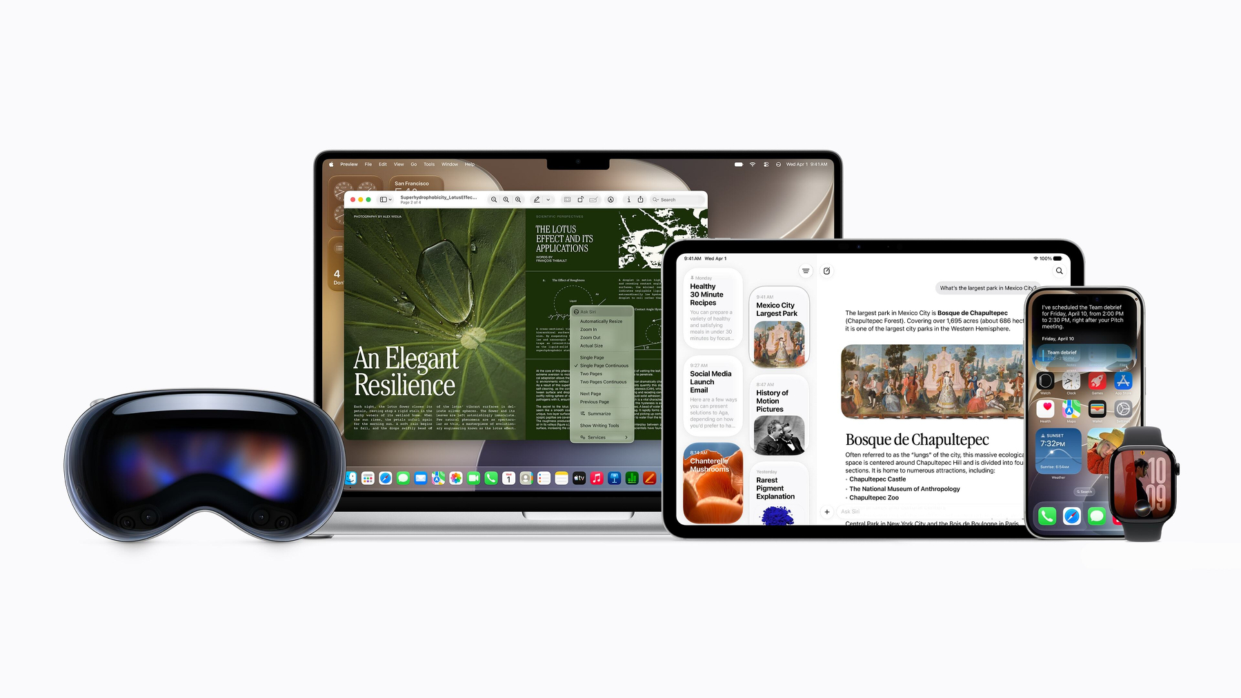
Hands-on With iOS and iPadOS 27, macOS 27 Golden Gate, and Siri AI
A return to form and function
 Image: Apple.
In 2009, at Apple’s Worldwide Developers Conference, Bertrand Serlet walked onstage and presented an audacious claim: “Zero New Features,” the slide read.
Serlet, Apple’s then-senior vice president of software engineering, was introducing OS X 10.6 Snow Leopard, a release Apple claimed would emphasize small “refinements” and major updates to internal technologies. But to the public, it really was “Zero New Features” — a quote forever cemented in Apple’s modern history as one of its most notable. As Serlet later explained, OS X Snow Leopard had plenty of new features, most notably Grand Central Dispatch, which brought multithreading to OS X for the first time. OS X Snow Leopard established the architecture on which all personal computers, including the iPhone and the Apple Watch, would eventually rely. Its stability solidified Apple’s reputation for reliable, high-quality software, so much so that the coming decade of pervasive, sloppily thought-out user interfaces — beginning with OS X 10.10 Yosemite — was treated as an aberration.
In early June, Apple’s first real announcement at WWDC was neither novel nor revolutionary. It was not a coding agent that would put all white-collar workers out of jobs by 2030, augmented reality glasses, or even as much as a tab bar in the Photos app — it was a slider to adjust the translucency of Liquid Glass. Then came the stunning admission that macOS 26 Tahoe’s window corner radii were too inconsistent and radical: Apple would decrease and equalize all corner radii throughout the system in macOS 27 Golden Gate. Liquid Glass app icons would use new glass layers for a more polished, legible appearance. The central processing unit scheduler — the program that tells the CPU when to execute a process — was made more efficient. The Spotlight index was rewritten, and the Mail app’s search function was markedly improved. These were among the first “features” on which Apple spent the precious opening minutes of one of its most-watched presentations, and it was marvelous.
All of Apple’s releases this year converge on a single philosophy: returning Apple to its original promise of reliable yet innovative software. And much as OS X Snow Leopard — the company’s last true “cleanup year,” with hundreds of bug fixes and underlying performance improvements — became known for transforming personal computing for decades to come, so will iOS 27 and macOS Golden Gate. After a section of the keynote aimed, candidly, at regulators keen to scrutinize Apple’s child safety efforts, Apple introduced what I’d loosely call the Grand Central Dispatch of WWDC 2026: Siri AI, a completely reworked, large language model-powered version of Siri promised two years ago. After years of rumors, personnel changes, and bottlenecks, the “more personalized Siri” is finally here, and it’s both a Herculean reworking of the internals and a breakthrough consumer product.
I have spent over a month with all the new operating systems and Siri AI, and I can confidently report that Apple Intelligence, or at least this new version, has changed the way I use Apple products. It is the first artificial intelligence system that feels personal, like it knows me and is willing to use the decades of information I have stored on my Mac and iPhone. It sheds the gimmickry of current AI systems and, dare I say, makes you feel like you’re living in the future. Apple has proven that the answer to modern computing’s biggest questions comes not via the LLM alone, but via the cowling built around the model. Apple is a product company, and Siri AI is the best LLM product, engineered by people who astutely know what makes a great one. It’s an ice-cold glass of water in the hell of coding agents that will supposedly assume everyone’s jobs by the decade’s end.
But the “Snow Leopard” nature of this year’s operating systems leaves little to write about. There is, of course, Siri AI, coupled with some interesting changes to Liquid Glass, but there are almost no new features in this year’s releases. That’s OK — more than tolerable, in my book. I can ostensibly name dozens of features Apple announced in just a few years that occupied collective hours of keynote time, but hardly anyone uses: StandBy, Image Playground, tinted app icons, the Journal app, and Stage Manager, as pertinent examples. It’s not even that these features are useless, per se, but that they’re just too onerous to find. This was, in fact, the lede of my OS review from two years ago: Apple adds dozens of new, marquee features each year to go undiscovered and unused, while the core parts of the OS languish. Perhaps hundreds of millions of people search for emails in the Mail app, and it has been terrible for years. It isn’t anymore.
This is to say that my relative brevity in this year’s review should not be considered a gripe, but great praise. The adage of “comparison is the thief of joy,” begone — this year’s releases are a perfect replica of what made OS X Snow Leopard one of the most beloved Apple platform releases in history. They’re reliable yet teetering-on-the-edge-of-revolutionary pieces of software, and they’ll undoubtedly change the way millions of people use their devices in the fall. And I think a throwback to 2009 — a mélange between innovation and reliability — is the ideal place to be in a time of grave uncertainty and mistrust in the technology industry.
Apple Is Suing OpenAI and Employees for Stealing Trade Secrets
Chance Miller, reporting for 9to5Mac:
Apple has filed a lawsuit against OpenAI today, accusing the company of trade secret theft. Specifically, Apple alleges that its former employees have stolen trade secrets “for the benefit of OpenAI.”
“This case is about Apple’s former employees stealing Apple’s trade secrets for the benefit of OpenAI. Apple brings this suit to put a stop to it,” the lawsuit says…
The complaint, filed in the U.S. District Court for the Northern District of California, alleges that Tan used insider knowledge of Apple’s confidential projects to grill job candidates in interviews. Additionally, Tan directed job candidates still working at Apple to bring actual Apple hardware components and samples for “show and tell” sessions.
Furthermore, Apple says a candidate began “screenshotting and downloading files relating to a highly confidential Apple project” hours before interviewing with Tan, who then “solicited more information about that same Apple project” once the interview started. This became an “established pattern,” Apple says.
Tan also allegedly possessed and distributed an internal Apple “Need to Know” document to new OpenAI hires before they gave their notice to Apple. The document included Apple’s departure security protocols. As part of its investigation, Apple found a “pattern by employees who depart for OpenAI of taking steps to evade the security processes intended to protect Apple’s confidential information.”
I read the full complaint. Some notes:
-
Chang Liu, an ex-Apple employee who now works for OpenAI, allegedly (a) failed to return all of his company-provided devices before he left, (b) used an exploit to access Apple’s internal files, and (c) downloaded them while working for OpenAI.
-
Tang Tan, OpenAI’s chief hardware officer — and Jony Ive’s right-hand man at OpenAI’s “io” hardware division — allegedly tells potential employees during interviews to bring in unreleased Apple hardware for “show and tell.” And as Miller notes, Liu and other ex-Apple employees suggested new hires “prepare” for their OpenAI interviews by studying unreleased Apple products.
-
Tang and Liu only got caught after they used work-provided devices to — in some cases — brag about their actions.
-
Over 400 ex-Apple employees work at OpenAI.
-
OpenAI allegedly contacted an Apple hardware supplier and asked them to “perform Apple’s proprietary, trade secret processes for OpenAI’s benefit.”
I’m not really surprised at any of this. There seems to be bad blood between the two companies — OpenAI’s models weren’t spoken about once during the Worldwide Developers Conference State of the Union in June — and OpenAI had been loosely threatening legal action even before WWDC. Moreover, OpenAI has never come across as a particularly honest corporation. Sam Altman, its chief executive, is a seasoned liar and manipulator; OpenAI employees are known for being narcissistic online; and the company doesn’t seem to attract very honest, forthcoming fans or workers.
But it does seem illuminating that OpenAI has such an inflated image of itself that it thought it could successfully evade one of the most litigious and secretive companies in the world. Apple does not let such behavior go unpunished — it never has and it never will. Everyone knows not to mess with Apple Global Security, except, clearly, OpenAI. The OpenAI people clearly have become accustomed to a privileged position where they feel untouchable. They were handed an inconceivable amount of free cash and thought it could protect them from anything, including immoral and illegal behavior. Maybe it will, but it doesn’t seem likely.
The only solution to OpenAI’s immoral behavior — and there are so many instances of it — is to force them to start turning a profit. It will happen eventually; the investors will get tired of losing money, and they’ll put pressure on the company. Perhaps this lawsuit is a step closer to that reality.
OpenAI Merges ChatGPT and Codex Apps, for Apparently No Reason
Introducing ChatGPT Work, a new agent in ChatGPT powered by Codex and GPT-5.6. It can take action across your apps and files, stay with a project for hours if needed, and turn a goal into finished work. It’s a whole new way to get work done.
ChatGPT Work is powered by GPT-5.6. GPT-5.6 makes ChatGPT state of the art at reasoning through complex tasks and creating materials that match your templates, reference files, and preferred style. Just describe the outcome you want, without having to spell out every step to get there.
On web and mobile, ChatGPT Work is rolling out today for Pro, Enterprise, and Edu plans. It will roll out to Plus and Business plans over the next few days. In the ChatGPT desktop app, Chat, Work, and Codex are available on every plan, including Free, and is available globally to download on Windows and Mac.
Codex app users can update their app as usual — it will become the new ChatGPT desktop app.
I fear OpenAI’s employees have lost the plot. The old, native ChatGPT app for macOS still exists and is renamed “ChatGPT Classic” after updating to the latest version. The Codex app, after updating, is renamed “ChatGPT.” The unfortunate side effect of this is that if you update the Codex app before the ChatGPT Classic app, the two names will conflict, and macOS will refuse to open the Codex app. This happened to me; I had to reinstall the Codex app from the OpenAI website to fix the issue.
Now I have two ChatGPT apps on my Mac: ChatGPT Classic and ChatGPT, née Codex. The ChatGPT Classic app has languished for years now, but when it was announced, it truly was incredible. It’s beautifully crafted with care, down to the little details. There’s even a mode to let ChatGPT peek into your apps like BBEdit or TextEdit — this is how we used to code with artificial intelligence before Codex and Claude Code! The Codex app is made with Electron, but I’ve always regarded it as one of the best Electron apps on the Mac. It’s not perfect, but superior to Claude in every dimension.
The new update ruins months of good favor with the Codex app. It quite literally benefits nobody. There are now two primary modes in the ChatGPT app: Codex and ChatGPT Work. Codex is the same; Work is just a simpler version of Codex, similar to Claude Cowork. I don’t even know why this mode exists — Codex has always been simple enough for non-technical people to use anyway. It’s also redundant in the cloud (iOS and the web) because it’s only limited to using plugins, which the standard ChatGPT mode can do as well. There’s almost no end-user benefit to using ChatGPT Work on the web or on iOS.
The actual ChatGPT interface — what the app is named for! — is hidden in a mini-window accessed from the sidebar. This is the most absurd, counterintuitive user interface OpenAI has ever conceived. If the app is literally named “ChatGPT,” how is ChatGPT not the main interface? Does OpenAI see ChatGPT Work as the replacement for ChatGPT, and if so, why doesn’t it make that clear? And to make matters worse, there’s no consistency in the models across interfaces. Work and Codex have GPT-5.6 Sol, Luna, and Terra — the three sizes of GPT-5.6 — while ChatGPT only exposes the Instant, Medium, and High reasoning levels. Medium and High are GPT-5.6 Sol, though that is not indicated in the interface.
The ChatGPT app doesn’t open ChatGPT anymore, and the models once again make no sense. Here’s a handy chart of the models and their reasoning options across ChatGPT modalities:
| GPT-5.6 Luna | GPT-5.6 Terra | GPT-5.6 Sol | GPT-5.6 Sol Pro | |
|---|---|---|---|---|
| Work and Codex | Light, Medium, High, Extra High, Max, Ultra | Light, Medium, High, Extra High, Max, Ultra | Light, Medium, High, Extra High, Max, Ultra | N/A |
| Chat | N/A | N/A | Medium, High, Extra High | For Pro users only. |
I haven’t heard from a single person happy with Thursday’s changes. Codex users are upset because their app has been renamed; ChatGPT users on the Mac are upset because the new ChatGPT app really isn’t ChatGPT at all. The only people seemingly pleased with this “work” are OpenAI employees themselves, who seemingly don’t understand anything about marketing or communications. But I’m supposed to believe this company is worth a trillion dollars.
A correction was made on July 13, 2026, at 5:30 a.m.: Previous versions of this post stated that GPT-5.6 Terra and GPT-5.6 Luna were available in ChatGPT Chat. This is incorrect; these models are limited to ChatGPT Work and ChatGPT Codex. Free users — and paid ones who select the Instant reasoning effort — are defaulted to GPT-5.5 Instant in ChatGPT Chat. In ChatGPT Work and Codex, free users are limited to GPT-5.6 Terra and GPT-5.6 Luna. Plus and Pro users can use GPT-5.6 Sol in ChatGPT Work, ChatGPT Chat, and Codex. Chart:
| GPT-5.6 Luna | GPT-5.6 Terra | GPT-5.6 Sol | |
|---|---|---|---|
| Free and Go | Available in Work/Codex. | Available in Work/Codex. | Unavailable. |
| Plus and Pro | Available in Work/Codex. | Available in Work/Codex. | Available in Work/Codex/Chat. |
Zuckerberg ‘Admits’ Meta’s Layoffs Were Ineffective
Mark Zuckerberg, Meta’s chief executive, at a Meta town hall reported by Katie Paul and Courtney Rozen at Reuters:
In retrospect, he said, the “trajectory of the agentic development over at least the last four months hasn’t really accelerated in the way that we expected,” and that the company’s bets on the new structure “haven’t come to fruition yet.” Zuckerberg was referring to AI agents, automated systems that can execute tasks on behalf of a user.
Conversations he was having “with our top people” when they started planning the restructuring in January and February “were that they were worried that we weren’t going to move fast enough to adapt,” Zuckerberg said.
At the time, he said, executives were “super optimistic” about tools like Claude Code from AI startup Anthropic.
The self-created tragedy of Meta is that the company is loath to invent new products. Instead, Meta’s management more or less relies on “vibes” to govern its decisions, and those vibes are often either wrong or far too late. The most pertinent example of the former is the ill-fated metaverse, which was developed solely on the (unbelievable) whim that the pandemic would last forever — or at least far longer than it actually did — and people would become accustomed to replacing in-person interaction with virtual reality. It was precisely at this moment, roughly around mid-2020, that Meta (then Facebook) disintegrated from a social media company into a Ship of Theseus that still technically operated its core social platforms but fundamentally was distracted by a red herring. Vibes-based management.
As I wrote in my now infamous “Meta-stasizing Cancer of Indirection” piece, Zuckerberg did not learn from this disastrous failure as the artificial intelligence boom kicked off in 2023. Long story short: Zuckerberg threw his company into turmoil because he was too late to identify that the metaverse was an abysmal failure. By the time he did, the AI boom was already in full swing, and Meta was thoroughly left out. This strategic failure, coupled with Zuckerberg’s arguably incompetent management style, left employees either out of employment, directionless, or both. It is just impossible to run a company on a whim — the metaverse was a distraction, and so was AI because Meta was far too late and improperly organized. Vibes-based management.
Zuckerberg yet again plunged his company into chaos after the success of Claude Code in December 2025. Knowing the company was behind in developing AI products after observing the rise of agentic coding, Zuckerberg effectively put Alexandr Wang, the chief of Meta’s AI division, in charge of the entire company. The only thing Wang did was wrongly determine that all human programmers were a waste of time and money and that it would be better to fire them and spend the freed-up cash on talented AI engineers who would unwittingly develop their own replacements. So that’s exactly what Zuckerberg did, per Wang’s hunch: he fired thousands of employees, put AI in charge of content moderation, and mandated that the remaining Meta workers install spyware that would track their computer use to train an agent that could take their job. Vibes-based management.
I can’t tell if Zuckerberg is dimwitted or just evil. The problem during the first era of the AI boom (circa 2023) was indeed that Meta was too slow to identify the metaverse flub. But that was no longer Meta’s problem entering the agentic coding era: The problem, rather, was that Meta had no coherent strategy. The last thing it should’ve done was “move fast enough to adopt” because “adopting” was not the answer to Meta’s problems. AI-assisted programming has developed in the last six months — contrary to Zuckerberg’s claim that it “hasn’t really accelerated” — but indeed not in the way Meta expected, because Meta’s vibes-based management this time was just plain wrong. AI never had the potential to replace so many workers at an instant. The vibe was — unlike in 2023 — not late, but wrong entirely. And I’m confident in saying only a fool could have lent credence to that laughably incorrect theory.
I’d say getting fired by Meta is like catching the last plane out of Vietnam, even in this ruthless job market.
6 Years Later, Is 5G mmWave Widespread?
Marko Zivkovic, reporting for AppleInsider:
For the U.S. variant of the iPhone 18 Pro, which will feature mmWave compatibility, Apple seemingly plans to use Qualcomm modem hardware.Multiple Qualcomm components, including the SDX80M, SDR875, QDM8771, QDM8720, PMK75, PMX75, and QET7100A, are referenced in a bill of materials related to the iPhone 18 Pro model Apple plans to sell in the United States.
As for the iPhone 18 models which will be sold elsewhere, Tata documentation suggests these configurations will use Apple’s proprietary C2 modem. While this approach may sound unusual, there is at least one possible explanation.
Apple’s current in-house modems, the C1 and the C1X, do not support 5G mmWave, and it looks as though the C2 will continue this trend. Until Apple develops a modem compatible with mmWave, it looks as though the company will offer mmWave support to iPhone 18 Pro users by using Qualcomm hardware.
I think Apple made the right choice in developing the C2 modem without support for 5G millimeter wave (“mmWave”), the technology that enables ultra-high-bandwidth connections in limited areas. Millimeter-wave signals — known by carriers as ultra-wideband — are extremely high-frequency and can be interrupted by even atmospheric attenuation. They cannot permeate through walls or people and do not work across long distances. This makes them unsuitable for most cellular transmissions; carriers instead use the lower-frequency C-band to transmit slightly slower but more reliable 5G signals. (Confusingly, carriers also refer to this as “ultra-wideband.”) The three major carriers — Verizon, AT&T, and T-Mobile — have installed 5G ultra-wideband antennas in city downtowns across the United States. Some sports arenas and airports have also been outfitted with the technology to limited success.
During Apple’s “Hi, Speed” October 2020 keynote, which introduced iPhone 12 with 5G, the company incessantly touted 5G ultra-wideband as the future of mobile communication. So let’s take a step back for a minute: Was the rollout of 5G ultra-wideband all that successful? Is it really everywhere? For one, Verizon, with which Apple partnered during the keynote, has since removed the map on its website that showed where 5G millimeter-wave was available. The coverage map now only marks certain metropolitan areas as “5G ultra-wideband capable” cities, while refusing to discriminate between the much slower C-band and millimeter-wave connectivity. There is, however, a map buried on a subdomain (gismaps.verizon.com) that shows the millimeter-wave rollout, and it’s quite underwhelming.
The map shows that Verizon still has not rolled out 5G millimeter-wave on even some of the most population-dense Manhattan streets. This is not malfeasance: It’s more likely that Verizon, sometime in the last six years, determined that it was either impractical or impossible to bring 5G millimeter-wave to most streets and instead slowly phased out the advertising. Nowadays, Verizon hardly even mentions 5G because it is, even on C-band, mostly a waste of battery. I have never once connected to millimeter-wave in these six years — despite living in an “ultra-wideband capable city” — and I assume most Americans are the same. If not for New York, where would people be most likely to take advantage? 5G millimeter-wave was a profound waste of everyone’s time and money, and the carriers know it. Betteridge’s law of headlines strikes again.
What isn’t a waste of time and money, though, is Apple’s C-series modems, which have performed equally as well as the Qualcomm modems — if not a bit better — while using less energy. If the carriers, Apple, and customers all somewhat agree that 5G millimeter-wave is a profound waste of resources, why even ship it at all? Carriers don’t even make a distinction between the two flavors of ultra-wideband anymore, and almost no one who buys iPhone 18 Pro will even know the difference. How many people are standing in Times Square running internet speed tests? I think people, including the carriers, would be happy to trade a technology hardly anyone uses for an hour of extra battery life a day with the C2 modem. I think it’s a mistake that Apple hasn’t recognized this and used the C2 in all iPhone models.
Apple Raises Prices Across Almost All Products, Effective Immediately
Hartley Charlton, reporting for MacRumors:
After temporarily taking it down earlier today, Apple’s online store is back up with a series of product price increases. The changes are as follows:
- HomePod mini: $129, up from $99 (+$30)
- HomePod: $349, up from $299 (+$50)
- Apple TV: $199, up from $129 (+$70)
- iPad: $449, up from $349 (+$100)
- iPad mini: $599, up from $499 (+$100)
- iPad Air: $749, up from $599 (+$150)
- iPad Pro: $1,199, up from $999 (+$200)
- MacBook Neo: $699, up from $599 (+$100)
- MacBook Air: $1,299, up from $1,099 (+$200)
- MacBook Pro: $1,999 up from $1,699 (+$300)
- iMac: $1,499, up from $1,299 (+$200)
- Mac mini (M4 Pro): $1,599, up from $1,399 (+$200)
- Mac Studio (M4 Max): $2,499, up from $1,999 (+$500)
- Mac Studio (M3 Ultra): $5,299, up from $3,999 (+$1,300)
- Vision Pro: $3,699, up from $3,499 (+$200)
I am humbled to admit I was wrong in my post earlier in June about these price increases: I predicted they wouldn’t take effect until new products were announced and that the iPhone (and Apple Watch) would be the first to take the hit. The iPhone and Apple Watch did not receive price increases on Thursday, perhaps in anticipation of the new models in September. Every other product, however, saw preemptive double-digit percent increases. I’m not willing to bet anything on it, but I feel like this indicates that most of these products — including the Apple TV and HomePod mini — won’t be updated until late in the fall, or maybe even next year. I don’t believe the (somewhat sensible, if not credible) theory that Apple is increasing prices to “get people used to” the higher price tags before new models are released later this year. (I’ll return to product cycles in a bit.)
Apple makes exceptional margins on its products, close to 40 percent excluding Services revenue. (Including Services, it makes about a 45 percent margin.) Some memory prices have increased by 100 percent year-over-year, but Apple has locked-in contracts with RAM manufacturers dating back years. It’s undeniable that despite that, Apple’s margins have taken a severe hit in recent months due to the RAM shortage — so much so that it may hinder research and development — but Thursday’s news seems to indicate that the company wants to return its margins to those industry-leading levels, not meet somewhere in the middle. I think that’s highly unrealistic, and Wall Street seems to agree, at least preliminarily: Apple’s stock dropped 6 percent after the news broke.
There are two sides to this coin if you’re Apple’s chief executive. If Apple raises prices, people will save their money and keep their existing Apple products, which work reliably for years, causing the company’s profit to tank in the upcoming quarters. But if Apple doesn’t raise prices, or raises them less heavily, its profits would also fall, and it might have to raise them even more aggressively in the future anyway just to maintain any profitability. Apple’s C-suite evidently opted for the short-term blow, hoping that people would accept the price increases in the months ahead. Wall Street, however, did not run Apple stock into the ground whenever the market rate for RAM increased (i.e., when Apple’s margins declined) — it believed, somewhat convolutedly, that maintaining prices and taking a (perhaps temporary) hit on margins would still be more profitable in the long run. It instead tanked the stock on Thursday.
I tend to agree with Wall Street here. These price increases are genuinely unconscionable. $250 for an Apple TV with Ethernet, whether it runs Apple Intelligence or not, is ludicrous. The iPad Pro is not worth $1,200. And Apple simultaneously increased prices on its refurbished products — which it does not have to pay to manufacture — while maintaining trade-in values for customers who wish to upgrade. On the surface, especially to anyone not well-versed in RAM supply-and-demand economics, these price increases look like the most blatant cash grab in Apple history. Especially for a company known worldwide for its historic profit margins. An M5 Max MacBook Pro now costs $4,100 without any memory and storage upgrades — that’s a $500 price delta overnight. Apple products, for a short while, were the most price-competitive on the market, but they are no longer.
I think even Apple knows hardly anyone is in the market for a $7,000 MacBook Pro with a modest amount of memory and storage. From Mark Gurman at Bloomberg, just a while after the news broke:
The company, currently on its M5 series, plans to debut a base M6 processor as early as this year for entry-level Macs, according to people with knowledge of the matter. But in a first, the company will skip higher-end versions of that chip, said the people, who asked not to be identified because the plans are private.
Apple instead aims to introduce its next Pro and Max chips with more advanced computing and graphics power in 2027 as part of a new M7 generation, according to the people.
Apple was, and maybe still is, heavily rumored to announce new high-end MacBooks Pro with organic-LED touchscreens in the fall. But it appears Apple has either gotten into a fight with Taiwan Semiconductor Manufacturing Company over pricing and/or determined it won’t be able to ship enough units at these updated prices for manufacturing them to be worth it. Either Apple fully delays the new MacBooks Pro to late 2027, which would be truly remarkable as it would be over an 18-month gap between revisions, or it will ship them with M5 Pro and M5 Max processors this fall anyway. It’s undeniable that the price increases — both on the supplier and consumer sides — will have some effect on product timelines in the short term.
One final note on this debacle: The RAM problem will likely get worse before it gets better, and I can see this sparking massive backlash to artificial intelligence development. It is hard to describe an aspect of modern life that AI-powered chatbots have not shattered: price increases for computers and video game consoles, a horrible job market, and a loss of creativity in media are all notable consequences of AI companies’ incompetent (and uncharismatic) leadership and inflated valuations. If this isn’t the final nail in the coffin for the AI industry, I’m not really sure what is.
A correction was made on June 25, 2026, at 9:10 p.m.: An earlier version of this article stated that the M5 Max MacBook Pro’s price increased by $600. It was actually $500. I regret the error.
New York Times: Meta Is Building a Gambling ‘Prediction Market’
Mike Isaac and David Yaffe-Bellany, reporting for The New York Times:
Polymarket and Kalshi, prediction markets where users can bet on outcomes as varied as the Super Bowl and the length of the State of the Union address, have been some of the fastest-growing destinations on the internet.
Mark Zuckerberg has noticed — and he wants in on the action.
Mr. Zuckerberg, the chief executive of Meta, recently dispatched a small team at his company to create a smartphone app similar to Polymarket and Kalshi, two employees with knowledge of the matter said. Users would not wager money, and the app would probably rely on a video-game-like points system instead, one person said, though the company had not ruled out the eventual use of real money betting.
My first thought was that Zuckerberg is the most blatant and prolific intellectual property thief in Silicon Valley. But that’s hardly the most important news here: The world’s most famous social media company is about to launch a gambling app for billions of people.
Prediction markets have taken hold of the United States unlike any modern social product. The FIFA World Cup broadcast is littered with advertisements from Polymarket and Kalshi, and in states where they’re legal, sports betting companies buy out nearly all of the mid-match advertising slots. America clearly has a gambling problem. The premise is somewhat enticing: bet on real events, like sports or politics, and win some money. These “markets” require no experience or specialized knowledge and can potentially pay out thousands of dollars. Kalshi and Polymarket have even positioned themselves as an alternative to political polling by littering the internet with shady, scantly disclosed news sponsorships.
But this is about Meta, one of the richest and most disreputable companies in Silicon Valley. If Meta wanted, it could buy Kalshi and Polymarket, turn them into a billion-user monopoly, and turn the globe into a mess of young gamblers in a matter of months. Knowing Zuckerberg and his history of building snide gimmicks into Instagram and Facebook — so much so that his company lost a lawsuit against those gimmicks — I wouldn’t be surprised if this is the game plan for “Arena,” this new prediction market app. Meta’s apps have always functioned as high-risk, high-reward social platforms, and Arena would be yet another.
The “points system” will probably be how the app works, but that’s not to say real money won’t be involved. (Real money will always be involved; points are useless for Meta’s flailing stock price.) I think Meta would sell those points for a fee through an in-app purchase, or perhaps require people to watch advertisements to earn more. This is how questionable “free-to-play” mobile games became the crown jewel of the App Store — they litter their apps with dark patterns to force people to buy “gems” or “coins.” This is clearly Meta’s overall business strategy, leveraging the wealth of information it has on people from their Instagram and Facebook usage patterns to devise clever bait.
I wouldn’t be surprised if this app launches in the fall, right as the midterm election season begins. It only seems natural for a company like Meta to use its inordinate power to sway an election that could have disastrous consequences for the company.
Tim Cook Says Apple Will Raise Prices Due to Memory Shortage
Rolfe Winkler, reporting for The Wall Street Journal (Apple News+):
Apple plans to raise prices on its products to offset the surging costs of memory and storage chips, Chief Executive Tim Cook said in an exclusive interview with The Wall Street Journal.
“Unfortunately, price increases are unavoidable,” he said. “We’re doing our best to mitigate the huge increases that are being passed to us, and we’ve been trying to shield our customers from the increases, but the situation has become unsustainable.”
Cook declined to offer details on the timing or scale of the planned price increases, nor which products will be affected. Apple’s next major product launch is likely to be in September when it releases the iPhone 18 lineup, expected to include a new foldable iPhone.
The memory shortage in particular has been debilitating for the tech industry. A new Raspberry Pi — a small computer with 4 gigabytes of memory — costs $150. Similar models used to cost around $100. The shortage, driven by a supply-and-demand issue of RAM manufacturers diverting resources to artificial intelligence servers, has already hit Apple. Earlier this year, it was forced to discontinue the base-model Mac mini and high-end configurations of the Mac Studio with 128 gigabytes of memory and higher storage capacity. It is unprecedented for Apple to flat-out discontinue an existing computer with no mention of its return — Cook’s supply chain prowess ensures that even high-demand configurations will always be in stock at some point. (Just take the MacBook Neo as an example.)
There are two basic, first-year economics solutions to this: decrease demand or increase supply. One is better for consumers than the other. If the AI bubble pops after the initial public offerings of the major AI companies, RAM prices will steadily decrease as data center construction grinds to a halt and the demand for inference slows. Perhaps this could even happen sooner than we initially thought because OpenAI can’t afford to build new data centers. If the bubble never pops, however, we’ll see more capital investment in RAM and storage production to meet demand, and prices may slowly come down. The former situation will have a much more immediate, drastic effect, however, as there’s not much incentive for RAM manufacturers to lower their prices at all if demand keeps rising. (The RAM industry operates as an oligopoly, and increased demand for inference only encourages it to form a cartel.)
While the game plays out, this ought to be quite unfortunate for iPhone and Mac buyers in the fall. I expect iPhone prices to go up by at least $100 in September — and a real price increase at that, not a storage bump like last year due to tariffs. The new MacBook Pro (or, maybe, MacBook Ultra) will probably see even steeper price hikes, though Apple may try to justify them with the new organic-LED touchscreen and new design. And I also wouldn’t be surprised if Apple discontinues more base-model products, like the cheapest MacBook Neo, older-model iPhones, and base-model iMac. If the price of RAM and storage really begins to devour Apple’s margins, I could even see the base-model MacBook Air being discontinued. All of these changes will be unfortunate.
Commerce Dept. Orders Anthropic to Suspend Access to Claude Fable 5
Hugo Lowell, Lily Hay Newman, and Maxwell Zeff, reporting for Wired (Apple News+):
Trump administration officials concluded talks with Anthropic on Monday without lifting export controls that were imposed last week on the company’s most advanced AI models in response to jailbreaking concerns, according to three people briefed on the matter.
The administration continues to believe that there are ways to disable some of the guardrails on Anthropic’s Claude Fable 5, effectively allowing users to access the more powerful cybersecurity capabilities of the company’s Mythos model, the people said.
Anthropic has said for days that the administration’s concerns are overblown, a position it reiterated in working group meetings held at the Commerce Department with government researchers from the Center for AI Standards and Innovation and the Office of the National Cyber Director, Sean Cairncross, one of the people said.
There are a few angles to this conundrum:
- Why did the Commerce Department suspend Claude Fable 5?
- Was Anthropic’s “fearmongering” responsible?
- Does the Trump administration have the legal right to impose export controls in this way?
First, why? The Trump administration’s official word is that the guardrails on Claude Fable 5 — which prevent users from using the model for certain biological and cybersecurity problems — can be easily jailbroken. Amazon, one of Anthropic’s key inference and investment partners, discovered the guardrails and, instead of reporting them to Anthropic directly, went straight to the Commerce Department. This is uneducated speculation, but that sounds like intentional sabotage to me. Either way, the Trump administration, after hearing about the jailbreak, ordered Anthropic to suspend Claude Fable 5 for all non-U.S. nationals, including those legally in the United States.
This reaction is nonsensical: For one, it is virtually impossible to enforce a domestic export control like this. (I’ll elaborate on this in a moment.) Second, Americans are absolutely capable of sabotaging U.S. military action and compromising national security. What stops a foreign adversary from bribing an American who has access to Claude Fable 5? So the rationale for this is clearly not national security or genuine concern, and fortunately, the Trump administration isn’t tight-lipped on culture-war issues. Defense Secretary Pete Hegseth posted this incredible message on X right after the export controls were hastily announced:
Three months ago, @DeptofWar kicked @AnthropicAI out of our building—forever.
Every passing day proves why that was the right move.
The U.S. government is waging a war against an American company. Media outlets have been caught up in the technical detail of the export controls — and, to an extent, so have Anthropic representatives negotiating — because they have “Silicon Valley brain.” Washington journalists know what’s happening here: the Trump administration is exacting revenge after Anthropic refused to let the Defense Department use Claude models for “all lawful purposes.” There is zero ambiguity here for why the Commerce Department decided to levy such a punitive, impossible punishment. This is not a matter of national security — this is the defense secretary laying it all out in the open.
So I think that makes the second angle moot, but only to an extent: Was Anthropic’s “fearmongering” about Claude Mythos responsible? I think yes, but not in the most direct way. Regardless of whether Anthropic said Claude Mythos and Claude Fable 5 were dangerous or not, they’re the most capable large language models ever created, in every benchmark. Third-party security researchers would inevitably try to jailbreak them because of their capability, not Anthropic’s advertising. But Anthropic has also advocated heavily for government oversight under the Trump administration, with Dario Amodei, Anthropic’s chief executive, saying the administration should have the power to cancel the deployment of its models if it deemed such action necessary. This is the only argument from the pro-Trump administration camp I find convincing: Anthropic wanted this. From Amodei’s essay titled “Policy on the AI Exponential”:
Frontier AI models, like airplanes, should be required to go through technical testing and auditing, and their release should be blocked or reversed as a threat to public safety if they do not meet high standards of safety. I am grateful to see the Trump administration’s Executive Order move incrementally towards a greater role for government in AI, though Anthropic’s proposal recommends even further action.
There are really two ways to approach artificial intelligence regulation: the OpenAI approach and the Anthropic one. OpenAI has no morals, ethics, or responsibilities. Its only goal is to make as much money as possible and turn the Great Plains into one gigantic data center. If the U.S. military wants unfettered access to OpenAI models, OpenAI will happily provide it. If the Trump administration wants to tune out “woke” information in the models’ weights, OpenAI will oblige gracefully. OpenAI will do anything to score an extra government contract and inch one step closer to world domination. It has always been that way.
Historically — before this passage in Amodei’s essay — the Anthropic approach has been quite meritocratic. It welcomed the government’s thoughts — particularly around protecting users’ economic and civil rights — but ultimately, it felt the final decisions of how those models were made and distributed should be in the hands of experts, not the government. Anthropic would rather lose government contracts worth billions of dollars than have its models make autonomous decisions in war — that was its red line and it refused to cross it. But after the kerfuffle with the Defense Department in February, I feel Anthropic emerged unnerved. It learned what happens to companies that oppose the administration. It silently abandoned this staunch authoritarian stance and loosened its grip on its models. So now, we’re here, where Anthropic is split between controlling its own models and letting the government regulate them. Anthropic had a good thing going and allowed the U.S. government to destroy it.
So, the third angle: Is any of this even legal? I am not a lawyer, but I err toward no. The government appears to be relying on the Export Administration Regulations, a set of laws that govern export controls. The EAR affects products that have dual military and civilian uses, such as LLMs. The government then imposes an export restriction on a usually narrow scope of countries, like China or North Korea. These restrictions may also be applied to foreign nationals from those countries. The Commerce Department has instead used the EAR to issue a blanket ban on all foreign use of Claude Fable 5, including many of Anthropic’s own employees who worked on the model. This is an outlandish interpretation of this law.
It hasn’t been well-conceived, either. Do dual citizens count? And how does an export restriction in the first place ensure foreign nationals don’t use the model? How does a company enforce such a restriction domestically? The most likely timeline is that the government wanted to punish Anthropic by kneecapping its flagship model, realized it didn’t have a law that allowed it to — thanks to the First Amendment — and used export controls inappropriately to achieve the same effect. I reckon that if Anthropic sued the government, it would win at least a temporary injunction. (Again, I am not a lawyer.) Banning people legally in the United States from using a private company’s technology is truly unprecedented. This whole thing is unprecedented — but it might just be Anthropic’s fault.
Siri AI, Along With the Rest of Apple Intelligence, Is Initially Unavailable In EU
Apple Newsroom, shortly after this year’s Worldwide Developers Conference:
Apple today introduced Siri AI, an entirely new version of Siri, powered by Apple Intelligence. Unfortunately, due to the Digital Markets Act (DMA), Apple will not be able to ship Siri AI in the European Union with the release of iOS 27 and iPadOS 27. Over the past several months, EU regulators did not accept any of Apple’s proposed solutions to bring Siri AI to the EU while safely supporting other virtual assistants.
“We’re deeply disappointed that our EU users won’t have Siri AI on iPhone or iPad when we share our new software releases later this year,” said Craig Federighi, Apple’s senior vice president of Software Engineering. “Our hope is to eventually bring Siri AI to the EU, and we will continue to engage with EU regulators on a path forward. However, their refusal to engage constructively on solutions that preserve privacy and security means we do not currently have a timeline for Siri AI’s availability on iOS and iPadOS in the EU.”
The DMA — or, at least, the European Commission’s interpretation of it — demands Apple allow any external large language model-powered chatbot access to the same information and plugins that Siri AI does. Siri AI has, among many other tools, access to the app toolbox and semantic index to use a person’s personal context and App Intents to personalize responses. Third-party LLM extensions, such as ChatGPT’s existing one, do not have access to these features, as there is no practical way to keep that data on-device if it were offered to third parties.
And yes, Siri AI does support third-party extensions, though they’re (probably intentionally) quite barebones. People can really only just chat to external chatbots through the Siri interface — they can’t do most of the things Siri AI can. The only reason this is even in the operating systems is most likely to stave off regulatory pressure from both the commission and the U.S. government, which filed an antitrust lawsuit against Apple during the Biden administration in 2024. But clearly, for the European Union, it isn’t enough. So why isn’t it?
The short answer is that I think the European Union doesn’t know what Apple is even talking about. They’re too decrepit to understand the intention of their law, how Apple is trying to comply with it, and what’s best for consumers. They, frankly, just want Apple to “figure it out.” The commission doesn’t fundamentally understand what on-device inference is, how Private Cloud Compute keeps user data private, and how Apple and OpenAI’s approaches to artificial intelligence differ. I don’t believe they think it’s all the same, but more like they think it’s all just kids playing in the yard. They can’t possibly be bothered with this “nerd stuff.”
Apple does not have access to people’s personal data. It is end-to-end encrypted if they so choose — a feature both the European Union and the United Kingdom have tried to eliminate — and always off-limits if a person decides not to store it in iCloud. Apple could not, even if it wanted to, read someone’s on-device Apple Notes. Siri AI can read those notes because they usually don’t need to be sent to Apple’s servers for processing — the inference is also done on-device. And if the inference does need to be sent to the cloud, it is encrypted in transit, decrypted using a special two-way handshake between the client and the server, and immediately erased the second it leaves the server. Apple could not, even if it wanted to, peek into the server.
By contrast, a request to OpenAI’s servers is very different. None of it is encrypted or on-device. As soon as a person hits Return on a query, it is sent to OpenAI’s servers, stored there for at least 30 days — if not longer — and trained on by default to improve future models. Human reviewers at OpenAI regularly monitor conversations and suspend users’ accounts for terms-of-service violations. Nothing about the ChatGPT experience is private — OpenAI itself tells its users not to share sensitive data with ChatGPT. If Apple gave ChatGPT access to a user’s private, on-device notes, it would be perhaps the biggest privacy scandal of the modern era.
Unlike the original suite of Apple Intelligence features, I truly think Europeans are missing out on something incredible here. Siri AI is the most private, environmentally conscious AI system on the planet. These are not considerations for a place like China — where Apple Intelligence is also unavailable due to regulation — but they seem like they would strongly appeal to Europe’s abundantly liberal politics. I don’t expect protests on the street from angry Belgians or whatever, but Siri AI seems like the first AI system really made for Europeans. I strongly respect Europe’s commitment to regulation, and in some ways, I think Apple does, too. That’s why the European Union’s regulatory action got a whole press release, while China’s only received a footnote. Europe is a liberal democracy worth fighting for.
macOS 27 Golden Gate Reverses Awful Menu Item Icons
Tim Hardwick, reporting for MacRumors:
In macOS 27 Golden Gate, Apple has removed many of the menu item icons that are so prevalent throughout macOS 26 Tahoe, as spotted by Nikita “Tonsky” Prokopov (via Daring Fireball). The developer shared before-and-after screenshots on Mastodon to evidence the reversal.
Tahoe was the first version of macOS to place a small icon next to nearly every entry in the menu bar across Apple’s apps, but the change drew swift criticism from designers and developers. Many of the icons are inconsistent and often difficult to understand on their own, with different Apple apps showing different icons for the same menu items.
Most system menus in macOS Golden Gate no longer have icons at all, and the ones that do are consistent across system apps. For instance, the Share button always has a share icon (square.and.arrow.up). Third-party apps that previously adopted menu item icons no longer display them on macOS Golden Gate — developers must programmatically specify that icons are required for particular menu items. (They still appear in macOS 26 Tahoe, even when compiled on the macOS Golden Gate software development kit.) Apple appears to adopt icons for major controls: Passwords and Finder use them for views listed in the sidebar, for instance.
I suppose most Mac developers will leave all icons off because that’s now the default behavior. (To override this behavior, as Apple does, developers should use .labelStyle(.titleAndIcon) in SwiftUI and NSMenuItem.preferredImageVisibility in AppKit.) Developers who do choose to adopt the new guidance will have to do it with intention. Every app will be different and choose to use icons in different menu items. This is not an inconsistency — it appreciates that every app is different and requires various user interface considerations. The old icons were ambiguous because they assumed every app needed an icon for every menu. The new system permits choice, and, ergo, tasteful UI design. And it’s not like apps that choose to eschew icons entirely will look dated, either.
The same goes for the new, tighter corner radius. All apps, regardless of their UI framework, use a single corner radius. It looks amazing in macOS Golden Gate — one of those tweaks you recognize as soon as you boot up the computer for the first time. macOS Tahoe looked like it was designed by a child with Fisher-Price blobs and rounded rectangles throughout. The new windows, combined with the more Aqua-like Liquid Glass elements, feel “grown-up.” They look like they’ve been designed with care and by someone who knows something — anything — about UI design. Again, it’s instantly recognizable and striking.
There are lots of other tweaks, too, like the new sidebars that no longer float over the window. They’re just great. They look every bit as Liquid Glass as the previous version, but they feel like they take up less space. Your eyes are forced to focus on fewer specular highlights and disoriented corner radii. Fundamentally, there’s less happening in the interface. Toolbars just look normal again — they don’t float over the content as they did in macOS Tahoe. The toolbar is unabashedly a toolbar, and the sidebar is unashamedly a sidebar. Whoever thought elements explicitly marked as “bars” should be part of the main content was not thinking straight. macOS Golden Gate might be my favorite operating system this year.
At WWDC 2026, Siri AI Aims to Make Amends
The ‘more personalized Siri’ is finally here — and it’s worth its salt
 Siri AI is here. Image: Apple.
Hey Siri, play “We Are the Champions” by Queen.
On Monday, live from its Worldwide Developers Conference in Cupertino, California, Apple’s reorganized artificial intelligence division had one noble goal: Make Siri a champion. The new, completely revamped Siri, dubbed Siri AI, has been two years in the making since its initial announcement at WWDC 2024. Since then, the colloquially named “more personalized Siri” has suffered setback after setback, initially slated for release in spring 2025 before being postponed to the following spring, and finally to the next generation of Apple’s operating systems. Much of the old Siri team is out — Robby Walker, the leader of the Siri division, resigned; John Giannandrea, Apple’s machine learning chief, whom the company poached from Google, was unceremoniously stripped of his duties and retired.
Siri AI realizes the vision Apple had for Apple Intelligence all along: a suite of frontier-class large language models, running mainly on-device, that can handle web searches, tool calling, and agentic work in a user interface familiar to ChatGPT users. Siri AI might be the flagship product, but Apple executives are eager to emphasize that Apple Intelligence is flexible and extensible for the company’s future AI endeavors. Siri AI is fast, powerful, private, and perfectly Apple-like. It turns a product genre almost universally besmirched for its “sloppiness” into a service worth using. And none of it is vaporware — it all shipped Monday for app developers to integrate with.
Expectations are sky-high for Siri AI and the slew of other Apple Intelligence announcements unveiled during Monday’s keynote: everything from the new system-wide dictation models that instantly vaporized a class of Silicon Valley start-ups overnight to the new image manipulation tools that rival Google’s. There is much ground to cover, but in many ways, WWDC 2026 was a return to the status quo for a company that has faced its biggest turmoil in years. After years of anemic developer relations, executive turnover, and a controversial redesign of its operating systems, I’m happy to say that Apple clocked a win this week — and so will the millions of Apple users come September. The Silicon Valley enterprise best known for making great products has, again, shipped a great product. The question now is whether its tardiness is excusable.
The Architecture
There was a not-so-distant moment when we all thought none of this would ever ship — when the story of the new “more personalized Siri” seemed destined to resemble that of the AirPower — unveiled at a high-profile keynote, delayed, and never to be spoken of again. It didn’t help that, concurrently, a deluge of rumors was swirling about Apple’s AI division and leadership. Employees were directionless, progress seemed stagnant, and new bugs seemed to stymie the project’s launch for years. At the core of the new Siri project, unveiled at WWDC two years ago, was an LLM that called App Intents actions in apps, leveraging a so-called “personal context” gathered through a semantic indexing feature. Each of these distinct parts suffered setbacks.
For one, the LLMs of the time — let alone the comparatively limited ones Apple had developed amid a lack of funds — were not advanced enough to reliably call tools. To meet expectations, the model must be post-trained on those tools and usually undergoes a process called reinforcement learning to reward the model when it correctly calls a tool. These tools — like web search and code interpretation — are exposed as instructions in a hidden section at the beginning of a chat. Apple wanted to expose App Intents, a protocol that allows apps to donate actions to the system, as tools for the model, but Apple’s models at the time were insufficiently trained to call these tools. The resulting product was practically unusable because it never reliably performed actions within apps, a marquee feature of the new Siri.
The new Siri also relied heavily on personal information to distinguish itself. While OpenAI and Anthropic were forced to rely on public application programming interfaces, or links to system data, Apple and Google could leverage personal data they already knew about users. Apple’s solution was to rely on a new framework called the personal context, a collection of user data that the model could tap into at any time. It was an early implementation of memory — a feature now built into every major chatbot — but perhaps more advanced, as it required apps to donate snippets of information. Apple planned to allow apps to contribute information like messages, notes, and emails to the system via the semantic index. But again, the models were too underpowered to know what information they needed for a query — they didn’t know what to look up in the personal context to answer a question.
Two years later, Apple is partnering with Google to distill Gemini models for use in Apple Intelligence.1 The models work in a new architecture where a classifier model, known as the system orchestrator, determines the type of query and which information and models are needed. The chosen model then calls the tools and returns an answer, usually on-device and occasionally in the cloud. There are three types of information the system orchestrator may deem necessary: the app toolbox, the semantic index, and on-screen context. Once the query is assigned to an adequately sized model, it may choose to use Apple World Knowledge, a pseudo-web search engine developed by Apple for its foundation models.
The app toolbox includes App Intents made by third-party developers. Any action in an app can be an App Intent — they run by silently launching the app in the background. Examples include playing a song, sending a message, or marking a task complete in a to-do list app. App Intents already exist across the system, such as in interactive widgets, Spotlight, and most importantly, Shortcuts, where their breadth is fully appreciated. The semantic index includes data from these apps — corresponding examples include the music in a person’s library, messages people have sent, and tasks in a to-do list. Developers can contribute actions and data through the App Intents framework: actions are called intent schemas, and data points are entity schemas. Apple’s foundation models can also, when requested, capture a screenshot of an app and analyze visual content.
Apple Intelligence uses two on-device models and three cloud models. All five are built “in collaboration with Google” and are pre-trained on Google’s silicon, known as tensor processing units. The two on-device models, AFM Core and AFM Core Advanced, have three and 20 billion parameters, respectively.2 The latter is only available on newer Apple devices and is not required to use most Apple Intelligence features — it actively uses only three to four billion parameters at a time through a mixture-of-experts architecture, i.e., the model chooses which parameters are relevant for a query as opposed to loading them all concurrently.3 AFM Core Advanced is also natively multimodal for voice and image processing. Craig Federighi, Apple’s software chief, said most queries rely on these on-device models.
Two of the cloud models are similarly distilled and made in-house by Apple: AFM Cloud and ADM Cloud, an image diffusion model. (ADM Cloud is used for image generation features in Image Playground.) The on-device classifier chooses to send longer, more intricate queries to these models, hosted by Apple’s own Private Cloud Compute servers. These models are specially designed to run on Apple silicon, much like the on-device AFM models. Their size, however, makes them impractical to run on mobile devices. For the most demanding queries, Apple Intelligence uses AFM Cloud Pro, a Google-made model post-trained by Apple that runs in Google Cloud’s Nvidia servers. Apple is, notably, not relying on Google and Nvidia’s privacy stack — these servers will still use Apple’s Private Cloud Compute software, and only Apple is authorized to run inference on them. Apple user data, as Federighi stressed, never touches non-Apple software.
This architecture puts to rest the incessant speculation that Apple would somehow abandon Private Cloud Compute for Google Cloud, which I have always dismissed as a preposterous rumor. Apple Intelligence continues to run on Private Cloud Compute — usually on Apple’s bespoke hardware running Apple’s own models — and most of the time, it relies on on-device processing anyway. (I can confirm this while testing Siri AI.) I believe this nets Apple two crucial wins: privacy and environmentalism. Private Cloud Compute, for the most part, runs on renewable energy, and on-device models are the most energy-efficient way to run inference. And Apple can wax poetic all it wants about how users’ data is never used for training or even seen by the company.
The new models and APIs are designed to work reliably and quickly. Siri AI should be able to understand a query through the classifier, gather the requisite data, send it to an appropriate model either on-device or in the cloud, optionally search the web, and return a result. App developers should be able to donate actions and information to the system. And the models themselves — since they’re distilled from Gemini — should be powerful enough to call tools efficiently and produce accurate responses. The new Apple Intelligence architecture — as complicated as it may seem — appears sufficient to meet those demands.
Siri AI, Née the More Personalized Siri
As Mike Rockwell, the executive under Federighi responsible for the new Siri project, said onstage, Siri AI’s paramount priority is better capability. I’ve written many times that any platform-native AI product must master three modalities: device use, search, and agents. This might seem simple enough, but excelling at all three has proven to be a difficult task for LLMs. The new Alexa+, for example, was fine at search and agents, but regressed in the most basic tasks, like controlling smart home accessories, because LLMs are inherently nondeterministic. The classifier, therefore, must choose which architecture to use: the deterministic one or the lossy one. Or, occasionally, some combination of the two.
Siri AI supports all three modalities. App Intents function as programmatic, lossless gateways to agentic work in apps; the Apple World Knowledge search engine gives models access to reliable, recent information; and Spotlight — now combined with Siri AI — is a reliable interface for file search. When Siri AI doesn’t need an LLM, it doesn’t use one. It uses App Intents, for example, to change settings, search for files, or play music. The model is in front of the interaction, not behind it — it only serves to process and analyze the query before calling a faultless, programmatic App Intent. When Siri does need an LLM, such as to summarize web results, it hands the query off to a more powerful model, perhaps in the cloud, to come back with accurate results.
Users can invoke Siri AI in two main ways: by pressing and holding the Side Button to open voice mode, or by swiping down from the middle of the screen to open the combined Spotlight and Siri AI view from the Dynamic Island. (It is also possible to swipe down on the Dynamic Island, but I have a hunch Apple will remove that after complaints.) On macOS, Siri AI can be invoked through the “Hey Siri” wake word, a system-wide context menu, or Spotlight. Siri effectively resides in Spotlight, and when it detects a query that matches no search results, it kicks off a Siri AI prompt. Spotlight is not replaced by Siri AI; the two features live in congruity. On all platforms, Siri AI has a gorgeous animation when it’s listening to user input or reasoning. It shows a spinning icon of six circles and occasionally makes soft beeping sounds to indicate it is reasoning after a few seconds. Results show in a semi-translucent black-and-clear sheet that takes full advantage of Liquid Glass.
When using voice mode, Siri writes shorter answers, usually one or two sentences. It doesn’t show web search sources visually in the first beta, but it does read them aloud, a minor gripe of mine. The system, as a result of its brevity, is fast — much faster than the keynote demonstration, a classic case of underpromising and overdelivering. Cloud and web search queries take slightly longer to process, but they’re still almost instantaneous compared to chatbots like ChatGPT and Gemini. And unlike Google’s flawed AI Overviews, I have yet to experience a single hallucination or uncanny response. I partially attribute this to the models having little personality: they’re quite dry compared to even Gemini. Users can pull down on the initial answer to view a chat interface and continue the conversation.
Conversations are saved in the initially barebones Siri app. The app truly looks as if it were cobbled together by Claude Code on the eve of WWDC; I assume it’ll improve through the betas. The app shows a monochrome list of conversations, and tapping on one opens a chatbot-style interface with options to attach files or enter voice mode. While the interface looks eerily similar to ChatGPT, it still has all of the same Siri features. People can ask it to, for example, play music or toggle a setting; it isn’t limited to typical chatbot-style conversations. It’s certainly possible, though uncanny, to open a new chat in the Siri app and ask it to turn on dark mode from there — it will happily display the toggle and everything, just like normal Siri.
All of the initially marketed features — including those from 2024 — function in the beta. Siri AI can call existing App Intents from developers who’ve already added them, and it can search the personal context. (The personal context is currently limited to first-party apps, as no developers have added support for it yet.) The system itself is usually quite accurate and triggers the correct tools, but it is sometimes trivial to confuse. I asked the model, “When was my last flight with United Airlines?” and instead of checking my email inbox for a confirmation, it ran the United Airlines app’s App Intent to list recent flights. I had to tell the model that it had been a few months since the flight for it to look in the Mail app. Perhaps a human assistant who didn’t know off the top of their head when my last flight was would have made the same mistake. (I can see the “When does my mom’s flight land?” scenario from 2024 working perfectly in this beta.)
Siri chooses which tools to call and expose in the interface. When an App Intent returns a result, it displays it in-line, just like the previous version of Siri. When an answer only requires text, it prefers headers and paragraphs to bullet points. The model doesn’t expose its reasoning traces or say how long it has reasoned for, and the interface isn’t cluttered at all, remaining focused on the answer and App Intents. It also doesn’t indicate whether inference was done on-device or in the cloud, but all of mine were clearly done on-device — my iPhone 17 Pro warmed up considerably while testing Siri AI. (iOS 27 is otherwise remarkably stable.) If Siri pulls from the personal context, it displays the information — such as an email, text message, or note — in an App Intent-like bubble, which can be tapped to view the source content. (Sources are always displayed at the bottom of the response in the Siri app.)
Web search results and world knowledge are fast and reliable. This is where the new Siri truly feels like a ChatGPT-style product and less like the original version. It’s a full-blown LLM, after all, and it knows everything, often without even having to reach for the web. Chances are, most people accustomed to the free Gemini and ChatGPT models won’t even notice a difference in accuracy when using Siri. (The models are definitely less sophisticated, though.) Siri even passes the “car wash test” when asked, “If a car wash is 5 meters away, should I walk or drive there?” In practice, the model was able to do time zone conversion, simple explanations, and more complex math through its own parameters. The model never lists search results; it always chooses to summarize them in a paragraph.
Apple’s keynote demonstrations, notably, were not aimed at ChatGPT, and I think this is emblematic of the company’s strategy: Siri AI isn’t meant as a replacement or competitor to ChatGPT. OpenAI has the model advantage, but Apple has the ecosystem advantage. There’s a reason that both Gemini and ChatGPT are equally popular — it’s not because there are two billion unique users of AI chatbots altogether, but that the billion people who use ChatGPT are also likely to use Gemini. Those people will probably also use Siri AI — if they own a new-enough iPhone, at least — to do things they’ve always asked Siri for, just with more precision and depth. Siri, for most people, has always been — and fallen short of being — an assistant to handle small tasks on their iPhone, like sending messages or finding emails, and now that experience will be augmented by generative artificial intelligence.
This is the central, axiomatic thesis behind each of Apple’s demonstrations: The appeal of Siri AI is not the models themselves, but what the models enable. The models are simply how Apple gets to a Siri that lives up to people’s needs and desires, and what ultimately suspended the project for two years. By contrast, the appeal of ChatGPT is the models, not the product. There are hundreds of products just like ChatGPT on the App Store, but what keeps OpenAI at the top of the list, even among its most direct competitors, is its models. The models are OpenAI’s moat; the data is Apple’s moat. Apple, unlike OpenAI, doesn’t have to attract new developers to build Model Context Protocol-powered apps. It doesn’t need them to build GPTs or skills or plugins or whatever other gimmick OpenAI cooks up to charm users. It has the App Store, a moat so brilliant that it has been sued countless times on nearly every continent for its brilliance.
People won’t go to Siri AI for writing advice or therapy. It won’t be the most powerful research tool, write software, or solve the next Erdős problem. The distilled Gemini models aren’t there for the sake of being great models — they’re there to leverage Apple’s idiosyncratic moat. I don’t think the ramifications of Siri AI will be felt in Silicon Valley writ large because it will not replace the usage of ChatGPT, Gemini, or Claude. The models just aren’t there, and they don’t have to be for Siri AI to succeed. I can see some Google Search market share fading due to Siri AI’s placement in Spotlight, but (a) as I wrote last month, Google wants that to happen anyway, and (b) the volume of Google searches is so high that it’ll barely make a dent. Siri AI is for the people who use their Apple products all the time and just want Siri to work.
Concurrently, I think Silicon Valley misconstrues just how large that contingent is. Siri, in its current, nearly-inept state, processes billions of server-side requests. People ask Siri legitimately difficult questions and hope for useful answers. If I had to guess, most of those questions are web search-related, and the new Siri is fantastic at synthesizing content from the web. All LLMs are, and the new Siri does it quickly and on-device. The Valley has spent Monday underselling the new Siri’s utility because it lives in its own hive mind, detached from the rest of humanity. Nobody cares about coding agents and “loops,” whatever they are — they just want to know when the next New York Knicks game is and when Subway closes. And believe me, the volume of people asking ChatGPT about the Knicks game on Monday is tenfold the number of people who have ever heard of Codex. Apple is not behind on anything meaningful; the rest of the Valley is putting the cart before the horse.
This is an unwonted claim from me, but I think Siri AI does almost everything it must. It’s amazing at quick searches, App Intents are smart and more useful than anything OpenAI has ever unenthusiastically shoved into ChatGPT, and it’s a good voice assistant. There’s very little slop here, and, dare I say, the vibes are quite phenomenal. Apple has always been a product company first, not a research lab, and Siri AI embodies that ethos strongly. Apple doesn’t even own the core technology — the Gemini models it distilled to make these Apple Intelligence features possible — but it has made a product that is somehow more compelling than much of even Google I/O this year. Apple is indubitably “behind” on AI because there are truly only two companies ahead: Anthropic and OpenAI, but I’d argue that catching up to them is a trapdoor anyway.
As I wrote in 2024, the developer story still has a metaphorical question mark looming over it, but I think major developers are more inclined to participate in AI features now than two years ago. The industry has diversified considerably since then, with Google and Anthropic now owning significant shares of the market. It would be petulant for major corporations like Uber, Google, and Microsoft to offer extensions for ChatGPT and Claude but snub Apple, whose user base theoretically extends far beyond any number OpenAI could ever hope to reach. I attributed my uneasiness in 2024 to developer tensions after the lackluster launch of Apple Vision Pro and the Digital Markets Act in the European Union, but despite stagnation in that part of Apple’s business, I think developers will be forced to act this time. There will be people who want Siri AI to work in all of their apps.
If the developer story has a happy ending, Apple would, in many ways, take the lead in the AI war. Start-ups and “Big Tech” have tried to teach vision models how to use computers natively and have gotten close in recent months, but those models are still nascent. App Intents are a programmatic alternative that don’t require an ultra-powerful model but can provide an equal or better user experience. (Anthropic and OpenAI also concluded that programmatic interfaces, like MCP servers and command-line interfaces, are more reliable than computer use, but with little broad support.) People could, all of a sudden, do legitimate agentic work on their device using the new Siri, like place orders, organize files, or send emails. I know from experience that App Intents are tricky for developers but not onerous to get right. I say every developer should hand the task off to an agent and see what happens.
The overarching theme behind WWDC this year is that this is real software for real people. It’s irrefutable that this is the kind of breakthrough that the AI industry, after years of insular thinking, needs to resonate with normal people asking the Valley what benefit LLMs and data centers have to them. No, the new Siri isn’t running on the most powerful models, but it’s a vastly more eloquent solution than anything Google has ever shipped, and it does the job prescribed two years ago dutifully, in Beta 1. There’s a long road ahead for Siri AI, but Apple is now where it needs to be, as long as third-party developer adoption remains strong. I’m pleased enough to give Apple a pass for now, not because it’s leaps and bounds ahead — or even because its tardiness is excusable — but because it has potential. Really strong potential.
The Rest
Siri AI and Apple Intelligence aren’t the same: Siri AI is a feature of Apple Intelligence. The models are integrated throughout the system in more helpful and creative ways, much more so than the initial 2024 set of releases. Existing features have been improved with the new models, such as Visual Intelligence and Writing Tools, both of which are now powered by Siri. In most text fields across the system — on iOS, iPadOS, macOS, and even visionOS — Writing Tools has been rebranded as Write with Siri, using the new models to draft emails, text messages, and notes, sometimes in a person’s own writing style. The Proofread feature uses a new user interface to underline and review changes, much like Grammarly. These are table-stakes improvements to features that languished during the first Apple Intelligence rollout, and I’m interested to try them throughout the betas.
Visual Intelligence is also baked into the Camera app, labeled as Siri mode. People can take photos of meals to get an estimate of their nutritional value and easily log them in Health; split bills by snapping a photo of the check; or import passes into the Wallet app. I assume the feature set will grow over time, similar to Google Lens. (Visual Intelligence still has the option to search Google, along with other third-party apps.) These features are also available when taking a screenshot or viewing a photo later. I think of Visual Intelligence as Apple’s consumer-facing name for image analysis, whereas Siri is the interface that displays answers. You open Siri mode, Visual Intelligence analyzes the image, and Siri gives you a response. Siri itself uses Visual Intelligence in the background to analyze photo uploads and for the on-screen awareness features. It even works on Apple Vision Pro — just look at something, either on-screen or in person, and ask Siri about it. I wonder what that could be for.
One of the most interesting underlying stories at WWDC this year was third-party model adoption. Apple doesn’t just want third-party developers to stop at supporting App Schemas — it wants them to use Apple’s foundation models in their own apps, either on-device or through Private Cloud Compute. Apple laid the groundwork for running its models in third-party apps last year, but this year, the models are far more powerful, especially now that they can run in the cloud. And if developers want to use third-party models, like those from Google or Anthropic, the company has updated the Foundation Models framework to simplify API calls to those providers, in addition to Apple’s models. (OpenAI was interestingly not mentioned, but it can add support for the framework if it wants.) If developers want to run third-party, open-source models on-device, they can use the new CoreAI framework to run efficient inference on Apple silicon.
Apple has integrated its own foundation models throughout various apps. In Safari, Apple Intelligence can group tabs by topic and monitor webpages server-side for specified updates. Users can also prompt the models to write bespoke Safari extensions. These are the kinds of updates that needed powerful, cloud-based models, and now the foundation models can write code with competence. They won’t be as fast or powerful as Claude Code, and the code certainly won’t be shippable to the App Store, but it’s amusing to see Apple embrace the personal software revolution this way. People can also prompt the system to create shortcuts in the Shortcuts app on their behalf. Powerful models make a difference.
Perhaps the most pertinent example of the models is the new agentic Automatically Fix Passwords feature. Current versions of iOS alert users to compromised or reused passwords in the Passwords app, but changing them has always been a bit of a hassle. On Apple Intelligence devices running iOS 27, Passwords uses an on-device computer-use model to log into the account, navigate to the Change Password menu, change the password using the Passwords app’s suggestion, and save the new one. It even collects two-factor codes from Messages or Mail if needed. I think this is such an ingenious application of computer use models, not only because the feature is plainly fascinating, but because it will improve security for millions of Apple users. I think every third-party developer ought to play around with the new models, for the sake of their users.
But playing catch-up has its consequences. In 2024, about Image Playground, I wrote:
I’m less concerned about the social justice angle many have seemed to stake their beliefs in and more about the feelings this feature creates. Apple users, engineers, and designers all share the conviction that software should be beautiful, elegant, and inspiring, but oftentimes, the wishes of shareholders eclipse that unwaveringly essential ideal. This is one such occurrence of that eclipse — a misstep in the eyes of engineers and designers, but a benison to the pockets of investors. Apple has calculated the potential uproar within a relatively and probably measurably minor slice of its user base isn’t worth it in favor of the deep monetary incentives, and it worked for the C-suite executives. Will Image Playground and Genmoji change the way people use and feel about their devices? Possibly, maybe for the best, or maybe for the worse — but what it will do with resolute certainty is upend the value of digital artwork.
Image Playground was contrived in the most un-Apple-like manner. It was never a good feature to begin with; hardly anyone used it after it was updated to use OpenAI’s image generation model, and AI-generated art is still overwhelmingly loathed. The foundational idea that someone can generate AI images of another person in their contacts is so beneath the Apple ethos. People legitimately and rightfully hold Apple to a higher standard than Google and certainly OpenAI. In an ideal world, Apple would’ve scuttled the feature after internal backlash, but alas, it has chosen to unscrupulously double down.
Image Playground in iOS 27 returns to using Apple’s own models, this time with new styles, including — try not to gag — “photorealistic.” I cannot believe Apple’s clearly tasteless executives have stooped so low that they now find it acceptable to put a photorealistic AI image generator that can create photos of real people in the pockets of hundreds of millions of users. Ideals be defenestrated — how has Apple not considered the backlash to AI image generators? It is not 2024, and AI image generators have become mainstream. The contingent advocating for their removal is not a minority, but clearly within Apple it somehow is. For a company once hellbent on producing products at the intersection of technology and liberal arts, it seems like it has eschewed its driving principle. Image Playground is unbefitting of Apple.
Perhaps that is not even the most objectionable of the image generation features announced this year. The Tools tab of the Edit menu in Photos now has three options: Clean Up, Extend, and Reframe. Extend and Reframe are the two additions, stolen straight from Google’s playbook: Extend generates new content to enlarge a photo after it has been taken, and Reframe allows people to adjust the angle and position of the camera, filling in gaps. Both of these tools muddy the waters and blur the line between photography and computer-generated imagery. A photo modified in this way after the fact does not exist — it is definitionally not a photo. Neither is it art, as it is created by a computer, not a human being with the skill and soul to produce a new work. The gall to produce something like this and call it a photo.
To a notable extent, I find Clean Up repugnant in much the same way, but at least in that case, the intent is to remove, not add. Additive content is intentionally misleading because it argues against the core principle of photography: to capture a moment in time. What good is that capture if it can be manipulated in whatever way by someone with no artistic ability? What is the utility of that capture if it is modified by a computer with no intent? This is not Photoshop; it encourages deception. There is no barrier to entry. As this technology develops, it inherently becomes more deceptive. This is a death spiral that nearly every company and government in the world is trying to combat through laws and rules — companies have been sued for it — and for some inscrutable reason, Apple chose now as a great time to go headfirst into the arena.
I don’t intend to belabor this point, but the litany of societal and philosophical issues around the development of generative AI is perennial. When Federighi, the software chief, introduced the Siri portion of Monday’s keynote, he plainly stated: “Still, some appear to be racing forward, seemingly pursuing AI for the sake of AI without clear regard for the people — all of us — that it’s ultimately meant to serve. At Apple, our mission has always been to turn the potential of advanced technology into helpful and intuitive products for everyone.” And what an evergreen statement that is. That philosophy has ostensibly guided all of Apple’s AI features announced on Monday except the image generation ones, and that’s a real pity. I’d love for one Apple executive to compellingly explain how they think image generation is positively impactful to society — I think they’d fall short.
Time will tell how well Monday ages in the history of notable days, but I think it has certainly earned its place on the list. There is much to do, both for Apple and developers, but Siri AI is a promising, hopeful, though admittedly overdue start. I think that’s a good place to be — in a way, that’s where the rest of Silicon Valley is. It’s ignorant to disregard the genuine uses of generative AI in 2026, and Apple fortunately hasn’t, but it’s simultaneously important to be astutely aware of its complications. Image Playground and the three photo editing tools debase Apple’s core philosophy, while Siri AI and useful features like the agentic Passwords tool clearly embody it. It’s about to be an eventful summer of beta releases and third-party apps.
At the beginning of this article, I posed a deceptively straightforward question: Is Apple’s tardiness excusable? Has the company done everything it promised two years ago, plus enough to make up for lost time? It’s probably — nay, definitely — too early to tell, but I’m erring on the side of yes. I think it helps that the initial idea was nothing short of brilliant, and that Apple didn’t get caught in the “hype cycle” of agentic AI, especially last winter. The new team, led by Rockwell, was disciplined, and that’s quite an admirable feat for the Valley. The models and interface are here, and now what’s left is developer adoption and rapid iteration. It’s not like now is the time to kick back and watch the sunset.
Throughout the rest of the year, it’ll also be important to keep an eye on how chatbot usage changes as people begin using Siri AI. Both Anthropic and OpenAI have filed for initial public offerings, poised to be completed later this year. While I think it’s unlikely that Siri AI will eclipse chatbot usage — especially among younger users who use them for schoolwork and programmers who use them professionally — it’ll be interesting to see if people think of Siri as a useful tool worth prompting now and then. I especially see Siri as becoming the de facto web search tool due to its prominent placement in Spotlight. Hallucinations will also be interesting to observe — I’d love to see some frontier model evaluations using the new Foundation Models command-line interface.
Ultimately, I’m relieved that the two-year-long saga has come to a close. The more personalized Siri is, as long as you’re not European or Chinese, finally here. But perhaps that’s just the start of yet another rigmarole.
-
Distillation is a process where a model is trained on an existing model’s outputs and thinking traces. The child model learns from the patterns of the parent model, exhibiting many of the same behaviors and producing better responses as a result. Most Apple Foundation Models are distilled and made — pre-trained and post-trained — by Apple, not Google. ↩︎
-
Parameters are a measure of knowledge for machine learning models. ↩︎
-
There is rampant misinformation about this online. Every device that Apple promised Apple Intelligence would work on — from iPhone 15 Pro onward — will support nearly every new Apple Intelligence feature launched on Monday. The two exceptions are the new voice-to-text dictation model and a new, more expressive voice for Siri. (Users in the European Union and China cannot use Apple Intelligence, much to Apple’s chagrin, irrespective of hardware.) ↩︎
Microsoft and OpenAI
Hayden Field and Tom Warren, reporting for The Verge:
For years, Microsoft’s AI business leaned hard on its early and exclusive partnership with OpenAI. But the drama-filled marriage slowly devolved into a situationship, and the pair effectively separated in late April (though Microsoft is still OpenAI’s primary cloud partner — for now). This year’s Build had the vibe of a freshly single divorcée posting a thirst trap on Instagram. “It’s always fun to be at developer conferences in times of great change,” Microsoft CEO Satya Nadella said onstage Tuesday, adding that events like this are about “coming to grips with the new opportunity.”
AI chief Mustafa Suleyman, in an interview with The Verge, put it even more bluntly.
“The goal is to prove that we can become one of the top four labs in the world,” Suleyman said. “There’s three labs that matter, Google DeepMind, OpenAI, and Anthropic. We are not one of them at the moment, and that’s always been my intention. It’s why I came here. I want to build the very best frontier models in the world, fully multimodal, and in order to do that, we have to prove that we can do everything that we need to from the ground up, and we’re not just going to take from others.”
One of Microsoft’s first steps at Build was indeed to play catch-up on AI models. Suleyman unveiled MAI-Thinking-1, the company’s first reasoning model, along with six other new models focused on image, voice, transcription, and coding. Microsoft said the medium-size MAI-Thinking-1 model, which will likely be marketed to primarily enterprise clients, is “built from scratch for serious math, coding, and real-world enterprise deployment.” Microsoft is years behind both OpenAI and Anthropic here; OpenAI began releasing reasoning models in the fall of 2024. But Suleyman emphasized its performance on benchmarks like coding and its price point, saying it was cheaper than OpenAI equivalents on some tasks — a big deal in the age of the AI money squeeze, which has inspired a lot of complaints with customers.
I think the main takeaway from this story is that Microsoft desperately wants to be known for anything other than its consumer products, Windows and Microsoft 365 (née Microsoft Office). That’s why it invested in OpenAI through Azure usage credits. Satya Nadella, Microsoft’s chief executive, has concentrated his company’s efforts on cloud computing, and when ChatGPT launched, Microsoft had no real choice but to back OpenAI and become the inference provider. As for OpenAI’s end of the deal, Microsoft integrated GPT-4 into Bing and Windows under the Copilot suite of products. (Remember Sydney?) Microsoft had to get something out of giving OpenAI millions of dollars in compute.
But Microsoft never wanted to be here. It had wanted to abandon Windows and Microsoft 365 for years, just to be pulled back in during the artificial intelligence boom due to the OpenAI investment. It felt pressure to get something out of the investment and capitalize on the boom itself, so it haphazardly reinvested in product, much to the chagrin of its users. Windows itself is underdeveloped, even by Microsoft’s own admission. (The company is finally remedying this after years of complaints.) Its core product — the piece of software it is known for — has languished in the face of frankly useless AI additions, like AI images in Notepad. (What?)
This was never how Microsoft drew up its plans, and now that OpenAI is building its own Stargate data centers with Oracle — if it can afford them — and Microsoft is released from its initial commitments, the company is easing back into being a model and inference provider. The whole Microsoft Build presentation on Tuesday signaled a shift away from consumer products and a concerted effort to appeal to developers. Microsoft has missed out on the OpenClaw phenomenon. It has kneecapped its GitHub Copilot plans due to high demand. Every major AI lab builds for macOS first and Windows when they remember it exists. And it’s not like normal consumers have given Microsoft a vote of confidence for its AI features. Clearly there’s room for a different strategy here.
I think new models are a great place to start. Microsoft is an incompetent product organization. Nobody there is driven by great products, unlike Apple or maybe even Google. Leave the Windows team to clean up the mess and start anew — build inexpensive, competent models and sell them to developers. The results will trickle down to users eventually in the form of better software, so long as agentic development is the future of software engineering. At a time when OpenAI seems close to collapse after its inability to market to enterprise users, Microsoft seems uniquely positioned to leverage its existing relationships — every technology company uses GitHub in some form — and massive cloud infrastructure. It doesn’t need to build data centers; it can subsidize inference with ease if it controls the models.
Microsoft’s divorce from OpenAI brings the potential to declutter Windows and bring plentiful inference to enterprise customers. I think that’s a good place for Microsoft to be.
Hopes and Ruminations on WWDC 2026
There are three things I want to cover in this post: the Snow Leopard rumor, the Siri shenanigans, and Private Cloud Compute. Beginning with the Snow Leopard rumor, here’s Mark Gurman, reporting for Bloomberg back in February:
Apple’s iOS 27 cleanup job includes code changes that could improve battery life. When it comes to Apple’s operating system updates this fall, the company has two main priorities. First, it wants to integrate AI into the software with a revamped, chatbot-style Siri. Second, the company is looking to clean up an operating system that has become a bit of a mess under the hood.
The tidying effort (similar to what Apple did with its Snow Leopard OS) will include removing scraps of old code, rewriting features, and subtly upgrading apps to let them perform better. That should make for a snappier, more responsive operating system. Apple also is planning some tweaks to the interface, though nothing as extensive as last year’s Liquid Glass introduction.
As part of the work on iOS 27 — code-named Rave within Apple — engineers are making improvements that could boost battery life, I’m told. The company hopes that underlying code changes will result in efficiency gains that will end up giving users more juice. If Apple does indeed pull off these improvements, it’s unclear if the company will market the changes — or if this is just a benefit of cleaning things up.
I think “Snow Leopard” is actually quite an apt description for this year’s operating systems. OS X 10.6 Snow Leopard was famously described as having “Zero New Features” onstage at 2009’s Worldwide Developers Conference. Indeed, the software had few customer-facing changes, with Apple instead opting to give the OS much-needed performance and stability improvements. Part of the underlying cause of these improvements, however, was an internal feature called Grand Central Dispatch, which introduced multithreading to OS X for the first time. Apple apps — and third-party apps later in the fall — were updated to run multiple processes concurrently, taking advantage of new Macs’ multiple cores.
Grand Central Dispatch is so important to modern iOS and macOS that we don’t even use the name anymore. Any processor-intensive task on iOS and macOS uses multithreading. (Just check Activity Monitor → Window → CPU History.) It was one of the most important features of OS X and set a precedent for how operating systems would work in the coming decades. Similarly, I imagine the new “more personalized Siri” and focus on on-device artificial intelligence — if these features are released into beta next week — will soon become integral to the way we use Apple devices. That was the thesis of my 2024 post-WWDC article “Why Apple Intelligence Is the Future of Apple Platforms.” On-device intelligence can repair AI’s suffering public image and takes full advantage of the powerful Neural Engines found in the latest Apple silicon.
But at its core, Apple’s platforms desperately crave some attention to detail. They’ve been deprived of engineering talent and design intuition for years, and it is starting to show. With the help of AI agents, I hope Apple revisits the SwiftUI apps written at the beginning of the decade and refines them with more capable UIKit and AppKit components. (System Settings, especially.) Conversely, I know there is plenty of old Objective-C code that could do with a modern rewrite — Swift is vastly more efficient than Objective-C, and with younger Apple engineers coming only with experience in Swift, now seems like a great time to begin the transition to newer components slowly. I understand the apprehension from some seasoned developers, but this transition must happen at some point. Whether it should include SwiftUI or not in the agentic age is debatable.
I also hope Apple’s new leadership lends greater importance to user experience. Alan Dye, Apple’s ex-software designer who left for Meta in December, famously neglected the Mac and its idiomatic controls and axioms. I hope Steve Lamay, Apple’s new software designer, pays greater attention to finer details, both on iOS and macOS. I hope new leadership, plus the unwavering spirit of AI agents, will have an important impact on the quality of Apple software come next week.
Bloomberg’s Gurman also has been extensively reporting on the “more personalized Siri.” Here’s him in May:
Apple has redesigned Siri for modern iPhone hardware, making it live inside the Dynamic Island as an always-on agent that can help users get things done across the operating system and within apps. The system can draw on web data, personal information, and what’s on a user’s screen to complete tasks.
There are two starting points for Siri. The classic approach — saying “Siri” or holding down the iPhone’s power button — is set to trigger a redesigned Siri animation in the Dynamic Island, the pill-shaped screen element that Apple introduced in 2022. That mode is best suited for voice-based queries and search.
The second method is entirely new: Apple plans to let users swipe down from the top center of the iPhone anywhere in the system to launch a new Search or Ask interface. (The Notification Center can now be opened by swiping down from the top left.) That opens a revamped Siri experience designed for getting things done or searching by typing, though using voice remains an option.
I’m quite intrigued to see how this interface looks in the final version of the OS, because Gurman’s reporting seems incoherent to me. Is the interface that appears when holding down the Side Button the same as the one hidden behind the Dynamic Island? What about iPhones without the Dynamic Island? What about the Mac and iPad? What differentiates the Siri mode from the Search and Ask interface? What is the difference between searching and asking? I think the answers to these questions will be a surprise come next week. Broadly, I think Apple has solved the three modalities: web search, device search, and agentic actions on the web. How it will integrate those three modalities in this interface is Monday’s question.
If I had to guess, I’d say the Side Button immediately launches the voice mode, while the Dynamic Island swipe gesture mirrors the current “Talk to Siri.” (I have Talk to Siri disabled because I find I activate it incidentally with the current double-tap-the-bottom gesture. This redesign will alleviate that pain.) “Ask” and “Siri” are different modalities for the Siri chatbot — text and voice, respectively — powered by on-device Apple Intelligence models and Gemini models in the cloud. The Ask feature will use a web search tool at its discretion. This is how I’d design the interface, at least. App Intents or Model Context Protocol integrations will likely be built into the Ask interface as tools, as will the Personal Context feature unveiled in 2024.
I’m also anxious to see how third-party providers function. I assume the plugin system Gurman has described in prior reporting is separate from the Ask/Siri interface. People will be able to talk to the Apple chatbot, which has all of their information and apps from the Personal Context and App Intents, but they’ll also be able to use ChatGPT instead if they prefer. It’s not like OpenAI will be a secondary model provider for the Siri interface — those models are bespoke, custom-designed Gemini models commissioned by Apple. Clearly the Siri chatbot will be the main affair, and secondary chatbots will be able to chat with users through the same interface.
I will note that I’ll find it odd that there’s even any doubt that Apple won’t ship these features in Beta 1. The company literally settled a class action lawsuit alleging that it misled customers about Apple Intelligence features in 2024 — the same features that still haven’t launched. In the post-Something Is Rotten in the State of Cupertino era, I think the world would completely lose it if Apple dared to come up onstage and say the new features are again coming “later this year.” It’s Beta 1 or bust — I don’t reckon anyone is willing to give Apple more timeline leniency.
Aaron Tilley, reporting for The Information:
As part of an Apple agreement with Google, some user queries to a new version of Siri will run in Google Cloud on a licensed version of the search giant’s Gemini model. Apple recently approved the use of a privacy technology from Nvidia in that setting, suggesting it will use Nvidia AI chips for at least some of its computing needs in Google Cloud, according to people familiar with the matter.
Specifically, Apple will tap into Google’s fleet of Nvidia’s Blackwell B200 data center chips, said the people. Apple will enable Nvidia’s confidential compute feature that encrypts data as it’s being processed on the chips.
The Information’s report also says that it is “unclear” how Apple will use Private Cloud Compute to run the white-label Gemini models, but I think the ambiguity is all the reporting we need. I contrarily predicted in January that Apple wouldn’t abandon Private Cloud Compute because it “wouldn’t squander the last remaining competitive advantage it has in the AI space,” and I stand by it. I don’t think Apple will hand all inference off to Google. While these Nvidia processors are fast and efficient at running inference, Apple has made lofty promises about the carbon neutrality and privacy of its AI products. This was a defining feature of the announcements two years ago. To think that Apple would abandon those virtues entirely at a time when backlash to AI is so outsized is foolish.
I’m not sure how Apple will split inference between Google’s servers and its own, but I imagine that the company will handle most inference either on-device or with Private Cloud Compute, not Nvidia and Google’s privacy stack. Maybe only the most difficult prompts will be sent to Google Cloud, or perhaps there’ll be an option to enable third-party inference in exchange for less privacy assurance. Something like “Allow Third-Party AI Processing.” Using Private Cloud Compute and touting 100 percent carbon neutrality during one of the most heavily watched technology presentations of the year would be an indescribably gargantuan boon to Apple’s AI efforts. If Apple came out and said, “Your data is confidential, we don’t train on it, it doesn’t kill the planet, and it doesn’t require a data center in your backyard,” I’d imagine that’d be one of the best AI pitches out of Silicon Valley.
Apple is undoubtedly using Google Cloud for training, since it has delegated that part to Google, but more efficient inference is what people seem to care the most about. Two years later, I hope Apple has figured this out.
Nvidia Announces a Consumer-Grade Processor at Computex
Sean Hollister, reporting for The Verge:
This fall, Nvidia will officially become a consumer PC chipmaker like Intel, AMD, Apple, and Qualcomm, putting a complete computing chip — not just graphics — into the very heart of laptops and mini-PCs. After many months of leaks, it’s finally announcing the RTX Spark, the first in a family of chips that will meet or beat the most powerful thin-and-light Windows machines ever, it claims.
“This is the most efficient PC chip ever built,” says Nvidia senior director of product management Mark Aevermann — without sharing so much as a single statistic or chart to back that up.
The RTX Spark is effectively the same GB10 chip that’s in the DGX Spark, the tiny “personal AI supercomputer” that Nvidia released last year, only now it’s a family of chips instead of just one. The flagship version appears to be spec-to-spec identical with 20 CPU cores, 6,144 GPU cores, and 128GB of LPDDR5X memory.
I find this announcement deeply fascinating. Not only is it scant on useful details, but it’s chock full of superlatives. This processor is somehow the “most efficient PC chip ever built,” which is such an audacious claim I don’t even know where to begin. What is a PC chip in this context? What is efficiency? Heat, power, price, all three? Are Macs “PCs?” Is Nvidia challenging Apple silicon’s industry-leading performance per watt? Nvidia seems loath to share any information, so we should take this all with a huge grain of salt.
I’m only linking to this because it illustrates how far gone the artificial intelligence hype cycle is at this point in 2026. Here’s a real quote from Hollister:
Nvidia claims this adds up to “a new personal computing paradigm where AI is the UX” and “users no longer need to master complicated app UIs” because you’ll just talk to your PC instead of needing to use mouse and keyboard.
None of this is intelligible. “AI” is not a user experience; AI is a technology that a user experience can be built around. ChatGPT is the user interface behind the GPT-5.5 large language model. The experience of using that UI is the “user experience,” by definition. This is a nonsensical statement, but I’d love to know what Nvidia means. Does it mean that chatbot-style user interfaces will replace all graphical windows and applications? That we will no longer have webpages to look at and windows to click on, replaced by chat bubbles? Or maybe the chat bubbles are gone entirely and we just speak to the sky and hope someone hears us.
I’m only jesting, of course. This is inscrutable marketing. Nvidia, by far the largest benefactor — and beneficiary — of the AI boom, wants to inflate its stock by positioning its new processor as at the forefront of computing. It wants its shareholders to believe that any computer without this chip is destined to fail because people will no longer want to use their hands and eyes to navigate a computer operating system, and that the RTX Spark is the most efficient — or perhaps only possible — way to meet these demands. It’s just a preposterous assertion. Transparently nonsensical.
UIs being complicated does not mean anything other than bad UI designers and computer scientists were put in charge of designing and crafting that UI. A “complicated” UI is not itself an indictment of the graphical user interface paradigm. Instead of highlighting how Nvidia’s chips can run the most powerful LLMs and how they can aid designers and programmers to make amazing UIs that people will intuit in seconds, the marketing people have taken over without even a moment of consideration. People like scrolling social media. They like typing documents. They like playing video games. Has anyone who wrote this presentation ever used a computer?
The answer to that, of course, is yes. They’re some of the brightest technologists in the world. But they’re betting their audience isn’t. And they might just be right.
A correction was made on June 2, 2026, at 5:05 p.m.: An earlier headline for this article said the RTX Spark was a laptop-only processor. This is incorrect. Microsoft unveiled a desktop PC at Microsoft Build that uses the RTX Spark processor. I regret the error.
Why Is Anthropic Making Money?
Mike Isaac and Cade Metz, reporting for The New York Times:
Anthropic, once the lesser-known artificial intelligence competitor to OpenAI, has been on an inexorable rise over the past few months.
The San Francisco company recently dueled with the Pentagon over the use of A.I. in warfare. It released a powerful A.I. model, Mythos, that it said was uncannily capable of finding and exploiting hidden flaws in software. And the company advised Pope Leo XIV on his papal encyclical delivered on Monday, in which he warned about safeguarding humanity from A.I.’s most disruptive effects.
On Thursday, Anthropic punctuated its ascent by officially passing OpenAI as the world’s highest flying A.I. start-up. Anthropic said it had raised $65 billion in financing that values it at $900 billion before the inclusion of the new capital, a deal that puts it ahead of OpenAI’s last valuation of $730 billion. The company also unveiled a new flagship A.I. model, Claude Opus 4.8, which is significantly better than its predecessor at generating computer code.
$900 billion on $47 billion of revenue is hysterical. The AI industry is very much in a bubble, and both Anthropic and OpenAI’s valuations will deflate significantly in the months and years after their initial public offerings, rumored for later this year. Exactly when that deflation happens is debatable, but it definitely will. Anthropic is almost a trillion-dollar company — a distinction it took Apple decades to achieve as the first to hit the milestone in 2018 — and it does not even make $100 billion in revenue. For context, Apple’s revenue run rate upon reaching a $1 trillion market capitalization was over $255 billion.
But Anthropic is unique as the only AI laboratory to turn a profit, due to its massively profitable enterprise deals and stingy rate limits. Anthropic does not like subsidizing heavy usage for its customers, as I wrote about in April. In the bubble, Anthropic might be the only properly valued company. OpenAI is struggling financially — it is unable to pay for its massive data center projects and has no financially successful product for an IPO. In a vacuum, it is OpenAI that is overvalued, not Anthropic.
So why does Anthropic “deserve” a $900 billion valuation? I’ve been thinking a lot about this as OpenAI rapidly iterates its Claude Code competitor, Codex. The OpenAI team has been shipping updates faster than any tech company I’ve seen, and every update is quite impressive. The Codex remote control feature, allowing users to code from their iPhones, is fully featured and excellent. The Computer Use plugin is astounding. The Codex plan rate limits are the best in the industry, and people can even use them with third-party tools like OpenCode and T3 Code. By comparison, Anthropic’s products are substandard. The Mac app is almost unusable, the Dispatch remote control feature is basic, and the computer use tool is nothing like OpenAI’s.
OpenAI is objectively winning the product development race. Codex is an immeasurably better product than Claude Code, and people on social media adore it. I hear almost nothing about Claude Code anymore among the developer crowd, in stark contrast to just a few months ago. Yet everyone is loath to cancel their Claude Code subscriptions — certainly enterprise customers, sans Microsoft, which is transitioning its employees to its bespoke GitHub Copilot product. While Claude doesn’t meaningfully surpass OpenAI’s models in any benchmarks — they appear to be neck and neck — the experience of using the model is absolutely better. This has created an interesting debate between models and products. OpenAI has the best products and great models, whereas Anthropic has fantastic models and terrible products.
This chasm will only widen in the coming weeks as Anthropic deploys Mythos-level models to the public. (Claude Mythos is Anthropic’s name for a much more intelligent model that surpasses the latest OpenAI and Google products.) Anthropic’s models have such an intuitive sense for what makes for great code, which is especially important to enterprise customers. While vibe-coders on social media care least about code quality, major corporations want their codebases to be workable. Fundamentally, Codex is better at working through problems and writing many lines of code to fix them, whereas Claude Code is slow, methodical, and detail-oriented. They’re just different mindsets entirely. Only one appeals to people who look at code. The Anthropic models are better at writing code — the OpenAI models are better at solving problems.
Anthropic will continue to be profitable as long as the models are more important than the products.