
Hands-on With iOS 18, iPadOS 18, macOS 15 Sequoia, and visionOS 2
Minor and meretricious modifications
 Image: Apple.
The biggest announcement of Apple’s Worldwide Developers Conference in June was Apple Intelligence, the company’s new suite of artificial intelligence features woven throughout its core operating systems: iOS, iPadOS, and macOS. When I wrote about it that month, I concluded Apple amazingly created the first true ambient computer, one that proactively works for the user, not vice versa. But spending time with the newest versions of Cupertino’s software — iOS 18, iPadOS 18, macOS 15 Sequoia, and visionOS 2 — I feel like the brains of the company went to powering and creating Apple Intelligence and that the core platforms billions use to work and communicate have been neglected.
Don’t mistake me; I think this year’s operating system updates are good overall. The new software is more customizable, modern, and mature, following the overarching theme of Apple’s recent software updates since 2020, after the breakthrough of iOS 14’s new widget system and macOS 11 Big Sur’s radical redesign. But the updates don’t truly fit the premise of Apple Intelligence, a suite of features unveiled an hour following the new OS demonstrations. While Apple Intelligence weaves itself into people’s lives in a way that only Apple can do, iOS 18, macOS Sequoia, and visionOS 2 are subtle. Power users will appreciate the minor tweaks, small feature upgrades, and increased customization opportunities, akin to Android. But most of Apple’s users won’t, leaving a huge part of the company’s market without any new “wow” features since Apple Intelligence is severely restricted hardware-wise.
In iOS 15, the new Focus system and notification previews instantly became a hit. It is impossible to find someone with a modern iPhone who doesn’t know about Focus modes and how they can customize incoming notifications for different times of the day. In iOS 16, users began tweaking their Lock Screens with new fonts, colors, and widgets, and developers knew they instantly had to start creating Lock Screen widgets to appeal to the vast majority of Apple’s users. Try to find someone without a customized Lock Screen — impossible. And in iOS 17, app developers began integrating controls into their ever-popular widgets, and users immediately found their favorite apps updated with more versatile controls and interactivity to get common tasks done quicker. Each of these otherwise incremental years had a stand-out feature that the public instantly jumped on.
In iOS 18 and macOS Sequoia, the stand-out feature is Apple Intelligence. Whether it is the new Siri, image editing, or Image Playground and Genmoji, people will be excited to try out Apple’s AI features. The public has shown that it is interested in AI by how successful Gemini and ChatGPT have been over the past two years, so of course people will be intrigued by the most iconic mobile smartphone maker’s AI enhancements. But Apple Intelligence doesn’t run on every device that runs iOS 18 or macOS Sequoia; thus, the overall feature set is much more muted. That isn’t a bad thing, and I know how much work goes into developing great, interactive software, and so do I understand that Apple redirected its efforts to go full steam ahead on Apple Intelligence. That doesn’t mean I’m not underwhelmed by Apple’s mainstay software, though — each of this year’s platforms is thinner than even the slowest of prior years.
I have spent the last month or so with iOS 18, iPadOS 18, macOS Sequoia, and visionOS 2, and I have consolidated my feelings on some of the most noteworthy and consequential features coming to the billions of Apple devices worldwide in the fall.
Customization
I’ll begin with the biggest customization features coming to iOS 18 and iPadOS 18. It has become an all too common theme that Apple brings new features to iOS first, then iPadOS the following year, but Apple surprised and brought everything to both the iPhone and iPad at once this year. The theme this year that even Apple couldn’t help but mention in post-keynote interviews is that people should be able to make their phones theirs. People care about personalizing their devices, and Apple’s sole focus was to loosen a bit of the Apple touch in return for some end-user versatility. Apple prefers to exercise control over the iPhone experience: It wants every Home Screen to look immaculate, every Lock Screen to be perfectly cropped and colored, and the user interface to feel like Apple made it no matter what. This is just Apple’s ethos — that’s how it rolls. This year, Apple has copied straight from Android’s homework, letting people change how their devices look in whacky, peculiar ways.
Take the new look for app icons. They can be moved anywhere on the screen in order to make room for a Home Screen wallpaper, for instance, but they are still confined to a grid pattern. For example, they can be put around the screen, at the bottom, or to one side. They are similar to Desktop widgets in macOS 14 Sonoma where they can be placed anywhere on the screen, but they are aligned to look nice. When holding to enter “jiggle mode,” the Home Screen editing mode, the Edit button at the top left now has an option to customize app icons. There, people can enlarge icons and remove the labels, though there isn’t a way to keep the icons at normal size and remove labels, which is a shame. Tapping and holding on an icon also shows its widget sizes so the icon can be replaced with a widget with just one tap. It reminds me of the Windows Phone’s Live Tiles feature.
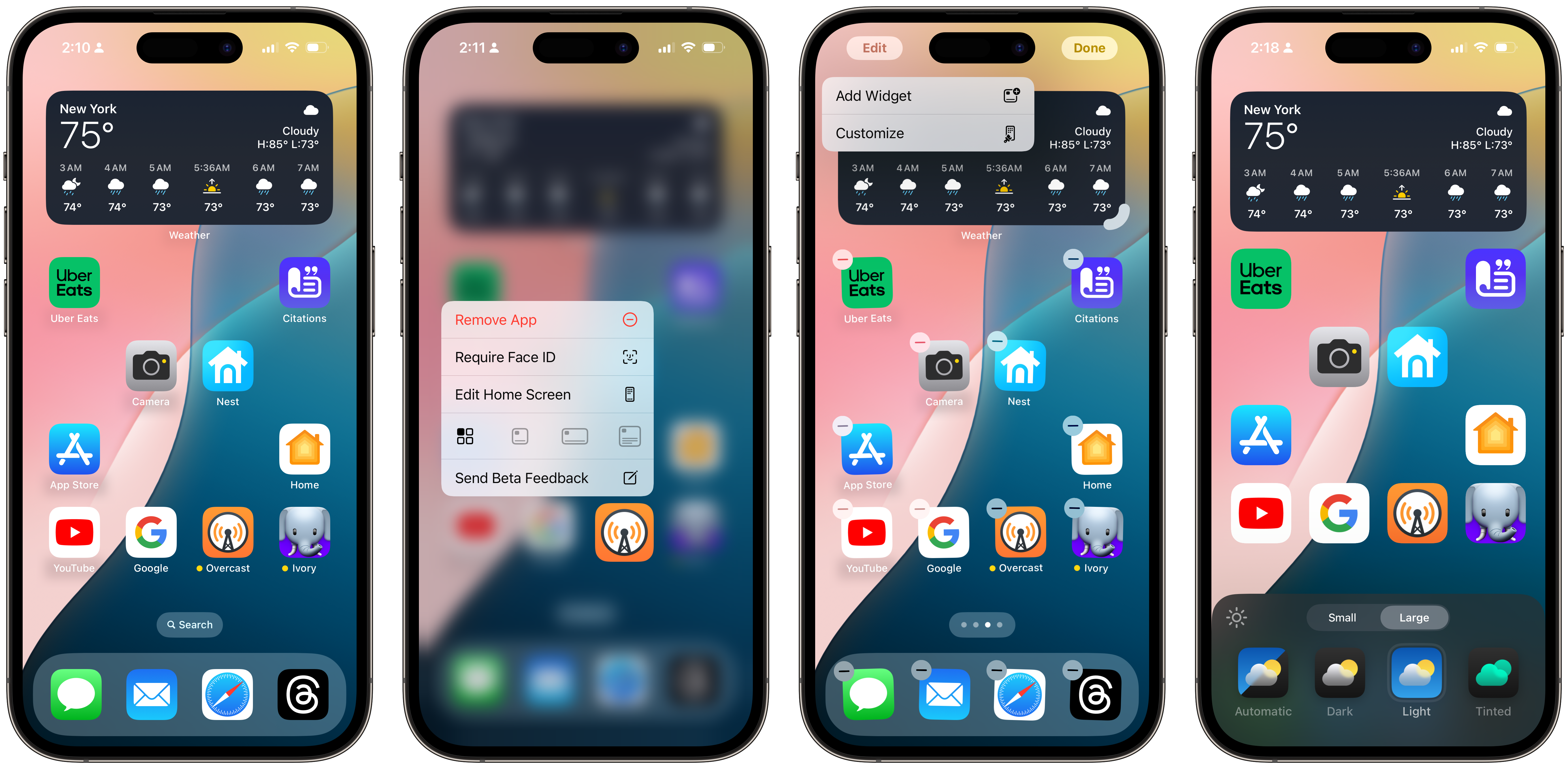 App icon customization in iOS 18.
The newest, flashiest feature that veers into territory Apple can’t control is the ability to change an app icon’s color scheme. There are four modes: Automatic, Dark, Light, and Tinted. Dark is a new mode where the system applies a dark background to a developer-provided PNG icon, or, for unmodified apps, the default app icon with the primary glyph accented with the icon’s primary color. So, in the case of the Messages app, the bubble would be accented with green and provided separately by an app developer — in this case, the developer is Apple — but the background would be a black gradient. The same applies to Safari: the compass is blue, but the background turns black.
Developers aren’t obligated to opt into the dark theme, but it is preferred that they do by providing iOS with a PNG of their app’s glyph so a dark background can be applied by the system when icons are in the Dark appearance. Developers who choose not to provide specialized icons — which I assume will be a majority of big-name corporations, like Uber and Meta — will still have their icons darkened in most cases because the system automatically cuts out the center glyph from the standard icon and applies a dark background to it, coloring the glyph with the primary accent color. This is most apparent in the YouTube app’s case: The white background is turned to gray by the system, but the button in the middle remains red, just as if YouTube updated the icon and submitted it to Apple.
This works surprisingly well for many apps, especially ones with simple gradient backgrounds and glyphs, and I think it was a good decision on Apple’s part because most developers won’t bother to update their apps. Developers cannot opt out of the system’s darkening of icons, so if they don’t like it, they can’t control how their app looks on people’s Home Screens. However, apps with complex icons, like Overcast or Ivory, aren’t given the same treatment, presumably because the system cannot decipher the main glyph. Instead, apps like this are darkened by turning the brightness down on the colors and increasing the saturation, leading to a rather grotesque appearance. Apple’s automatic theming will work well for most icons, but those with many colors and images — Instagram comes to mind — will be better off with developer-provided PNGs. Artistically complex, faux-darkened icons simply don’t jibe well with optimized or simpler icons.
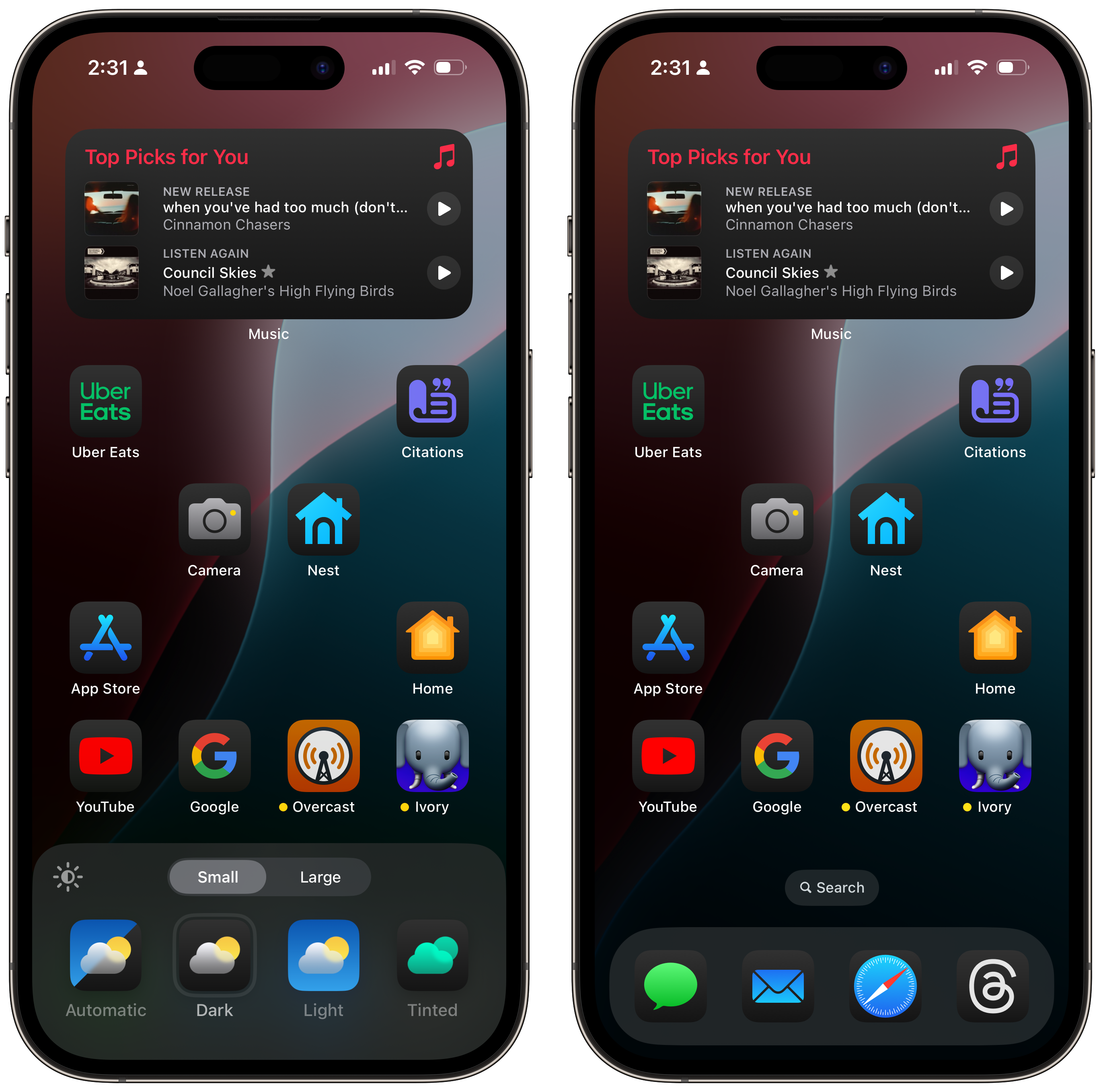 Dark app icons in iOS 18. YouTube, Google, Overcast, Nest, Uber Eats, and Ivory are not optimized.
Tinted is perhaps the most uncanny and controversial, maybe for the exact reasons Apple feared. The options to change where icons are placed or their light and dark appearances aren’t very risky and are bound to look fine no matter how they are used, so Apple still has a bit of confidence and control over how people’s devices look. But the same isn’t true for tinted icons, where the system applies a negative black-and-white filter to apps, then a color filter of the user’s choice to change which hue an app icon prominently displays. While just like the Dark appearance in the sense that the icon’s background will be black, the accent color — green for Messages, blue for Safari — is user-customizable so that someone can make all of their icons any color.
It looks very unlike Apple, which is probably exactly what the company feared when it developed this feature.
The colors picked in app icons are hand-selected by talented designers and are often tailored to look just perfect — some of the most beautiful iconographies in the land of computing are designed by talented independent artists who design exquisite app icons made just for the apps they represent. In iOS 18, the hard work of these designers is thrown away unless they develop a bespoke themed version of the icon, which must have transparency for the dark background — à la the Dark icon, which the developer also has to provide separately — and a grayscale glyph so the system can apply its own theming to it. In the case of the Messages icon, the file supplied to Apple would be a grayscale Messages bubble, which Apple then applies a color filter. Apple encourages developers to add a gradient from white to gray so that the icon appears elegantly in the Themed icon mode, but it doesn’t make the appearance much better.
The problem, as I have understood it to be, is regarding non-optimized icons and the saturation of the colors. When a non-optimized app is themed, the system applies a negative filter to reverse its colors — white would become black, and vice versa — and then a translucent color layer on top. This works fine for icons made from very simple colors, like black and white, almost as if the developer provided an optimized PNG for Apple to use. But apps with intricate details and prominent light colors look atrocious, nothing less than a can of paint thrown over a finely crafted painting. This is problematic for developers since it ruins the work of their designers, but also for users, who will inevitably complain that some of their favorite apps aren’t optimized and ruin the look of their Home Screens. (Again, Instagram.)
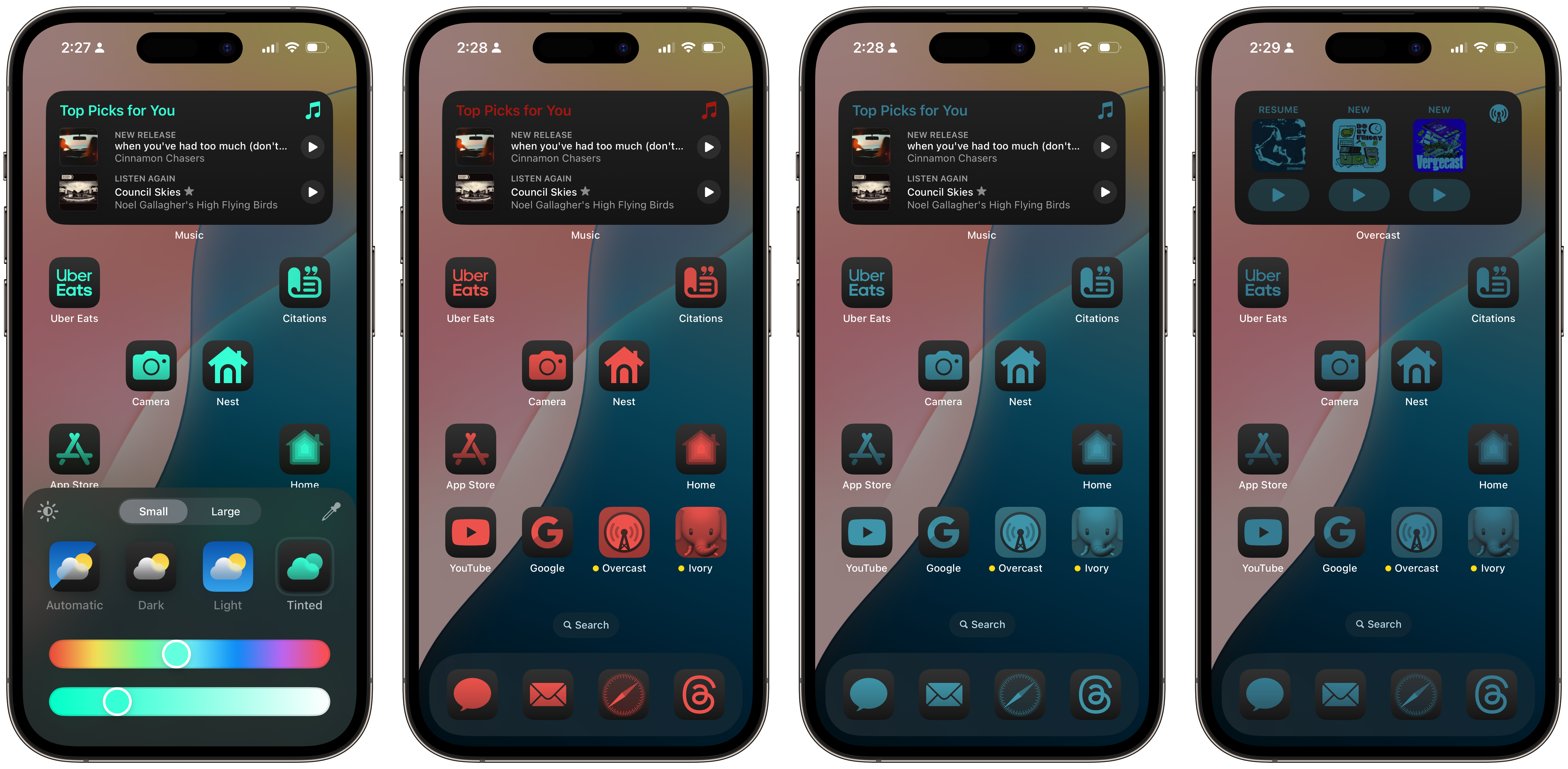 Tinted icons in iOS 18. Notice Overcast and Ivory, as well as the widget.
The common, popular argument against axing this feature entirely is, “So what?” And sure, so what? People can make their Home Screens as distasteful as they’d like because they are their Home Screens, and they should be able to do whatever they’d like to them. I guess that’s true, but it also makes iOS feel cheapened. Even Android does better than this — it does not theme icons when a developer hasn’t provided an optimized version. That’s already a low bar since Google knows nothing about design, but all this will do is encourage people to make bad-looking Home Screens with off-colored icons. Again, “So what?” is an acceptable argument, and I am not a proponent of getting rid of icon theming entirely, but I feel like it could’ve done with a bit more thinking.
The problem isn’t that it is possible to make a bad-looking Home Screen because “good-looking” is in the eye of the beholder. Rather, the default case for the majority who know what they’re doing should be an Apple-like, well-designed Home Screen. With app icon theming, it is easier to make the Home Screen look worse than it is to make it look better — the default is bad, and the onus for that is on Apple. Apple makes the paint cans and the canvas and users should be able to make a nauseating painting, but the paint colors shouldn’t encourage nausea right off the bat. The color picker in Tinted mode is too broad, so many people’s Home Screens are going to be shoddily designed and appear overly saturated because Apple didn’t put in the hard work beforehand to make tinted — or darkened — icons appear well-designed. This is a poor reflection on the human interface design team, not the “ideas” one. And it is certainly a shame when Android is more well-thought-out than iOS.
Or maybe it isn’t, circling back to this article’s trope: Apple doesn’t even tell people how to customize their icons when they set up their iPhones for the first time on iOS 18. Unlike widgets, this isn’t a core system feature and is not advertised very well. It could be a beta bug, but if there isn’t much adoption of icon customization in the first place, large developers will be further disincentivized to develop customizable icons. Unlike interactive widgets — or even normal widgets from iOS 14 — people won’t even think to try app icon theming in the first place because it is not widely advertised in iOS. In fact, I don’t even think the Automatic theming mode that switches from Light to Dark is switched on by default. Knowing how popular Apple is with developers at the moment — not very popular — I don’t think any of these theming features will take off as Apple envisions.
The same is true for Control Center, which brings back pagination for the first time since iOS 10 and is also customizable, with a suite of new controls that users can add wherever they’d like. The new controls are built on the same technology as Lock Screen widgets from iOS 16, and they even look similar. In previous versions of iOS, Control Center customization was confined to Settings, where the most people could do was reorder controls. Now, pressing and holding on Control Center will allow users to reposition controls in a grid pattern, like on the Home Screen, as well as add new ones from third- and first-party apps. Apple has even made controls more granular: Before, Hearing was one Control Center toggle, whereas now it’s separated into a main Hearing option, Background Sounds, and Live Listen for easy access.
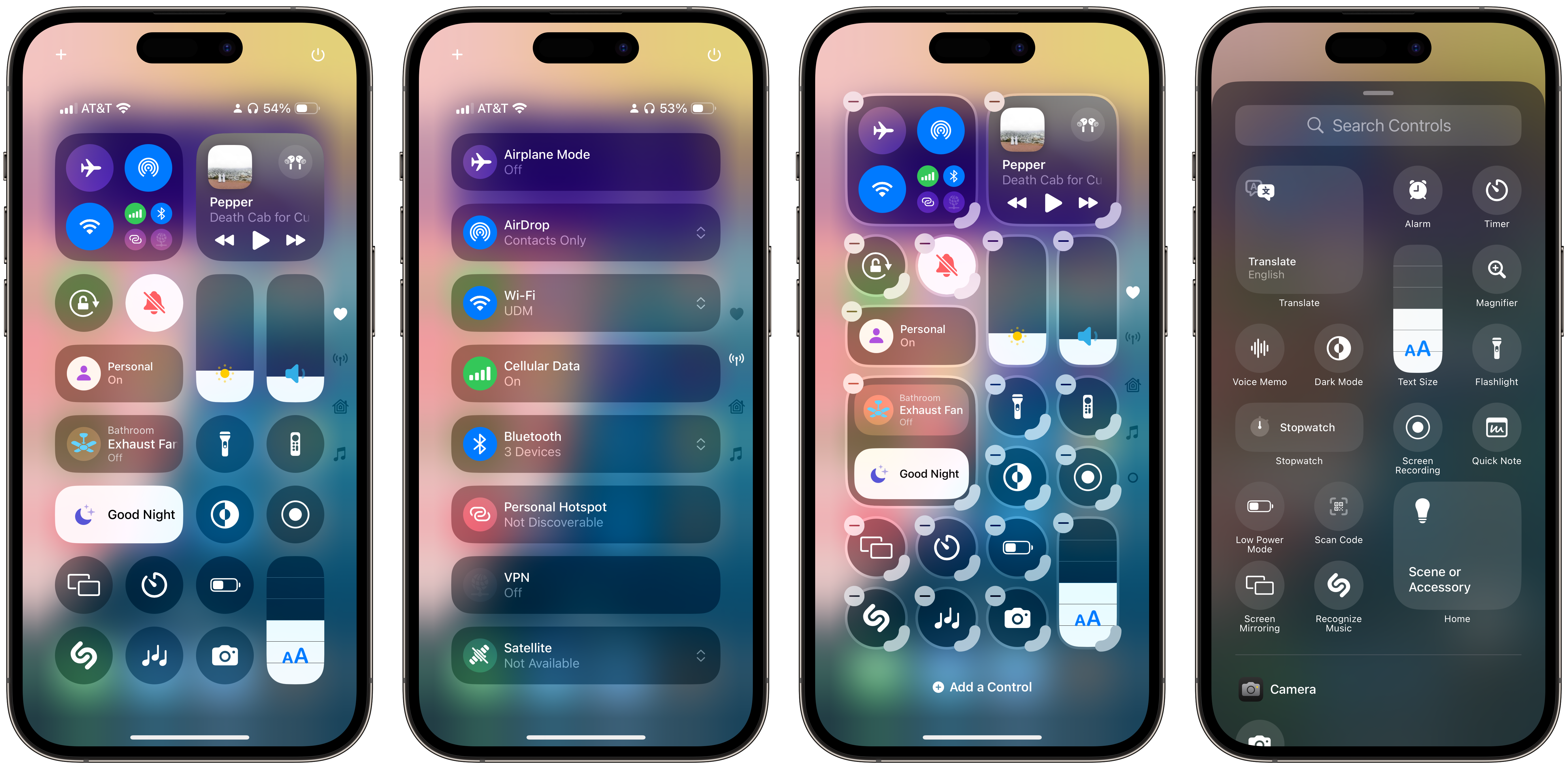 Control Center modification in iOS 18.
Control Center options, much like widgets, can also be resized horizontally and vertically, even when they are already placed — a new addition coming to Home Screen widgets, too. Small controls — small circles with a glyph in the middle, as usual — can be expanded into medium- and large-sized toggles depending on their actions. For example, the Media control can be extended to take up the entire width of the screen, or it can be compressed to a single small control. The Text Size control can be stretched to be taller and allow inline adjustments, but it can also be compressed. The system is extremely versatile, just like widgets, and app developers can add their apps’ controls to the controls gallery, contributing a variety of sizes and types. Once a toggle is placed on a Control Center page, it can be resized; controls can also come in a “recommended” size.
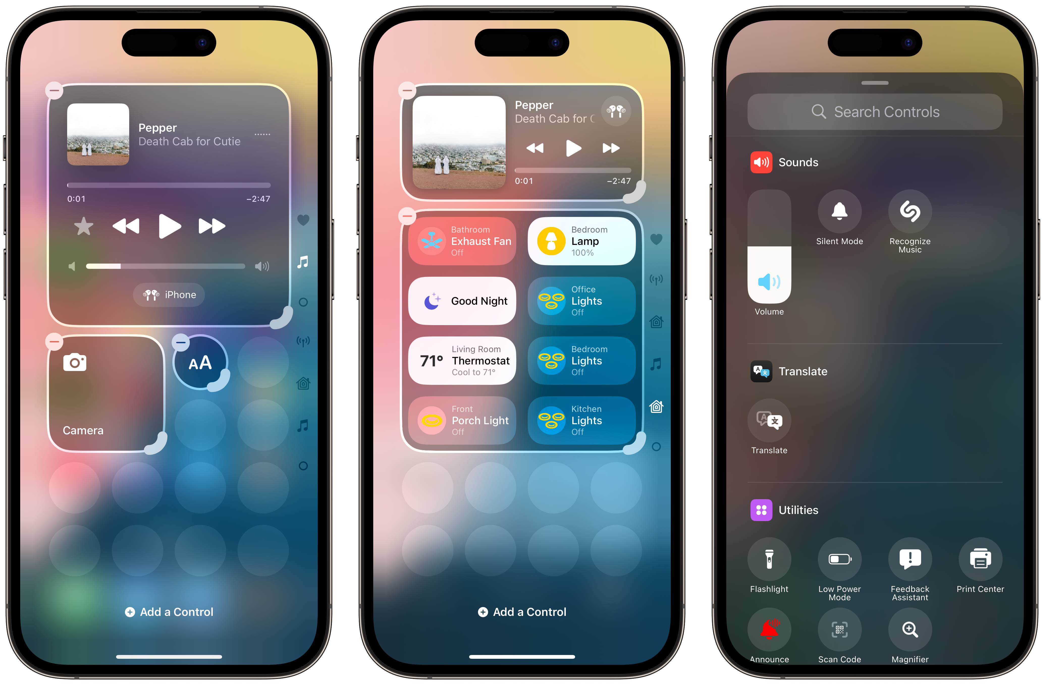 Controls can also be made larger, depending on their source app.
The new Control Center is a double-edged sword, and it somewhat reminds me of Focus modes from a few years ago in iOS 15. It is very customizable, which is great for power users as well as developers — or, at least the eager ones — but it isn’t as approachable to the vast majority of users as I’d like it to be. People can add controls to the default first page, but they can also create a new page below it by creating a control larger than what can fit on the first page. There isn’t a way to create a new page with a “+” button or something similar, just like the Home Screen, which is disorienting, even to me. Controls also don’t have set sizes, unlike widgets, which only come in three or four sizes depending on the platform. Some controls can be compressed into a small circle or take up the entire page size, but it isn’t consistent — and there isn’t a way to know all possible control sizes.
In theory, I like what Apple has given the public here, but much like Apple Intelligence, it will require some work from developers who might not want to create more methods of interacting with their apps without having to open the app itself. Widgets were a must-have in 2020 not because developers supported them on Day 1 of their own volition but because users immediately wanted to customize their Home Screens to be more versatile and useful, and thus demanded developers support them. I don’t see that happening with Control Center customization.
That doesn’t mean I’m complaining just for the sake of complaining, but chances are that when iOS 18 ships in the fall, most people will stick to the default layout that has been in place since iOS 11. Control Center customization has to be actively discovered, making it a subtle enhancement to the operating system that really only applies to a small subset of developers whose apps leverage interactivity. For everyone else, it’s just too much work for too little return.
I do find it nice that Apple has finally given users the option to modify Lock Screen controls at the bottom of the screen on iPhones X and newer. Now, people are no longer restricted to the Flashlight and Camera toggles and can swap them out for any Control Center button with a small appearance. Apps that already support the new Control Center customization will have their widgets automatically added to the Lock Screen’s control gallery, too. I think keeping Flashlight1 is probably advisable, just because of how useful it is, but I have always considered having the camera there is particularly useless because swiping left anywhere on the Lock Screen opens it anyway. I also think Apple should develop a way for makers of third-party camera apps, like the excellent Halide or Obscura apps, to automatically launch their apps upon swiping to the left, but this will do for now.
 Lock Screen controls can now be customized in iOS 18.
The last of the personalization features I surmise people will find the most handy is locking and hiding apps. People have always done the weirdest things to make their apps less discoverable, even to people who know their iPhone’s passcode, such as hiding them in folders or disguising them with shortcuts, but they will no longer have to do so because iOS will allow them to be locked inside a Hidden section inside of the App Library. Interestingly, and perhaps cleverly, the Hidden section is always visible, even if someone doesn’t have any hidden apps. This way, nobody can determine if someone has any hidden apps at all — the section will always remain visible. It is also opaque, unlike the tiles — so icons of apps can’t be deciphered just from their color — and it requires Face ID or Touch ID authentication to access, not just a passcode.
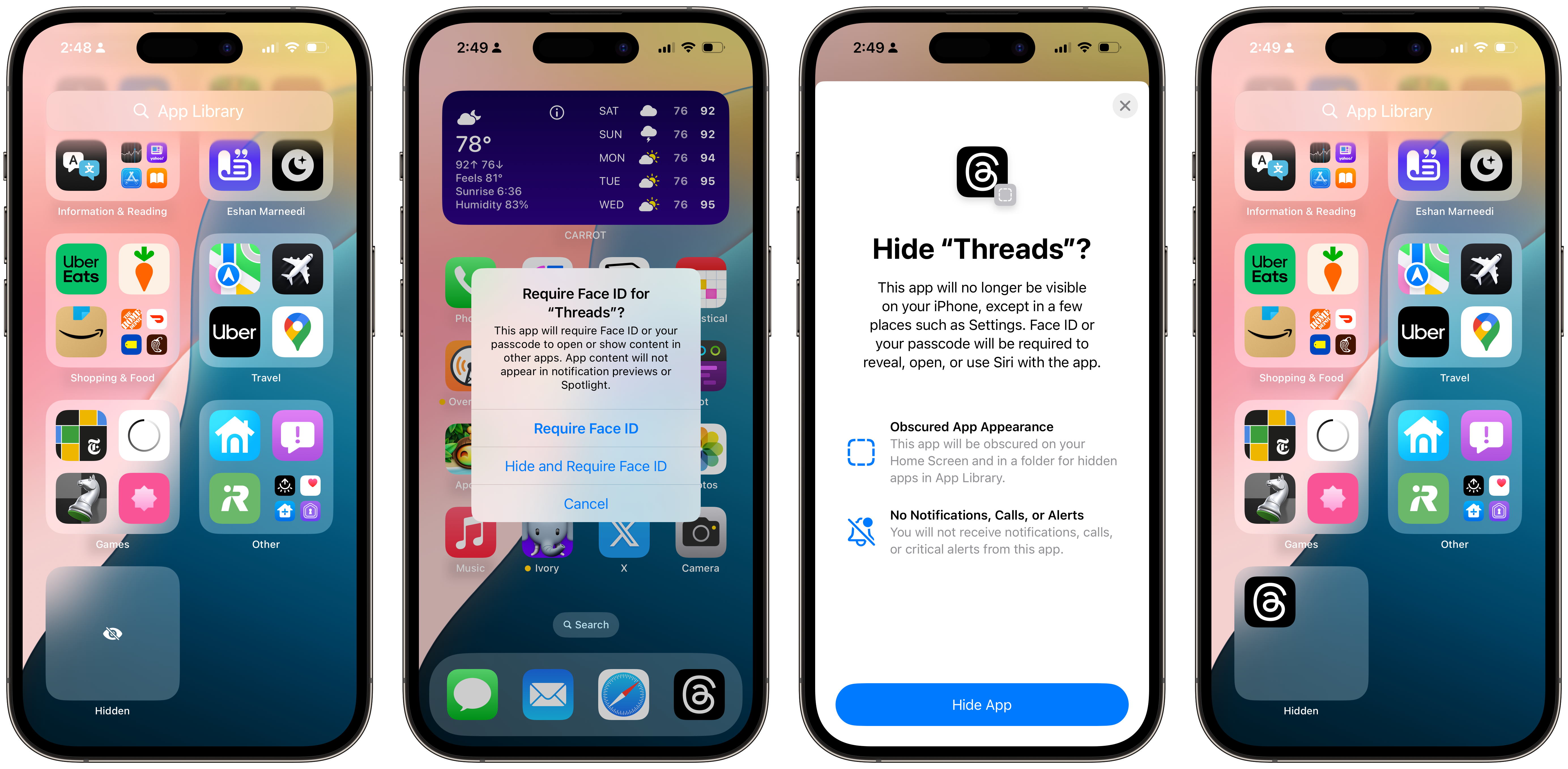 Hiding apps in iOS 18.
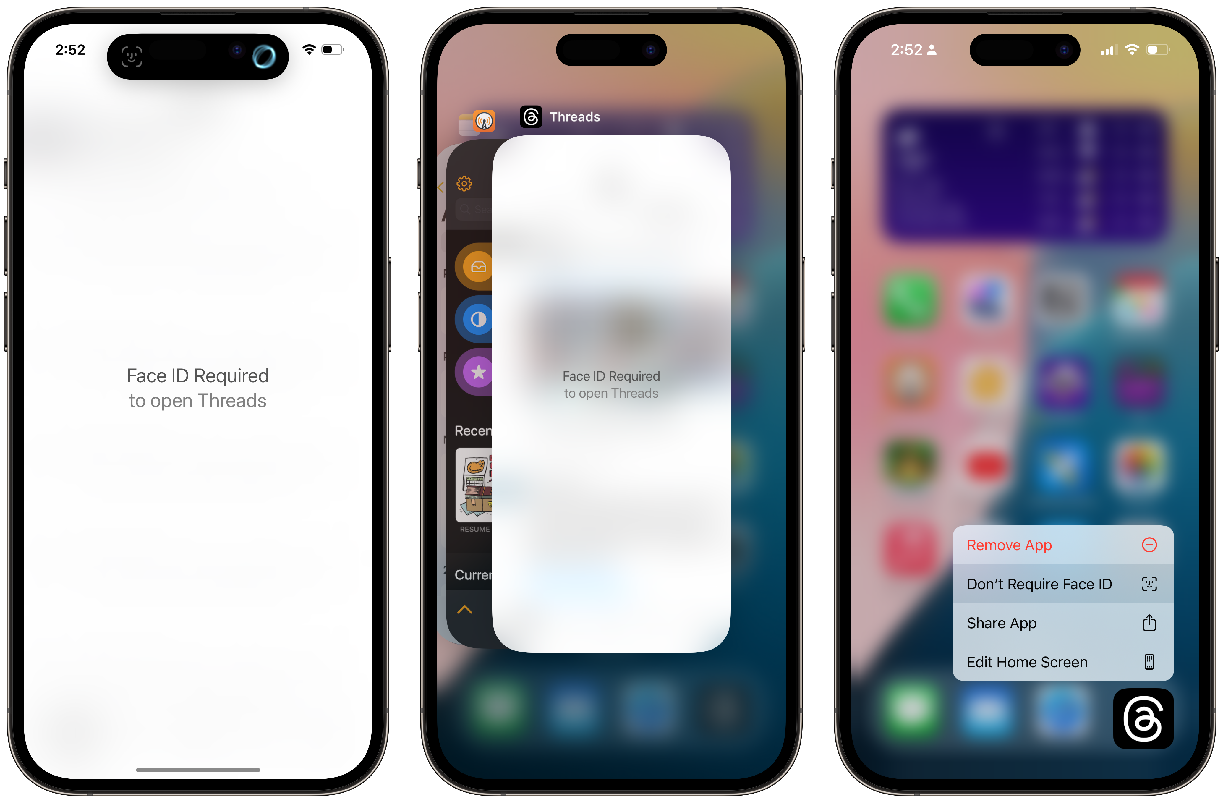
Locked apps are similar, only that they aren’t squirreled away into a private space in the App Library; they can be placed anywhere on the Home Screen and look just like any other app. However, once they are opened, they require biometric authentication to unlock, and their contents are obscured by a blur. Some have complained that the blur still allows colors from an app’s display to shine through, making the contents visible, but I assume Apple will address this in a later version of the beta. (I propose making the app entirely white or black, depending on the device’s appearance, until it is unlocked.) If a locked app is even briefly swiped away, it will prompt the user for biometrics again — the same goes for when it appears in the App Switcher. I think the feature is well thought out, and many people will use it to hide, let’s say, private information they don’t want their loved ones looking at.
 This is what a locked app looks like.
Weirdly, none of these new features — including hiding and locking apps — come to the Mac. I don’t expect Home Screen customization to be there, but the new Control Center isn’t in macOS Sequoia, which is disappointing. I could imagine third-party controls functioning as menu bar applets would, except stashed away in Control Center. (At least the new Control Center came to iPadOS 18.)
Notes and Calculator
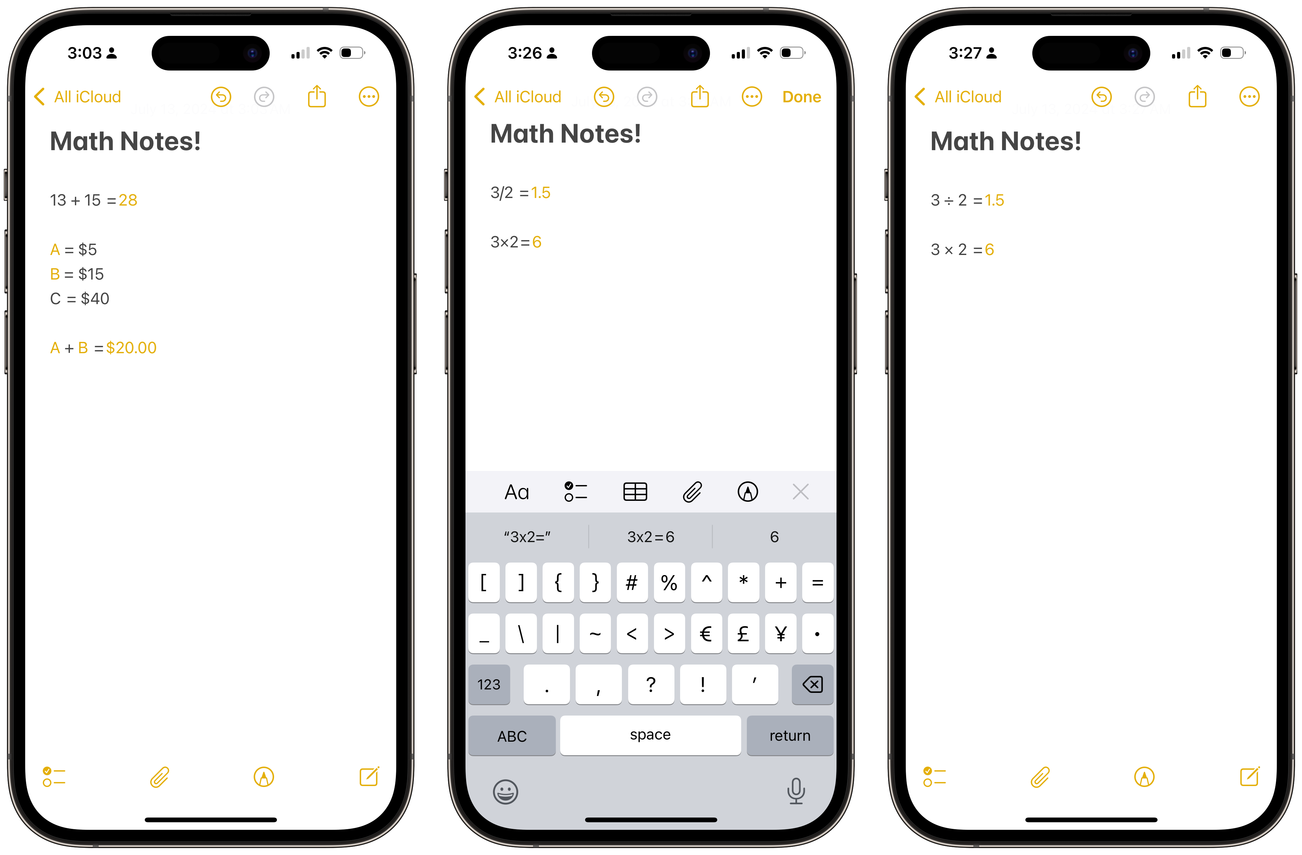
Usually, the Notes app and Calculator aren’t associated with each other because they are so different. This time, they are closer than ever through a new feature called Math Notes. Math Notes was easily a highlight of the keynote’s first half, leaving me astonished. Here is how it works: When turned on, a user can write down an equation and append an equals sign to it. The system will then automatically recognize and calculate the equation, and then display the answer to the right of the equation inline. People can even add variables, so if the price of A is $5, B is $15, and C is $40, the system can solve the expression “A + B = $60.” It works with currency, plain numbers, or even algebra, though not calculus for some odd reason.
This feature is available on iOS 18, iPadOS 18, and macOS Sequoia, and isn’t part of Apple Intelligence, meaning it is available to a broader swath of devices. It effectively “sherlocks” Soulver, an app that aims to turn natural expressions into mathematical ones automatically, and while I am sure it hurts for its developer, it’s amazing for math homework, quick budgeting, or bill splitting. On iOS and iPadOS — yes, Calculator comes to iPadOS for the first time in 14 years — Math Notes lives in Notes and Calculator, and on macOS, the feature is in Notes. They sync across devices, even if made in different applications; math notes made in Calculator are in their own folder in Notes.
 Math Notes in iOS. In the last image, the math notation is being automatically corrected.
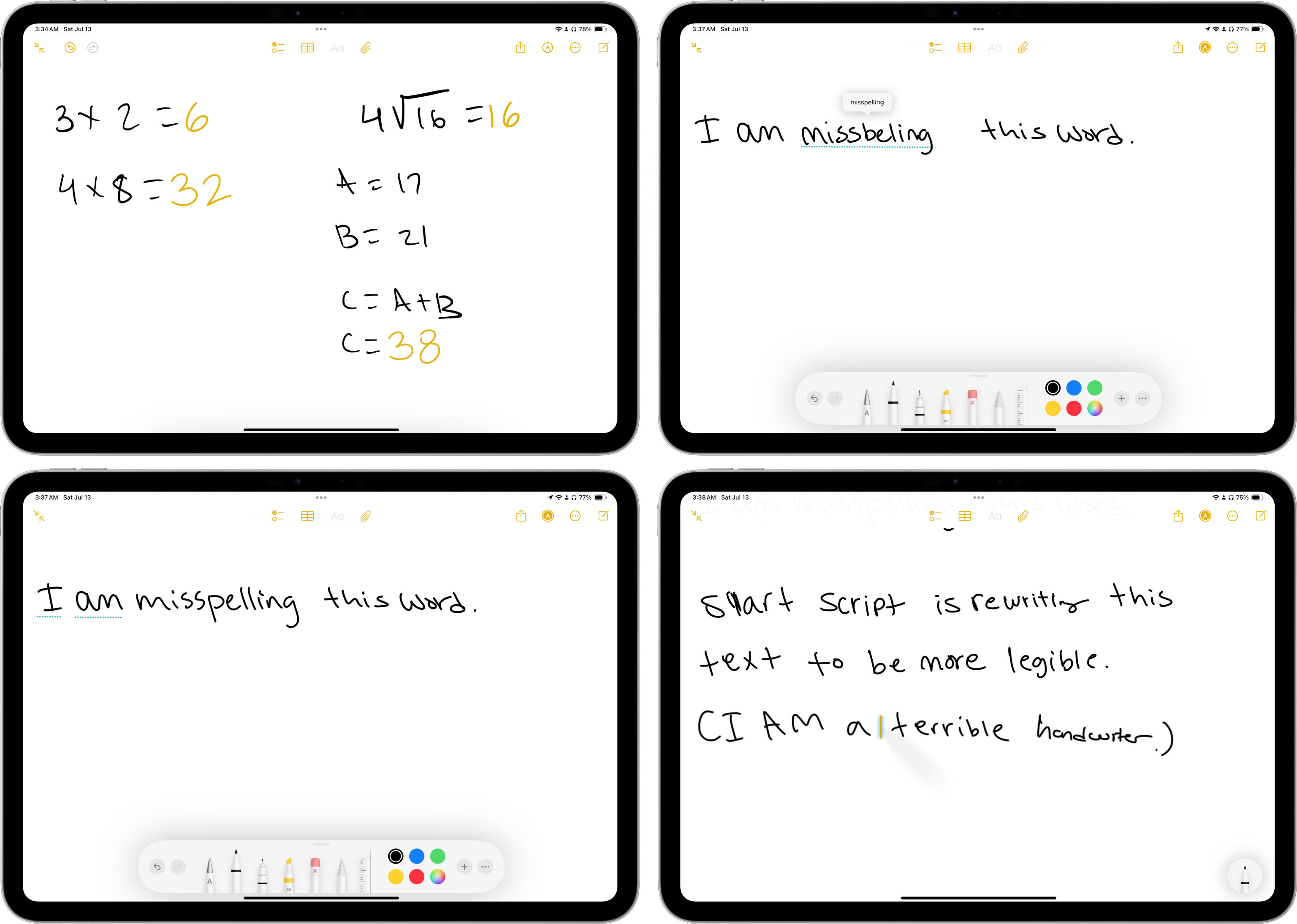
But back to iPadOS: In addition to providing a larger scientific calculator-like mode to take advantage of the iPad’s expansive display — the bare minimum for a 14-year-late entry — Math Notes works with handwriting via the Apple Pencil. Here is how it works: For a while, Notes learns a user’s handwriting through an “on-device machine learning model” and then tries to replicate it to write the answer in their handwriting rather than San Francisco or whatever other system font. It is such an excessive attention to detail that screams Apple, so remarkable that I have immediately forgiven the company for waiting 14 years to develop a calculator for a device that costs thousands of dollars at its priciest.
Math Notes works the same way with handwriting or normal text, but it is substantially more genius when calculating script on the fly, almost magically. If there is a list of numbers and a line is drawn below it, they are immediately summed. Variables and long division work flawlessly in various formats and even with the sloppiest of handwriting. And each time, the system replicates my handwriting almost perfectly, so much so that it would look like I wrote it myself if it weren’t in yellow, the color Notes uses to mark an answer as automatically calculated. There aren’t many more delightful interactions in iPadOS than this, and I think Apple did a fantastic job. Now, there is no need for a calculator in Split View with Notes when working out calculations — they are both bundled together.
Math Notes is so bright that it can even generate graphs from complex equations, à la Desmos, only it can recognize expressions from handwriting and accentuate text to correlate with the graph’s colors for clearer correlation. This still works with typed text, as well, but it is even more impressive when handwriting magically turns into a perfect graph without having to open a third-party app, paste the equation in, screenshot the output, and then paste the image into the note. Math Notes also understands mathematical syntax, both typed and written, so if a number is above another one or follows a caret (^) or two asterisks (**), it will automatically be recognized as an exponent, for example. And slashes and Xs are automatically converted into proper symbols for enhanced readability when typed — for example, “3/2” for “3 divided by 2” would be rewritten into “3 ÷ 2”; “3 x 2” for “3 times 2” would be rewritten as “3 × 2.”
The extraordinary engineering prowess of Math Notes isn’t just limited to mathematical calculations, either — it comes to all handwriting by way of Smart Script, a new feature that corrects and refines script. Messy, quick writers will know the pain of borderline illegible handwriting, and Smart Script straightens bad writing into more legible, pleasing characters while maintaining the original script’s style. In other words, it doesn’t look like Helvetica with some curvier lines — it actually looks like a person’s handwriting, but if they could write better. It didn’t look like a one-to-one replica, but it was good enough to pass — it seems like it errs on the side of making the writing look better than worse. (And yes, I tried — it works with cursive, even bad cursive.)
The advantages of enabling the system to clone handwriting are numerous. If a word is misspelled, Smart Script will offer to rewrite it correctly just as if it were typed, red squiggle and everything. It can also capitalize words and turn copied text into handwriting, so if someone pastes text from another app into the middle of a handwritten note, it will be automatically converted to fit in. (It is much like the reverse of optical character recognition.) iPadOS can also make room for new writing by way of a “touch and drag” gesture, which is much nicer than having to squeeze in a word like someone would on normal paper.
Paper is limited because it is a physical object, and the iPad has carried paper’s limitations for so long, up until Apple added the “squeeze” gesture in May to the Apple Pencil Pro. But come to think about it, it makes sense for text to be automatically restructured and spell-checked when the iPad is just a computer at the end of the day. Why should handwritten text be any different from typed text? Until now, the system couldn’t offer automatic text editing functionality because it would require the text to be rewritten, which was only possible with computer typefaces, but by treating a user’s handwriting as a font, Apple has cleverly gotten around this. I have always yearned for better text editing for handwriting, and even when Apple announced Scribble a few years ago, I still found handwriting cumbersome. Now, even as someone who has bad handwriting, I find it more enjoyable to write on the iPad.
 Math Notes and Smart Script in iPadOS 18.
There are other features in Notes and Calculator coming to iOS and macOS, too:
-
Highlighting and text coloring come to typed notes for better styling.
-
Headers and their contents are collapsible, allowing for better organization. (There still isn’t Markdown support in Notes, which makes it useless for my writing needs.)
-
Live audio transcription opens an interface to begin speaking, akin to Voice Memos, but transcribes speech into a note. Recordings don’t have to be transcribed; they can remain in a note just as an attachment and be searched. (In the future, Apple Intelligence will let users summarize them, too, which can be handy for meeting notes.)
-
To erase a word in handwritten documents, the “scratch out” gesture from Scribble has been transplanted to work with any handwritten script. Scribbling over any word removes it and moves the surrounding words together.
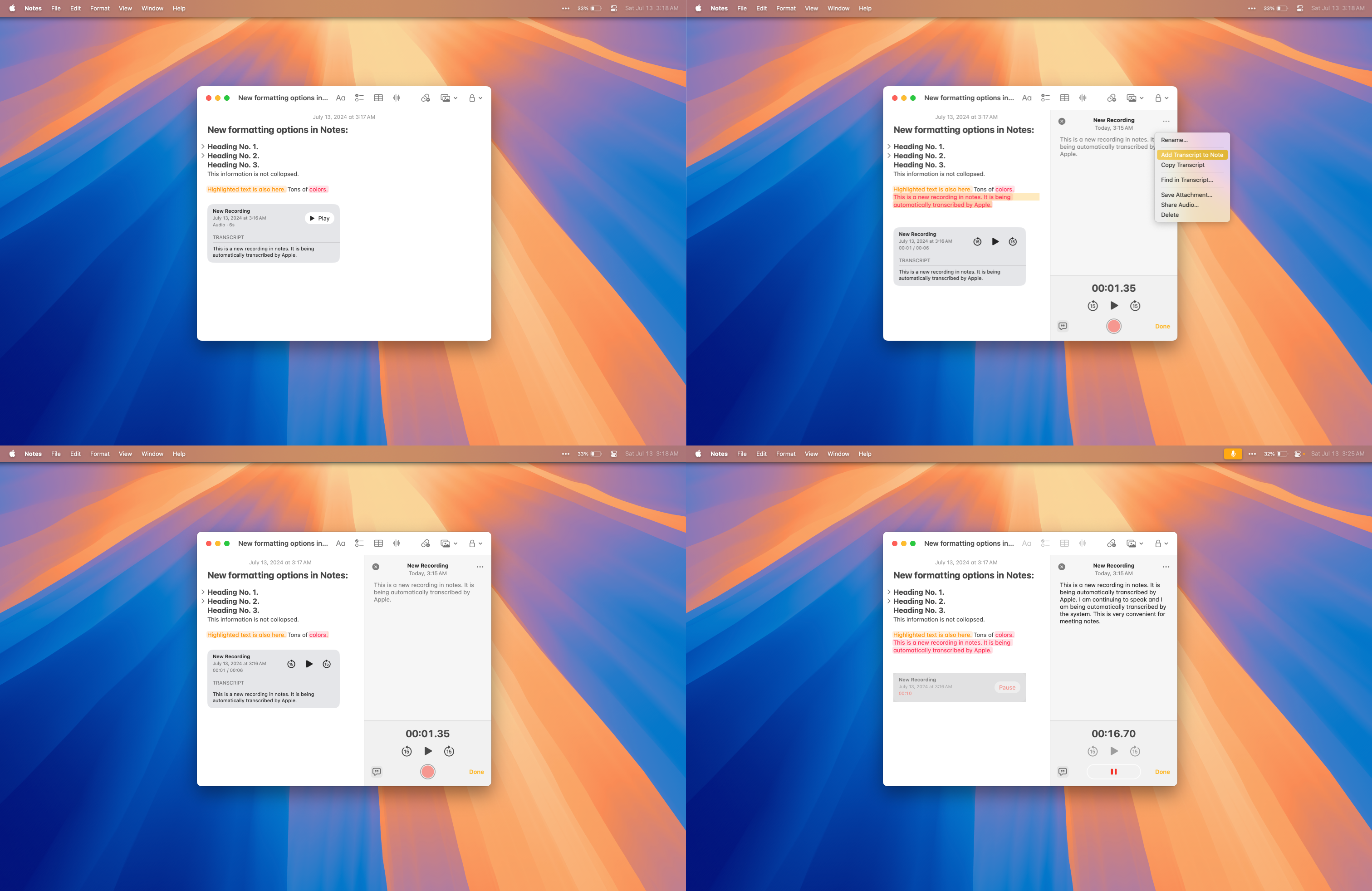 New Notes features in macOS 15 Sequoia.
-
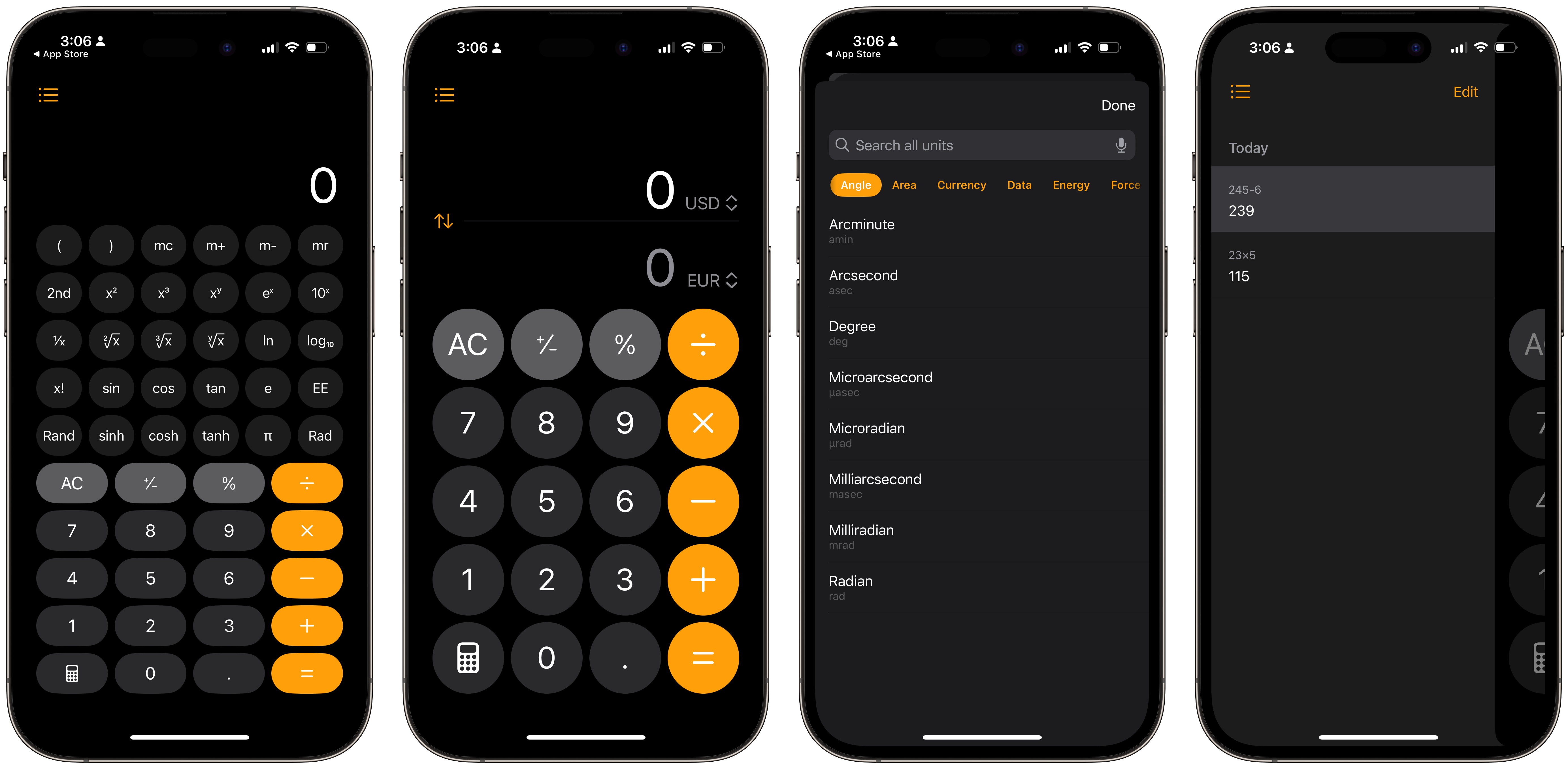
The Calculator app has history now.
-
There is a conversion mode in Calculator. Switching it on shows an interface with numerous units, ranging from currency to weight, length, energy, power, and so much more. This feature wasn’t even mentioned during the keynote, but conversions have been built into Spotlight for years now.
-
On iOS, the scientific calculator can now be displayed vertically.
 The new Calculator app in iOS 18.
I reckon Math Notes will be beloved by many because it is in the Notes app rather than confined to Calculator — I know I will use it daily. And Smart Script is truly impressive technology, especially for messy writers like myself.
Photos
If I had to guess, Photos is one of the most used apps on the iPhone, probably below Messages and Safari. So when Apple announces a massive redesign that is not only unlike anything that has ever graced the Photos app but any app in iOS, it is bound to be controversial. I don’t think the new Photos app is bad, but it is a fundamental shift in how the company wants people to view and resurface their photographs over decades. The Photos app in its original form was a simple grid of images, chronologically sorted, with some albums and automatic media type sorting, and it was great for photo libraries mainly consisting of a few hundred pictures, all taken on iPhones. But as iPhoto became an app of the past and iCloud Photo Library replaced My Photo Stream — which synced photos between Apple devices on the same iCloud account — photo libraries have ballooned into hundreds of thousands of shots encompassing people’s entire lives.
So, Apple built on Photos to surface old pictures and help people scroll back in time. It built filters at the bottom of the grid to make it easier to view photos by year and month, and perhaps most noteworthily of all, a Memories feature to recollect old images and create custom videos of trips, events, and people. But here’s the dilemma: nobody uses them. Memories were always hidden in a For You tab beside the main photo library, so many people would only access them via widgets, which the company thought was problematic since iOS does a ton of work to automatically categorize photos in the background and make them visible for viewing. What’s the point of taking photos if it is arduous to view them? In iOS 18, Apple changed that.
Now, Apple’s ML-created Memories are front and center, and iOS automatically generates “collections” of memorable days, people, the “Memories” videos themselves, memorable photos, and trips. The idea is for Apple’s ML to function as a librarian for photo libraries, per se, revisiting old memorable moments while keeping their form as photos intact. Take trips, for instance: Photos uses geolocation data to categorize vacations away from home and associates them with the trip. These groups are all categorized by year and month, so they will be labeled descriptively, such as “New York, July 2018.” All of the years are shown at the top for easy access, and each trip is turned into its own bespoke album of sorts, with only the best shots placed at the top.
The Days filter works similarly to the Days view in the old Photos app from iOS 17, but it also shows the best images first, as the Photos widget does. It also shows videos and other types of media, as well, but is smart enough to exclude screenshots and other detritus unless that was the only media taken that day. It will also filter images based on where they were taken, so if one part of a day was spent in one city and the rest in another, they will be separated into different sections for better clarity. Photos also considers national holidays and personal events, like anniversaries and birthdays, and properly labels them. The entire system is very well thought out, and I say that even as someone who dislikes smart ML-powered photo categorization.
In older versions of iOS, Photos would usually fixate on events that I don’t particularly care for. I don’t need to see hundreds of photos of when I was 4 because that’s not particularly memorable to me. Instead, I want to see what pictures I took a year ago, or what I did on my birthday during the pandemic. The older photos get, the less attachment I have to them — that doesn’t mean they aren’t special, or that I don’t want to look at them, but I don’t want to be reminded of them every second as if my only joyous moments were when I was young. The older version of Photos spiraled into nostalgia and ignored recent moments. In contrast, the app’s new design focuses more on recent events since each filter is laid out in reverse chronological order, from newest to oldest.
When going to Days or Trips, the newest events show first, so I can look at my latest travels before I go back in time to ones from long-ago years. It isn’t hard to see old ones, and they are still personalized equally well, but they are not upfront. If I want to see trips from decades ago, I can by just tapping the button I want, but they are not presented forcefully in the ways Memories still does. I have never liked the thought of personalized AI-generated videos of Ken Burns effects on photos I have taken from years prior — they seem artificial and I have never enjoyed looking at them. Now, there are more ways to utilize Photos’ intelligence while actually being able to enjoy the photos themselves rather than having them be converted into an uglier, in my opinion, inferior format.
I have read a lot of takes online that the new Photos app is less pleasant for people who strictly use the chronological grid and custom-made albums since it pushes categories iOS creates by itself more prominently. I disagree, however: What Apple did is reorganize the app to make the automatic librarian, as I like to call it, more friendly for old-school users, such that the system isn’t telling anyone which pictures to look at, but surfaces old times. Photos before used to choose the best images from moments it thought were precious. It still does that, but it also shows all moments and makes the events themselves easier to find. The Moments (capital-M) movies are still there for the few who enjoy them, but the new filtering is, to exemplify the library example, more akin to a librarian helping someone find the book they are interested in than one helping someone discover a new genre of books. Both kinds of assistance can be helpful, but old-school users who know what they want and just want easier access to it will much rather prefer the former.
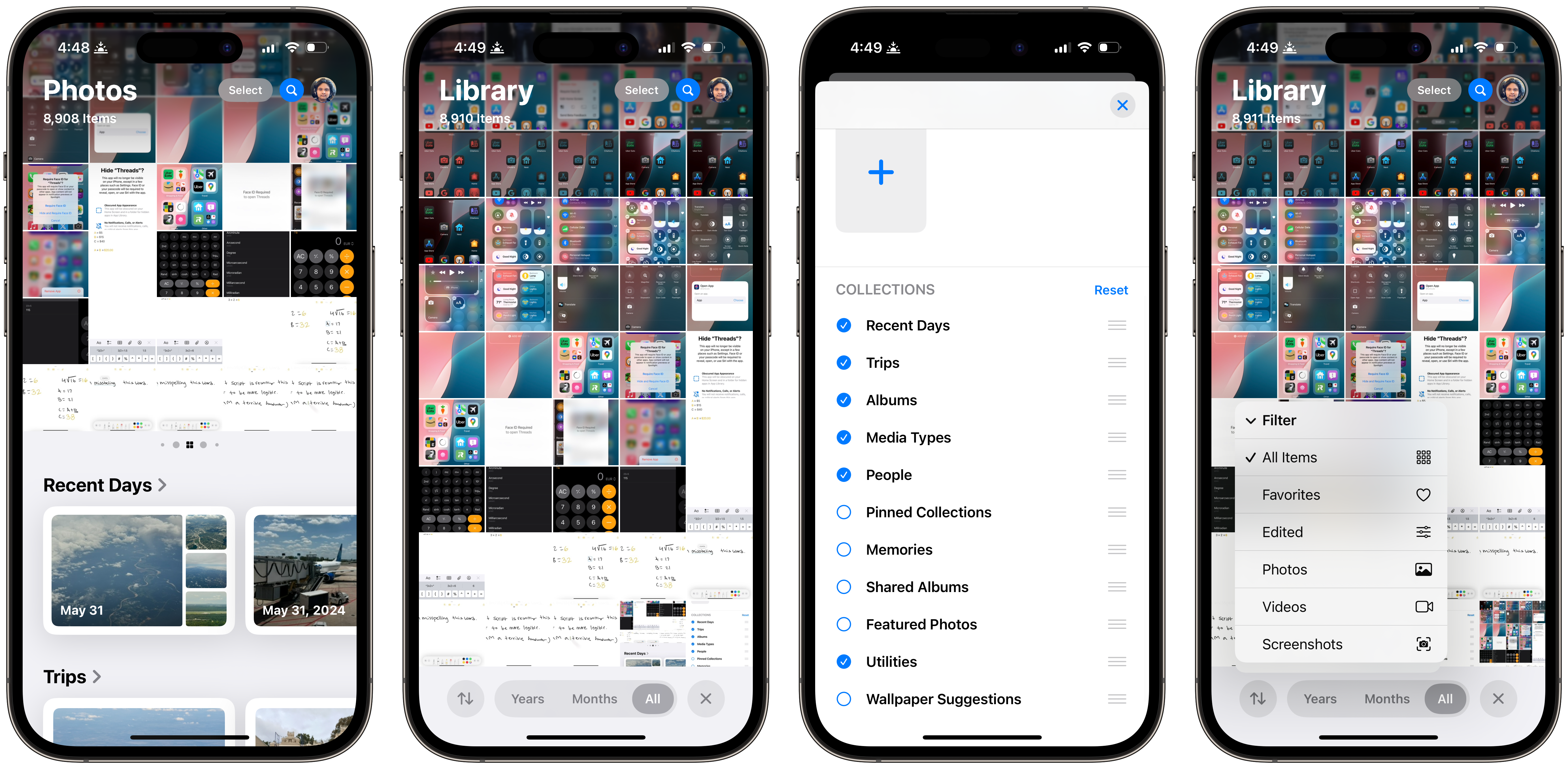
To facilitate this broad rethinking of Photos, the design needed to be rebuilt from the ground up. If all of this precious work was limited to the For You tab, it would feel too busy; similarly, integrating it into user-made albums would blur the lines between the user organization of photos and system suggestions. The librarian is only a librarian, and it shouldn’t interrupt the patron’s work. So, Apple thought of perhaps the most peculiar circumvention of this problem: eliminating the tab bar entirely. The result is a very flat navigational structure in a typically hierarchical app. Think about it: the grid is a tab, which is then segmented into Years, Months, Weeks, and Days; Memories had section headers for different kinds of media; and Albums had different media types and albums, which each had their own subviews. Now, all three tabs are merged into one modal sheet.
This design isn’t inherently a bad idea, but it is confusing. At the top, the grid remains, but the Days filter is now missing because it has been added to the sheet below, reminiscent of the one in Maps. Albums now live near suggestions from the system, but media types open a second sheet atop the main navigation sheet which slides in below the grid of photos. Together, the new changes make me feel a bit claustrophobic, where every item is too confined and I want some of the clutter to be segmented into separate tabs, just like any other app. I am one to enjoy the chronological grid because it reminds me of a real photo library, where albums function like real physical albums, and I only want the system to help me catalog them — not tell me what pictures are the best to look at.
The new design is intrinsically pushy because its creators wanted it to be that way, but I’m unsure of how quickly it is growing on me. Firstly, I don’t appreciate how the sheet is always visible when all I want to see by default is the grid of photos. It is possible to hide the navigation sheet by tapping an X in the right corner, expanding the grid to take up the full screen, but I want it to remain hidden by default upon the app’s launch.
The sheet takes up much more vertical room on iOS than the tab bar when it doesn’t necessarily add much new functionality, which makes the grid feel cramped when it never did before. Rarely do I have a use for the items in the sheet — just because they’re more prominently placed doesn’t mean I need them more — so I would like to be able to collapse it when the app is first opened. For an update that prioritizes customization so prominently, I’m surprised to see that such a simple feature wasn’t implemented. I’m sure I’m not the only one yearning for such an option.
Even before the new Photos app redesign, I have long wanted to hide the tab bar, mostly because I don’t use it for anything — it wasn’t that long ago when searching photos was a fool’s errand and I rarely look at albums on iOS. Apple has seemingly realized this, but instead of moving the navigation design to a split view style, akin to Mail or Messages, which would allow for a combined view while making the grid front-and-center, it instinctively decided to artificially diminish the importance of the grid, which is still most people’s favorite way of looking at photos on a small screen.
Talking to project managers or marketing executives from Apple makes the motivation for this change sharply apparent: Apple is disappointed that users don’t take advantage of its intelligent ML, so it wants to bring it front and center. But that is a flawed approach because Apple should work for the people, not vice versa. I don’t think Apple’s enhancements to the Photos app are bad — it built a librarian into it, which is commendable — but the company needs to tame the showiness a bit.
 The new Photos sheet can be customized.
My lede for this article was that Apple’s newest software platforms require users to discover for themselves the “wow” factor, and the same is true for the Photos app — even more so, I’d argue, due to how radically different it is. People will be off-put by the elimination of the tab bar and the aggressive positioning of system-generated content without realizing that most of it can be hidden, which is entirely new in iOS 18. For example, I despise Memories, so I have scrolled down, tapped Customize, and removed that section from the navigation entirely. Every section can be removed and rearranged, making the entire app much more flexible than ever before, which is a godsend to remove clutter and simplify the interface.
Moreover, sections can also be added and prioritized: The top area of the screen which the grid usually occupies acts as a swappable stack of views, like the Home Screen, so users can add albums, Trips, Days, and certain media types like videos into the stack and swipe between collections. This makes the entire Photos app infinitely customizable; no longer is it a simple grid and tab bar because the tab bar is rearrangeable and the grid is pseudo-replaceable. (It isn’t possible to remove the grid or select a collection as the default primary view.) I have set mine to allow easy access to videos, and when a collection is displayed in place of the grid, it cycles through various pieces of media from it. It adds to the complexity yet versatility in a way that ties into the motif of this year’s OS updates, for better or worse. I’m interested to observe how the broader public views this reshaping of a quintessential iOS app.
There is a reason I specify that the new Photos app is an iOS app: it isn’t available on the Mac. The Mac does receive the new categories, like Trips and Memorable Days, and they are displayed in the sidebar alongside user-created albums, but there isn’t a redesign anywhere to be found in the app. I think this is a good thing because the mobile version of the Photos app on iOS and iPadOS is designed for quick viewing, whereas the Mac version should be broader in nature to let the user manage their libraries. Users value ease of use and speed on mobile platforms but prefer to be unobstructed by the system’s preferences on the Mac while also retaining access to the niceties of mobile interfaces. Still, though, it seems incongruous that the Photos app is so drastically different on two of Apple’s flagship platforms, so much so that they don’t even feel like the same product. The iOS app has a flat navigational structure, whereas the Mac’s is more traditional.
 More modifications to the Photos app in iOS 18.
I also feel that because more iPhone users have iPads than Macs, Apple should have brought split view-style navigation to the iPad app rather than the sheet design from iOS. The iOS app is by far the most known of the three versions, but it is used much differently than the iPad and Mac variants — the iPhone’s is used to check on recently taken images, whereas the iPad and Mac versions are, due to the devices’ larger screens, pleasant for consumption. The bottom sheet in iPadOS feels like it occupies too much space on the larger screen when it could be used instead to display a larger grid of photos while keeping a compact sidebar to the left, similar to Shortcuts. The iPad version does have a sidebar, but it is more of a supplementary interface element than the main design.
The new design is controversial and changes how numerous parts of Photos work. The media view in the Camera app differs with modified buttons and layouts, the video player is also replaced with the standard iOS-native one rather than the Photos-specific scrubber which displayed thumbnails of the video, and the editor is slightly modified, with item labels removed from some icons for a simpler look. The whole app is bound to garner attention — and perhaps controversy — when it ships later this year, and I still think there is a lot more room for improvement before the operating systems are out of beta.
iPhone Mirroring
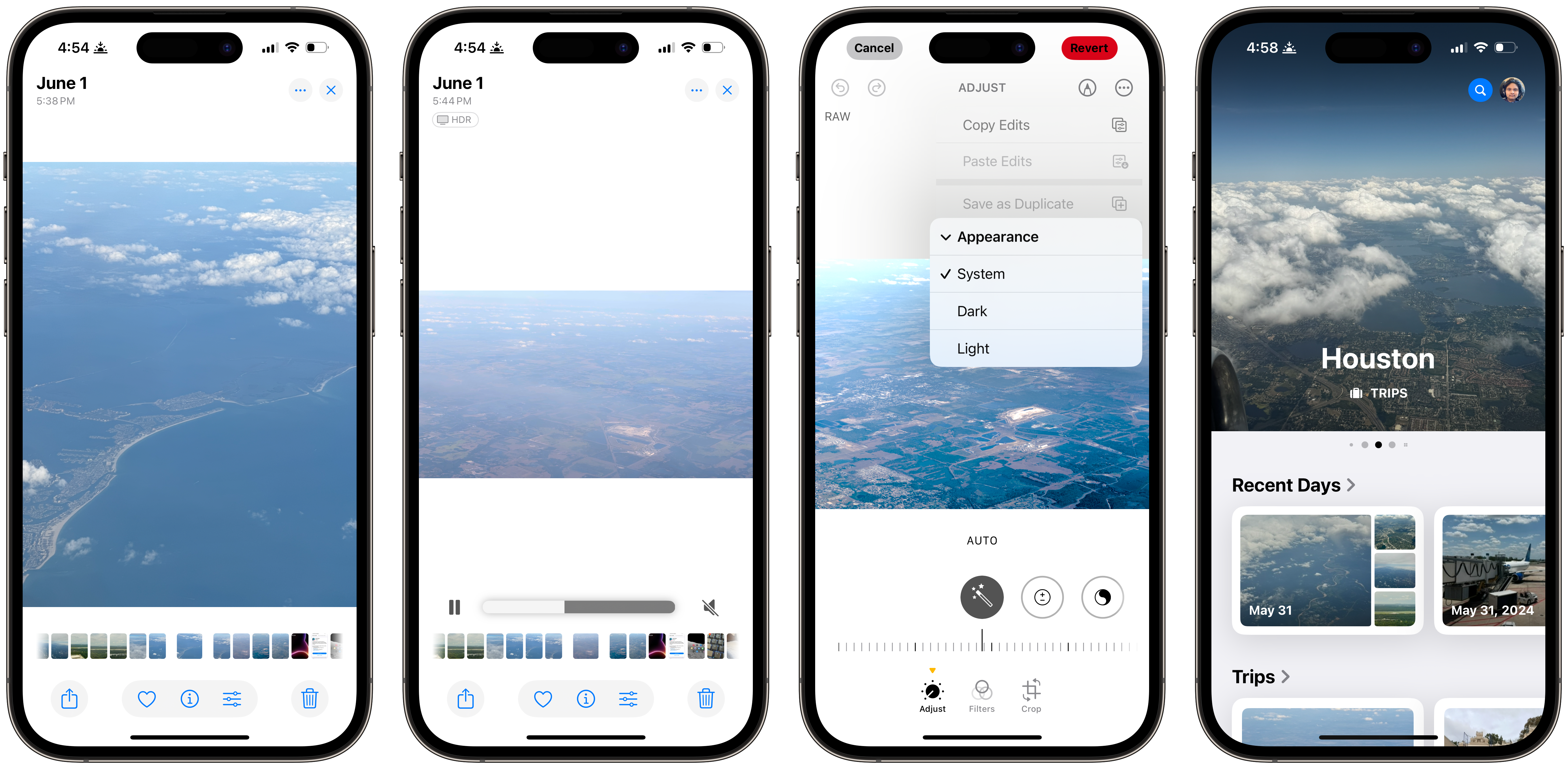
The problem is simple yet insurmountable: Many developers don’t make Mac apps. The reason for this isn’t necessarily Apple’s fault, but the Mac is a smaller platform than iOS and iPadOS, and most iOS apps from well-known developers like Uber and Google aren’t available on the Mac. These services have desktop websites, but they are subpar — and more often than not, people just use their iPhones to access certain apps when there isn’t a desktop app available. The disadvantages of this are numerous, the most obvious being if a person’s phone is in another room or a bag. Apple has devised a clever yet obvious solution to this predicament: iPhone Mirroring, a new feature in iOS 18 and macOS Sequoia which mirrors an iPhone’s screen via a first-party app to macOS.
When I first saw Craig Federighi, Apple’s senior vice president of software engineering, demonstrate this feature during the WWDC keynote, I instinctively felt it was lazily implemented. I still do mostly, but I also don’t think that is inherently a bad thing.
When a compatible iPhone and Mac are signed into the same Apple account2, the iPhone Mirroring app becomes available through Spotlight in macOS, and opening immediately establishes a connection to the phone. I haven’t tested iPhone Mirroring using an Apple account with multiple iPhones signed in, but I assume it will connect to the iPhone within closest proximity since I have found it fails to connect if the iPhone is far away. For instance, it isn’t possible to connect to an iPhone in another building. The iPhone and Mac don’t have to be on the same Wi-Fi network, however; the iPhone can be connected to cellular data as well.
Once connected, which generally takes a few seconds, the iOS interface is displayed in an iPhone-shaped window, even down to the Dynamic Island and corner radius, though the device’s frame — like the bezels and buttons — isn’t displayed, unlike the iOS simulator in Xcode for developers. The status bar, Spotlight, and the App Switcher are accessible, but Control Center and Notification Center aren’t because they require swiping down from the top to open and that isn’t a supported gesture. To close an app, there is a button in the iPhone Mirroring Mac app’s toolbar to navigate to the Home Screen or the Home Bar at the bottom of the virtual iPhone screen can be clicked. (The same is true for the App Switcher.)
 iPhone Mirroring in macOS 15 Sequoia.
When iPhone Mirroring launches, the app navigates straight to the Home Screen and there is no need to authenticate with Touch ID on the Mac to unlock the device, except for the first time when the iPhone’s passcode is needed, just like when an iPhone is initially plugged into an unfamiliar computer. As the phone is being used via a Mac, a message appears on its Lock Screen indicating iPhone Mirroring is in progress. If it is unlocked during an iPhone Mirroring session, it disconnects and the Mac app reads: “iPhone Mirroring has ended due to iPhone use. Lock your iPhone and click Try Again to restart iPhone Mirroring.” On the iPhone, a message is displayed from the Dynamic Island saying that the iPhone has been accessed from a Mac recently with a button to change settings.
There are some other limitations beyond not being able to use the iPhone’s display while iPhone Mirroring is active: there isn’t a way to use the iPhone’s camera, authenticate with Face ID or Touch ID, or drag and drop files between macOS and iOS yet, though the latter is coming later this year, according to Apple. I assume the reason for these constraints is that Apple wants both the Mac and iPhone users to know both devices are linked so people can’t spy on each other. To access iPhone Mirroring, the Mac must be unlocked and iPhone Mirroring must be approved in Settings on both devices for the first time after updating. The feature also can’t be used while the iPhone is “hard locked,” i.e., when it requires a passcode to be unlocked, such as after a restart.
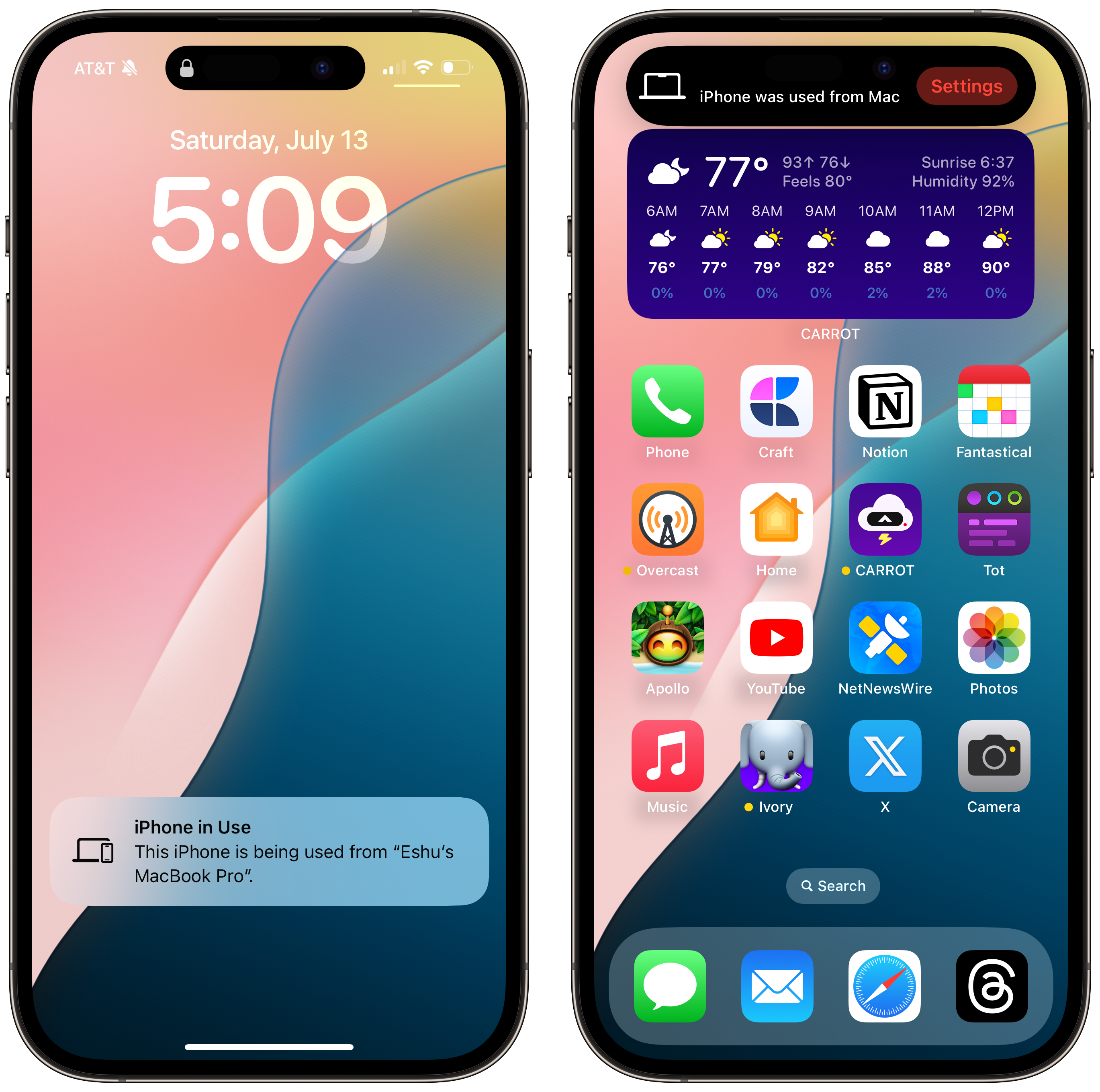 iPhone Mirroring notifications in iOS 18.
Interacting with iOS from a Mac is strange, and it doesn’t even feel like iOS apps on Apple silicon Macs. The closest analogue is Xcode’s iPhone simulator, even down to the size of the controls, though the device’s representation in macOS isn’t to scale; it’s smaller. The best way to use iOS on macOS is with a trackpad since most iOS developers don’t support keyboard shortcuts, so swiping between pages or clicking buttons feels more natural on a Mac laptop or Magic Trackpad. Scrolling requires two fingers and is inertial, just as it is on iOS, so it feels different from scrolling in a native Mac app. Clicking Return doesn’t submit most text fields or advance to the next page, and some apps, like X, don’t even open in iPhone Mirroring for some bizarre reason. The Mac’s keyboard is used for text input.
Otherwise, it mostly feels like connecting a mouse to an iPhone, which most people probably have never done, but I think it feels right after some adjustment. I believe iPhone Mirroring should be used for niche edge cases where it is best to use the iOS version of an app, like ordering an Uber, when pulling out a phone would otherwise be an unnecessary workflow distraction. Otherwise, I still think websites and iOS apps on Apple silicon Macs are a better, more polished experience; I wouldn’t use the Overcast app on the iPhone via iPhone Mirroring over the iPad version available in the Mac App Store, for instance.
This will easily be the most used and appreciated feature of macOS Sequoia, which, upon introspection, is somewhat of a melancholy statement. If developers made great Mac apps, as they should, there would be no need for this feature — but Apple realized that it couldn’t bet on every developer making a great desktop experience, so it invented a way to bring the iPhone to the Mac. Think about it: The iPhone was made to be an accessory to the Mac for on-the-go use, but so many companies have made a footing on the smartphone, so now the iPhone needs to be on the Mac for desktop computing to be as capable and practical. I’m unsure how I feel about the technology world becoming more mobile-focused, and I don’t think Apple does either, but for the best feature in macOS Sequoia to be literally the iPhone itself is an interesting and perhaps disappointing paradox.
If I had to bet, I think Apple conceived iPhone Mirroring right after Continuity Camera was introduced as part of macOS 13 Ventura in 2022. While an iPhone is used as a webcam, its notifications are rerouted to the Mac to which it is connected. iPhone Mirroring builds on that foundation and diverts all iPhone notifications for apps not installed or available on the Mac to authenticated computers. When an iPhone is connected, the Notifications pane in System Settings displays a section entitled “Mirror iPhone Notifications From,” where individual apps can be disallowed. Apps whose notifications are already turned off in iOS are disabled with a message that reads: “Mirroring disabled from your iPhone.” I’m happy this exists because, without it, notifications that would otherwise be too distracting would appear on my Mac.
Both notification rerouting and iPhone Mirroring aim to lower distraction on the Mac, and it works: I use my phone less, as indicated by my iPhone’s Screen Time charts3 for the past few weeks, and I’m able to quickly look at notifications without having to look down and authenticate with Face ID. This also addresses one of my biggest iOS pet peeves: using Face ID while the iPhone is on a desk. If facial recognition fails, the iPhone must be picked up and tapped again to retry Face ID, which is inconvenient when I’m working and already distracted by a most likely unimportant notification. I have always preferred Mac notifications to iOS ones because I can simply swipe them away; now I know that if a notification has come through on my iPhone and hasn’t appeared on the Mac, I can ignore it.
I rarely click into notifications unless they are text messages, but when clicked, notifications from iOS on the Mac automatically open the iPhone app they were sent from in a new iPhone Mirroring window. This system of notification management I have become accustomed to since iPhone Mirroring launched in the second iOS 18 and macOS Sequoia betas has been helpful, and I think many people will feel the same way. It is a perfect way of minimizing distractions and truly something only Apple could pull off. It is flawless — I have never had it fail, not even once — the frame rate is smooth, notifications are instant, and it has made me less reliant on my physical iPhone, allowing me to leave it in another room while I work elsewhere. It elegantly ties into the theme of this year’s OS releases: minor, appreciated by the few, sometimes meretricious, but mostly superb.
Passwords
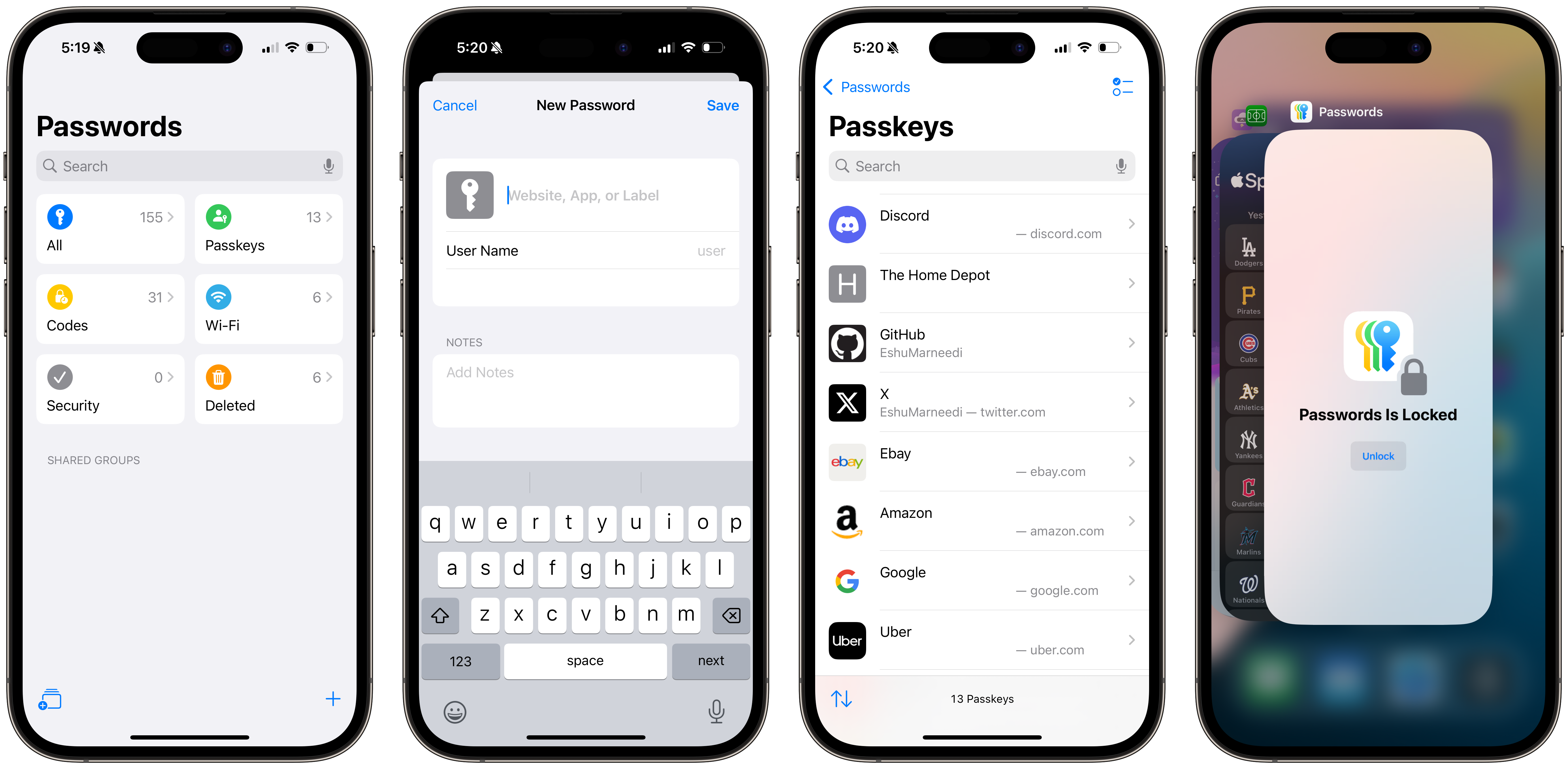
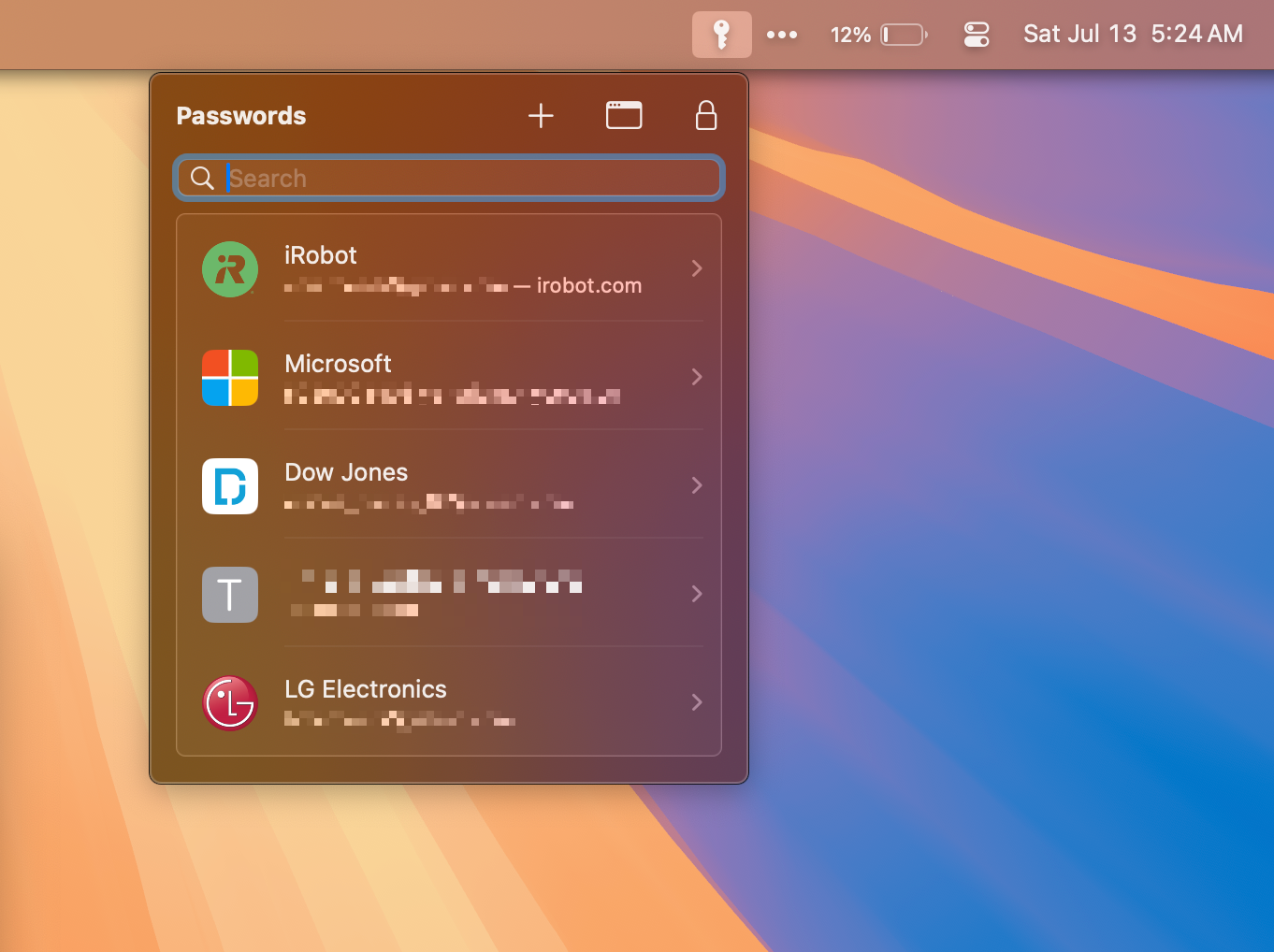
Usually, iCloud Keychain — Apple’s password manager — is a forgotten-about, taken-for-granted part of iOS and macOS, mostly because it has always been buried in Settings only to be used in Safari and supported Chromium-based browsers. Now, iCloud Keychain has its own app, aptly named Passwords, available on iOS, iPadOS, macOS, and visionOS. Functionally, it works the same as the pane in Settings, but it shows that Apple is serious about making the password manager on Apple platforms as good as possible. My biggest complaint with passwords in Settings was that it was always hard to find what I needed when I needed it the most, and the new Passwords app makes the experience more like third-party password managers, though made by Apple.
The Passwords app isn’t revolutionary, but no Apple service is; Apple caters to the bottom 80 percent, and power users can enjoy the versatile tools third parties make. I don’t think Apple “Sherlocked” any third-party password manager here — all it did was make its app more reliable and better for the people who use it, which is most iPhone users who use a password manager at all, already a minority. The new Passwords app adds login categorization, some basic sorting, and a menu bar applet on the Mac for easy access, which I’ve found quite handy after switching away from 1Password. It is an alright password manager and does what it needs to do acceptably, but I wish it were more fully featured and allowed for more customization.
For example, the Passwords app doesn’t add custom fields to items, which I would argue isn’t a power-user feature at all. There is only a Notes field for adding other information, such as alternative codes for two-factor authentication. And my biggest gripe now with Apple’s password manager entirely is that there isn’t an “emergency kit,” per se, so if someone loses access to all of their devices and Apple account, there isn’t a way for them to gain access to their password manager — both are intrinsically coupled. Third-party options, like the aforementioned 1Password, allow users to print an emergency kit they can store with other important documents so that if they lose access to their devices, they can still log into their password manager, and thus, all of their various accounts. With Apple’s password manager, the canonical “master password” is the Apple account password, and if someone can’t get into their Apple account, they’re also locked out of every one of their accounts. (This especially applies to those with Advanced Data Protection enabled.)
This is why, though I still recommend Apple’s password manager to almost everyone, I keep a backup of my passwords in 1Password and will continue to do this until Apple offers a better way to access passwords — and perhaps only passwords — without an Apple account password. I also recommend everyone enable Stolen Device Protection on iOS because it requires biometric authentication to gain access to the Passwords app; without this feature enabled, anyone with a device’s passcode can access Passwords since there isn’t a master password. Stolen Device Protection isn’t available on iPadOS, which is problematic, and perhaps Apple should consider allowing people to set a master password for the Passwords app, like the Notes app, where a device’s passcode isn’t the only option to lock notes.
The Passwords app itself is quite barebones, though now it is usable for people with large collections in a way the Settings pane wasn’t due to the lack of organization. Most people will still search for items, and six categories are also displayed in a grid in the sidebar for easy access: All, Passkeys, Codes, Wi-Fi, Security, and Deleted. This is helpful because finding passkeys is simpler now and security codes are all on one page, similar to third-party offerings. I wish Apple would allow people to create custom tags or folders, though, as well as pin favorite items for quick access at the top of the sidebar. Still, however, this is a welcome enhancement to the usability of Passwords — it is possible to find particular items now, whereas the version nestled in Settings was nearly impossible to use.
The Passwords app also finally allows for items without a website, which is helpful for computer passwords or other logins not on the web. Wi-Fi passwords stored in iCloud Keychain by Apple devices automatically are saved in the Wi-Fi section, finally coming to iOS after being confined to the arcane Keychain Access app in macOS for decades.
 The new Passwords app in iOS 18.
I have a few interface complaints with the Passwords app, and while not dealbreakers, they might make people reconsider switching from 1Password, which already has a terrible enough interface:
-
The app locks after a few seconds, even on the Mac, which is inconvenient when copying information between apps. It shouldn’t lock on iOS immediately after a user has switched to another app or lock on macOS at all unless the computer has been inactive. More bafflingly, it locks on visionOS, which is truly inscrutable; as if there is a security risk to exposed passwords on visionOS.
-
Since the app is built in SwiftUI — Apple’s newest cross-platform framework for programming user interfaces — text input fields in macOS are aligned right-to-left in left-to-right languages. This isn’t a quirk limited to the Passwords app, but it is the most irritating there, especially when manipulating case- and character-sensitive passwords: Normally, the text cursor moves to the right after every character beginning at the left because English is a left-to-right language. In Passwords and other SwiftUI apps, the text cursor stays at the right edge of the field and does not move rightward — instead, characters always appear to the left of the cursor. This is not how any English text field should operate, and it flummoxes me.
-
Options for creating new passwords are limited to normal strong passwords and ones without special characters, referring to the periodic dashes Apple adds to system-generated passwords. Automatically generated passwords never include other symbols, like punctuation, to make the password more complex — oftentimes, websites have requirements for these characters, and Passwords isn’t accommodating of them.
-
Passwords is very fastidious about when it auto-fills passwords on a website. For example, if the saved website for a login is set to the root domain of a website (
example.com), but the login page is a subdomain (login.example.com), it will not auto-fill the password; all domains must be added to the item in advance. If it is not added, Passwords will offer to add it automatically, but it will create a new item instead of adding the new domain to the existing item. (This might be a bug.)
Overall, despite my numerous niggles, I find the Passwords app to be much more workable and flexible than when it was limited to Settings, as well as a suitable replacement for 1Password. I still use the latter, but I have only opened the app a few times since June to keep passwords up to date, and I enjoy using the functional AutoFill in Safari and Chromium browsers with Apple’s Passwords app. I recommend it for most people, even if it is limited at times, and I think it is well overdue for Apple to pursue a standalone password application. It says a lot that I felt a whole section for Passwords was warranted in this year’s OS hands-on.
 The new Passwords menu bar applet in macOS 15 Sequoia.
macOS Productivity Updates
While Apple didn’t sherlock any password managers this year, it did sherlock window organizers and video background apps for macOS, two features people have been using for years but that Apple somehow hasn’t integrated into the system.
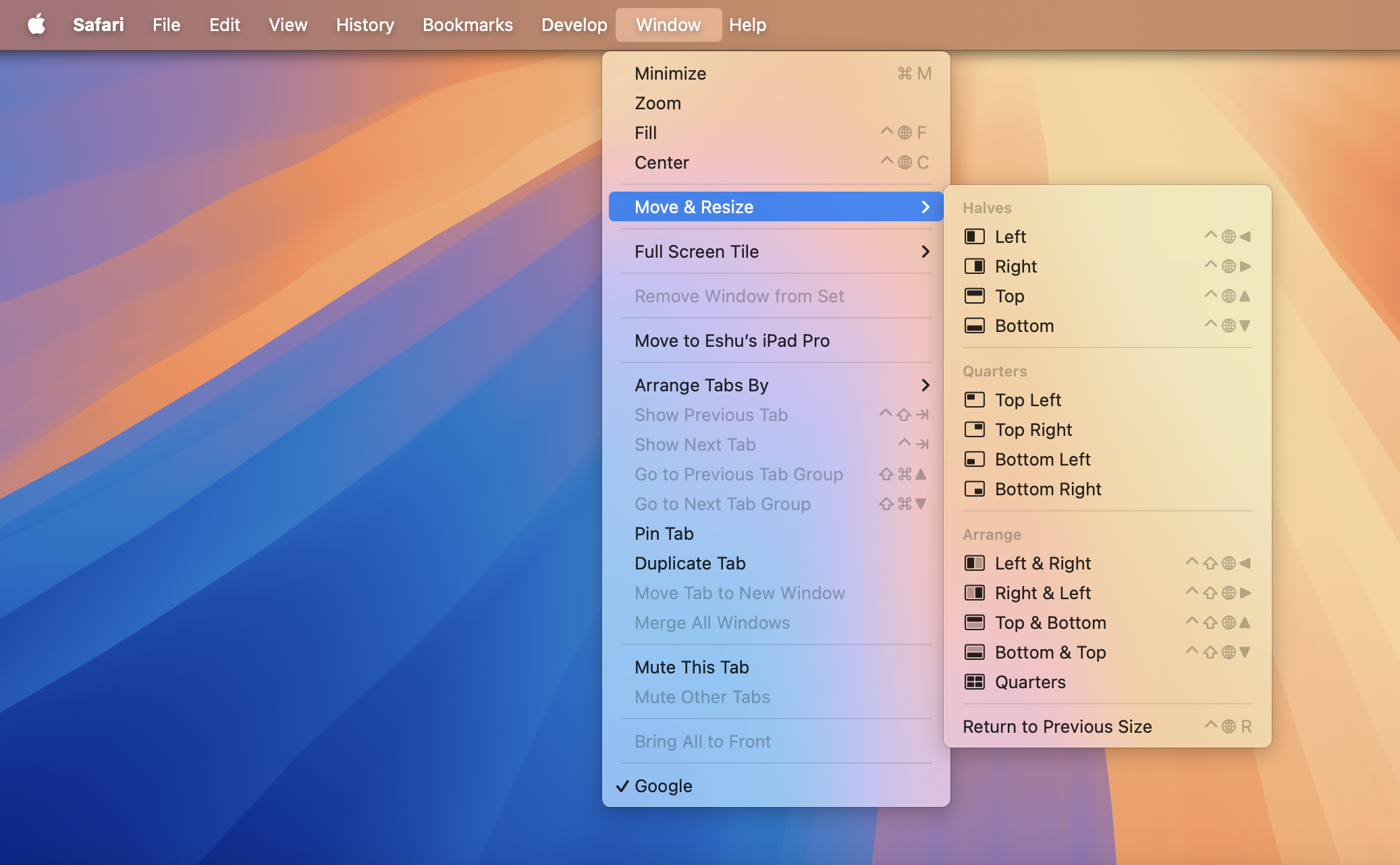
Window management on the Mac has historically been sub-par, or at least second-class to Windows, which has long had options for tiling windows to preset sizes and positions by clicking and dragging a window to the side of the display or using a host of keyboard shortcuts. On macOS, third-party apps like the free and open-source Rectangle and paid Magnet were required to reorganize windows this way, but Apple has now built this functionality into macOS Sequoia, ending a decades-long window management nightmare on the Mac.
macOS has enshrouded basic window management within the maximize button at the top left of windows since OS X 10.11 El Capitan; it must be clicked and held to reveal a context menu to go full-screen and tile a window to the left or right of the screen. But this method had compromises: the window would always be in full-screen, which hid the menu bar and dock and opened a separate space on the desktop. It was also limited to two windows which could only be split half and half, so this method was never preferred over third-party options. As a decades-long Mac user, I have never used the maximize button because I prefer to resize windows than go into full-screen mode, which is only useful for focused work sessions in one app. In macOS Sequoia, Apple has added window tiling — automatic resizing and repositioning of windows — into the maximize button context menu alongside split screen mode.
Clicking and holding on the button presents a few options: tiling to the left, right, top half, or bottom half. Additionally, there are four options to manipulate the chosen window and other windows in a space, like half and half, half and two quarters, or four quarters. These modes use the last focused windows in order, so if the current window is Safari and the second most recently focused one is Mail, the half-and-half mode would tile Safari to the left and Mail to the right of the screen. There is also an option to maximize the current window to the full size of the screen, which can also be done by clicking the window’s toolbar twice in any app. This suite of controls mimics but does not entirely replace Rectangle and Magnet’s, which also offer centering and more tiling options for more windows, but they’re overdue and good enough for a first attempt for the vast majority of users — sherlocking.
These commands are not only restricted to the maximize menu, which most seasoned Mac users don’t even bother using — they are also in the menu bar within the Window and Move & Resize menus. However, I’ve found them sometimes to be missing when an app has added custom items to the Window menu, such as BBEdit, which is why they are also accessible via keyboard shortcuts involving the Globe modifier, macOS’ new modifier key for window management available on newer Mac keyboards from late 2020 onward. Pressing Globe and Control and the correct arrow key will tile the window to the top, bottom, left, or right halves of the screen, while holding Globe, Shift, Control, and an arrow key will move the current and last most-recent windows to pre-defined tiled configurations. Quarter-tiling windows can only be toggled via the menu bar and maximize button; there is no keyboard shortcut, unlike Magnet and Rectangle.
 Options for window tiling in macOS 15 Sequoia.
Most people will choose the left and right tiled option in most cases, which is easy to access with a simple keyboard shortcut — or two to tile two windows. macOS also remembers the last window position when using the tiling shortcuts, so dragging the window out of its tiled spot on the screen will return it to its prior size. (The keyboard shortcut Globe-Control-R will also return the focused window to the last size and position.) When a window is tiled, it moves to the correct position with a graceful animation and leaves some space between the edge of the screen and the beginning of the window, though that can be disabled in System Settings, which I recommend to maximize screen real estate. Windows can also be dragged to the screen’s left, right, top, or bottom to be tiled automatically, just like Windows, which ought to be the most popular way of using this feature.
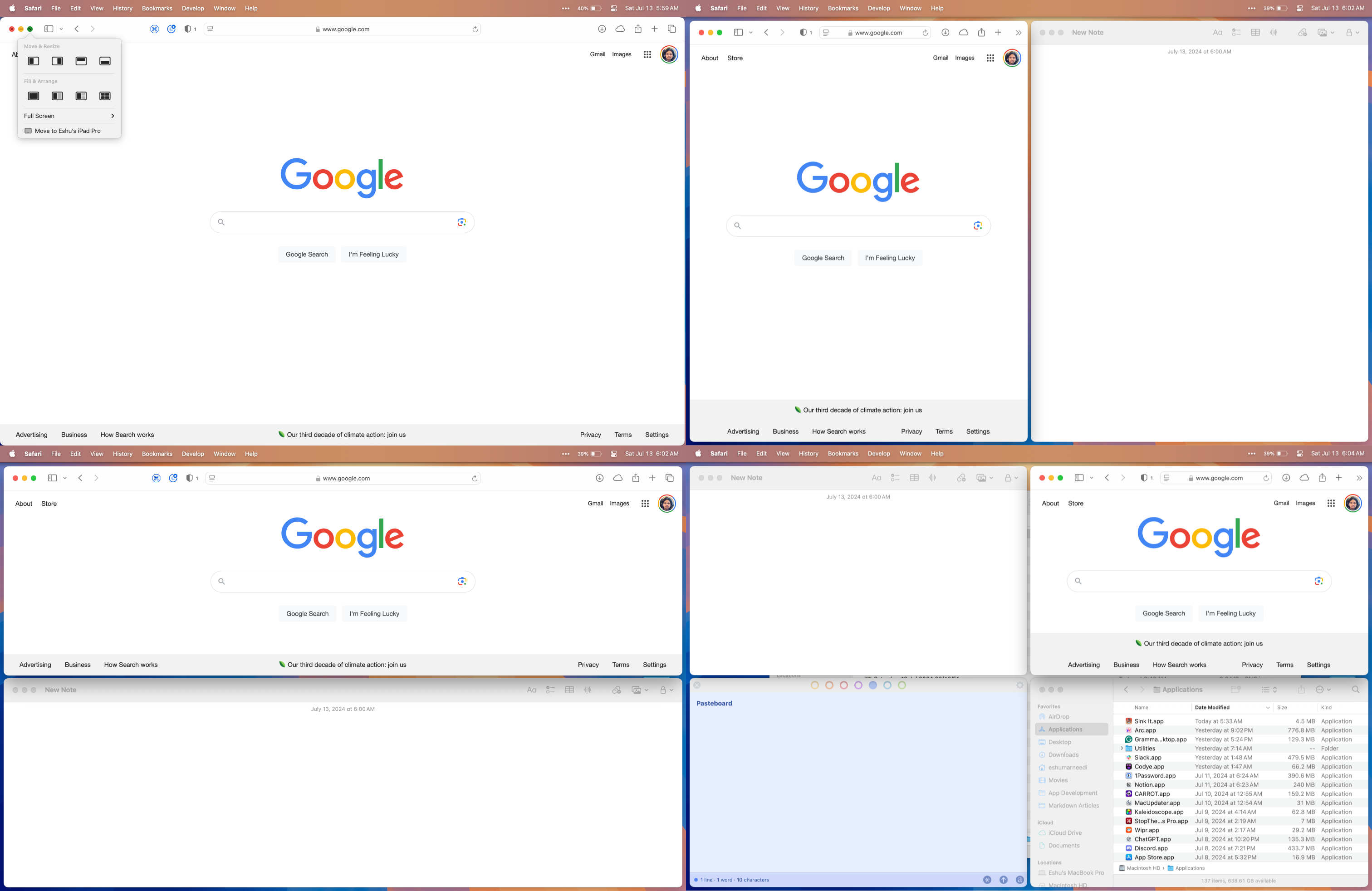 Window tiling in macOS 15 Sequoia.
It is quite comical that it took Apple so long to integrate basic window tiling into macOS, but, alas, it is finally here. I’m not going to switch away from Magnet because it still has more features, and I don’t think Apple’s offering will be sufficient for power users, but it certainly will slow sales for window management apps on the Mac App Store. File this one under the list of features people won’t really notice until they know about them, just like much of this year’s software improvements from WWDC. (I can’t wait for when Apple inevitably introduces this to Stage Manager on iPadOS in five years and the crowd goes wild.)
In a similar vein, Apple also outdid Zoom and Microsoft Teams by bringing virtual video backgrounds system-wide to every app that uses the camera in macOS. Apple is exercising the upper hand it gained with its work in Portrait Mode from macOS Ventura and presenter effects from macOS Sonoma by using the Neural Engines in Apple silicon Macs to separate people and objects from the background with decent accuracy — much better than Zoom — allowing people to set backgrounds for videoconferencing. The algorithm does struggle when wearing over-ear headphones in my testing, as well as in low-light conditions, but in well-lit rooms, it works well. It even works with complex backgrounds, such as against a bed’s headboard or in a busy room, and I think people should use it over Zoom’s offering. People can choose from various system offerings, such as the macOS 10.13 High Sierra wallpaper, pre-installed color gradients, or their own photos from the Photos app or Finder.
Backgrounds can also be combined with other video effects from previous versions of macOS, such as Studio Light, which changes the hue and contrast of the background and a subject’s face. I do, however, wish there were a green screen mode for better accuracy as I find the system to be a bit finicky with hair, exhibiting the typical fuzziness around the edges. But mostly, it works just like Portrait Mode, except instead of a blurred backdrop, it is replaced with an image. Curiously, Apple does not offer videos as backdrops, unlike Zoom, but I find those distracting anyway.
Building on presenter overlays from last year, macOS will also display a screen sharing preview in apps like FaceTime and Zoom from the menu bar. There, users will also be able to allow participants on a call to control the screen without the need to give the app accessibility permissions — the application programming interface, or API, introduced in macOS Sonoma for screen sharing sandboxes screen sharing so the system handles it — or change which window is broadcast. Screen sharing has always been arduous in macOS, and putting all controls in one menu is convenient.
Messages
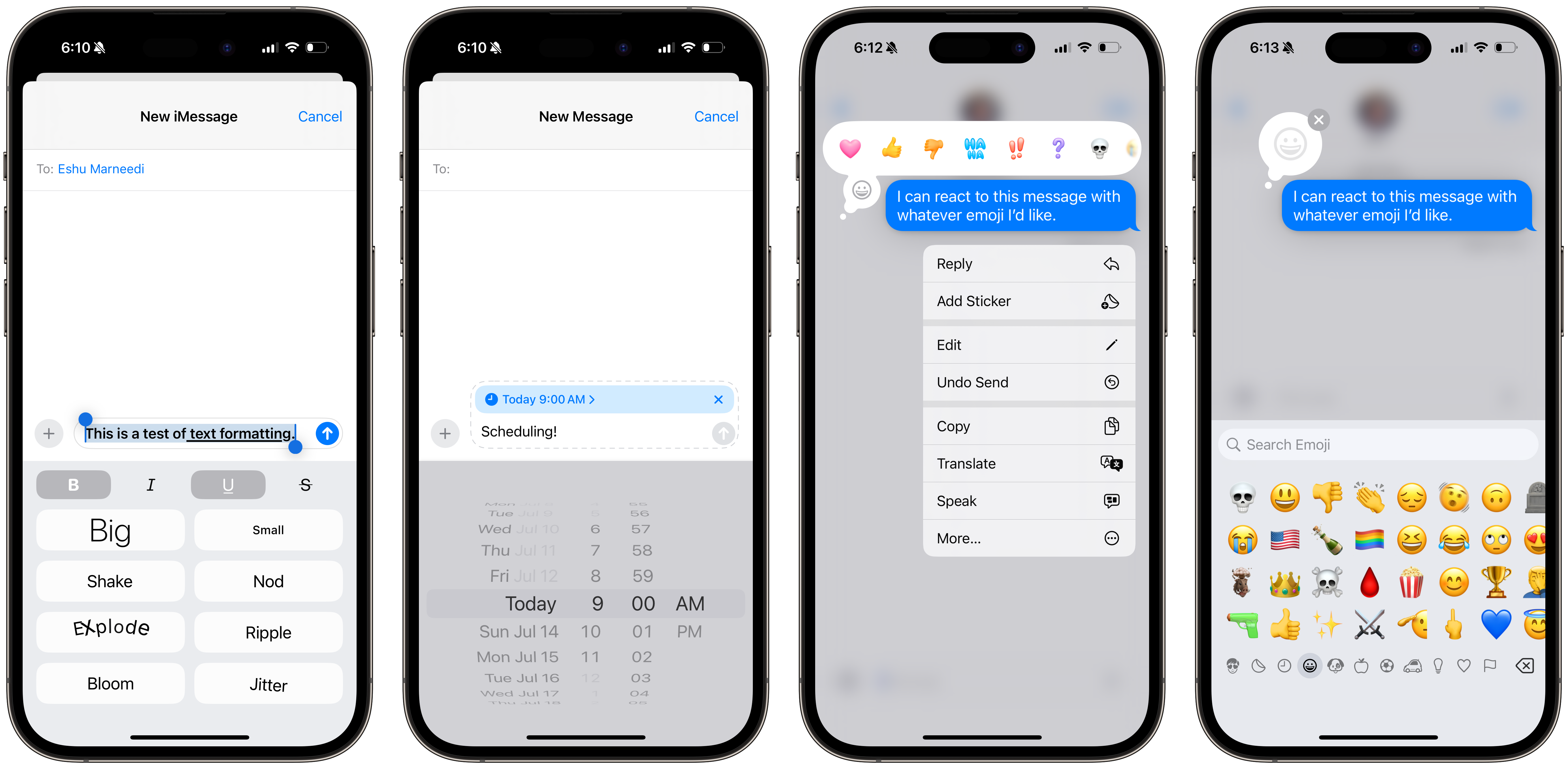
Aside from Image Playground and Genmoji, Messages received some subdued improvements on iOS, iPadOS, macOS, and visionOS that perfectly tie into this year’s WWDC keynote: minor, meretricious announcements. Apple added text formatting and emoji reactions to iMessage, so users can add bolded, italicized, struck through, or underlined text to their messages4, as well as Tapback to messages with any emoji — something the entire world has collectively been requesting for ages. iMessage effects can also be added to “any word, letter, phrase, or emoji,” according to the company, and the system will suggest them as a user types into the text field.
Connectivity-wise, Apple finally expanded satellite connectivity beyond Emergency SOS: People with iPhones 14 or later can send text messages without cellular or Wi-Fi service with select carriers by aligning their iPhones with satellites in Earth’s orbit via the same wizard used for Emergency SOS. I couldn’t try this feature because it doesn’t seem to be in beta yet, but there isn’t a limit to how many messages can be sent. This seems like a perfect opportunity for Apple to begin charging for satellite connectivity — or add it to iCloud+ — so it can remain free for emergencies, but for now, Apple has indicated that it will remain free for two years after the purchase of a new iPhone. I predict this will change by the end of the year — Apple should always keep the emergency service free, but it has the opportunity to turn off-the-grid niceties into paid features.
Text messages can now be scheduled to be sent in the future, a feature Android has had for years that has become a laughingstock. Send Later is a new module in the iMessage Apps drawer — see: last year’s commentary on the awkward design of this part of the Messages app — and when opened, a straightforward interface appears to set a date to send a message later. Multiple messages can be scheduled, too, even when the device is off or out of charge since they are uploaded to iCloud first. Night owls and early risers will appreciate this feature greatly, and it is massively belated.
 Updates to Messages in iOS 18.
But the most underrated, behindhand, and its-about-time feature is the introduction of Rich Communication Services on iOS. Finally, irrevocably, and decisively. RCS enables standard messaging features like read receipts, high-quality media, and Tapbacks to chats with Android devices, practically ending the iMessage-on-Android debate that has engulfed the technology industry since iMessage’s 2011 introduction. RCS is mostly functionally equivalent to iMessage, and while it is obvious that its introduction won’t spur any defections from iOS to Android, it will make iOS-to-Android chats more up to standard with 2024’s messaging requirements.
RCS threads are colored in green, just like SMS ones are, but they are indicated with an “RCS” label in the text message input field. They sync between devices like SMS messages do and work with satellite connectivity. Most carriers in the United States, like Verizon, AT&T, and T-Mobile, support RCS, and most smartphones running the latest version of Android do, too — though Google Voice doesn’t, for some puzzling reason. When someone contacts an Android user on iOS 18, the message thread will be automatically converted to RCS from SMS, allowing for inline Tapbacks — no more “[Contact] reacted with a thumbs-up” — full-resolution images and videos, voice messages, read receipts, and more. While it isn’t a one-to-one replica of iMessage’s feature suite — iMessage is still the preferred messaging standard, I would say — it comes near enough.
The largest omission feature-wise is end-to-end encryption: Like SMS messages, but unlike iMessage, RCS is not encrypted. Android-to-Android RCS communication is encrypted because Google, the maker of Android, has built a special Google-exclusive version of RCS with end-to-end encryption for use on its operating system. Google welcomed Apple to use the standard it built, but Apple refused for blatantly obvious reasons, opting to remain with the Global System for Mobile Communications Association’s open-source RCS standard, left without encryption. Apple, Google, and the GSMA have said that they are working together to build encryption into the public, non-Google version of the standard, but currently, RCS chats remain unsecure. This is easily the most important exclusion and differentiator between iMessage and RCS, and why using third-party apps, like WhatsApp, Telegram, or Signal, continues to be the best method of cross-platform messaging.
But in the United States, as I have written about and bemoaned many times, people use the default messaging service pre-installed on their device, whether it be Google Messages or Apple Messages, not a third-party offering. This is the closest the United States will ever get to true cross-platform messaging, and it is already maddening enough that it took this long for Apple to adopt it. RCS is a plainly better user experience than SMS: chats feel more like iMessage, group messages feel more like iPhone-exclusive ones did, and the world is one step closer to global messaging harmony. RCS sounds like a nice trinket, but it is truly a monumental leap toward a synchronized text messaging ecosystem. It won’t stop the classist bullying epidemic in America’s high schools, nor is it more secure, but it is a good first step and one of the biggest features of iOS 18.
No, it won’t stop the bickering amongst so-called technology “enthusiasts,” but it negates the need for iMessage on Android. When encryption comes to RCS, it will be even better and more secure, but for now, this is the best cross-platform messaging the United States will ever realistically see — and I am content with it. It also has the side benefit — and perhaps the main benefit for Apple — of expelling regulatory scrutiny and is something Apple can point to when it argues its case against the Justice Department, which has sued Apple for “intentionally” making cross-platform messaging impossible on iOS, a point I have described as moot due to the thousands of texting apps on the App Store. It is a win for consumers, a win for regulators, and even a boon in a backhanded way for Apple. Now, please, no more belaboring this point.
visionOS ‘2’
I will be frank: Five months later, I still do not think of visionOS as a major Apple software platform alongside iOS, iPadOS, macOS, and watchOS; I feel it is more akin to tvOS, wherein it exists but doesn’t receive the attention Apple’s flagship operating systems do. App support is scant, the first version is buggy and slow, and it still feels unintuitive. But the biggest problem thus far with Apple Vision Pro is that there isn’t much to do on it, whether content, apps, or productivity. visionOS isn’t a computing platform like macOS due to its iPadOS base; it isn’t as comfortable or sharable as a television, not to mention the significant lack of Apple Vision Pro-exclusive films and immersive videos; and the remaining apps are fun to toy with but aren’t substantiative in value.
Long-time readers will recall I promised a review of Apple Vision Pro and visionOS after my second impressions from February, but that never materialized struggled to write anything positive about the device, and I don’t use it often enough to be able to compose a review because there isn’t a compelling reason to go to the effort to put it on. Every one of my complaints stems from the price — developers have no interest in making great apps for visionOS due to the lack of adoption — and comfort, two factors tied to the hardware, not visionOS, so it is quite difficult to be able to assess the state of visionOS currently.
This year’s visionOS update is visionOS 2, which seems odd at first glance since the product just launched, but I think it is sensible because the software development kit was launched last year. I will be upfront: I had high expectations for visionOS 2 because it should address every major complaint I have had with the software, but to say Apple fell short of these hopes would be an understatement.
visionOS 2 feels more like visionOS 1.2 because it does address some bugs but doesn’t hasten feature parity between visionOS and iOS. There are still plenty of features available on Apple’s more mature platforms and it is unacceptable Apple hasn’t been able to add them to the second generation of its newest OS. visionOS 2 is a smoother, more refined version of the current visionOS 1, but it is not a second pass at visionOS as I had presumed it would be — it is far from it. It doesn’t even add things that should have shipped with the first version of visionOS, like native Calendar or Reminders apps, which still run as unmodified iPad versions in Compatibility Mode. Nothing Apple introduced in visionOS 2 is compelling enough to inspire potential customers to purchase an Apple Vision Pro.
If it seems harsh I am grading the second version of a $3,500 virtual reality headset’s software on the premise that it should inspire new sales, hearken back to this: iPhone OS 2 brought the App Store to the iPhone. That was how monumental the second generation of iOS was, and Apple’s newest product doesn’t even have a Calendar. This is laughably embarrassing: I was willing to give Apple the benefit of the doubt for the first few months thinking that it would address in June users’ myriad gripes with visionOS, but it didn’t. Instead, it is already regarding visionOS as a mature platform, adding minor knickknacks here and there when it desperately begs for major features. Truth be told, there are gaping holes in visionOS’ software ecosystem being willfully ignored by Apple in pursuit of maturity. Platform maturation happens naturally and cannot be forced, and Apple seems to either be oblivious to this concept or is purposely employing a different strategy for the development of this device.
For every feature visionOS 2 adds, there are zillions of grievances Apple didn’t address. For example: Spawning the Home View, Control Center, or Notification Center no longer requires reaching up to the Digital Crown on the physical device — it is replaced with a hand gesture, performed by glancing at a hand, flipping it over palm-up, and tapping to open the Home View or flipping it back down again for Control Center. The gesture is incredibly fluid and fun, but Notification Center is still useless at displaying notifications properly, opting to lay them out horizontally in oddly organized stacks in an unusual departure from iOS. The Home View can now be reorganized, but it is onerous and requires staring at an app icon and holding it in mid-air to drag it to a different page, which is even more cumbersome than iOS. And, of course, many of Apple’s apps are still left unchanged in Compatibility Mode, though iPad apps are no longer restricted to the Compatible Apps folder and dark mode can be enabled system-wide for non-optimized apps.
visionOS lacks an app library, nor is there a way to quickly access Spotlight as on the Mac and iPhone to search for apps. Neither is there an App Switcher or App Exposé mode to view currently open apps, which is exacerbated by the fact that closing an app, much like macOS, only hides it from view and does not quit it. But unlike macOS, there isn’t a way to temporarily hide or minimize windows, so to momentarily remove one from view, it must be repositioned out of view, such as to the side or ceiling. When a keyboard is attached, Command-Tab does not cycle between windows, and oftentimes, windows will appear atop each other so moving back to a window that has been occluded requires repositioning the frontmost window and bringing the old window back so it can be seen. App Exposé feels like such a godsend after using visionOS for more than five minutes.
Mac Virtual Display now gets an ultra-wide display mode, supposedly coming later this year, which Apple says is the equivalent of two 4K displays side-by-side. Yet there isn’t a way to bring macOS windows into visionOS as if they were Mac apps floating in a visionOS Environment, which is inconvenient. Also, looking at a Mac laptop while in visionOS still doesn’t reliably show the Connect button — the best and most dependable way to open Mac Virtual Display is by going to Control Center on macOS, and then choosing to mirror the screen to Apple Vision Pro via the Screen Mirroring menu.
A new Bora Bora Environment has been added to visionOS, but one is still marked as “coming soon,” which really just cheapens the interface — I would prefer it be removed until the new Environment ships. When in an Environment, Mac laptops and Magic Keyboards are purportedly visible when in an Environment, but the feature rarely functions for me, though that hiccup could be a beta bug. I also don’t understand why Apple could only build an image recognition algorithm for its keyboards; it seems to me like it wouldn’t be that difficult to train a model on what a generic, English-language QUERTY keyboard looks like. When it does work, it is not like hand passthrough in visionOS, but rather, a portal to the outside world with soft, hazy edges is shown where the keyboard is positioned, a design choice I think is preferred in low light.
None of these features are particularly revolutionary or fix visionOS’ shortcomings — instead, they reek of Apple egotistically believing visionOS is already mature enough to take the iOS approach to its development, which is to say, sprinkle minor refinements throughout the OS so much not to offend anyone currently satisfied with the system. That approach works well on a user base of one billion people, but Apple Vision Pro only services less than 100,000 power users wealthy enough to spend thousands of dollars on a first-generation product. If Apple can fundamentally rethink visionOS’ windowing system, it should, because early adopters will put up with it no matter what. Apple needs to bring its most scrappy, forward-thinking engineers and managers to the Vision Products Group — the team at Apple responsible for Apple Vision Pro — who are ready to innovate and make changes even if they don’t stick long-term because that mentality has historically always made Apple products best-in-class.
Apple is not Meta, and I don’t expect it to “move fast and break things,” and I believe its company culture embraces design purity and maturation — two qualities which have also equally made the company successful. But as Steve Jobs, Apple’s late founder, insisted on having complete control over the iPhone’s app environment when it first launched, he also succumbed to Phil Schiller, the marketing chief at the time who said an App Store would be a good idea and allow Apple to make money and still exercise control over the developer ecosystem unlike the Mac. Jobs’ change of heart happened in just a year, whereas the same company 15 years later is unable to be so flexible in its design, presumably because its leadership holds a preoccupied notion that it is correct all of the time.
People who have interviewed Tim Cook, Apple’s chief executive, about Apple Vision Pro and how consumers use it have always received a rehearsed and rehashed answer: We think people love it, developers are building for it, and enterprise customers are buying tons of units. Apple never admits fault publicly, but it also doesn’t privately, so much so that it is letting its new star product fall apart in the market because it is treating visionOS akin to iOS rather than a new platform altogether. Apple has had a year to address feedback, both from within the company amongst staff and externally, but it hasn’t even bothered to optimize its own apps for its platform. Why would developers build for this device if Apple itself doesn’t express interest in doing so either? Apple’s lethargy affects the whole visionOS ecosystem.
The problem isn’t a lack of capability or understanding, but misplaced priorities. I can’t deny Apple has added some personal, groundbreaking features to visionOS, like the new Spatialize Photo function, which allows users to add 3D depth effects to any photo in their photo library — not only ones taken with a new iPhone, which is impressive. This is not an Apple Intelligence feature, but it works remarkably well with most pictures, especially those taken of nearby subjects — and the effect is even more emotionally profound the older the photo, where it almost feels like reliving the moment the image was captured.
The Neural Engine in Apple Vision Pro’s M2 processor perceives the location of a subject and interprets it to give it depth when looking at it stereoscopically, and the result is a portal-like depth map added to any photo taken with any camera, similar to Spatial Videos. I have tried spatializing hundreds of images by now, and in most cases, the system does a great job — I only noticed it tripped up on some images where the subject and background were less clear to differentiate, and I think this is the new best way to revisit photography, period.
Entertainment-wise, Safari will detect videos on websites like YouTube and Netflix to open them in a native visionOS video player for full-screen expansion as if they were played in a custom-built app, relieving some pressure for the app market to adopt Apple Vision Pro. Websites that support WebXR, the industry standard for displaying 3D immersive web content, are also displayed properly, so 360- and 180-degree videos from many places on the web will play in Apple’s immersive video player. WebXR support in Safari was previously a developer option in visionOS 1, but it has now been polished and works great, even for websites that require motion data and hand tracking to perform properly.
Other improvements can be summarized in some mundane bullet points:
-
Mice are now supported across visionOS, including third-party ones. I have never understood what functional difference between mice and trackpads prevented them from working in visionOS 1, but I am glad both work now in visionOS 2.
-
Guest User will now remember the last user’s eye and hand data, though there is still no proper multiuser support like macOS. visionOS only remembers the most recent user’s data, so more than one guest cannot have their details saved on one Apple Vision Pro. I guess this is acceptable, albeit less flexible than I had wished, but what I truly want is the ability to preview content locked via digital rights management on an AirPlay device when Guest User is enabled. Currently, if Apple Vision Pro is mirrored to an external device via AirPlay, DRM content isn’t displayed in visionOS; it must be disconnected, which is inconvenient when trying to walk a family member through how to watch immersive content.
-
Travel Mode now works on trains. Great, I guess.
-
Content from iOS can now be mirrored to Apple Vision Pro as if it were an Apple TV, a good feature for apps that aren’t available natively on visionOS and whose websites are lackluster or nonexistent. Content cast via AirPlay opens in a visionOS-native video player.
-
Swiping between Home View pages is much smoother thanks to a faster frame rate, making the entire visionOS experience more enjoyable. This is by far one of the most noticeable yet deviously subtle improvements in visionOS 2.
None of what Apple announced in visionOS 2 is bad, it just fails to meet the high standard Apple has set for this product. visionOS needs a fundamental rethinking before it will ever reach mass market adoption, and Apple has failed to develop the platform in a way that appeals to a broader audience or developers, two markets Apple Vision Pro pressingly needs attention from. Windowing is a mess, there isn’t enough subsidized content tailor-made for the device, and Apple’s favorability amongst developers is at a record low due to its shenanigans on the App Store and in the European Union. When the iPhone was announced, it was developers who were itching to gain access to it to market themselves — but now, Apple needs third-parties’ help and isn’t doing a good job of garnering it.
That social problem can’t be addressed with a software update, but what it can do is give people more uses for the product from Apple to encourage developers to support it reluctantly. It can make Apple Vision Pro more useful for productivity by making visionOS more like the Mac; adding hand controller support to enable 3D, immersive games like “Beat Saber”; and developing innovative ways of using the device that other Apple products can’t match. Right now, Apple Vision Pro feels like an iPad floating in space even though its hardware is loads more complex and enables it to do so many more things. Comfort and usability are hardware problems that can’t be addressed in the technology’s current state, but software can and should — the answer to how can be found in the annals of Apple’s most successful products. Until Apple nails visionOS, Apple Vision Pro will continue to be a limping half-success, half-failure. visionOS 2 is not enough.
Miscellaneous
This year’s OS hands-on has been organized by app rather than platform, so I wasn’t able to add miscellaneous features that don’t fit in a certain category at the end as I usually do. Here are some small quality-of-life changes bestrewn throughout the operating systems.
-
Safari Highlights will “automatically detect relevant information” on a website, such as addresses and telephone numbers, which is helpful for hotels or restaurants whose information is usually placed in the footer. I have thoroughly been enjoying this feature.
- In the nature of visionOS, Safari on macOS will detect videos on certain sites to expand them into a large, native video player, similar to Reader but for videos.
-
The Maps app now has topographic hiking and trail maps that can be downloaded for offline access. Custom routes can also be created and downloaded, adding AllTrails to the list of sherlocked apps this year at WWDC.
-
Game Mode comes to iOS and iPadOS for increased performance while playing mobile video games, lowering Bluetooth latency for controllers and AirPods and increasing frame rates. This feature was introduced to macOS last year.
-
Tap to Cash in the Wallet app for iOS builds on NameDrop from last year to allow the ability to exchange money between two iPhones with ultra-wideband chips (U1 and U2; iPhone 11 and newer) by simply tapping them together. Tap to Cash must be enabled for every session in Wallet or Control Center first, so there isn’t a risk of accidents.
- Event tickets will now show venue information like restaurants, merchandise, and seating charts for supported arenas.
-
Second-generation AirPods Pro can now recognize head gestures, like shakes or nods, to speak with Siri. For example, if Siri asks for confirmation, a simple nod will affirm the action. This is available on all Apple platforms so long as the AirPods are on the latest version of their software.
- The newest AirPods Pro also gain support for Voice Isolation to silence background noise.
-
The Journal app for iOS finally receives a search bar, but there still aren’t versions for iPadOS and macOS, two operating systems where a writing app would be the most useful. Relatedly, there is no Apple Sports app for iPadOS or Apple Music Classical for macOS.
-
InSight is a new feature similar to Amazon Prime Video’s X-Ray which displays actors and music currently on-screen in an Apple TV+ show. It also visualizes this information on iOS via a Live Activity. I am curious how this operates: Did Apple manually sift through each scene of every single Apple TV+ program and manually label actors, or is a machine learning model analyzing each frame in real time? (I presume it is the former since InSight does not work with non-Apple TV+ programming.)
- When something is playing on a nearby Apple TV logged into the same Apple account as an iPhone, the show will be displayed on the Lock Screen via the same Live Activity on iOS. It can be swiped away, but I haven’t found a way to disable it automatically appearing.
-
Similar to photos, users can now restrict a third-party app’s access to contacts by choosing only a few people. Developers do not have to adopt a new API for this; when an app requests access to contacts, users can choose to allow access to all or a select group.
-
Apps that connect to Bluetooth devices can use a new API to connect to only that app’s peripheral without needing to be granted local network permissions. When an app is given access to the local network, it is given data about every client connected to the network even when it is unnecessary, and this new Bluetooth pairing process attempts to alleviate that. It also assuages regulatory concerns by providing any company with an AirPods-like pairing sheet and intuitive setup flow.
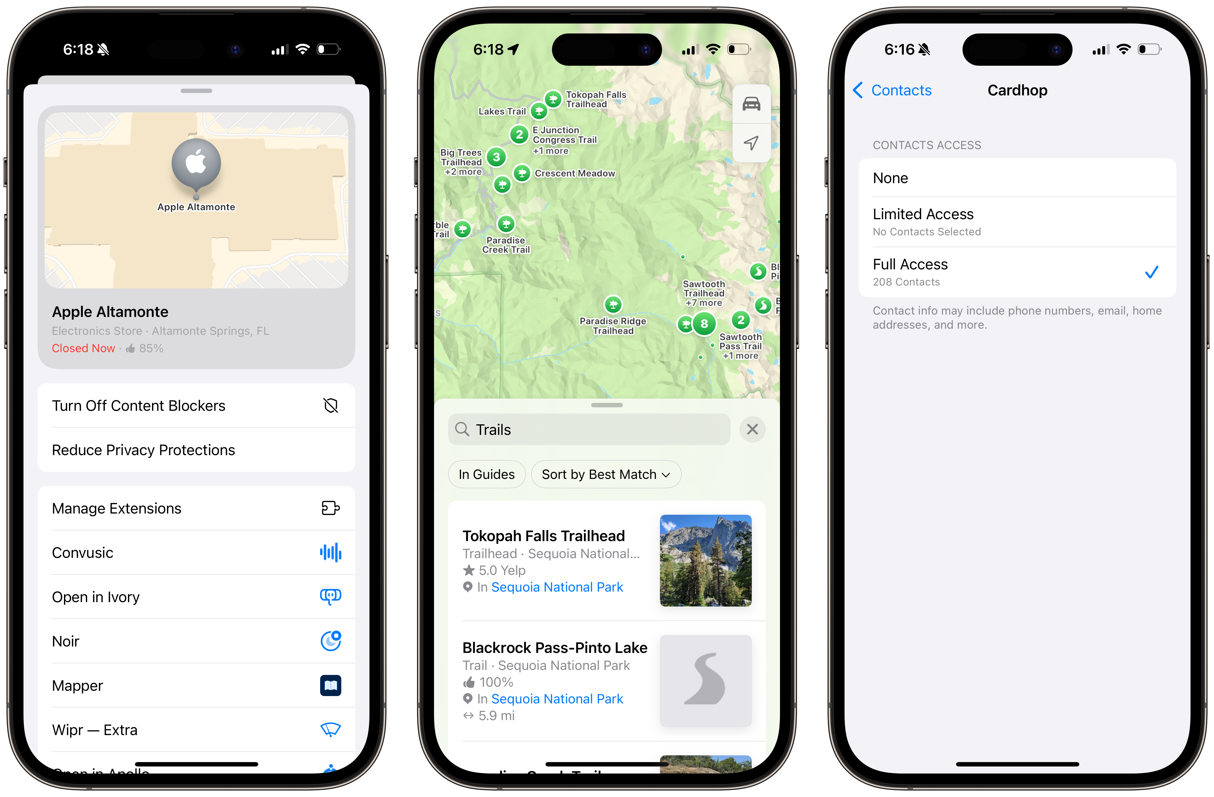 Safari Highlights, hiking in Maps, and updates to contact sharing.
My lede for this piece, over 15,000 words ago, was that Apple failed to bring a “wow” feature to any of its operating systems this year since it funneled its efforts into sculpting Apple Intelligence, a trade-off I think is justifiable knowing the stakes financially for the company. But that makes for a rather boring series of operating systems this year, so much so that I, a few weeks into using the betas on all my devices, sometimes forget I am using the next generation of Apple software. Last year was the closest Apple has gotten to a rerun of OS X 10.6 Snow Leopard — a small, marginally improved yet refined version of each operating system — but this year’s releases introduce plenty of bugs with few noticeable changes.
Again, I am not complaining for the sake of it, and neither am I ardently dissatisfied with iOS 18 or macOS Sequoia, but Apple could’ve done more. After reading thousands of words about every minute detail Apple modified, it might not seem like it, but for the broad public, it is just another version of iOS. It’s a departure from the Apple of the past four years — meretricious and minor for just another year. I’m already excited to see what Apple has in store next year at WWDC, and I’m even more excited to try Apple Intelligence when it partially ships later this year and fully in January 2025.
An update was made on July 23, 2024, at 6:32 p.m.: iPhone Mirroring, as of macOS 15 Sequoia Beta 4, now allows users to enlarge the iPhone window. This article has been updated to reflect that change.
-
The new Flashlight toggle in Control Center for iPhones with the Dynamic Island is extraordinarily overzealous, almost to the point where it feels like an intern spent tens of hours on it as a hobby side project. Tapping on it no longer displays a simple view of brightness levels — it shows a chromatic representation of a flashlight from the Dynamic Island with two axes that can be dragged to modify intensity and beam width respectively. Swiping up and down changes brightness, and swiping left to right focuses the light inward or outward. I have no idea how Apple did this, but the user experience is gorgeous. ↩︎
-
Apple IDs are now “Apple accounts” as of iOS 18 and macOS Sequoia. I like the new name and think it makes more sense, though most people I assume will continue to refer to these accounts as “Apple IDs.” ↩︎
-
Interestingly, no matter how long iPhone Mirroring is used for, it is not counted in iOS’ Screen Time breakdown, but rather the client Mac’s. This is well thought out because the iPhone’s physical screen isn’t powered on while iPhone Mirroring is activated, but it is being used on the Mac as if it were just another application. ↩︎
-
My lobbying continues for every text field on the internet to have Markdown support, but alas, Messages only supports what-you-see-is-what-you-get, or WYSIWYG, formatting. To format a message, the text must be selected and a formatting option must be chosen in the standard iOS or macOS context menu. ↩︎