
Hands-on With iOS 26, iPadOS 26, and macOS 26 Tahoe
Whimsy, excitement, and hope return to Apple’s software
 Image: Apple.
Before the Worldwide Developers Conference this year, I felt listless about the state of Apple software. iOS 18 turned out to be one of the buggiest releases in modern iOS history, the company’s relationship with developers and regulators around the globe is effectively nonexistent, and Apple Intelligence is an abysmal failure. None of that is any different after June’s conference: Apple is still in murky regulatory waters, Apple Intelligence is nowhere near feature-complete, and developers seem less than enthusiastic about working for Apple. But Apple’s latest operating systems have birthed a new era of optimism, one where the company feels respected and ahead again.
The new software — named iOS 26, iPadOS 26, and macOS 26 in a new, year-based unified naming scheme — capitalizes on shiny object syndrome, but I mean that positively. People often begrudge software redesigns because they’re largely unnecessary, but that view is limited; software design is akin to fashion or interior design — trends change, and new updates are important to excite people. Appealing to aesthetics is important because it keeps things interesting and fresh, giving a sense of modernity and progressiveness. The optics of software play just as important a part in development as pure features because design is a feature. Apple realizes this right on cue, as usual: While I soured on the prospect of the redesign when it was rumored earlier this year, the new Liquid Glass paradigm reignited my love for Apple in a way I had only felt since the Apple silicon transition a few years ago. This is where this company excels.
These new operating systems are light on feature updates, and I would like to think that’s intentional. Part of last year’s drama was that Apple pushed too hard on technologies, and as I’ve said ad nauseam, Apple isn’t as much of a technology company as it is one that ships experiences. When Steve Jobs marketed the iPod, he presented it as “1,000 songs in your pocket.” Perhaps the click wheel and stainless steel design were iconic and propelled the MP3 player market, but MP3 players existed long before the iPod. The experience of loading legally acquired iTunes songs onto an iPod and taking them wherever you wanted was something special — something only Apple could do. The relative jank of pirating music and loading it onto some cheap plastic black box was in direct opposition to the iPod. The iPod won that race because Apple does experiences so well.
This year, for my OS hands-on, I focused on the experience of using Apple software after a while of covering pure functionality. There’s still a lot to write up, of course, but it’s less than in previous years. Instead of belaboring that point in my preamble, as I’m prone to sometimes, I think it’s more valuable to focus on what Apple did make and why it’s important. And that is the key this year: Liquid Glass is important. The new operating systems aren’t less buggy than last year’s, nor are they more feature-packed, but they mark a new chapter in Apple’s design history that I’m confident will extend to the rest of the software world, much like how Apple reinvented software design 12 years ago with iOS 7. Importantly, I want to minimize the time I spend discussing 12-year-old software, largely because it’s irrelevant. Apple is a significantly different company than it was over a decade ago, and the developer ecosystem has changed with it. iOS 26 isn’t iOS 7 — it’s not as radical or as new. It’s the same operating system we know and love, but with a few twists here and there that make it such a joy to use.
I’ve spent the last month using Apple’s latest operating systems, and I’ve consolidated my thoughts into what I hope makes for an astute analysis of Apple’s work this year and how it may be construed when it all ships this fall.
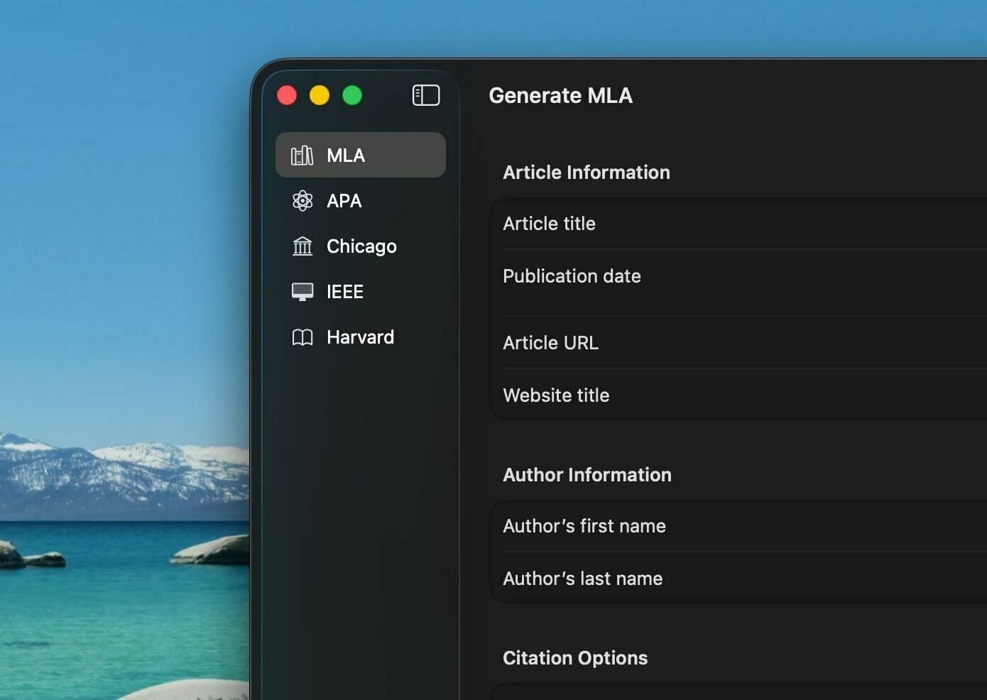
Liquid Glass
When I was organizing my thoughts this year, post-WWDC, and thinking about how I would structure my hands-on impressions, I knew I had to put Liquid Glass into its own category, even though it differs so greatly between the iPhone, iPad, and Mac. Truthfully, I think it looks miles better on touch devices than on the Mac, not because I don’t think the two were given equal priority, but because of how Liquid Glass influences interactions throughout the platforms. Liquid Glass is more than just a design paradigm — it reimagines how each gesture feels on billions of Apple devices. To really grok the Liquid Glass aesthetic, you have to live with it and understand what Apple was going for here: It’s not visionOS, and I don’t think the two are even that similar. It’s a new way of thinking about flat, 2D design.
Before iOS 7, Apple software was modeled after physical objects: microphones, notepads, wooden shelves, pool tables, etc., iOS 7 stripped away that styling for a digital-first design, now characterized as a “flat” user interface. When the Mac and graphical user interfaces were first introduced, there needed to be some parallel to objects people could relate to so they could intuit how to use their computers. There were entirely new concepts, like the internet and command lines, but folders, applications, the desktop, the Dock, and the menu bar all have their roots in physical spaces and objects. As software became more complicated and warranted actual design work, it was natural for it to model the real world to embrace this familiarity. As an example, the Voice Memos app had a microphone front and center because it had to be familiar.
Liquid Glass goes one step further than iOS 7. Instead of moving away from physical models, it transitions into a world where complex UI can be digital-native — in other words, where the whimsy comes not from modeling real-world objects but from creating something that could never exist in the physical world. Liquid Glass, by Apple’s own admission, embraces the power of the computers we carry around in our pockets: they can render hundreds of shaders and reflections in real-time in a way the real world cannot. This is what makes it so different from visionOS: While visionOS tries to blend software with the physical world, Liquid Glass embraces being segmented into a screen far away from physicality. It’s almost like a video game.
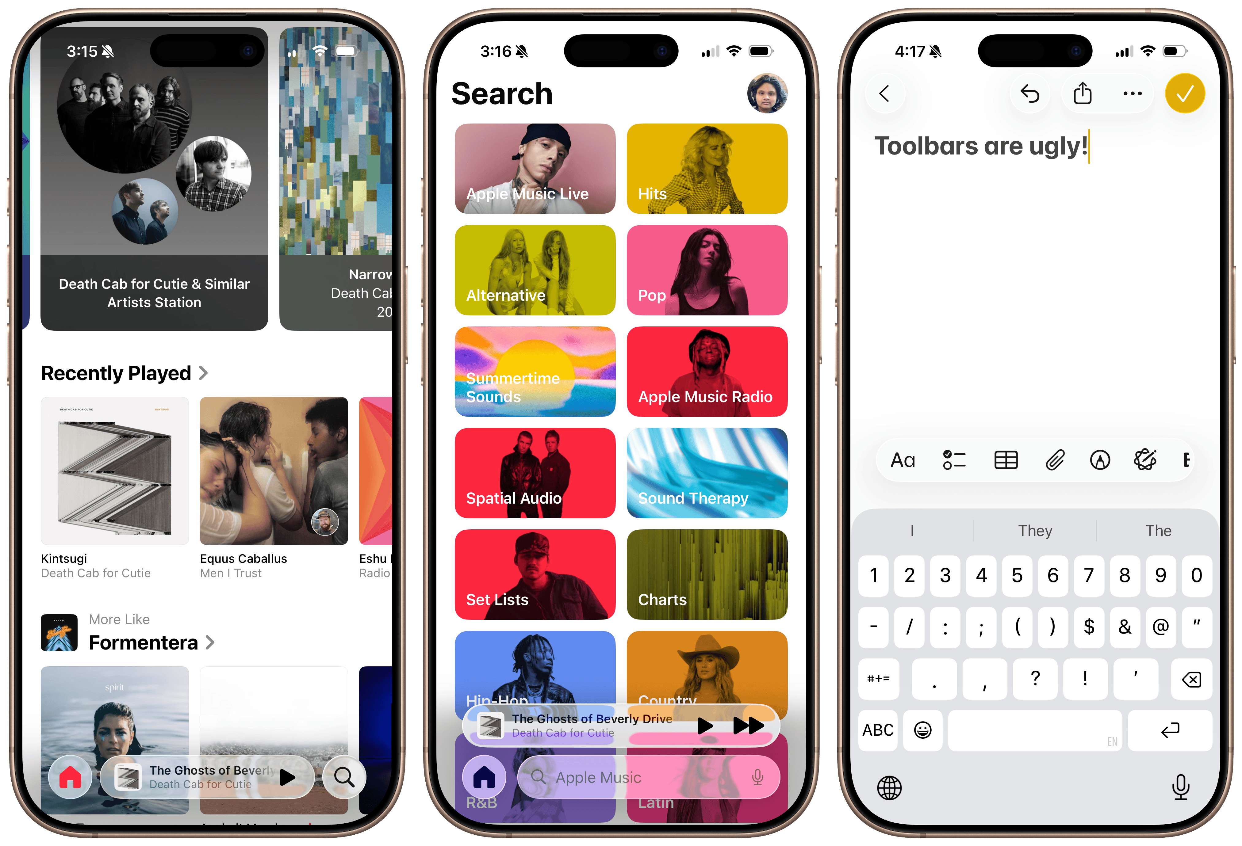
Every element in iOS, iPadOS, and macOS 26 this year has been touched to usher in rounded corners, more padding, and the gorgeous Liquid Glass material. The use of transparency isn’t meant to guide your eye into the real world — it’s used to draw attention to virtual elements, almost like a new take on accent colors. The most prominent example of this is the Now Playing bar in the Music app in iOS 26: it draws attention to its controls but allows album artwork to peer through not as a means of hiding away, but to integrate with the content. People have begrudged this because they feel it distracts from the content — and in some places, I agree — but I think it enhances the prominence of controls. iOS feels more cohesive, almost like it all concurs with itself.
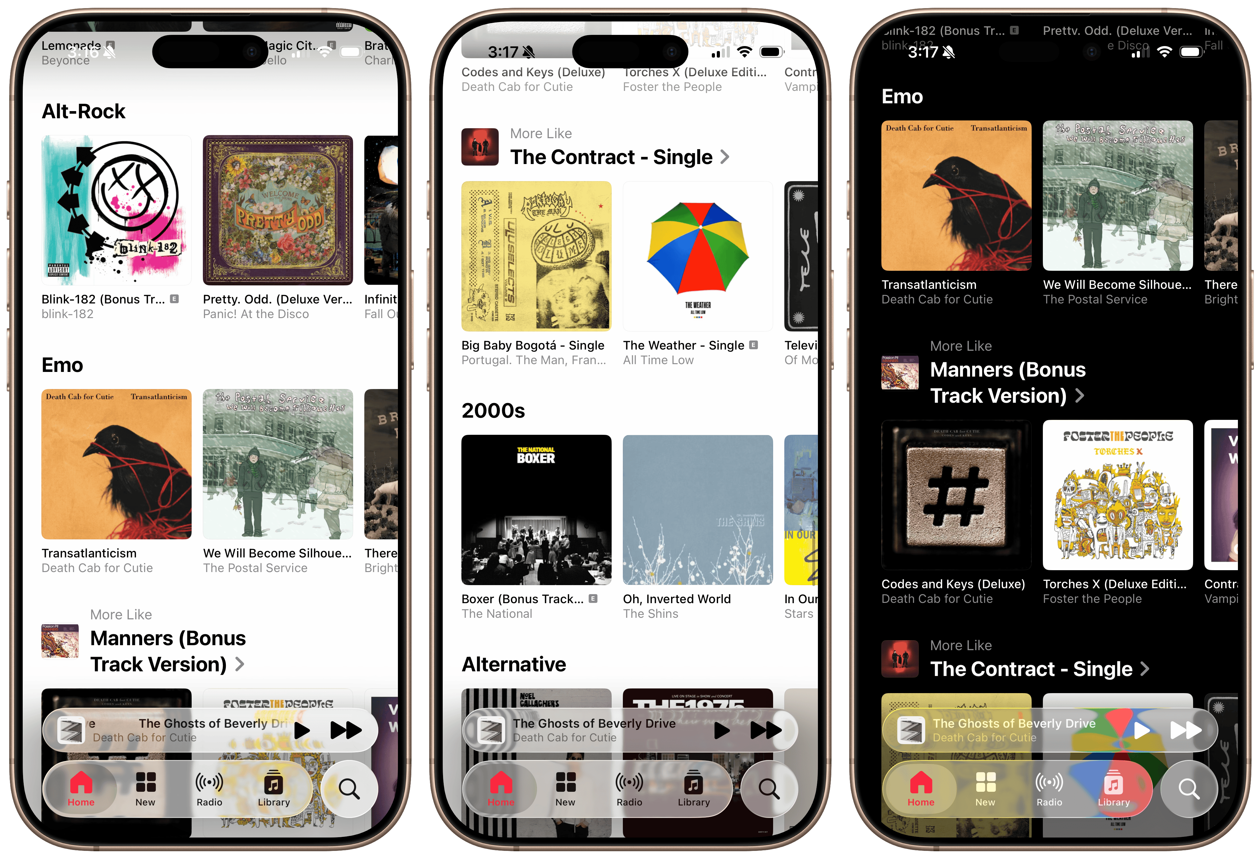 The Music app’s tab bar in iOS 26
There’s a new level of polish to the operating systems that really makes them feel like they belong in 2025. A great example is the new text selection menu design, which really does look gorgeous. The old one looks ancient because it lacks transparency or rounded corners, looking like something from 10 years ago, but you won’t notice until you try the Liquid Glass version. Tapping the right arrow to scroll through the options feels foolish when it could be a vertical menu, as it is in iOS 26. This is how the Mac has done context menus for decades, but proper menus finally come to the iPhone, and they’re touch-first and great. It’s parts like this that make you realize how much of iOS and iPadOS were designed for less-complex interfaces with only a few buttons. The same goes for dialog boxes, sheets, and context menus — they all look beautiful, alive, and refined. Dialogs are finally left-aligned on both the Mac and iPhone, and it all feels so modern.
 Control Center, text selection menus, and dialogs in iOS 26.
And then there’s the whimsy scattered throughout the operating systems. My favorite interaction in all of these OS versions is when you swipe down from the Home Screen to the Lock Screen: a gorgeous chromatic aberration layer descends from the sheet, covering each app icon in gooey Liquid Glass goodness. Interactions like this are wholly unnecessary and are being modified in each beta, but they just feel so premium. They match the hardware ethos of Apple products so perfectly and seem right at home. iOS 7’s ideas were meant for a world that was still trying to nail the transition between physical and virtual, but now, Apple has moved on to going big. This is the same idiosyncrasy Apple had in the Aqua-themed Jobs era, but this time, adapted for a world past skeuomorphic design.
 The gorgeous chromatic aberration in iOS 26.
This is what I mean when I say these platforms were designed for interaction: Another great example is when the new glass effect is applied to action buttons in apps. Initially, they appear like 2D blobs of color — like in the post-iOS 7 appearance — but as they’re tapped, they turn into these delightful virtual glass objects that shimmer as you drag your finger across them. This is not something that happens in the real world; if you press down a metal button and move your finger around, the way light reflects on it doesn’t change. But in iOS, it does, and it’s another example of delightful virtual-first design. And when a “glass” button is pushed down, the screen lights up in high dynamic range, providing further feedback that the button has been tapped and adding more quaintness to an already delightful interface somewhat reminiscent of iOS 6. Interactions like these couldn’t have even been conceived in the iOS 7 days because HDR screens didn’t exist in our pockets — the ideas had to be turned down because computers were limited 12 years ago.
After using the betas for a while, I’ve concluded that Liquid Glass is meant to be tapped, making it feel great on touch devices but an afterthought — maybe out of place? — on the Mac. Again, I don’t think this is for a lack of effort, but that it’s impossible to match the material’s interactivity on a mouse-first interface with the fluidity of a touchscreen. When you hit a button in macOS, even with the Liquid Glass style, it only briefly shimmers, and there’s no dragging effect. In other words, light reflections are practically nonexistent because it wouldn’t make much sense for them to be there. To combat this, macOS uses excessive shadows in favor of color-defined borders and contrast, almost emulating a neumorphic style.1 Toolbar buttons and sidebars appear like they’re floating atop the interface, creating this odd hierarchy and preferring auxiliary controls over the app’s content. I don’t think it fits in well with the rest of Apple’s Liquid Glass elements, which feel more interactive and bubbly rather than static, which macOS tends to be.
 Finder in macOS Tahoe. The toolbar looks odd.
Apple tried to add some smidges of interactivity to macOS, but the effect was limited. macOS and iPadOS sidebars now have an elevated look that not only brings content in from the background — either an app’s background or a user’s wallpaper — but has a ridge around it to add contrast. The ridge acts as a chamfer reflecting light from other interface elements, like colored buttons. iOS employs reflectivity when a user touches the screen, but because that’s not possible on the Mac, it’s replaced with lighting- and context-aware elements in sidebars, buttons, and windows. I don’t know how I feel about them yet, but I lean toward disliking them because they’re more distractions than enhancements. Part of what makes Liquid Glass on iOS so special is that it only reacts when a user wants it to, like when scrolling or tapping, but on macOS, the reactions happen automatically.
 Sidebars have a new floating appearance in macOS Tahoe.
Apps that adopt the new recommended design styling behave even more bizarrely. Apple recommends that macOS apps extend their content behind the sidebar, but to prevent partially obscuring important content like images or text, Apple says to use a new styling feature to mirror that content behind the partially translucent sidebar. Here’s how it works: If an app has, say, a photo that takes up the full width of the window on macOS, older OS versions would have it stretch from the sidebar to the trailing side of the window. The app’s usable content area is between the sidebar and the trailing edge — it does not include the sidebar, which usually lets a blurred version of the desktop wallpaper through, at least since OS X 10.10 Yosemite. In macOS 26 Tahoe, apps can mirror their content, like that photo, behind the sidebar, giving the illusion that the sidebar is sitting atop the content without obscuring it. It’s purely illogical because the sidebar also reflects colors from the desktop wallpaper with its “chamfer,” and I don’t think there was anything wrong with the prior style, which maintained consistency across apps.
macOS Tahoe has dozens of these visual oddities that add up to a less-than-ideal experience. Another example is the restyled menu bar, which is transparent by default with no background color. Menu bar items just float atop the desktop wallpaper with a slight tinge of contrast from a drop shadow. The Mac has historically been defined by two elements: the menu bar at the top and the Dock at the bottom, and the new default style removes a key part of what made the Mac so distinctive. It’s meant to keep system controls out of the way of user content, but it just makes it difficult to see menu bar items. In the second beta of macOS Tahoe, Apple added a toggle in System Settings to add the menu bar background back, but that’s not really the point — it’s that Apple finds this illogical hiding and showing of key system controls sensible. When important interfaces hide and show at the whim of the OS, they become obtrusive, not unobtrusive.
 Menu bar transparency can be disabled in System Settings.
The main problem with Liquid Glass in all the operating systems is contrast and usability. When I first remarked on the redesign, I said how the new material acts like crystal accents in a premium furniture piece — not over the top, but enough to add an elegant touch to an already gorgeous design. I still stand behind that, but the more time I spend with Liquid Glass, I think that’s not the entire story. The best example of this is Safari, which gets yet another redesign just four years after the failed one in iOS 15 and macOS 12 Monterey. Safari on the iPhone now has three tab bar layouts: Compact, Bottom, and Top. I’ve enabled the Top design on my iPhone since the Bottom option was added in iOS 15, and I still think it’s the best (albeit the most boring) choice, but I fiddled with all three during the beta period just to get a feel for how they work.
 The Compact, Bottom, and Top Safari appearances.
Bottom is the standard option, just like iOS 15 through iOS 18, and it works almost well enough. Liquid Glass heavily prefers “concentric” corner radii, an industry term referring to corners that align perfectly with the radius of the iPhone’s screen. This design fad discourages straight, bezel-to-bezel lines, which is what the previous Safari design had: a bar that reached from the left to the right of the screen and contracted only vertically, not horizontally. The Bottom placement in iOS 26 is inset slightly, letting a bit of the site through the borders between the tab bar and the iPhone’s bezel to give the interface a rounded look and make it appear as if the tab bar is “floating” above the content, but I find this effect to be profoundly useless. Apple can embrace concentricity and rounded corners while letting controls go edge to edge. Nobody can see anything in the sliver between the tab bar and the edge of the screen — all it does is eliminate some space from the tab bar that could be used for larger touch targets.
The worst sin is the new Compact layout, which takes every mistake from the failed iOS 15 design and exaggerates it. In this mode, it really becomes palpable how much of an afterthought contrast appears to be at Apple. Depending on an interface’s primary colors — i.e., whether they are primarily light or dark — iOS tints Liquid Glass either dark or light to contrast the background, then further applies this effect by changing the color of the text. (This is best visualized in an app like Music, with dozens of differently colored album covers, causing the Now Playing bar in Liquid Glass to change color schemes erratically.) This is great until you stumble upon a website with light-colored text on a dark background: because the overall website is dark, the Liquid Glass tab bar chooses a light color scheme. But when you scroll over that light-colored text, the lightly tinted tab bar blends in with it, impeding contrast. I wouldn’t go as far as to say it’s unusable, but it’s bad, and I hope to see the effect dialed in throughout the beta process.
 The Compact appearance in dark mode.
I would have written this off as a beta bug if I hadn’t seen how Apple handled another sore point in the interface: Control Center. In the first beta, Control Center used clear Liquid Glass with very little background blur to separate the controls and the app icons behind them. Apple changed this in the second beta, dumbing down the Liquid Glass effect and adding a progressive blur, much to the chagrin of many Liquid Glass believers. This made me realize that Liquid Glass really only has two possible modalities: an icy, melted look that hinders contrast, or a blurrier, more contrasty appearance. The melted one is obviously more attractive, but contrast is necessary for an interface with so many controls competing for attention. The Compact mode in Safari is perhaps the best example of everything wrong with Liquid Glass: It hides buttons in a context menu to “enhance” the content while using an unusable form of the material for aesthetics.
The worst offender thus far in the beta process is the macOS version of Safari. I’ve tried to ignore the bugs in this version, but truthfully, I find it difficult to tell which parts are glitches and which are intentional design choices. The new toolbar — the macOS equivalent of the tab bar on iOS — tries the same gimmick as the Compact appearance on the iPhone, but instead of using the semi-transparent Liquid Glass sparingly, Apple used a translucent material that lets the colors of the site through while obscuring details. In a way, this maintains the general design shift between iOS and macOS: while Liquid Glass on iOS is more transparent, animated, and fluid, it’s more static and opaque on the desktop. But the result is truly horrifying. The toolbar should always remain static, legible, and unmodified, no matter what the content is underneath — that’s the canonical definition of a toolbar — but because Safari in macOS Tahoe is translucent, it’s hard to tell which tabs are focused or even their titles in certain cases. By default, the tab bar’s theme depends on the page’s color scheme — light or dark — not the system, leading to cases where the tab bar is dark when in light mode, and vice versa. This can be disabled, but it shouldn’t have to be.
 A dark page in light mode in Safari. You can’t tell light mode is on. Tinting is enabled.
 The same page when tab bar tinting is disabled. Better.
This is at the heart of why I think Liquid Glass was poorly contrived on macOS. Apple wanted to do what it did on iOS, but because a touchscreen is inherently more reactive than a desktop mouse interface, it had to overdo transparency at the expense of contrast. As a result, everything looks too flat and muddy, while extraneous elements are floating above the mess of UI. Tab selection has been a solved problem on the Mac for years: deselected tabs are tinted in a darker accent color, and the active tab is in the Mac’s toolbar color, jibing with the rest of the toolbar. But because Apple clearly didn’t find that distinction satisfactory, it had to reinvent the wheel and decrease the contrast between the two colors. I’m not kidding when I say it’s nearly impossible to tell which tab is selected in Safari 26 on the Mac in dark mode with tinting disabled, and I truly don’t know if that’s intentional.2 Meanwhile, the tab bar looks nearly identical in light mode on lightly colored sites with both tinting enabled and disabled, adding to the chaos and inconsistency.
 A dark webpage with tinting disabled. Tab selection is indecipherable.
This all distills to one common complaint with Liquid Glass: it’s too cluttered and incoherent at times. I explained earlier how it really is gorgeous and adds a new dimension to the operating systems built digital-first, and while true, I think it’s half-baked in many areas, especially on the Mac. I could go on with my complaints with macOS Tahoe’s windows alone: the corner radii change if a sidebar is showing or not, window tinting is even more distracting with light reflections everywhere, third-party app alerts no longer have icons, and bottom-placed toolbars like in Music just look so poorly designed — and that’s only a few of my main gripes with the redesign. On iOS, I think Liquid Glass is a positive design overhaul since the concentricity aligns with the rounded corners of modern iPhones, while the transparency is reactive to a person’s touch. On macOS, none of that exists, and the remaining elements are haphazardly. Many of these quibbles might be ironed out later in the beta process, but my underlying problems appear indefinite. At least on the Mac, the “polish” of Liquid Glass doesn’t necessarily correlate to a better design, just agreement with iOS.
 Four windows’ corner radii in macOS Tahoe. Three of four are system apps.
On iOS, the clutter mostly affects toolbars, tab bars, and other “hiding” elements. Above-keyboard toolbars, like in the text editing fields of Notes and Mail, float above the newly redesigned keyboard, just like the Compact Safari tab bar appearance. It’s all in the interest of padding and “concentricity,” but it doesn’t provide any value. I don’t share Apple’s aversion toward edge-to-edge lines, and I don’t think the whitespace around arguably every control does anyone any good. The effect is uncanny on the Mac, too, where the concentric button border shapes around toolbar controls clash with the now irregular-across-apps corner radii of windows — I can’t quite put my finger on why they look so bad, but they do, even though they’re mathematically aligned. Sometimes, math isn’t the best way to design user interfaces, and that’ll be a tough lesson for Apple to learn.
There are parts of iOS and macOS where the concentric padding, transparency, and bubbly nature of Liquid Glass make for gorgeous interfaces, but they’re rare. One example is in Messages, where a contact’s current location is displayed in a bubble that pops out from their name and contact photo, peeking into the main Messages conversation. This was controversial and I wouldn’t be surprised if it ends up disappearing before iOS 26 launches, but I think it adds just a tiny bit of whimsy to the interface. When a search bar is expanded from the new system-standard bottom placement, it animates upward, above the keyboard, and the X button to close it morphs out of the text field, similar to the Dynamic Island. When you scroll down in Music, the Now Playing bar collapses into the tab bar, making more room for scrollable content. These are just some examples of my favorite Liquid Glass animations — they’re just good fun and make for a more interactive OS.
 The Music app’s automatic tab hiding and keyboard toolbars in iOS 26.
Perhaps one of the best parts of iOS and iPadOS 26 is the completely redesigned Camera app. I’ve long said that the Camera app is one of the most convoluted pieces of UI in any modern OS, and the new design addresses every one of my critiques. The camera mode selection control — at the bottom in portrait and on the side in landscape — now exposes two primary modes and more options as you swipe. To the right are the photo options: standard photo, Portrait Mode, Spatial Photos, and panoramas. To the left are the video modes: standard video, Cinematic Mode, slow-motion, and time-lapse. The more niche modes are hidden behind a horizontal scroll, and only Photo and Video are typically exposed, which makes for a simple, easy-to-understand interface. Just tap on the desired mode or swipe for more advanced options.
Photo and Video modes now have nicer controls to adjust capture settings, like frame rate, resolution, and format. Even as a nerd, I find the mélange of formats to be too convoluted, especially to pick in a hurry. The app now exposes them as à la carte options, and tapping on, say, a video format narrows frame rate and resolution choices. For example, you can choose to film in ProRes HDR to start, then a desired frame rate and resolution from the picker, whereas they were bundled together as options previously. It’s just so nice to pick the correct options with just a few taps.
Other options, like flash, Night Mode, and exposure, are hidden behind an easily accessed menu with large buttons and easy-to-understand controls. Users can swipe up — or from the side in landscape — anywhere in the Camera app’s interface, exposing seven tiles: Flash, Live, Timer, Exposure, Styles (on iPhone 13 models and later), Aspect Ratio, and Night Mode. Flash, Live, Night Mode, and Aspect Ratio are tappable buttons — that is, they change modes once they’re tapped from off to on to auto and back around again — and the other options have sliders and context menus for further fine-tuning. When you’re done making adjustments, the interface dismisses itself. It’s so much better than fiddling with the tiny touch targets nestled atop the viewfinder in previous versions of the Camera app, and I believe it’ll encourage more people to learn all the features of their iPhone’s camera — commendable, exemplary design work.
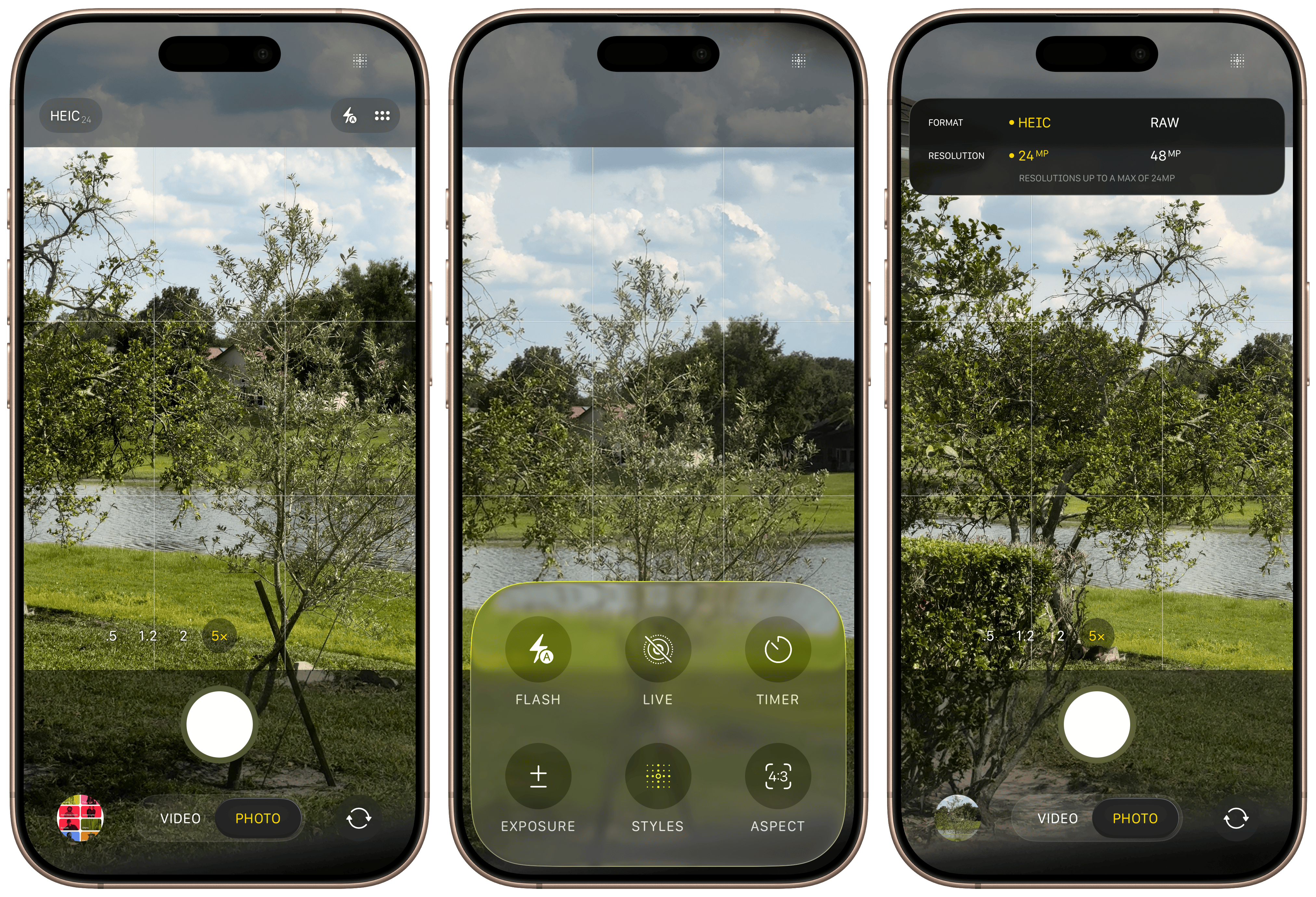 The new iOS 26 Camera app.
Home Screen and Lock Screen customization, first added in iOS 18, has now been updated to support the Liquid Glass aesthetic on both iOS and macOS, and it’s another example of the beauty of the new material. The Lock Screen’s clock now has an option to use Liquid Glass, creating a gorgeous, reflective appearance that tints wonderfully in system-provided accent colors. It can also be stretched to occupy more than half of the vertical length of the screen, which I find a bit tacky but also enthralling, as watching the digits render in any size is weirdly satisfying. (The latest version of the San Francisco typeface is drawn to allow at-will resizing of its characters, unlike most typefaces, which have set sizes and fonts.) The byproduct of this new large clock style is that widgets can now be moved to the bottom of the Lock Screen, enabling the depth effect while using medium and large widgets. Liquid Glass really shines on the Lock Screen, and I almost wish Apple would add these features to macOS someday.
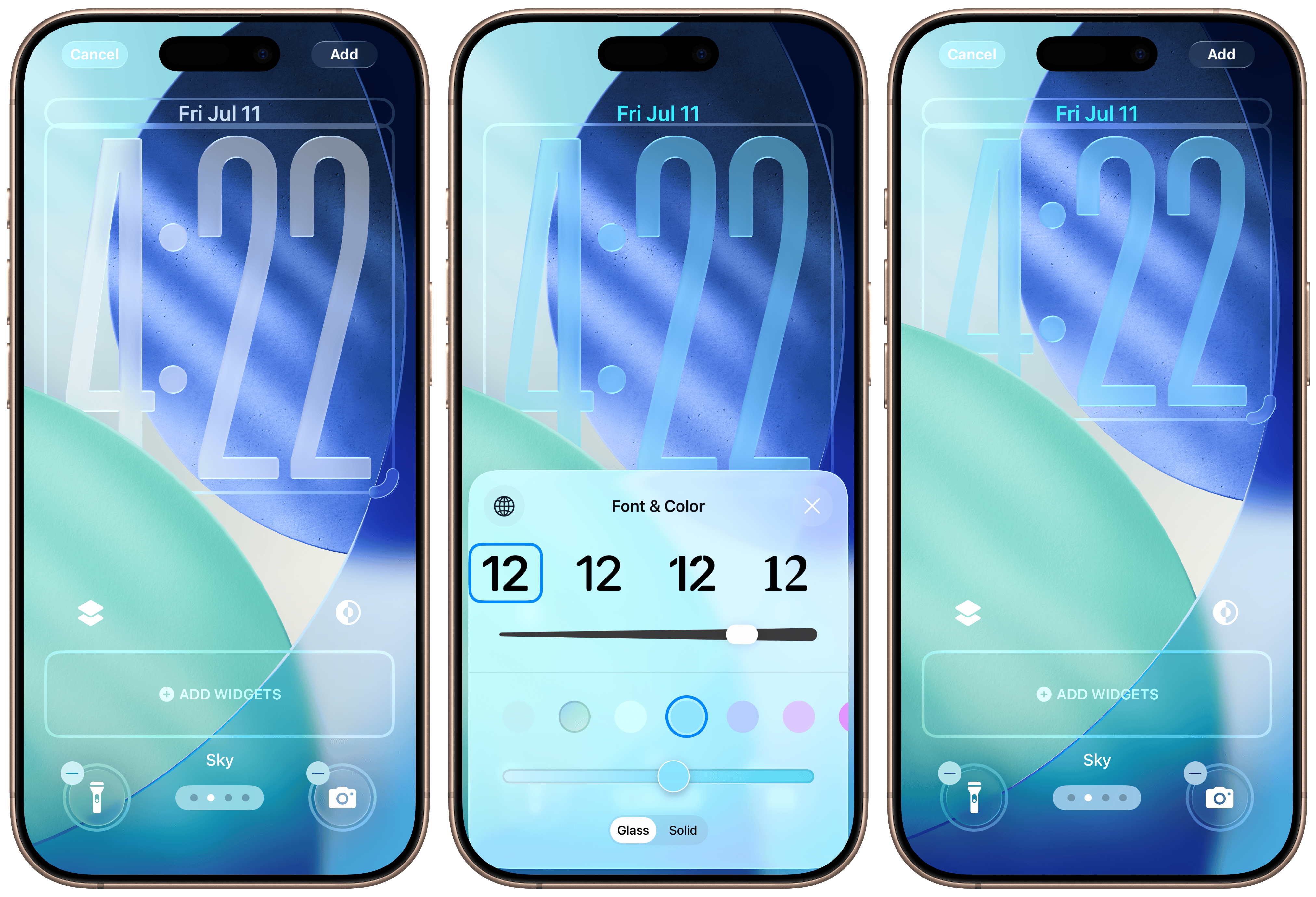 Updates to the Lock Screen in iOS 26.
macOS receives the icon themes from last year, plus some new, Liquid Glass-enabled ones. There are now four modes in the Home Screen and Dock’s Customize menu: Default, Dark, Clear, and Tinted. Default provides the standard light mode appearance, and Dark allows users to choose a permanent dark style or use automatic switching dependent on the system’s appearance — these were added last year and haven’t changed. The new Clear style renders eligible icons in Liquid Glass entirely, with white glyphs and clear backgrounds replacing the typical colorful gradients of most icons. I don’t like it as much as others do, but people truly into the Liquid Glass aesthetic ought to appreciate it. I can see this being a hit with Home Screen personalization fanatics come this fall.
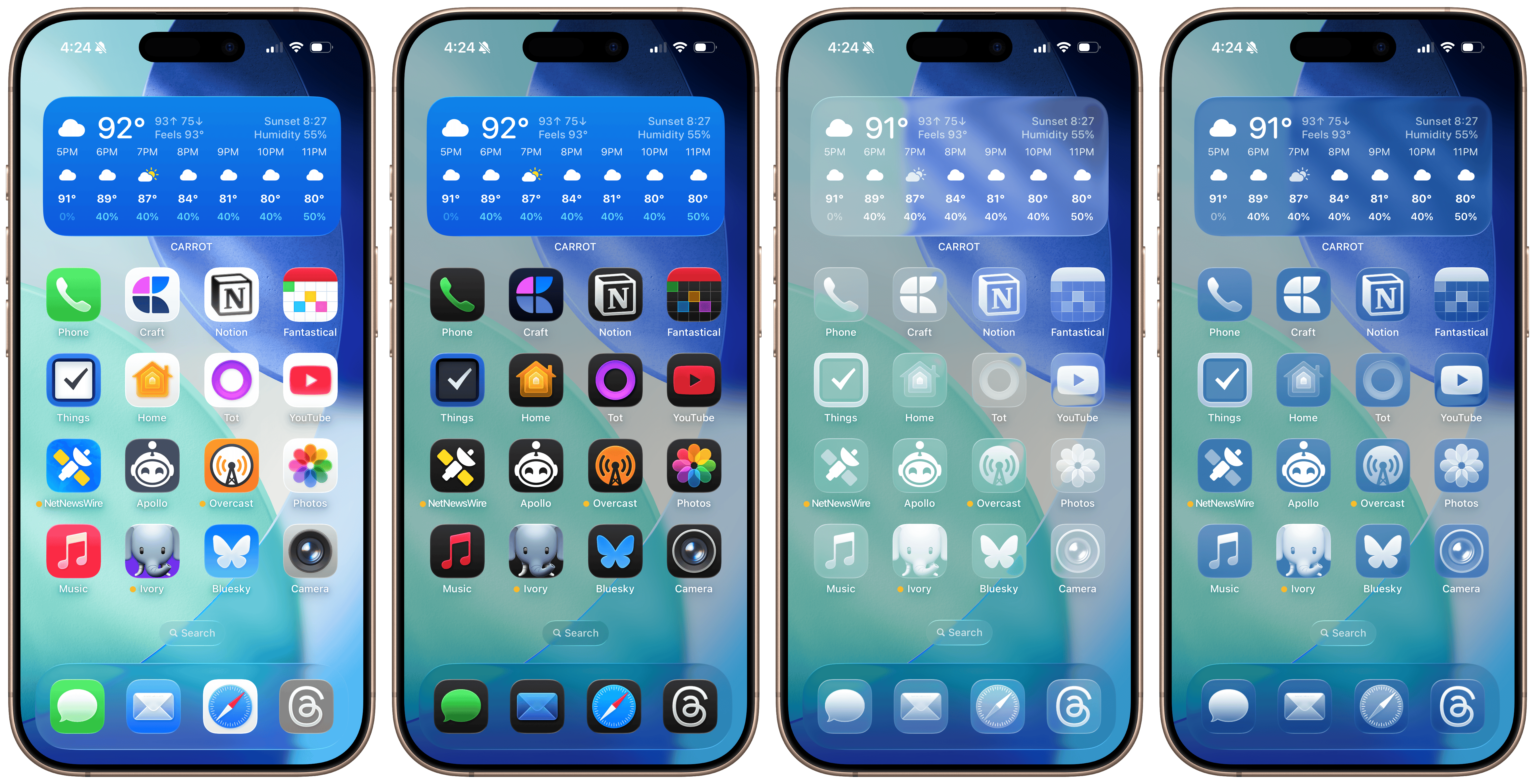 Default, Dark, Clear, and Tinted icon modes in iOS 26.
The Tinted mode last year was one of my least-favorite additions because I thought it just looked naff. It’s been entirely redone in iOS 26 and macOS Tahoe, with variants for both light and dark mode. Choosing more vibrant colors, especially in the Dark style, still looks disorienting as it remains largely unchanged, but I think the Light style with more muted colors looks especially gorgeous, at least with icons that support it. The Light style colors the icon background using Liquid Glass’ new tinted appearance, where it renders the color a layer below the reflective material, leading to a stained-glass look that’s plainly gorgeous with the right colors and wallpaper. (Tinted Liquid Glass is used to color accented controls in apps, too.) Home Screen icons also now reflect artificial light and have the iOS 7 parallax effect, so they feel alive, almost like real tiles floating atop the screen.
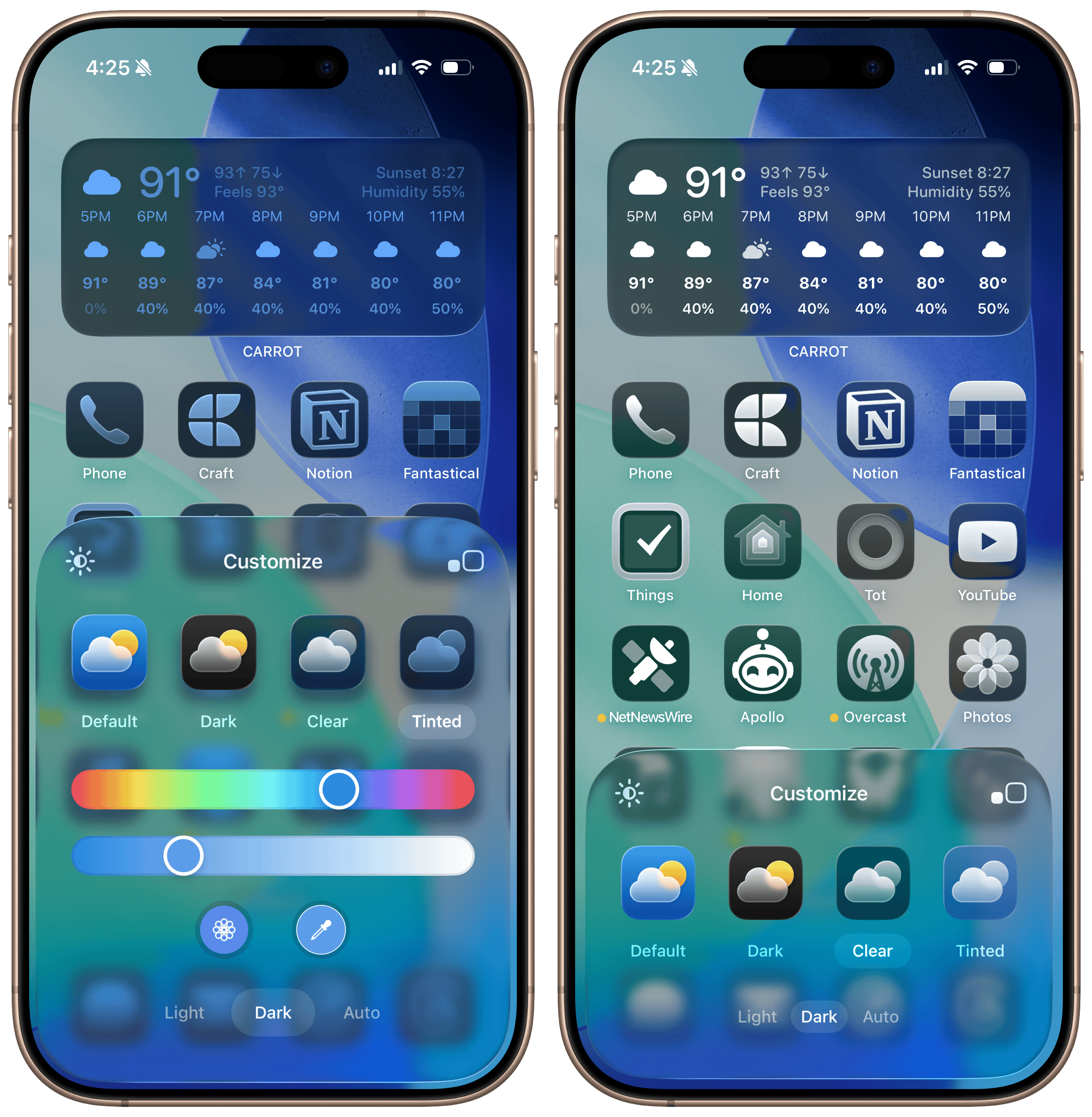 Light and Dark variants are now available in the Tinted mode.
Supporting all of these styles is next to impossible, especially when working across platforms, so Apple rethought the way it handles icons across iOS, iPadOS, and macOS. This year, they all use the same icon created using a new developer tool: Icon Composer. Apple hinted at how it would think about app icons last year, but this year, it really wants developers to get on board with the layered icon structure introduced in iOS 18, and Icon Composer allows icons to transition between styles easily. Developers give Icon Composer as many layers as they have in their current app icon design, except this time, those layers — aside from the background gradient — should be provided as transparent PNGs. Icon Composer layers these images and renders them in Liquid Glass automatically, even if they’re just flat images with no specular highlighting.
From here, supporting the new modes is trivial. Icon Composer recognizes which is the background layer and pulls the key colors from the gradient, then applies them to the glyph in dark mode and replaces the background with a system-provided dark color. In the Tinted modes, the background (Light) or glyph (Dark) becomes the tint layer, and Icon Composer ditches any colors the developer has provided, all automatically without any developer intervention. Traditional icons support Liquid Glass, dark mode is applied automatically, and tinting is handled by the system, all within specification, as long as the assets are provided individually. These new modes do mean most — if not all — developers will have to update their app icons yet again to support the styles, but any seasoned designer should have a gorgeous new icon they can use across all platforms using Icon Composer in minutes. (iOS 18-optimized icons look alright on iOS 26, but they won’t support macOS and aren’t rendered with Liquid Glass.)
 Tinting works on the Mac just like iOS.
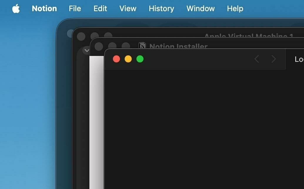
This sameness does have some unfortunate effects for the Mac, however, because it forces the constraints historically imposed on iOS developers. Before macOS 11 Big Sur, macOS app icons were irregularly shaped, usually with a protruding tool — a pen, hammer, guitar, etc. — extending from the background. macOS Big Sur made squircle (a square with rounded corners) app icons the standard across the system, normalizing icon shapes, but icons could still “break out of” the squircle to show tools. The macOS Big Sur style retained a hallmark of Mac whimsy and let designers create gorgeous icons that looked native to the Mac while being familiar to iOS users using Apple’s desktop OS for the first time. You can see this today in apps like Xcode, TextEdit, or Preview — tools protrude just barely out of the squircle, adding a unique touch to the OS, and some apps, like Notion, still hold onto the old, macOS 10.x irregular design. The system doesn’t normalize icons.
macOS Tahoe eliminates this functionality and encloses all irregularly shaped icons in what John Siracusa, a co-host of the “Accidental Tech Podcast,” calls the “squircle jail.” I love this term because it perfectly encapsulates Apple’s design ethos with these icons: prison. macOS generally has a sense of panache unlike any of Apple’s more serious operating systems, like iOS. Finder has a merry face as its icon, a staple landmark of any Mac since the original Macintosh’s icon set, drawn by Susan Kare. The Settings menu in the menu bar is an Apple logo, once rainbow colored to commemorate color displays on classic Macintoshes. The setup wizard even has its own name, Setup Assistant, and its counterpart, Migration Assistant, shows two Finder icons exchanging data. The default text document icon shows a copy of the “Here’s to the crazy ones” quote from Steve Jobs. The Mac is a whimsical, curious OS, and stripping away irregularly shaped icons is well and truly Apple putting the Mac in a prison.
Any app with projecting elements, like from the macOS Big Sur days, is held captive within a gray, semi-translucent border to normalize app icon sizes. They look indescribably awful. When I first caught wind of this — interestingly, right after learning about the menu bar’s castration and the truly asinine Beta 1 Finder icon, which thankfully has been rectified — I immediately realized what I disliked about this version of macOS: it doesn’t feel like the Mac anymore. This has been an ongoing process since macOS Big Sur, which had already stripped out the uniqueness of the Mac, but macOS Tahoe just feels like an elevated version of iPadOS. The Mac feels like home to me, as someone who has used it every day for at least a decade and a half. The iPhone and iPad are auxiliary to my home — almost like my home away from home — but sitting down with a Mac is, to me, peak computing.
macOS Tahoe isn’t all that different from previous macOS versions, but it’s different enough for me to be irked by the whole thing. That’s a natural human instinct — to be afraid of change, and I’m aware of that. But it’s that conflict between liking the Liquid Glass redefinition of Apple’s software for being new and interesting, and the jarring jank of some of its parts that ends up being where I land on the redesign, for now at least. I began this section by saying Liquid Glass adds a new level of polish to the operating systems, but that comes at the expense of familiarity. I’ve really been struggling with this chasm between wanting to try new things and feeling vexed by drastic change, but that’s just how Liquid Glass hits me. I definitely think it’s positive overall on the iPhone and iPad, where the minor interactive elements feel like a joy to use, but on the Mac, I find it too concerning. It’s cohesive, but in the wrong direction.
There are dozens of little quirks with Liquid Glass — both the material itself and the design phenotype overall — but I don’t want to belabor them because the operating systems are still in beta. Many people have chosen to enable accessibility features like Increase Contrast to negate some of the material’s most drastic (and upsetting) changes, but I think that’s excessive. Apple will iron out most of the design’s anomalies in the coming betas, and I’m intrigued to see how it’s put together eventually.3 But my thoughts on the design boil down to this: Liquid Glass is great when it’s ancillary to the main interface. Action buttons, sliders, controls, gestures, menus, and icons look beautiful when set in the new material, and it’s even more stunning when interacted with. I love the new tab bar animations and navigation views, how moving your device around changes how light is reflected on Home Screen icons, and how alerts and sheets look. But once Liquid Glass becomes the primary element of interaction, like in Safari or toolbars, it begins to fall apart.
 Modifications to toggles, sliders, tab bars, and sheets in iOS 26.
Unlike the contrast quirks or Safari bugs, I think this is deliberate. The more that the glass is used in key views, the more crowded and busy they become. That’s why toolbars on the Mac look so bad, or why the Compact Safari view on iOS is infuriating. Alan Dye, Apple’s software design chief, said in the keynote that the Liquid Glass redesign is meant to “get out of the way” of content, but when it’s used aggressively, it intrudes too deeply. System controls like toolbars or buttons don’t need to move that frequently, as they do in Safari; keyboard controls shouldn’t float above text like in the iOS Notes app; tab bars shouldn’t always collapse upon scrolling like in the iOS Music app. The common theme between these three cases is that they’re entirely Liquid Glass-coded, and that’s wrongheaded.
My thoughts on the redesign remain positive overall, and despite my apprehensions about developer support, I think it is a success. Apple’s designers have outdone themselves yet again, crafting dozens of separate user interfaces that feel vibrant, fun, and interactive, all while maintaining the marquee simplicity of Apple platforms. iOS and iPadOS are stunning, and while macOS needs some tweaks, new Mac users who aren’t accustomed to the decades of Mac-specific design philosophy will probably find the uniformity and cohesiveness appealing. That is who Apple makes the Mac for nowadays, anyway. But I can’t help but think what will happen in a few years, when Apple finally gets a grip on the cutting edge and tones down the clutter a bit.
Apple Intelligence
Last year, Apple Intelligence was the highlight of the show, and I think that’s where Apple went wrong. The company overpromised and underdelivered — a classic Apple blunder in the post-Jobs era, which is to say, it’s not in Apple’s DNA. Looking back at last year’s keynote, Apple really threw everything but the kitchen sink at the artificial intelligence problem to appear competitive when (a) it wasn’t, and (b) it never could be, and that created a new task for the company: make Apple products using an uncharacteristically short-sighted strategy, which is impossible. Writing Tools are next to worthless on the current versions of Apple’s platforms, Siri is worse than junk, Image Playground is a complete joke, Swift Assist doesn’t exist, and the “more personalized Siri” was literally fake news. Apple’s presentation last year was truly unlike anything out of Cupertino since Apple nearly went bankrupt over 25 years ago: a slow-burning abomination.
Fast forward to this year, where Apple Intelligence warrants a section in my operating system hands-on. Candidly, I didn’t expect to write about it at all. This year is a small one for Apple’s AI efforts, but I believe it’s more consequential than the last, and that’s why it warrants part of my impressions. The new features aren’t even really features — they’re a set of new foundation models available to the public via Shortcuts and developers using an application programming interface that, for the first time, feels like an Apple spin on AI. No, they’re not groundbreaking, and they’re nothing like what Google or OpenAI have to offer, but it’s an indication that, after the disastrous Apple Intelligence rollout over the last 12 months, Apple’s AI division has a pulse. If the new Siri ships, developers take advantage of App Intents and the new foundation models, and Apple integrates ChatGPT more deeply within Siri — or buys Perplexity — it could really have a winner on its hands. Compare that to how I felt about Apple Intelligence just a few months ago.
There are two new foundation models available to end users through Shortcuts: the on-device one and the Private Cloud Compute-enabled version. The latter is significantly more capable and should be used for actual queries, i.e., when users want the model to create new data, either in the form of prose, code, or some data structure like JavaScript Object Notation. It’s comparable to some of Meta’s midrange Llama models and has three billion parameters, which doesn’t hold a candle to ChatGPT or Gemini, but that’s not really the point. Developers don’t even have access to this model either, which makes its purpose obvious: data manipulation in Shortcuts. But I’d actually say the smaller on-device model is much more consequential because it’s nearly as good at data manipulation, but with the advantage of being much quicker.
Part of the disadvantage of large language model chatbots is that they’re constrained to lengthy chat conversations. Chatbots are powered by Herculean models with each query having an unusually high carbon footprint, and typing something into one feels important, almost like you’re taking up a human’s time. Asking chatbots questions makes sense on a surface level because their interface deceptively implies they’re smart and creative, but they’re more proficient at manipulating text, not creating it. The new models in Shortcuts can be used in chatbot form, but they shouldn’t be. They’re modern-age data manipulation tools, like regular expressions or sorting algorithms, and the on-device version of the model feels perfect for that.
Take this example: I’ve wanted a native way to format plain-text math equations in Markdown-compatible LaTeX for a while. LaTeX isn’t the easiest formatting language to remember or understand, and writing larger, more complex expressions becomes difficult. Markdown has support for inline LaTeX (i.e., well-formatted math equations within otherwise normal text) just by surrounding the math with two dollar signs, but actually creating the formula is cumbersome. Some websites do this automatically, but it just seemed unnecessary. I wanted an app for this, and I could’ve probably written one myself, but it would involve learning how the LaTeX kernel works and parsing plain text through it in some complicated way, so I set the idea aside.
LLMs are particularly adept at formatting text. If you give one a lengthy paragraph and tell it to replace straight quotes with typographically accurate ones and double-dashes with em dashes, it would provide a result in seconds. They’re great at creating lists in Markdown from ugly paragraphs and making text more professional. (As a testament to LLMs’ prowess, Apple includes some of these use cases as functions in the Writing Tools feature.) LLMs are great at turning ugly plain text equations into beautiful LaTeX, and since ChatGPT launched, I’ve been using them to do this, albeit with some guilt because this isn’t some computationally intensive work that requires a supercomputer. Ultimately, LaTeX is a typesetting system, and we’re not solving calculus here. Apple Intelligence models were the solution to my conundrum.
I gave the on-device model a prompt that went something like this, but in many more words: I will give you a math expression, and you should return the proper LaTeX. But the prompt didn’t work, unlike when I tried it with ChatGPT. The models allow users to choose a result format, making them powerful for data manipulation: text, number, date, Boolean, list, or dictionary. (These terms, especially more niche ones like dictionaries or Booleans, will be familiar to programmers.) I chose the text option as it was the closest to what I wanted and passed the result to Shortcuts’ Show Result action. But the action was reworked for the new models: It now renders their output “correctly,” in Markdown or LaTeX, even if the output type is set to text. (There is also an Automatic type, which I thought would only render the result, but it turns out the Show Result action renders all output types.) This isn’t what I wanted — I want plain, un-rendered LaTeX, not even with Markdown formatting.
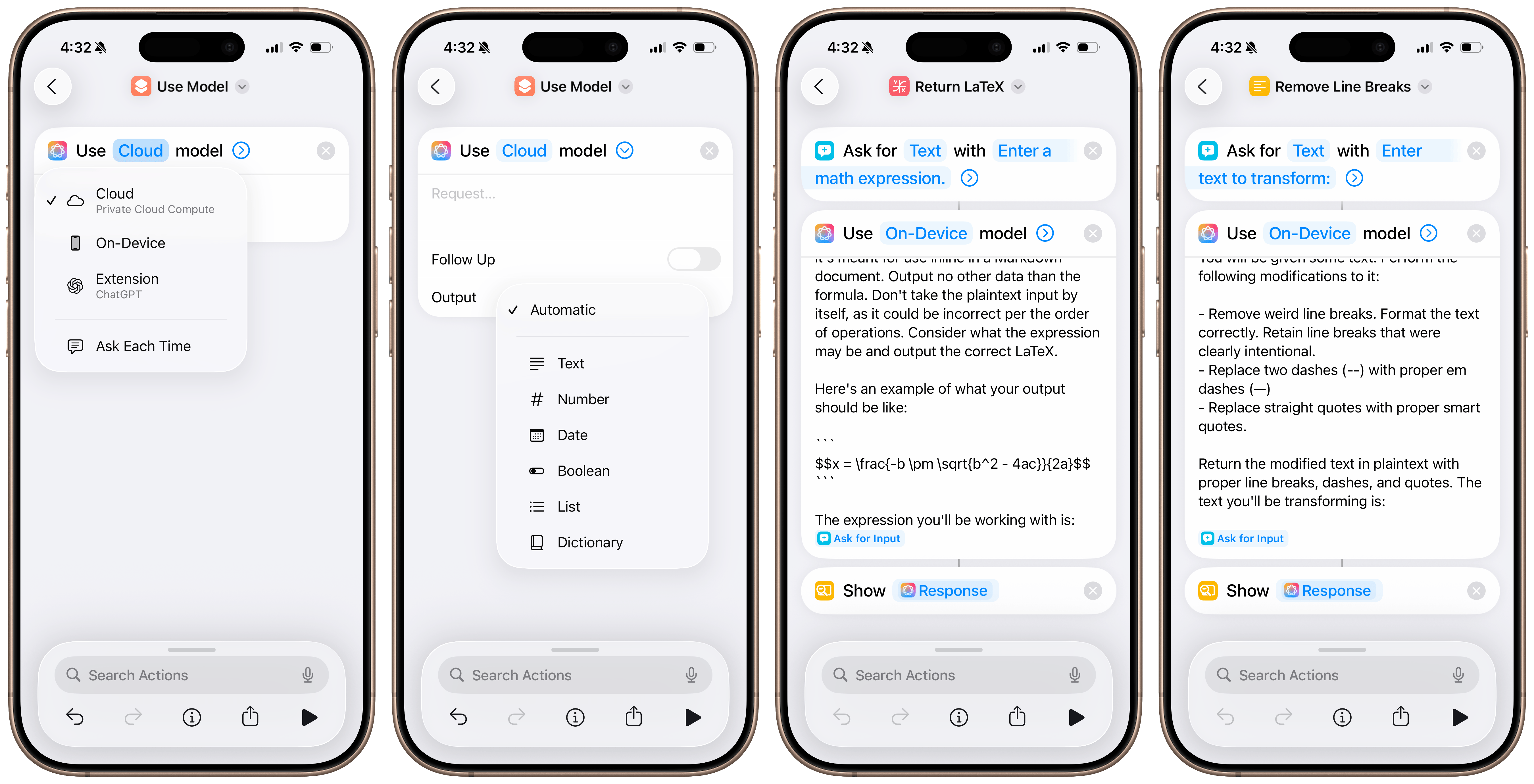 The new on-device Apple Intelligence models in Shortcuts.
LLMs are best at writing Markdown because it’s used extensively in their training data. If you ask one for an ordered list, it’ll use two asterisks for boldface lettering and dashes or asterisks for bullets, which render correctly in Markdown. In my case, the LLM was outputting LaTeX even though I told it not to because it was trained to surround any formulas with two dollar signs, telling the Markdown parser in the Show Result action to render the LaTeX formula. To get around this, I tried the Show Text action, but that just displayed an un-rendered Markdown code block with some instructions telling the Show Result action to render the LaTeX. Again, this wasn’t what I wanted — I hoped for something like this: $$\frac{1}{2} + \sqrt 3$$, as an example, so I could paste it into my Markdown notes app, Craft. Fiddling with these minor formatting issues taught me something about these less-powerful LLMs: don’t treat them as smart chatbots.
Apple’s on-device LLM is especially “dumb,” and the way I got it to work eventually was by providing an example of the exact output I wanted. (I wanted the result in a multiline code block because that would already be rendered by the Show Result action, so I gave it an example with three grave symbols [```] surrounding the LaTeX formula, and it worked like a charm.) And that’s what’s so exciting about these models: In a way, they’re not really models in the traditional, post-ChatGPT sense. They’re hard to have conversations with, they’re bad at logic and reasoning, and their text is borderline unreadable, but they’re excellent for solving simple problems. They’re proficient at text formatting, making lists, or passing input into other Shortcuts actions, and that’s why they’re perfect in the Shortcuts app rather than elsewhere in the system.
I realize this is too nerdy for the vast majority of people, and for them, the general-population Apple Intelligence features are still presumably in the works, and developers will have these new models to integrate into beloved third-party apps when the operating systems ship this fall. But those with a knack for automation and customization will find these Shortcuts actions especially powerful to do lots of new things on their phones, all on-device and free of charge. In a way, it opens up a new paradigm of computing, and if history is anything to go by, these vibe shifts usually end up weaving their way into the lives of normal computer users, too. For instance, people can make a shortcut that takes a list of items in Notes with improper spelling, formatting, and capitalization, and turn it into a shopping list in Reminders, powered by the automatic sorting introduced a few years ago, all thanks to the new Apple Intelligence models. These models don’t just stand alone, like in an app — they’re effectively omnipresent system-wide.
The new actions have made me realize how underrated a tool Shortcuts can be for not just automation but the future of contextual, AI-assisted computing. People averse to AI are really just unhappy with generative AI, the kind that has the potential to take people’s jobs and turn the internet into a market of nonsense AI slop. Add to that the environmental concerns of these supercomputers and the narcissistic billionaires who control them, and I really do get some of the hysteria against these models. But by building shortcuts that run on-device and that are meant to help rather than create, I think Apple has a winner on its hands, even for the less technically savvy population. It’ll just take some clever marketing.
These Apple Intelligence models bring AI to every app from the other way around — that is, the backend rather than a frontend implementation, to put it in programming terms. Instead of having an AI summarization in a task manager, the model could help you create those tasks. And it’s not in the annoying, typical way AI has found itself in products thanks to overzealous tech companies over the last few years — it’s in a way that really doesn’t feel like “AI” in the traditional sense at all. People do lots of scut work on their computers, and AI promises to reduce the time spent managing files, tasks, documents, and other computer baggage. Tech companies have gotten carried away adding AI to everything for no reason, but these new actions in Shortcuts really home in on what LLMs are best at: helping with scut work.
I can think of zillions of use cases developers can add support for in the fall, and I really feel like it’s in their best interests to do so. Batch renaming files, creating calendar events from documents, organizing and saving browser tabs into a read-later service, writing alt text on the web, and correcting writing — all of this is possible in the betas thanks to these new Apple Intelligence actions, realizing the potential of truly contextual computing. Some might take this as an overreaction, but once you truly grasp the possibilities of having powerful text models on-device up and running in seconds, it really does feel like the future. A future Apple perhaps should have thought of last year before announcing the new Siri, yet to be demonstrated to the press or released as a beta.
In many ways, WWDC this year was a return to form for Apple. I can’t recall a single feature the company promised would be coming “later this year” that isn’t already in beta, and the race between Android and iOS continued for yet another round of software releases. Apple brought three previously Pixel-exclusive Android features to iOS this year, much to my surprise: Circle to Search, automatic call hold detection, and call screening. It also added some quality-of-life improvements throughout the system, like translations in Messages and Music; updates to long-form transcripts in Notes and Voice Memos, mimicking the Pixel Recorder app; and a timeline view in Maps to automatically track places you’ve been. All of these are ostensibly Apple Intelligence features, but unlike last year, they were scattered throughout the presentation, making it feel like (a) they’ve been properly conceived and thought out, and (b) they’re part of a concerted effort to position Apple competitively in the AI space. I think Apple nailed it.
Apple’s Circle to Search competitor comes in the form of Visual Intelligence, a feature announced with the iPhones 16 last year that allows people to use the camera to ask ChatGPT about something or do a quick reverse image search on Google. It single-handedly killed gadgets like Humane’s Ai Pin and the Rabbit R1 because of how easy it was to use, and I’ve found myself reaching for it anytime I need to look something up quickly. Circle to Search on Android lets people use these features within the OS, like on screenshots, apps, and all other on-device content. Visual Intelligence in iOS 26 now works the same way and has excellent ChatGPT integration, along with Apple’s own Siri intelligence to automatically detect phone numbers, email addresses, locations, and calendar events across apps.
When you first take a screenshot on iOS 26, the system will immediately display a new, non-Markup Visual Intelligence menu. (To disable this, you can revert to the previous “thumbnail view,” which shows a screenshot thumbnail in the bottom left instead of expanding immediately after taking it; I dislike the new behavior and have turned the thumbnail view on.) The menu has five primary buttons: Markup, Share, and Save are typical, but Ask and Image Search are new. Ask pulls up a native ChatGPT window where a user can ask anything about the screenshot, just as if they uploaded it to ChatGPT’s iOS app themselves. Image Search performs a reverse Google search for any content in the screenshot, which I’ve found less helpful but might be convenient, especially since Google removed that feature in the mobile version of its website. Users can also highlight parts of the image to search using their finger, just like Circle to Search. If iOS detects any metadata, like events or contact information, it’ll also allow users to easily save it, which I’ve found handy for posters, ads, and other whatnots I screenshot only to forget about inevitably.
 The initial screenshot view and Markup in iOS 26.
The new Visual Intelligence menu is different from a traditional screenshot. You can swipe the thumbnail away to save or hit the Done button to copy and delete or save manually, but just hitting the X button in the corner dismisses the screenshot. It doesn’t save it to the photo library unless explicitly told to. This might be confusing for some iOS users who don’t understand the distinction between the X and the Done button, especially since confirmation buttons are now styled with a checkmark instead of the “Done” text in iOS 26, but I think it’s a good design overall. The idea is to reduce screenshot clutter — most people take them to send info or keep it in their photo library for later, but by pulling out information from it to easily save into a more appropriate app, Apple is carefully retraining how people think about screenshots. You can always edit by hitting the Markup button, and your choice is remembered across screenshots.4
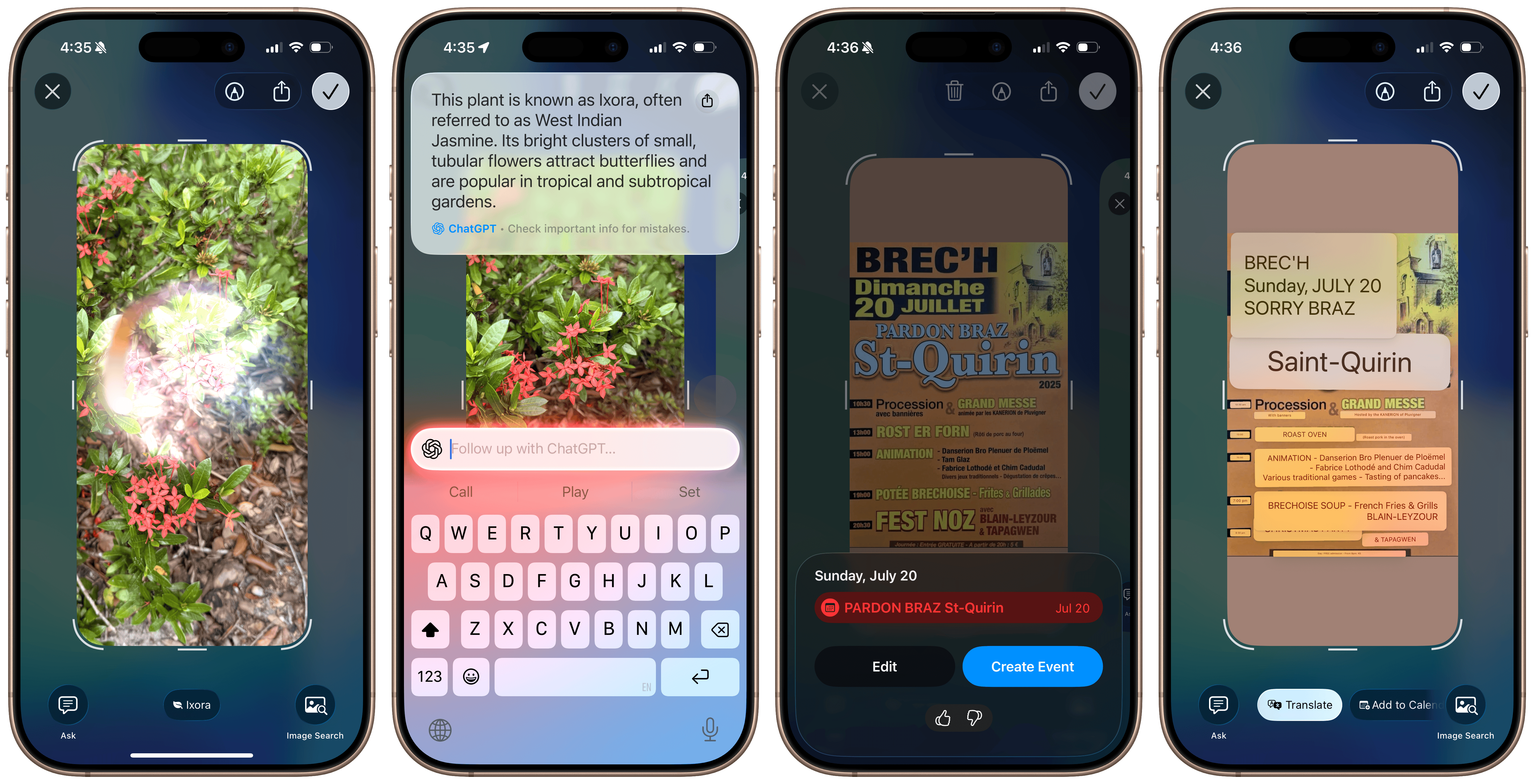 Visual Intelligence in iOS 26.
Call hold detection and screening are two of my favorite iOS 26 features, and I’ve wanted Apple to add them ever since they came to Google’s Pixel phones a few years ago. Now, when iOS detects you’re on hold, say, waiting for a customer support representative, it will offer to remain on the call automatically and send a notification when someone is on the line. I’ve only used it once, but it worked remarkably well: iOS detected the call was on hold, waited for the line to be connected again, told the representative I would be back shortly, and sent a notification as if a new call was coming in. It really is one of the nicest quality-of-life features in iOS, and it works tremendously well. Some have pointed out concerns that this will create a cat-and-mouse game of sorts, where help desk software will use some kind of robot to ensure a person is actually on the line, but that’s already used by many companies, including Apple itself. I think this is a great feature with little to no downside.
Call screening is a bit riskier, but Google Voice users will find it familiar. iOS has had a feature for years where it silences unknown callers entirely, sending them to voicemail, but turning that feature on isn’t ideal for most people who receive important calls from numbers they don’t know. The Live Voicemail feature, introduced a few iOS versions ago, alleviated this a bit, but spam calls still hit the Lock Screen, and it wasn’t the ideal solution. The new call screening feature automatically answers calls from unknown numbers and asks the caller who they are and why they’re calling. It then relays that information back to the user via a Live Activity. This feature also extends to Messages, where iOS will filter suspected spam and unknown senders along with promotions and other junk, but unlike in Messages, there don’t seem to be any improvements to spam call filtering from iOS. I’ve kept this feature off for now since I find a robot answering for me to be a bit embarrassing, but I feel like there’s a real market for a Nomorobo or Robokiller competitor built into iOS.
I already wrote about Apple’s new transcription tools in a separate blog post in June, but I’ll go over them again just because I think they work so well: In apps like Phone, Notes, and Voice Memos, the transcription model has been replaced with a new one similar to OpenAI’s Whisper, leading to significantly higher-quality transcripts than in earlier OS versions. The problem with those older transcriptions was that they used the model Apple still begrudgingly uses in the keyboard dictation feature, standard across all text fields in iOS and macOS. It was updated in iOS 17 to support automatic line breaks, punctuation, and some proper nouns, but in my testing, it really is next to worthless. Maybe it’s just because I’m a fast typist, but I find it’s slower to correct all the mistakes it makes than to write the words I want to say myself. Apple’s new model — called SpeechTranscriber for developers, who can now also integrate it into third-party apps — is significantly better in almost every dimension.
I find that it still lags behind Whisper with proper nouns and some trademarks — it still can’t discern Apple the computer company and the fruit often — but it’s lightning quick, so much so that Apple even lets developers offer a “volatile,” in-progress transcript, just like the keyboard dictation feature. It works pretty well in apps like Voice Memos, but I just don’t understand why Apple doesn’t throw out the old, bad model, at least on new, powerful devices that can handle the more demanding model. I’m not much of a heavy Voice Memos user, and I haven’t even touched the speech transcription feature in Notes once since I reviewed it when it first came out, but I would’ve loved to see the model replaced on the Mac at the very least, where pressing F5 activates the inferior dictation feature. I could probably do some hijinks with Keyboard Maestro and assign the key to a shortcut that employs the new transcription model, but I feel like that’s too much work for something that should just be built in. Personally, I would even go as far as to say it should power Siri.
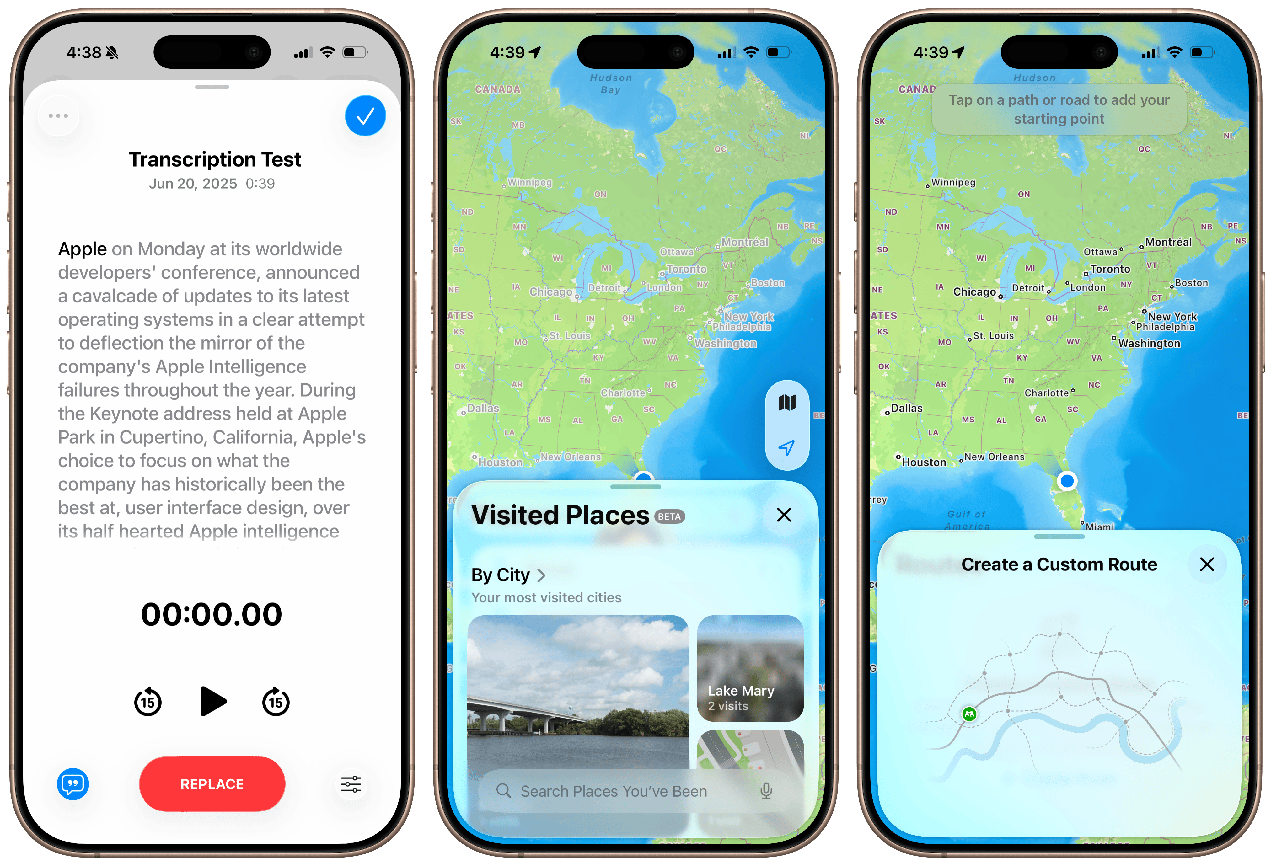 Updates to transcriptions and Maps in iOS 26.
It’s little features like these — shortcuts, dictation, call filtering, etc., — that really make the system feel smarter. Google has largely sold the Pixel line of phones on the premise that they’re the “world’s smartest smartphones,” and I still think that’s true thanks to Gemini. But before that, it was these little niceties that made the Pixels so valuable. The possibilities for the foundation and dictation models throughout the system give me hope for the future of Apple platforms, and Visual Intelligence really feels like something Apple should’ve rushed to ship last year, as part of the first batch of Apple Intelligence features — it’s that good, and I find myself reaching for it all the time. (It’s a shame that it didn’t come to the Mac, though, where I maybe would find it the most helpful.) All of these new features feel infinitely more useful than the Writing Tools detritus Apple shipped last year, and combined with better ChatGPT integration in Visual Intelligence and Image Playground — still a bad app, for the record — I think Apple has a winner on its hands.
I’ve been saying this for weeks now: the “more personalized Siri” must ship soon for there to be any juice left here. The only weak link in the Apple Intelligence chain is perhaps Apple’s most important AI feature: Siri. It’s what people associate most strongly with virtual assistance, and for good reason. Apple has the periphery covered: its photo categorization features are excellent, data detection across apps works with remarkable accuracy, Visual Intelligence with ChatGPT is spot on, its transcription and text models are fast and private, and its developer tools are finally back on track. It’s just that nearly every other “Big Tech” company has a way to interact with an LLM that feels natural. People rely on Siri to search the web, search their content, and access system settings, and it excels at only one of those domains. (Hint: It’s not the important one.) The new Siri, announced over a year ago, could fix the app problem, and better ChatGPT integration could remedy Siri’s uselessness in search.
The bottom line is that Apple is far more ahead in the AI race than it was 12 months ago. That wasn’t something I expected to write before WWDC, and it’s thanks to Apple going back to its roots and focusing on user experience over abstract technologies it’ll never be good at. My advice is that it continue to work with OpenAI and build the new Siri architecture, pushing updates as quickly as possible. This industry moves quickly, and Apple last year didn’t, to say the least. It relinquished its dominance as the de facto tech leader because it leaned into unorthodoxy; its engineers were directionless and without proper leadership. The tide now appears to be turning, albeit slowly, and here’s hoping it makes it across the finish line soon enough.
iPadOS Multitasking
Multitasking modes on the iPad have been a dime a dozen at least since iOS 9, when Split View was first added to the iPad version of the OS. Split View changed the calculus of the iPad and made the iPad Pro a more powerful, useful tablet, so much so that Apple started calling it a computer in its infamous “What’s a computer?” advertisement circa 2017. That commercial was so bad, not because the iPad wasn’t a good tablet computer, but because it dismissed the concept of a computer (a Mac) altogether. The iPad didn’t magically become a computer in 2017 just because it had a file manager (Files) or because people could split their screen to show two apps at once, but Apple used these features as a pretense to put the Mac on hold for a few years. The years from 2016 through 2020 were some of the darkest for the Mac platform since before Jobs’ return to Apple in the 1990s, and it was in part thanks to the iPad.
The second step in the iPad’s evolution came shortly after the introduction of iPadOS at WWDC 2019 — more specifically, the Magic Keyboard with Trackpad in early 2020. iPadOS 13 brought Slide Over to the iPad, the device’s first flirtation with app windows, and allowed users to make separate instances of the same app, just like they could on the Mac, but it was the cursor and proper keyboard that made people begin to think of the iPad as a miniature computer. Apple capitalized on this with Stage Manager, first introduced in 2022 as a way to create limited instances of freeform windows. There was a hitch, though: Stage Manager wasn’t a true windowing system and came with severe limitations on how it would spawn new windows, how they could be placed and sized, and how many there could be, even on the most powerful M1-powered iPads Pro. Stage Manager was the most irritating evolution of iPad software because it positioned the iPad and Magic Keyboard setup — more expensive than a Mac — between a true tablet and a full-fledged computer, akin to the Mac.
That brings us to 2025, probably the greatest year for the iPad since iPadOS 13 and the Magic Keyboard. This year, Apple scrapped the iOS-inspired Split View and Slide Over system launched before the Magic Keyboard and started essentially from scratch, building a new, Mac-like windowing system. As a Mac user for over 15 years, I can say Apple nailed it after a decade of trying, not trying, and failing either way. The new system succeeds because Apple came to terms with one fundamental truth about its software: the Mac does window management better than any of its other platforms. Apple was nervous about whether iOS-based iPads would handle a Mac-level windowing system, but Apple sold Macs far less powerful than even old iPads when Mac OS X first launched. Does anyone really think an iPad Pro from 2018 is less capable than a PowerPC-powered Mac from 2001? Apple ditched the bogus Stage Manager system requirements for the new windowing system and built it just as it would for the Mac: with no limits. It’s a wonderful breath of fresh air for a platform that has suffered from neglect for years.
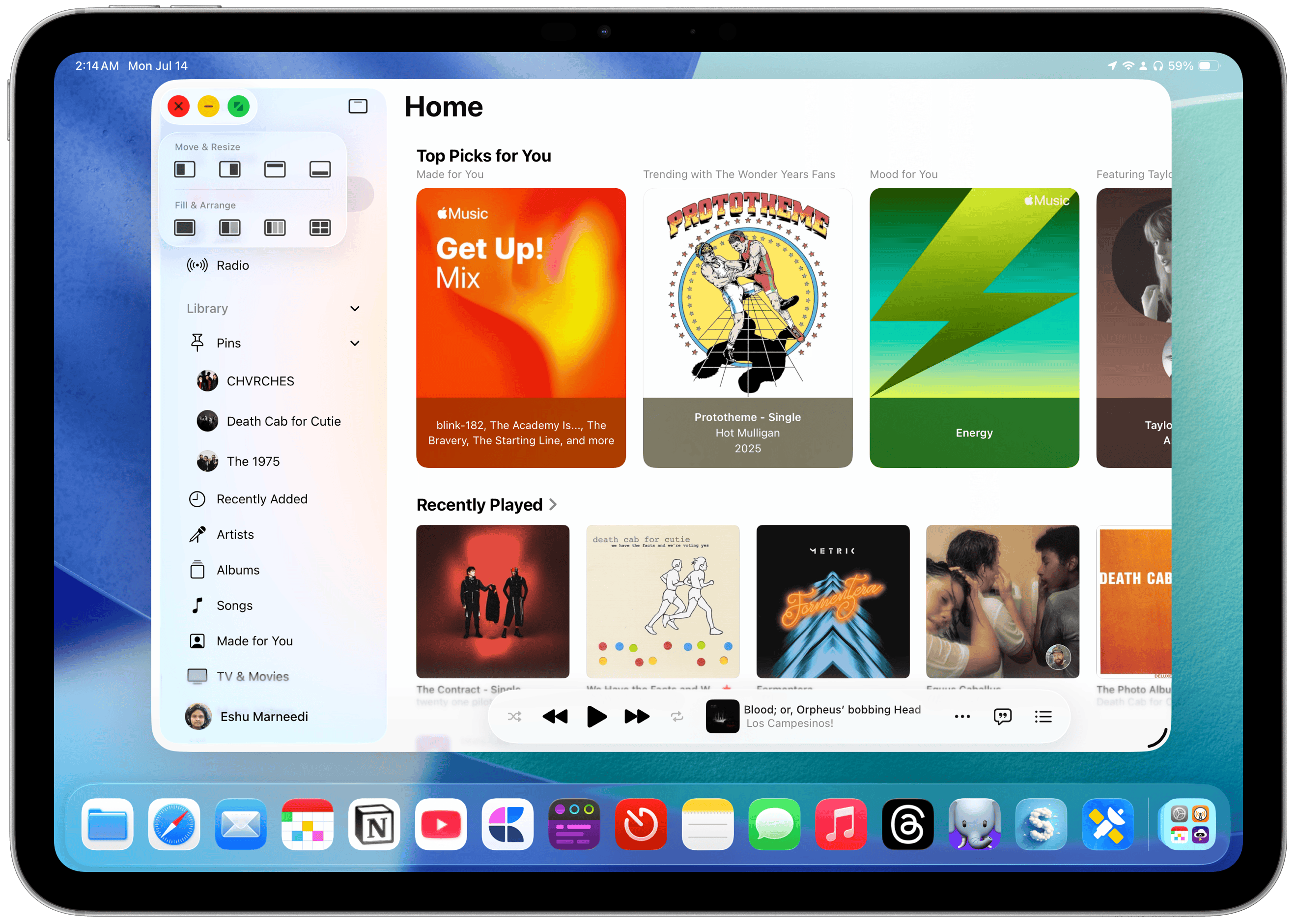
There are now three discrete iPadOS “modes,” and the OS makes you choose which one you want when it’s first updated. The first is the traditional iPad experience, titled “Full Screen Apps”: It opens apps normally and only allows one to run at a time, taking up the full width and height of the screen. Apple scrapped Split View and Slide Over, and they no longer work in this mode, which I believe 90 percent of iPad users will opt for as soon as they see the prompt. The second mode is Stage Manager, and it works just like the iPadOS 17 version, with looser app and window limits, but it’s still so annoyingly fiddly that I almost wish it were removed. (Don’t get me wrong, I wouldn’t applaud if it were omitted, but it’s just so annoying to use.) The third is the all-new Windowed Apps mode, allowing for fully freeform apps that can be moved, resized, and adjusted to the user’s content.
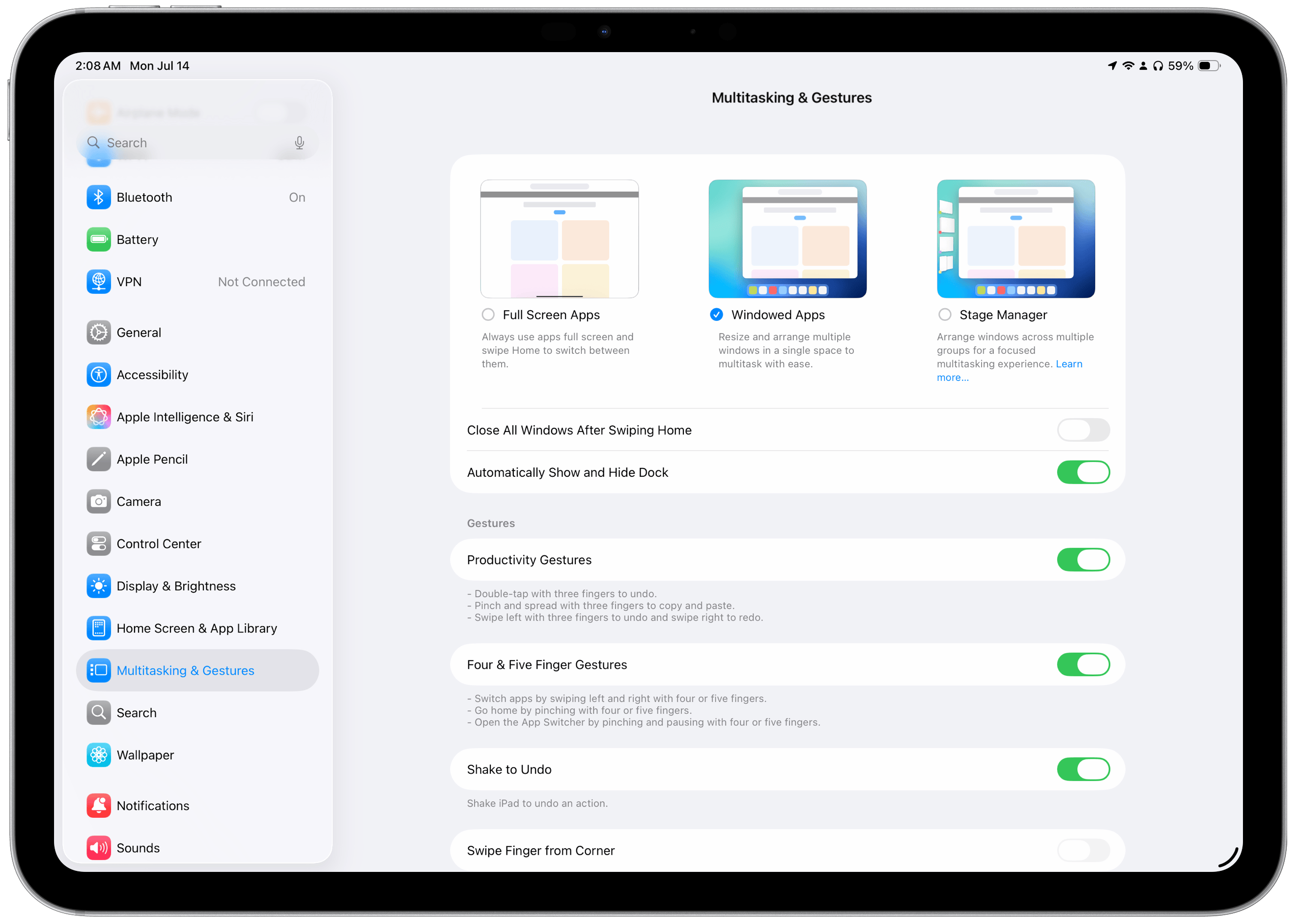 The three multitasking modes in iPadOS 26.
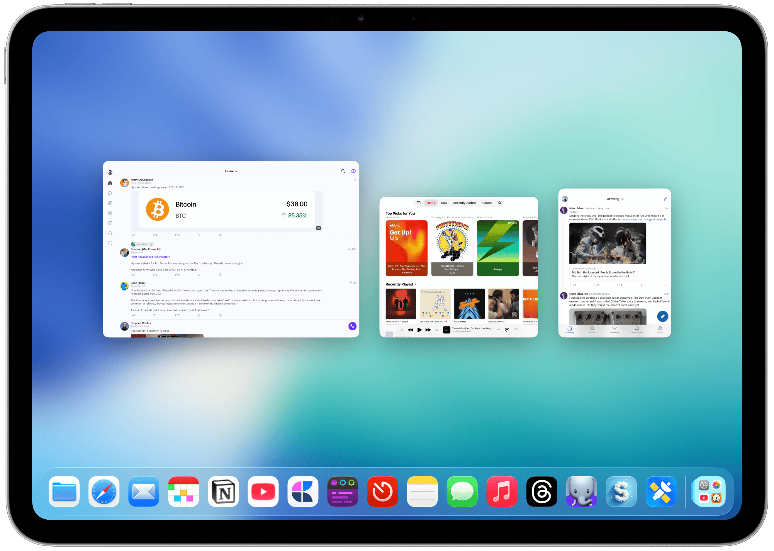
When an app is initially opened in this mode, it takes up the full screen, just like a traditional iPadOS app, but unlike the Mac, where developers can set a preferred window size at launch. But the window also has a drag handle at the bottom left corner that permits nearly unlimited resizing and repositioning, just like on the Mac. This works in almost all modern and native UIKit and SwiftUI apps because they no longer use size classes, an arcane developer feature that allowed apps to be constructed into various sizes for use in Split View and Slide Over in addition to the full-screen presentation. That functionality was deprecated with Stage Manager, and now, most apps can be resized freely like Mac apps. Once an app is resized, iPadOS remembers its position and size even after it’s closed and relaunched. Windows can also overlap each other and be tucked into a corner of the screen, partially trailing off the edge of the “desktop.”
 Apps are initially maximized.
 Full multi-window support finally comes to the iPad.
 Windows can be pushed beyond the edges of the screen.
Tapping anywhere outside a window’s bounds shows the iPadOS Home Screen, but people using their iPad in this mode probably won’t get much use out of it. Spotlight still works as usual, and the Dock is always visible unless an app is explicitly pushed into its area, enabling an auto-hide feature of sorts, like macOS, though this can be disabled if desired. At the top of each window are three buttons, similar to the “traffic light” window controls on the Mac: close, minimize, and maximize. There’s been way too much confusion about what these buttons do, and I think Apple should clarify this both for Mac and iPad users just because of how many new people will be exposed to them for the first time. On the Mac:
-
The close button closes the window, but in many apps, it doesn’t quit the application, i.e., halt its execution in the background. Either way, the closed window’s state is usually gone forever. If the app is not quit, it can be foregrounded even when its windows are not visible, say, to jump straight into composing a new email in Mail with a keyboard shortcut.
-
The minimize button collapses a given window into the Dock to move it out of the way, but it’s different than hiding (Command-H), which collapses all of an app’s windows.
-
The maximize button enlarges that window as much as possible, hiding the menu bar (by default) and Dock and creating a space in Mission Control. It is different from manually dragging all four corners of the window to occupy the full width and height of the screen.
On iPadOS, each of these buttons has a completely different (yet loosely related) purpose and function, and I think they work intuitively:
-
The close button’s function depends on the number of windows an app has open. If only one is open, it will close it and halt the app’s execution, like going to the App Switcher, now App Exposé, and swiping up to quit it. If more than one window is open, it functions like the Mac, closing just that window permanently.
-
The minimize button collapses just that window, but does not close it permanently. (Emphasis on “collapses”; its state is not destroyed, much like the Mac.) There is no functional iPadOS equivalent to the Hide function on macOS. To temporarily show the Home Screen, tap outside the bounds of all apps. (This does not minimize all windows, though; it just shoves them aside. It works like macOS’ Show Desktop feature.) If only one window is open, minimizing it shows the Home Screen.
-
The maximize button expands the window to the bounds of the iPad screen. If you recall, apps automatically open in full screen when first launched, but they can be resized using the handle. The maximize button returns them to their initial state as if the handle was dragged to the edge of the screen. It also creates a new space, like on macOS, and all other resized, windowed apps will be moved to a new space. Holding down the button allows quick window tiling, just like on the Mac or in the prior Split View mode.
 The window controls in iPadOS 26.
 App Exposé in iPadOS 26.
This cleans up the “three dots” menu from iPadOS 13 and onward and eliminates the awful window management controls scattered across the OS. All windows across all apps are shown in App Exposé with the same three-finger drag gesture from macOS, and all window visibility and tiling have moved to the window controls menu. It does take two taps to access the buttons, but I can excuse that because it has to remain touch-friendly. (And yet, the new multitasking features work amazingly well, both when docked to the Magic Keyboard and while using the touchscreen.) But the best addition to iPadOS that I feel exceeds the new window controls is the menu bar, now enabled for every app, just like on the Mac. The menu bar really makes the iPad feel like a computer because everything is where it is supposed to be. In previous versions of iPadOS, commands were scattered throughout the system, like behind a hidden menu found by holding down the Command key. Now, everything is in one place.
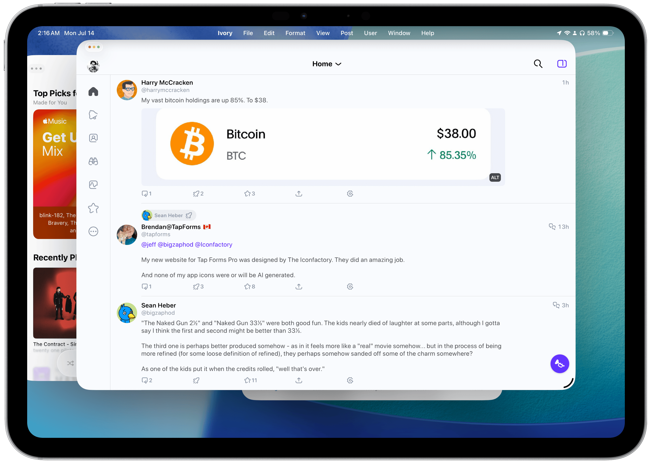 The menu bar in iPadOS 26.
If you want to create a new window in any app, there’s a way to do it. In prior versions of iPadOS, you would have to tap the three dots at the top of a Stage Manager window to view all windows and open a new one. Now, it just works like on a Mac, where the New Window button is in the menu bar. All system-wide commands are located in the menu bar by default, and apps with macOS counterparts have their items available on Day 1, too, with no optimization required. The menu bar is hidden by default, but it can be quickly accessed by hovering the (redesigned, pointy) mouse cursor over the top of the screen or by swiping down. It feels like a little brother of the Mac — it has almost all of the features, but it’s sized down for the iPad and works perfectly, even just by touching.
 Window controls in the menu bar.
 Third-party apps with macOS counterparts fit in well.
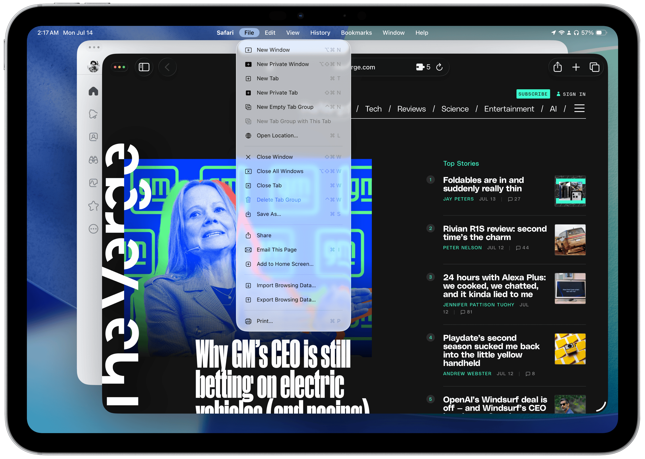
There are some oddities around the menu bar, though, and I hope Apple and third-party developers address them soon. My main gripe is how some apps, like Safari, have a New Window option in the File menu, while others use the system-default placement in the Window menu. On the developer side, apps made in Xcode 26 with iPadOS 26 don’t automatically get common window management shortcuts like Command-N — they must be manually added, causing the same action to appear twice in the menu bar. Some shortcuts in first-party apps are also completely different on the iPad than on the Mac. On the Mac, opening a new window is done with Command-N, and opening a new tab is Command-T; on the iPad, a new window is Option-Command-N, but new tabs are still created using Command-T. Where is Command-N? The OS is clearly not fleshed out entirely, but developer documentation appears to suggest these decisions are made manually by developers, whereas on macOS, they’re handled by the OS.
 Oftentimes, not all window controls are available.
The biggest thing that surprised me about this new mode was how easy it was to pick up, even as someone who seldom used Stage Manager. I attribute some of this to my decade and a half of using the Mac and picking up its idioms, but if anything, that’s a testament to how well Apple did at bringing those idiosyncrasies to a touchscreen-first interface. And yes, the iPad is still touch-first, and it remains that way because most people will never buy the Magic Keyboard. Stage Manager felt “heavy” and cumbersome in a way the new windowing mode doesn’t because Stage Manager was trying to be something the iPad wasn’t. It was a bad hybrid between iOS and macOS, and while Apple says it’s been working on it since 2009, I think it was created to keep people’s dreams about the iPad alive. After using the new windowing system, Stage Manager feels so wrong.
iPadOS still has its fair share of quirks, and it isn’t a one-to-one Mac replacement by any stretch of the imagination. I’d recommend the $1,000 base-model MacBook Air over a tricked-out iPad Air and Magic Keyboard almost any time just because a Mac opens up limitless productivity possibilities. But Apple’s work on iPadOS this year gives me new hope for the platform and makes it feel like a worthy companion to the Mac, something I and many iPad enthusiasts have coveted for years. iPadOS 26 has a slew of updates and additions that make it more analogous to the Mac: Preview brings a full-fledged PDF viewer to the iPad, folders can now be added to the Dock, and default apps can be set in Files, just to name a few. You’d be surprised how many people’s jobs revolve around managing files and signing documents, and those workflows weren’t possible in any reasonable way on previous iPadOS versions.
 Preview and Files in iPadOS 26.
But my favorite features, separate from the new windowing mode, happen to be pro-oriented. While I was watching the WWDC keynote and seeing all of the new improvements to iPadOS that made it more Mac-like, one thing lingered in my mind that stopped me from giving it my full endorsement: background tasks. On macOS, apps run as processes separate from each other and the system, meaning they can perform tasks in the background while another app is in the foreground. This is underrated but essential to how the Mac functions. For example, if an app like Final Cut Pro — Apple’s video editor — is exporting a file in the background, you can still do other things on the computer. What’s in the foreground doesn’t affect background processes. It isn’t that iOS and iPadOS don’t have background processes, but they’re entirely controlled by the system. Canonical examples are widgets or notifications, which can be called by third-party apps, but their updates are handled by iPadOS autonomously. The result: The iPadOS version of Final Cut Pro must be in the foreground to export a file.
In iPadOS 26, developers have a limited API to perform background tasks that aren’t system-created. I say it’s limited because background tasks must have a definite start and end time, and must be initiated by the user. On the Mac, apps can start up and do some work in the background, then go to sleep, all without any manual intervention. That work can be indefinite, and it doesn’t need to be explicitly allowed — the user is only asked once for permission. These processes, called daemons, don’t exist on iPadOS. Don’t ask me why, because I disagree with their exclusion in iPadOS 26, but that limits what kinds of tasks can run in the background. The background tasks API is a welcome addition, and made me partially reverse course on my initial, rash take on the OS, but it isn’t entirely computer-like and remains one of iPadOS’ primary restrictions. It fixes the Final Cut Pro issue, but doesn’t open opportunities for new apps.
The lack of daemons and background tasks kills off many app categories: clipboard managers, system utilities, app launchers, system-wide content blockers, or any other process that must run in the background, perhaps receiving keystrokes or screenshots. If Apple hadn’t positioned the iPad as a computer for years, I would’ve ignored this because a lightweight alternative to the Mac doesn’t require background processes — they’re niche tools overall, and most Mac users don’t even know they exist or have any apps installed that require them. But the iPad Pro has an M4 processor and up to 16 gigabytes of memory. Why shouldn’t it be able to run daemons, screen recording utilities, or any of the other desktop-only tools Mac users rely on? Why doesn’t the iPad Pro have a shell to run code?
Apple’s argument for why the iPad is so limited boils down to what it wants users to buy one for. Sure, it puts the M4 and 16 gigabytes of memory in the iPad, but that’s not for any computationally intensive work. Apple envisions the iPad as a hybrid device, taking on some Mac roles while retaining the essence of tablet computing. But why put an M4 in the iPad, then? It’s more powerful than the base-model Mac laptop, has a nicer screen, and costs almost double with all options selected, but it can’t do the most advanced Mac functions. If Apple wishes to position the iPad as a lightweight alternative to the Mac, it should do that in the hardware stage, not the software one.
Apple’s iPad design philosophy contradicts itself. Features like the new windowing mode work perfectly for tablet computing and more desktop-oriented tasks. The iPad hardware is faultlessly attuned to the needs of both lounge-on-the-couch-type tablet users and professionals who require the grunt of a full-fledged computer. It’s only the high-ups calling the iPadOS shots who decide to limit its full potential artificially. The windowing system isn’t any less complex than the one on the Mac. The M4 isn’t any less powerful than base-model Mac laptops sold today. Apple has already crossed the threshold where the iPad is strictly a limited-use tablet, so why not lean into it entirely? Apple needs to pick a side. Let background daemons through on the iPad.
I’m not saying the iPad is a bad device or that nobody should buy it, and neither am I insinuating that professionals can’t get their work done on an iPad. The new audio recording features are great for podcasters, allowing them to record local audio while streaming to an audio app that supports the new feature; video editors can finally use Final Cut Pro like normal, in the background; and photographers can manage their files on the go with Preview and the enhanced Files app. But there’s no way to play audio from two sources (e.g., from Safari and Music) concurrently — a vestigial iOS limitation. The iPad version of Final Cut Pro has no plugin support, and going between projects created on the Mac and iPad is nearly impossible. These are arbitrary limitations — they have no rhyme or reason to them, and I wish Apple would just ditch them.
 Audio settings in Control Center in iPadOS 26.
In many ways, the iPad smells like the lightweight Mac it’s always dreamt of being. In prior iPadOS versions, the limits were baked into the OS, unavoidable because Apple seemed uninterested in opening up access to the core parts of the system. Now, Apple is finally showing a willingness to let the iPad do more. It just didn’t do enough. The parts that it did design are thought through wonderfully, and I’ve enjoyed using my iPad with all of the new features. They’re remarkably idiomatic, natural, and well-suited for both handheld and keyboard use, and Apple’s designers ought to be proud of themselves. I just wish for a world where Apple truly leans into the side of the iPad it’s slowly been cozying up to since the Magic Keyboard’s introduction. Until then, the iPad is a niche product for users who already have a Mac and iPhone and want a virtual “third space” of sorts for their computing life. Whether that’s a compliment or a complaint is up to interpretation. I mean it as both.
Spotlight on macOS
Spotlight search, Apple’s built-in app, file, and web search tool on iOS and macOS, has its roots in Sherlock. Sherlock was a tool in the pre-Mac OS X 10.4 Tiger days that worked much like Spotlight does today, and it’s a mostly unremarkable precursor, but its most infamous version is Version 3, which added web search support. Before Sherlock 3, an app called Watson by Karelia Software in the early 2000s, extended Sherlock to support web searches through various modules, like weather, stocks, and other information. Sherlock 3 directly copied those modules and built them into the system, digging a fresh grave for Watson and its developers and birthing a now-well-known term: “sherlocking.” An app is “sherlocked” when Apple builds a native feature that obviates the need for a third-party utility.
That backstory was necessary, and it will become obvious why in a moment. This year, only on macOS, Spotlight has been completely rethought and is probably one of the most unforeseen announcements from WWDC this year. The new version in macOS Tahoe has four tabs that summarize the changes well: Applications, Files, Actions, and Clipboard. Spotlight, since the Sherlock days, has supported application and file search, and those features remain relatively unchanged. Typing in a query shows matching files, apps, and “smart” web search results, all in a neat menu redesigned for Liquid Glass. One small hiccup that remains unchanged: performing a Google search still requires navigating to the Search the Web button at the bottom of the results; simply pressing Return will not perform a search automatically.
 The four Spotlight tabs.
The all-new feature, however, is Actions. Apps with App Intents — the framework of tools Apple uses for Shortcuts, interactive widgets, Control Center toggles, and Siri integration, including Apple Intelligence and its personal context — now donate those actions to Spotlight by default, allowing it to go one layer deeper in the user data stack, per se. Instead of just searching for applications alone, Spotlight can surface the actions inside of those apps, and developers can even donate their content to be visible in Spotlight alongside other files from Finder. Say you have a notes app, for example: it can now show your notes and options to quickly create a new note or open your most recent one through Spotlight, without having to open the app and find what you’re looking for manually. Spotlight effectively operates at the app level, not just the system level.
 Actions in Spotlight.
This turns Spotlight from a simple search utility to a powerful command line, effectively. For apps that adopt the new App Intents framework — most modern, native apps — Spotlight suddenly becomes an indispensable tool to surface common actions and files. This, by all means, is a power-user feature, as most people do not even know Spotlight or App Intents exist, but for those who can appreciate it, it brings system-level interactions to all third-party apps. Files from Finder have always been visible in Spotlight since the Sherlock days, but now files from every other app in the system are also searchable. Controls from all other apps are now centralized in one command bar.
These controls go further than widgets or Control Center toggles, the latter of which have been integrated into macOS Tahoe’s new menu bar. They act as full-fledged shortcuts because, in a way, they are. Under the hood, the controls use an underlying system called App Shortcuts, which surfaces common Shortcuts actions and makes them available to users who may not be interested in creating their own automation routines. This means that, in addition to custom shortcuts, users will find common controls from their apps as soon as they upgrade to macOS Tahoe, pushing developers to support the framework, which has been around for a few years. These controls also accept parameters, allowing users to do more than just toggle settings. They can add tasks in a to-do list app, navigate to a view, or open a file.
 Actions can also accept parameters.
The Clipboard tab houses a feature long-time Mac users have dreamt of for years: a native clipboard history manager. When enabled, macOS will remember items added to the clipboard across apps for eight hours, after which they’ll be deleted. This means that the clipboard is no longer limited to just one snippet of text from one app — people can copy multiple things at once and go into the clipboard manager to find and paste them. Like the other tabs, the Clipboard tab has a keyboard shortcut, too: Command-4 after invoking Spotlight with Command-Space, making it easy to view the history. This doesn’t eclipse the third-party clipboard manager market, though, as I’ve found the eight-hour memory constraint to be particularly limiting, and it doesn’t have options to strip formatting or see when a snippet was saved to the clipboard. It’s a barebones feature, but I feel it’ll be handy for so many people who’ve never heard of something like this. Once you use a clipboard manager, you can’t go back.
 The new clipboard manager in macOS Tahoe.
The Applications and Files tabs are more predictable, but still include noteworthy changes. The Applications tab can now be opened from a new (confusingly named) Apps app, which is added to the Dock by default on every fresh macOS Tahoe install and replaces Launchpad for the first time since OS X 10.7 Lion. The reactions to this change have been mixed so far online, but I like it and think it’s miles better than Launchpad, which had no organizational scheme whatsoever, working like the Home Screen pre-App Library on iOS, where apps would just be added to the end of the list. The new Applications section of Spotlight is organized by app category by default, but can also be sorted alphabetically and includes options to show the large icons or a more compact list view. I don’t know of anyone who used Launchpad regularly, and I’m glad it’s gone.
 Launchpad has been replaced with a new Apps section.
There has been a thriving ecosystem of third-party, so-called launchers on the Mac for a while that expand Spotlight’s functionality while piggybacking off its index — the list of files it searches. In a way, these third-party launchers could be thought of as modern versions of Watson, since that application added web extensions to the default Sherlock interface. Launchers like Alfred, LaunchBar, and Raycast — three of the most popular offerings — have their own features that make them more powerful than Spotlight. Remember what I said about searching the web through Spotlight? Alfred has default fallbacks, so when an entered query does not match any results, it automatically makes a web search with just a press of the Return key. It has a file hopper to select files and perform actions like sharing, copying, or moving to a new location, and can navigate to files by path, like ~/Desktop/file.png.
Raycast is even more powerful and beloved by thousands of programmers and power users. It allows people to chat with AI chatbots inline, download third-party extensions to work with third-party apps, and even has an extension store to install utilities like calculators, window management software, and more. Like Alfred, it even has a native clipboard manager, much like Apple’s new built-in Spotlight one. This feature parity caused some concern amongst the independent Mac app crowd because it brought up sour Watson memories, and from afar, it really does seem like Spotlight is out to kill the third-party launcher ecosystem. But whenever one of these features arises, I always remember Apple’s product design philosophy: appeal to the 99 percent and let third-party apps handle the remaining few. Spotlight has been great for most people for years, and what Apple added doesn’t change its intended demographic. Those who know about Alfred or Raycast will still use them because they’re much more powerful tools.
The issue with Watson was that it did one thing: enable web support for Spotlight. Raycast and Alfred are their own, independent apps, with new ideas and features Apple would never imagine integrating into macOS — they’re convoluted, nerdy apps. Alfred’s fallbacks, advanced calculator, plugins, and intuitive, keyword-based navigation system are unique and too niche for the majority of Mac buyers. When Apple killed Watson, Mac users were, by and large, a small, boutique segment of the personal computer market, but today, Macs are widespread computers. It’s just irresponsible to draw a line between Watson and third-party launchers on the Mac nowadays because sherlocking an app in 2025 is exceedingly difficult. Third-party launchers do more than just launch apps — they’re a full-blown experience beloved by their users, and Spotlight doesn’t even come close.
What the new version of Spotlight does do, however, is introduce the masses to automation, keyboard-based navigation, and clipboard managers. Alfred, Raycast, and LaunchBar might never have the inherent first-party advantage of connecting to Shortcuts or App Intents, but they have a whole user experience in their favor. The select few who have never heard of these apps but now find Spotlight useful thanks to the new actions might be inclined to try out a more powerful alternative. Even if they don’t, powerful automation on the Mac should be accessible to all users, because workflows like these make the Mac the Mac. Windows has always been a tasteless operating system where everything takes more clicks than it should. Automation apps like Keyboard Maestro, BetterTouchTool, and more have always called the Mac their home, and bringing (albeit much simpler) automation to every user, with no work required on their part, advances the goal of making the Mac a feature-rich, intuitive, powerful OS for people who want more out of their computer.
Spotlight still isn’t well-fitted to my needs, and I’m inclined to think many others are also in my camp. The new quick keys — which allow people to assign any action a key combination, like “msg” to compose a new message, for instance — don’t even come close to Alfred’s fallbacks. I intentionally ran the beta in a virtual machine without Alfred installed to get a feel for the new Spotlight, and I just found it so hard to get anything done with the added friction of having to navigate to things I want rather than assigning them a quick command. My Mac feels broken without Alfred, and the new actions didn’t change that — they’re very much a quality-of-life feature for existing Spotlight users. But if you never used App Intents at all, or prefer to run your own shortcuts in some other way, you won’t find this version of Spotlight to be immediately compelling.
Spotlight, at least to me, seems too reliant on my files in Apple apps. This is innate to the way Spotlight works, but most of the time, I use a launcher to search the web. If I wanted to search my emails, I’d open Mimestream; if I wanted text message conversations, notes, or tasks, I’d open the apps for those files. To me, the system launcher has always been for the web and files from Finder, and anything else just feels too cluttered because the rest of the apps on my computer have way too much data. I have thousands of emails in my archive — why would I want them in the system launcher? Alfred, Raycast, and other utilities understand that well, but I feel Spotlight searches a little too deeply. If anything, macOS Tahoe’s updates exacerbate that problem. You might find this comparison unfair, but I am making it to prove a point: third-party launchers will never die because many users have individualized needs.
When this update hits people’s computers in the fall, I expect it to be met with a collective shrug, just like the app shortcuts introduced in Spotlight in iOS 16, which hardly anyone remembers. But the nerdy reaction to the update has been much more interesting, because it makes Apple’s software purpose evident: to make good software for the majority. We Mac power users have been using third-party actions, quick keys, and clipboard managers for literally decades, and the fact that they’re now being introduced to a much wider set of people for the first time should be encouraging, not just for the Mac’s endurance and freshness, but for the independent developer scene because it brings more people to the market. When Apple adds a feature power users have had for years, it should be celebrated, not begrudged. That’s where I stand on the new Spotlight: great for most people, but not groundbreaking enough to kill off third-party apps.
Miscellany
These platform releases have been slow feature-wise, but there are lots of minor feature additions strewn throughout that are worth mentioning.
- Aside from the Mac’s new transparent menu bar design, Control Center has been redesigned to bring feature parity with iOS. More intriguingly, though, is that controls can be added to the menu bar like typical menu bar extras — applets for apps that benefit from running in the background. To me, this is an example of how Apple thinks about the menu bar nowadays: It doesn’t want to remove menu bar extras, but it believes most apps could do with replacing them with controls, akin to iOS. Controls can now be nestled in custom menus or removed entirely, too, making for a neater appearance on notched Mac laptops — an annoyance Bartender, a third-party utility, has solved since the 2021 MacBooks Pro.
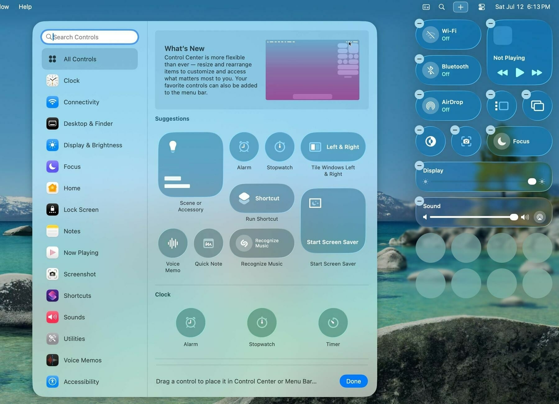 The new Control Center in macOS Tahoe.
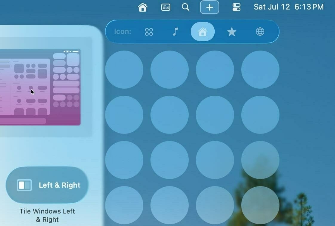 Control menus can be added to reduce clutter.
-
The Mac menu bar now displays Live Activities from a nearby iPhone. When displayed, macOS merges the leading and trailing edges of the Live Activity’s appearance in the Dynamic Island to create one small bubble that sits neatly in the menu bar. Clicking on it expands the Live Activity as pressing and holding one in the Dynamic Island would. As a major Live Activities proponent, I’ve enjoyed trying this out in beta, and I think the minimized appearance is genius.
-
The Phone app has now been redesigned and is available on the iPad and Mac for the first time. Like last year’s Mail app redesign, users can choose between the new and old appearances, but unlike Mail, the old design is the default. The redesign displays voicemails, transcriptions, and calls in one unified Calls tab and features prominent favorites at the top. I like the new design and think it makes sense to have voicemails and calls in one place, but I have a feeling most people will opt to retain the old design.
-
The Photos app regains a tab bar, but only with two options: the photo grid and the Collections tab. Collections displays the categories from last year’s bottom sheet, but since it was so controversial, Apple has moved it into its own, separate interface. One quirk of this design that I hope is ironed out in later betas: It’s more difficult to show the view changer bar, which allows you to switch between Years, Months, and All. It’s still there, but hidden behind a swipe. That’s broken some muscle memory for me, and I think it’s more important than always showing the rather large Collections tab.
-
The Maps app now includes a Visits menu and allows you to save favorites. I briefly touched on this in the Apple Intelligence section, but it just didn’t fit in neatly. Part of the reason why is that it’s too unreliable — it’s meant to track places you’ve been as a copy of Google Maps’ timeline view, but it’s spotty in when it chooses to save a trip. Even if it did work properly, I don’t know who this is useful to; I have the timeline feature turned off on Google Maps.
-
All of Apple’s platforms have a new Games app, and I think it is worse than useless. The app’s Home tab just shows every game with Game Center support installed on any of your devices, and tapping on an icon launches the game. There are also some recommendations for Apple Arcade titles, but that is it. Game Center data is still available in Settings, and Apple Arcade games haven’t been moved outside the App Store. I do not know who this is for or what its purpose is.
 The new Games app.
-
Select iPhones now display how long it will take to charge to 80 percent and 100 percent on the Lock Screen and in Settings. The Battery menu in Settings has also been redesigned, but I find the changes make the pane more annoying to use.
-
Shortcuts on the Mac now supports background automations. This has been a feature on iOS since Shortcuts launched in 2018, and allows users to set shortcuts to run depending on a variety of factors, like time, location, device charge level, or Focus. I’ve been asking for this since Shortcuts came to the Mac in 2021, and I’m glad it’s here.
-
The Terminal app on the Mac has a semi-transparent Liquid Glass background, and the default appearance is dark with light foreground text. (The older version would change appearance depending on the Mac’s system setting.) I think it’s gorgeous, but again, I wish it would come to the iPad.
 The redesigned Terminal app in macOS Tahoe.
-
macOS Tahoe has a redesigned cursor for the first time since Mac OS X. The new design is more rounded, and the selection cursors — such as when hovering over a button or text — are no longer at a slight angle, playfully dubbed the “Mickey Mouse cursor.”
-
Alarms in the Clock app now support setting a custom snooze duration. Alarms and timers also have a new appearance on iOS and iPadOS with gargantuan buttons, and while controversial, I like the change. I can see the buttons much better in a bleary-eyed haze, and the Snooze button is still accented. There’s also a new API for developers to show alarms like the native Clock app.
-
AirPods with the H2 chip now have enhanced microphone quality, which Apple — in typical Apple fashion — proclaims is “studio quality.” I wouldn’t go that far, but Federico Viticci at MacStories has a great demonstration, and I think it sounds much better than before. Newer AirPods are also supposed to detect when you’ve fallen asleep and pause audio automatically, but I haven’t seen it work yet. (I’d love to know how this feature works internally.)
-
The Journal app makes an appearance on the iPhone and iPad, and it’s largely unremarkable. I feel like a writing app of all things should’ve made it on the devices with physical keyboards a lot sooner. (Maybe this is a big deal for Journal app diehards — I’m barely a note-taker.)
-
Widgets now make it on Apple Vision Pro, and I think they’re great. I can’t use my Apple Vision Pro for more than an hour without a headache, so I didn’t think my visionOS review would be particularly insightful this year, but I find the way widgets and windows can remember their placement in rooms to be delightful and impressive. They really do feel like physical objects.
-
Apple Notes now has an option to export a document in Markdown. I don’t write much in Notes, but I’m just glad Apple acknowledges Markdown’s existence in a default app. Bear and Craft are great Markdown-based note-taking apps, but I just wish Apple supported it, too.
 Battery charge time estimates and custom durations in iOS 26.
Nearly 17,000 words ago, when I began this piece, I wrote that Apple’s operating systems this year have a new, rejuvenated sense of whimsy and fun. I meant that in the context of Liquid Glass, which is by all counts the marquee feature of the platforms, but Apple this year really dialed in on user experience. The opening WWDC keynote has, for at least a decade, been a consumer-oriented feature showcase of everything coming to people’s phones later in the year. You can always glean some insight into Apple’s priorities just by reading between the lines of the keynotes: some years are feature-packed, others are more focused on user experience, and this year was the latter.
Last year, Apple Intelligence was a mess because Apple took the feature-packed route. It clearly felt the pressure to deliver. But I think this year’s Apple Intelligence updates are immeasurably more consequential and compelling than last year’s. The same goes for iPadOS windowing improvements, which are more well-thought-out and designed than Stage Manager ever was, even to the point where I do not begrudge the removal of Split View and Slide Over. Apple, like most of us, works better when it is not under pressure, and this year was the most direct example of that seen from Cupertino in a while.
I think Liquid Glass and the rest of Apple’s 26 platforms will be treated well in the fall. They’re still rough around the edges, and I’m eager to document their evolution throughout the summer, but they’re so much better than iOS 7 when it was in beta, or even iOS 18, which was directionless and not substantial. I can’t believe I’m saying this after Apple’s drab 2025 thus far, but I’m more enthused than ever about Apple’s software.
iOS 26, iPadOS 26, macOS Tahoe, and visionOS 26 are all available in public beta beginning Wednesday.
-
Wikipedia’s entry for Liquid Glass calls the design “neumorphic,” and I’m not sure how much I agree. Neumorphism is typically categorized by extensive use of drop shadows instead of defined borders, and while that applies to the macOS version of Liquid Glass, I don’t think it describes the semi-transparent material very aptly. ↩︎
-
I say I don’t know if it’s intentional because Apple addressed this in light mode as of the third developer beta. In dark mode, however, tab selection is illegible, and it’s unclear if it’s a bug or not. ↩︎
-
I will, however, quibble about tab bar contrast in iOS and iPadOS 26 Beta 4. I’ve been trying to put my finger on why it’s so bad since the beginning of the beta cycle, and I think I’ve figured it out: it’s accent colors. Liquid Glass looks best when it’s monochrome, with starkly contrasting foreground and background colors. Apple is aware of this, which is why iOS adjusts the Liquid Glass appearance to be either light or dark, depending on the background content. But this falls apart when accent colors are introduced, making the current tab selection effectively illegible. I didn’t want to nitpick specific design quirks in this review, but I must point out this one, as it’s the worst offender by far. I hope, and think, Apple fixes this before September’s release. (Link to Federico Vicicci’s commentary on Mastodon.) ↩︎
-
Further clarification: When you take your first iOS 26 screenshot, Markup is disabled by default, instead only showing the Visual Intelligence menu after tapping on the thumbnail (if the thumbnail view is enabled) or right as you release the buttons (if it isn’t). If you tap Markup to draw on the screenshot, then copy or save the screenshot, it’ll show by default the next time you take a screenshot. If you want the Visual Intelligence menu, you must turn off Markup by tapping the button again. I think this behavior is unintuitive, especially since the thumbnail view isn’t enabled by default, and it might be jarring to first-time iOS 26 users. ↩︎