
At Cook’s Apple, Internal Politics Begets Apple Intelligence’s Failures
Jacqueline Roy, an Apple spokeswoman, in a written statement to John Gruber at Daring Fireball:
Siri helps our users find what they need and get things done quickly, and in just the past six months, we’ve made Siri more conversational, introduced new features like type to Siri and product knowledge, and added an integration with ChatGPT. We’ve also been working on a more personalized Siri, giving it more awareness of your personal context, as well as the ability to take action for you within and across your apps. It’s going to take us longer than we thought to deliver on these features and we anticipate rolling them out in the coming year.
This “more personalized Siri” featuring Apple’s personal context artificial intelligence feature was demonstrated at the Worldwide Developers Conference last year as part of iOS 18 and was supposed to be out by the spring. Apple never acknowledges future products — for all intents and purposes, this is supposed to be a current feature of iOS just coming in a future update. But reading the tea leaves leads me to believe that the new Siri won’t ship until the fall, perhaps as part of iOS 19, which is rumored to feature no substantial improvements to Apple Intelligence. This year’s WWDC invites should be out in a few weeks, and Apple’s development teams are all hard at work on putting the final touches on the next operating systems scheduled to go into beta in June. There’s just no time to ship these 18.x features by the end of the month.
But why? Apple’s demonstration last June was supposedly recorded live, so the features must’ve been partially developed by then — or at least, that’s what I thought. Most likely, WWDC was the work of Apple’s marketing department with no oversight from engineering, similar to the AirPower wireless charging mat announced alongside the iPhone X in 2017 that died because it was impossible. Phil Schiller, Apple’s then-marketing chief, proudly proclaimed that his teams “know how to do this” on that September morning, just like Craig Federighi, Apple’s software vice president, said about Apple Intelligence. Neither of them seemed to be correct in their assertions. Here’s Mark Gurman reporting for Bloomberg on the internal shenanigans at Apple:
Since then, Apple engineers have been racing to fix a rash of bugs in the project. The work has been unsuccessful, according to people involved in the efforts, and they now believe the features won’t be released until next year at the earliest.
In the lead-up to the latest delay, software chief Craig Federighi and other executives voiced strong concerns internally that the features didn’t work properly — or as advertised — in their personal testing, said the people, who asked not to be identified discussing internal matters…
Some within Apple’s AI division believe that work on the features could be scrapped altogether, and that Apple may have to rebuild the functions from scratch. The capabilities would then be delayed until a next-generation Siri that Apple hopes to begin rolling out in 2026.
If Gurman’s reporting is to be believed, there’s no functioning version of the “new” Siri at Apple Park. Marketing seems to have caught on; an advertisement from last fall showing the actress Bella Ramsey asking questions to the more personal version of Siri was deleted this week upon the news of the statement. The fancy rainbow glow at Apple’s Fifth Avenue store — “when I say A, you say I” — the “Hello, Apple Intelligence” slogan on all of last year’s iPhone models, and the countless occurrences of billboards in subway stations and city streets around the country were all for nothing. They advertised nothing. Those features never existed beyond a nonsense presentation cobbled together in a few months.
I gave Humane a hard time for shipping the Ai Pin in a state where it was nothing more than overpriced vaporware. The Ai Pin does nothing it was supposed to and I rightfully flamed Humane for its marketing lies and subsequent pump-and-dump scam. I’m applying my standards evenly: Apple sought to capitalize on the AI stock market gold rush last year, put together a fancy demonstration for eagle-eyed WWDC viewers, and never shipped the feature. The only difference between the two companies is that I still presume Apple intended to release them in the spring, whereas Humane’s primary motive was to find the first idiot to buy the company for an obscene amount of money. Either way, the outcomes were the same.
This is sheer, unbridled incompetence, and there’s no other way to put it. John Gianandrea — Apple’s machine learning chief who has accomplished almost nothing during his time there — Federighi, and Tim Cook, the company’s uncharismatic, slow-as-a-snail chief executive, all need to huddle and figure out how to address their collective lack of meaningful leadership skills. Otherwise, they should all be fired. I’m not saying this as a fluke — if Scott Forstall, Apple’s previous software chief pre-Federighi, was forced out of Apple due to the cataclysmic Apple Maps failure, Federighi and Gianandrea should be out of the door by next week. The only difference was back then, in 2012, Apple still had a culture dominated by the Steve Jobs school of thought. People who didn’t do good work were sacked with no remorse. Apple under Cook is ruled by a hierarchy of convoluted politics, whereas Jobs governed like a monarch.
Federighi, Gianandrea, and Cook’s roles in the Apple Intelligence drama have significantly undercut Apple’s leadership in software. That politics is, in my eyes as an outside spectator, the real reason why Apple has no AI strategy. There’s only one solution I can think of: Gut the entire department and buy another company that knows how to make large language models. Of the ones out there — or the ones for sale, anyway — Anthropic jives the best with Apple’s ethos of privacy and safety at the heart of every core innovation. Claude is designed to be safe — so safe, in fact, that it doesn’t even search the web yet. I’ve written this before, but the problem doesn’t lie in the low-level programmers who write code in Xcode or fiddle with models, but rather the people with oversight tasked with managing the direction of the company. Anthropic’s direction is very similar to Apple’s, if it had a direction at all: build artificial general intelligence that’s safe and benefits humanity. Apple just needs to adopt the fast-paced nature of a Silicon Valley start-up. Cook’s politicking both inside and out needs to go.
Apple doesn’t have a money or a people problem. Gianandrea worked for years at Google, developing some of the best machine learning in decades. Federighi’s teams are efficient and produce beautiful and intuitive software used and relied upon by billions daily. Cook’s leadership has turned Apple into the most valuable company in the world. The engineers who do the scut work make products worth praising day in and day out. They’re some of the most talented, smart, and creative people in software development. On paper, Anthropic pales in comparison to Apple’s efficiency and knack for great hires. But Apple needs a direction after playing internal politics for far too many years. There’s too much bureaucracy in that company. Every report from Gurman leaves me feeling like the low-level programmers at Apple are trying to send a message that the C-suite just isn’t interested in doing the work. They’re not worried. They’re never worried. They’ve become too comfortable in their company’s place as top dog. They need a fire under their seat, and the people at Anthropic have exactly that.
Oh, Right, Apple Still Makes Vision Pro
Ryan Christoffel, reporting for 9to5Mac:
Apple released the latest iOS 18.4 and visionOS 2.4 betas today. Beta 2 arrives with a brand new app on each platform: ‘Apple Vision Pro’ is the newest iPhone app, and ‘Spatial Gallery’ is new to Vision Pro.
The new ‘Apple Vision Pro’ app on iPhone offers a dedicated home to:
- view your Vision Pro’s model number, software version, and serial number
- access tips and the Vision Pro user guide
- and discover new and recent Vision Pro content, such as immersive videos, apps and games, and more…
With Spatial Gallery, users will enjoy breathtaking and intimate moments spanning art, culture, entertainment, lifestyle, nature, sports, and travel, with new content released regularly. At launch, users can discover remarkable perspectives from photographers like Jonpaul Douglass and Samba Diop; new stories and experiences from iconic brands including Cirque du Soleil, Red Bull, and Porsche; behind-the-scenes moments from Apple Originals like Disclaimer, Severance, and Shrinking; and special moments from top artists.
Finally, there is some new content for Apple Vision Pro. Neither of these apps change the experience of using visionOS — which still lacks experiences and entertainment — but it’s a step in the right direction. This is the first major visionOS update since the ultra-wide Mac Virtual Display feature from last fall; visionOS 2.4 also adds Apple Intelligence, which is interesting to exactly zero people. I poked around in the Apple Vision Pro iOS app — installed by default for people on the iOS beta with an Apple Vision Pro signed into their Apple account — and I think it’s well-made and helpful. Apple realizes it’s cumbersome to strap on the headset just to check if there’s anything new to watch, so the app allows users to add immersive content to their watchlist and download apps for later use. I like the idea, and over time, as more content is added, I feel like it’ll be handy to add things throughout the week and put the headset on over the weekend to experience saved content.
The “Spatial Gallery” is a bit of a mixed bag, but it reminds me of Apple TV+ when it first launched and had next to no compelling content. Sure, perhaps the idea of “Apple Original” visionOS-specific content isn’t appealing now, but in the future, I can see this as being a great place to view immersive video clips and photos. Maybe the app could even be used to live stream Apple events, but that might be wishful thinking. A few years ago, Apple shipped a companion game to “For All Mankind” using the augmented reality feature on iOS, and I can imagine something similar coming to the Spatial Gallery app. (Just imagine sitting in the Macrodata Refinement office from “Severance.”)
Moreover, I want Spatial Gallery to become a place for user-generated content. I don’t expect or even want it to be a social network, but I think people should be able to sell their own visionOS environments like apps or iMessage sticker packs on iOS. This opens up the opportunity for not only third-party developers to make their own themed environments — Disney+’s come to mind — but also independent creators and photographers, who have to resort to shipping panoramas that can only be opened in the foreground. Apple’s environments, while serene, are limited, and it’s not like the company is shipping new ones with every visionOS update. Much like games and apps, environments should be an additional, productivity-focused layer of interaction on visionOS.
I’m really just writing this to express some positivity toward Apple Vision Pro. This is the first update in a year worth celebrating, and while it’s no live sports subscription or YouTube app, it’s something. Is Apple Vision Pro any better after this update? No — nobody should buy it. I’m severely regretting purchasing mine because, again, there’s not much to do on it, comfort hurdles aside. Really, I want Apple to give users a reason to put the headset on at least once a week. There aren’t that many of us, but if all of us stop using Apple Vision Pro, the product line is all but dead. Once a product has reached stasis, it’s very hard to resurrect it, so Apple needs to start adding content that’s worth sparing a few minutes of neck pain. (And no, Apple Intelligence shouldn’t be part of the plan.)
People made fun of the original 2010 iPad for being a “bigger iPhone,” and while that was true at the time — or even now — it sold like hotcakes because there was a thriving app ecosystem. Instapaper, Kindle, The New York Times, YouTube, Netflix, and so many more apps that benefited from the larger screen came to the iPad when people wanted the iOS experience they knew and loved to fit more content. The iPad, in my eyes, revitalized online media. It made e-books worthwhile, television streaming became more common, and online newspaper subscriptions began to thrive. If Apple wanted, visionOS could be the next frontier in computing. It could replace movie theaters — sorry, Sean Baker — and usher in a new era of online media. I wrote about this last October when the “Submerged” short film debuted on visionOS, and it’s even truer now.
Amazon Fully Announces Alexa+, Possibly Months Before the New Siri
Wes Davis, reporting for The Verge:
Amazon is finally launching the long-awaited generative AI version of Alexa — Alexa Plus — that, if all goes well, will take away much of the friction that comes with talking to a speaker to control your smart home or getting info on the fly.
Some of the new abilities coming to Alexa Plus include the ability to do things for you — you’ll be able to ask it to order groceries for you or send event invites to your friends. Amazon says it will also be able to memorize personal details like your diet and movie preferences.
Alexa Plus is $19.99 per month on its own or free for Amazon Prime members — a better deal, considering Prime costs just $14.99 per month or $139 per year. That comes with access to the Alexa website, where the company said you can do “longform work.” Amazon also said it created a new Alexa app to go with the new assistant. Alexa Plus will work on “almost every” Alexa device released so far, starting with the Echo Show 8, 10, 15, and 21. The new system will be free for anyone in early access, which will start rolling out next month.
The actual Alexa+ announcement isn’t very interesting and was teased September 2023 as “Alexa 2.0,” a large language model-powered version of the normal Alexa chatbot. It works just like Gemini now1, drawing from a pool of personalized information and webhooks to complete more complex tasks than the Siri-like Alexa introduced in 2014. Expect it to function in practice like ChatGPT’s voice mode or Gemini on Pixel phones (formerly “Assistant with Bard”), using the breadth of the world’s knowledge thanks to web integration and various application programming interfaces thanks to Amazon’s connections and server business, Amazon Web Services.
One peculiar note is the pricing structure: $20 a month, like any other artificial intelligence chatbot on its own, but free for Amazon Prime subscribers, which, if we’re being honest, is most Echo owners anyway. Even I, an active Amazon hater, subscribe to Prime. Amazon Prime, for context, costs $16 a month and offers free Amazon delivery, among many, many other perks. This has led a lot of people to ponder how Amazon is making a profit on Alexa+ if it already made “minimal” margins on Amazon Prime by itself before running LLM servers all day for the new chatbot. The answer lies in Prime’s genius business model: it only subsidizes the free shipping aspect. Free two-day shipping to virtually any urban address, at Amazon’s scale, is dirt cheap, and the rest of the $16 is profit because the rest of the services (Prime Video, Music, etc.) are just fancy names for content licensing deals Amazon could eke out with just a few billion dollars a year.
Alexa+ is powered by Amazon’s own LLM — Amazon Nova, according to Davis — and some off-the-shelf models from Anthropic, and both are obviously run on AWS, which Amazon owns. It doesn’t have to build any new servers or pay any API costs. The infrastructure is there and has been for years — at least ever since AWS started selling AI server space for third parties after the ChatGPT boom. The $20 monthly entry fee for non-Prime members is a marketing gimmick to get people to purchase Prime, which Amazon makes a disgusting amount of profit on. It looks like a bargain on the consumer’s side, but it’s just a ploy to sell more Prime subscriptions. And if any fool actually pays the $20 for Alexa+, that’s just free money for Amazon. It’s not generous on Amazon’s part because it (a) sells more Prime subscriptions and (b) satiates investors’ appetite for AI juice in every product. Clever business move, Jeff Bezos.
This brings me to the world’s most advanced AI technology company, Apple of Cupertino, California. The new Siri — previewed nearly a year ago — better be able to develop a cure for cancer and end childhood poverty at this rate because of how long it’s been in the oven. Seriously, what the hell is Apple doing? Amazon — the company that forces its employees to urinate in water bottles and still was sweating bullets about missing its timeline — has a solution for the LLM wars while the Apple Intelligence-powered Siri has no official estimated arrival time. And forget about the truly LLM-powered one, which is aimed for a release next spring. Apple just isn’t behind; it’s living in the medieval times.
Deep inside, I know the new Siri isn’t going to be worth the wait. It’s entirely reliant on app developers to integrate App Intents into their apps, something the big names like Google and Uber aren’t bound to do anytime soon. Without App Intents — Apple’s version of Google’s Gemini apps, Amazon’s webhooks, and OpenAI’s Operator — the only Siri will really only work with Apple’s own apps like Mail and Messages. Sure, that might be helpful, but when shouting into the air at an Echo probably yields a better answer than the iPhone in someone’s hand, there’s really no point. Keep in mind: These products live together. There are hundreds of millions of iPhone users with an Alexa-powered smart speaker in their home — does Apple really think people are desperate for LLM voice assistants? If Siri fails, ChatGPT is two button presses away. Alexa+ is putting on a show, Gemini is hanging out, and Claude really is developing the cure to cancer or something like that. Nobody is waiting on Apple.
What comes first: the first public beta of iOS 18.5 containing the “new” Siri or Alexa+’s full rollout to all Echo Show devices? My money’s on the latter.
-
According to Aaron Perris at MacRumors, Apple is poised to finally add Gemini as a chatbot alongside ChatGPT in Siri. I don’t know how this will work after Google lost an antitrust trial for doing exactly this for two decades, but I hope it includes the “apps” functionality of Gemini, which allows it to plug into Google Maps, YouTube, and Search. (Further reading from Federico Viticci at MacStories.) ↩︎
Apple’s U.S. Investment ‘Plan’ Sounds a Bit Too Familiar
Apple today announced its largest-ever spend commitment, with plans to spend and invest more than $500 billion in the U.S. over the next four years. This new pledge builds on Apple’s long history of investing in American innovation and advanced high-skilled manufacturing, and will support a wide range of initiatives that focus on artificial intelligence, silicon engineering, and skills development for students and workers across the country.
“We are bullish on the future of American innovation, and we’re proud to build on our long-standing U.S. investments with this $500 billion commitment to our country’s future,” said Tim Cook, Apple’s CEO. “From doubling our Advanced Manufacturing Fund, to building advanced technology in Texas, we’re thrilled to expand our support for American manufacturing. And we’ll keep working with people and companies across this country to help write an extraordinary new chapter in the history of American innovation.”
As part of this package of U.S. investments, Apple and partners will open a new advanced manufacturing facility in Houston to produce servers that support Apple Intelligence, the personal intelligence system that helps users write, express themselves, and get things done. Apple will also double its U.S. Advanced Manufacturing Fund, create an academy in Michigan to train the next generation of U.S. manufacturers, and grow its research and development investments in the U.S. to support cutting-edge fields like silicon engineering.
Cook is a con artist whose masterful swindling hasn’t proven it will pay off over a month into President Trump’s second term. Make no mistake: This is just another instance of Apple’s politicking that comes around every four years to placate the new administration for some favorable business terms. This time, it’s all about the 10 percent China tariff already in place and eating into Apple’s margins; last time, it was about dodging the ire of Lina Khan, the former chair of the Federal Trade Commission under former President Joe Biden. From April 2021, also on Apple Newsroom, just three months after Biden’s inauguration:
Apple today announced an acceleration of its US investments, with plans to make new contributions of more than $430 billion and add 20,000 new jobs across the country over the next five years. Over the past three years, Apple’s contributions in the US have significantly outpaced the company’s original five-year goal of $350 billion set in 2018. Apple is now raising its level of commitment by 20 percent over the next five years, supporting American innovation and driving economic benefits in every state. This includes tens of billions of dollars for next-generation silicon development and 5G innovation across nine US states.
“At this moment of recovery and rebuilding, Apple is doubling down on our commitment to US innovation and manufacturing with a generational investment reaching communities across all 50 states,” said Tim Cook, Apple’s CEO. “We’re creating jobs in cutting-edge fields — from 5G to silicon engineering to artificial intelligence — investing in the next generation of innovative new businesses, and in all our work, building toward a greener and more equitable future.”
Sounds familiar, except this time, the announcement is much more artificial intelligence-coded, while 2021’s announcement was all about 5G. In 2021, Apple announced an all-new campus in Raleigh, North Carolina, pledging to invest $1 billion in the campus and associated jobs themselves while also spending $100 million on schools in the state. According to the news, Apple postponed the North Carolina campus indefinitely last June despite apparently owning enough land to begin building. Now, Apple is “announcing” an “advanced manufacturing facility” in Houston — which will presumably cost much of that $500 million — and if history is predictive, it will go the way of the Raleigh headquarters from four years ago. Sounds like a successful business endeavor.
Meanwhile, also from Apple’s press release on Monday, the company is planning to add 20,000 new jobs over the next four years, and it also wonderfully touted how many billions of dollars it paid in U.S. taxes. I wonder who these numbers are for. But Apple already adds 5,000 jobs a year, as evidenced by Apple’s use of the exact same number in the 2021 press release:
Apple is on track to meet its 2018 goal of creating 20,000 new jobs in the US by 2023. With today’s new commitment, Apple is setting a target of creating 20,000 additional jobs in states across the country over the next five years.
None of what Apple posted on Monday is new, but that doesn’t stop Trump from taking credit for it.1 And why would Cook correct Trump when it’s in his best interests to shut up and bend the knee further? The plan of obsequiousness isn’t working — the iPhone 16e from last week is 12 percent more expensive than the previous model, which is almost certainly a taste of what to expect come September when the flagship iPhone models are announced. That Texas plant isn’t going to reduce costs, either, because (a) it never will exist, and (b) Apple has no reason to invest so much into a U.S. facility without any subsidies from the federal government.
Taiwan Semiconductor Manufacturing Company, which produces, or fabricates, Apple’s Arm-based custom silicon, built a fab in Arizona over two years thanks to Biden’s Chips and Science Act, which provided a boatload of funding to kickstart the project. Even so, the project only produces 4-nanometer processors — not the 3-nm ones Apple uses in its latest devices. Now, the Chips Act, like much of the federal government, is in the hands of Elon Musk, a purported “adviser” to Trump whose sole interest is to enrich himself and give his companies as much federal spending as possible without letting anyone else benefit from Americans’ tax money. Apple has no fiscal interest in manufacturing its products in the United States for at least the next four years, and probably longer since the Democrat who occupies the Oval Office in 2029 will probably be more focused on ensuring a speedy recovery from Trump and Musk’s shenanigans.
Here’s what Apple had to say in its nonsense press release about the Arizona TSMC plant:
The fund’s expansion includes a multibillion-dollar commitment from Apple to produce advanced silicon in TSMC’s Fab 21 facility in Arizona. Apple is the largest customer at this state-of-the-art facility, which employs more than 2,000 workers to manufacture the chips in the United States. Mass production of Apple chips began last month.
But the passage has no mention of the Chips and Science Act at all, which was central to the construction of the facility, to begin with, because that would anger Trump’s camp and negate the whole point of the flattery puff piece. It doesn’t explain how federal subsidies would be crucial to ensuring manufacturing remains in the United States, it fails to mention how backing away from Taiwan weakens American companies, and it wouldn’t dare to ever state how taking Russia’s side in a brutal, three-year-long war with Ukraine only results in China’s power over our economy. There is no constructive feedback or criticism in this statement — no ideas, no concepts, and no plans for the future of American innovation. It is a simple regurgitation and reworking of a years-old template stashed in a Pages document on someone’s Mac at Apple.
I don’t care who’s in the Oval Office: If Apple is serious about American manufacturing, it should have a proper meeting with the federal government destroying every aspect of investment and work put in over the last four years. China is so proficient in manufacturing cheaply because it subsidizes the slave labor found in Foxconn factories. TSMC makes the most money in Taiwan because the Taiwanese government knows how important TSMC is to its economy. The U.S. government, meanwhile, is emboldening its biggest adversaries for cheap bribes while stealing congressionally appropriated money from rightful American businesses and putting it in the hands of a kleptocratic billionaire narcissist. And Cook seems to be perfectly fine with this new reality, which makes complete sense coming from the most spineless Silicon Valley mogul.
-
Trump also flat-out lied about Apple building a factory in Mexico. Apple does not manufacture anything in Mexico and hasn’t for decades. Here’s Trump, quoted by Axios:
“He is investing hundreds of billions of dollars and others, too,” Trump continued. “We will have a lot of chipmakers coming in, a lot of automakers coming in. They stopped two plants in Mexico that were… starting construction. They just stopped them — they’re going to build them here instead, because they don’t want to pay the tariffs. Tariffs are amazing.”
There is still no correction from Apple’s public relations department, which is perhaps too busy modifying the app approval template sent to developers. ↩︎
Thoughts on Apple’s Odd New iPhone 16e
The ‘e’ stands for ‘expensive’
 The iPhone 16e. Image: Apple.
Apple on Wednesday announced an all-new iPhone model, succeeding the previous-generation iPhone SE but nevertheless carving out a new spot in the now-convoluted iPhone lineup. The new model, called the iPhone 16e, follows the same philosophy as the SE line of iPhones — the latest-generation processor with otherwise lackluster specifications — and brings Apple Intelligence to Apple’s cheapest iPhone, but otherwise sports a recycled design from the iPhone 15, sans one camera lens and a few other features that make it sit weirdly within the lineup. But the most important detail is the price: the iPhone 16e costs 12 percent more than its predecessor, at an eye-watering $600. Among many of its other glaring omissions, I think the price instantly negates any reason to buy this iPhone. But that doesn’t mean it’s not interesting: For one, it’s Apple’s first iPhone with a custom cellular modem, called the Apple C1 — an interesting branding choice coming from a company typically coy about underlying technologies. The C1 makes the iPhone 16e one of Apple’s most interesting smartphones in a while, but I reckon its time will be short-lived, with the more flashy iPhone 17 Slim anticipated to be released later this year, along with the rest of Apple’s autumnal iPhones.
What Does ‘e’ Even Mean?
Up until Tuesday night, I was dead-set on the “fourth-generation iPhone SE” name. Apple refreshed the iPhone SE’s design drastically in 2018 and didn’t find the need to change the name, so I was positive the SE moniker would always designate Apple’s most affordable iPhone. There is even an Apple Watch named SE, too — it just makes sense to call the next cheap iPhone the iPhone SE. I was wrong, and Apple decided to go for “iPhone 16e.” I think the name has a few different meanings: it still sounds familiar, can be updated yearly to match the previous year’s flagship iPhones, and models the Google Pixel’s “A”-series naming scheme. The “e” could stand for many things — chiefly “economy” — but I truly believe Apple wanted to pick any letter other than A and landed on E because it sounded similar to “SE.” (SE stands for “special edition,” according to Phil Schiller, Apple’s then-marketing chief.)
Why a letter? If I had to guess, it’s probably because it’s easy to increment. In a way, I’m glad Apple is done with the “fourth-generation” nonsense. For most people, it’s too difficult to remember, and for journalists, it’s too cumbersome to write. Apple’s naming schemes vary across device lines: iPhones increment yearly (14, 15, 16, etc.), iPads have the “nth-generation” prefix that often goes into parentheses (“11-inch iPad Pro (fourth-generation)”), and Macs are known by their year (“2022 MacBook Pro”). The iPhone SE lineup has always been named by its generation, like iPads, but people usually choose to increment the number anyway, i.e., “iPhone SE 2, iPhone SE 3,” etc. Keeping the flagship iPhone number simplifies the name and allows Apple to update the device yearly around springtime. But e? It couldn’t do better than that? I still think “iPhone SE 4” is a perfectly fine name, especially because “e” adds ambiguity to the lineup. I despised the iPhone XR’s name for this reason, too — letters should mean something, and the “R for Retina” theory never spoke to me.
Time will tell if Apple sticks with the “e” name or if it goes the way of the “c” in “iPhone 5c” and “R” in “iPhone XR.” But I’d be lying if I said I wasn’t surprised when I read that the “e” was lowercase, not uppercase and subscript like the XR. The only case of this in the iPhone’s history is the iPhone 5c, which leads me to ask: Why didn’t Apple go back to 2013 and call this iPhone the “iPhone 16c?” Even “iPhone 16R” would make more sense than “e,” yet another letter to clutter the iPhone release timeline. Either of those names would also give Apple a nice excuse to offer the iPhone 16e in some snazzy colors — it’s only offered in a boring white and black now. Maybe it doesn’t want to adopt the name of a badly received low-end iPhone, but I recall the iPhone XR being very well-received for its time. The name stuck so well that it was rumored up until the last minute that the iPhone 11 would be called “iPhone 11R”; Apple ditched the letter for the “Pro” scheme the lineup carries now.
‘$600, Fully Subsidized?’
The iPhone SE’s price has steadily crept up over the years, and even the last generation’s $430 price tag was too unfathomable for me to recommend to anyone. By contrast, the iPhone 16e has a lot to offer, and I think a minor price increase is warranted: an organic-LED screen, (binned) A18 processor, Action Button, 48-megapixel camera, and USB Type-C port all are worth at most a $70 price increase. But anything over $500, and it isn’t a “low-end” smartphone anymore; $600 is flagship pricing for a below-average specification sheet. It doesn’t have the Dynamic Island, Camera Control, ultra-wide camera, or even MagSafe, a feature introduced in 2020 with the iPhone 12 mini that cost only $100 more than the iPhone 16e when it launched. Seriously, when I saw the newest iPhone in Apple’s lineup was missing MagSafe, a core feature of the iPhone, I was shell-shocked.
But then it hit me: The price increased 12 percent, just 2 percent more than President Trump’s 10 percent tariff on all Chinese-made products. Suddenly, everything made more sense — the material cost for the higher-end iPhone 15-era components cost Apple 2 percent more than the iPhone SE, but the rest is thanks to the Trump administration. That doesn’t explain why the phone is 730 euros (approximately $761) in Europe, but it is a possible reason for the higher component costs. I’m not willing to put the blame entirely on the Trump administration because of truly how outrageously overpriced it is in Europe — a relatively tariff-free land — but it’s something to consider for the fall. I think the most likely outcome is that the base-model Pro iPhone starts at 256 gigabytes of storage, and Apple bumps the price to $1,100, just like it did for the Pro Max model a few years ago, but I still don’t know how much the base models will go up. (I do still think prices will increase across the board, though.) This should serve as a word of caution for what Apple thinks is acceptable in the new regulatory climate.
Back to the iPhone 16e: The phone doesn’t make sense at its current price, not even in the slightest. Most people in the United States don’t buy their phones outright — they buy them in monthly installments on a two-year contract. Doing some rough math, that’s $25 to $27 a month over 24 months for a base model, 128 GB iPhone 16e. An iPhone 16 would cost $33 to $35 a month, which really isn’t that much more money, especially if carrier deals come by with any frequency, as they typically do. The standard iPhone 16 is a much better iPhone: a better camera, better screen, faster charging, MagSafe, and Camera Control all come at just $8 more a month. That’s the price of a reasonably sized Starbucks coffee. And people buying used iPhones are better off purchasing a refurbished iPhone 14 at $530 — $70 less for a better camera and only marginally worse chip — or, even better, waiting until September for the iPhone 16 to drop to $700. That’s the best option for anyone who cares about Apple Intelligence, the Dynamic Island, Camera Control, and the new Photographic Styles, the latter omission of which is the most disheartening because I think they’re the best feature of the iPhone 16 line. (As an aside, Visual Intelligence is demoted to an Action Button feature on the iPhone 16e.)
I don’t think Apple deserves any accolades for increasing the base storage to 128 GB — it is 2025, for heaven’s sake — but it certainly deserves blame for charging nearly $800 in Europe for a phone with a single camera lens. (Well, two, if we’re being pedantic, thanks to the 2× binning feature first introduced in iPhone 14 Pro; I believe it’s the same sensor as found on iPhone 16.) It’s telling that the only iPhones Apple compares the iPhone 16e to on its website are the iPhone 11, iPhone 12 and 12 mini, and the older iPhones SE — it bests none of Apple’s recent flagship handsets.
Apple C1
After years of development, Apple finally debuted an in-house, custom cellular modem to replace Qualcomm’s models still used in higher-end iPhones. I’m surprised Apple even mentioned the C1 beyond a footnote in its press release and “event” video, knowing it doesn’t usually disclose what modems its devices have, but I don’t blame the marketing department for this one. Apple C1 truly is a big deal because it opens up a new paradigm for success (and failure, but most likely success). The C1 is a 5G modem — but with no millimeter-wave functionality, which is fine by me — that Apple says provides sizable efficiency gains, but I reckon it’ll be even more impressive if 5G is turned off or in the “Auto” mode as it is by default. Time will tell if the C1 is unreliable garbage or not, but I have confidence in Apple, and I’m excited for when a higher-end, more advanced C2 or C3 is added to the flagship iPhones, perhaps in 2026.
I anticipate the C1 serving as a test run of sorts. If it fails catastrophically, Apple will go back to the drawing board and ship the C2 toward the end of the decade, cutting its losses on a relatively low-yield, low-production iPhone. But if it goes well, it’ll start adding the C1 to the iPads, maybe go up a generation to the C2, and then slowly introduce it to the flagship models in a few years. That’s why I thought the C1 would be nothing more than a footnote — because understating it would allow Apple to pause the rollout with minimal scrutiny or even try shipping some iPhones with the C1 and others with a Qualcomm modem, as it did with the iPhone 7. My only hesitation is that modem switches haven’t gone well for Apple; the iPhone 7’s Intel modems were bad, and the company quickly had to shift back to committing business with Qualcomm, one of its archenemies. (Bear in mind Intel and Apple were friends in 2016.) This time, Apple can’t pawn off the responsibility for bad modems to Intel — it’s all or nothing.
I truly believe Apple doesn’t want to renew its contract with Qualcomm come 2026, which is as long as it’s valid for now, but for that dream to be realized, the C1 better be up to snuff. Any media fiasco for this otherwise subdued technology is bad news, just like iPhone 4’s “Antennagate” scandal. I think it’ll be fine, but don’t be surprised if it ends up in the news a lot over the coming months. The modem is one of the most fundamental parts of the iPhone, and the launch of the C1 needs to go well for Apple’s processor division to have another triumph post-Apple silicon Macs.
Humane Sells to HP for an Unbelievable $116 Million and Bricks All Ai Pins
Brody Ford, reporting for Bloomberg:
HP Inc. will acquire assets from Humane Inc., the maker of a wearable Ai Pin introduced in late 2023, for $116 million.
The deal will include the majority of Humane’s employees in addition to its software platform and intellectual property, the company said Tuesday. It will not include Humane’s Ai pin device business, which will be wound down, an HP spokesperson said.
Humane’s team, including founders Imran Chaudhri and Bethany Bongiorno, will form a new division at HP to help integrate artificial intelligence into the company’s personal computers, printers, and connected conference rooms, said Tuan Tran, who leads HP’s AI initiatives. Chaudhri and Bongiorno were design and software engineers at Apple Inc. before founding the startup.
For people who spent $700 on an Ai Pin like a sucker, Humane published a nice knowledge base article effectively announcing its devices will become the world’s most expensive paperweights in just 10 days:
End of Consumer Availability: Effective immediately, new purchases of the consumer Ai Pin will be discontinued.
Device Timeline: Your Ai Pin will continue to function normally until 12pm PST on February 28, 2025. After this date, it will no longer connect to Humane’s servers, and .Center access will be fully retired.
Device Features: Your Ai Pin features will no longer include calling, messaging, Ai queries/responses, or cloud access.
Data Access: We strongly encourage you to sync your Ai Pin over Wi-Fi and download any stored pictures, videos, and notes from .Center before February 28, 2025. If you do not do this, your data will be lost upon deletion on February 28, 2025 at 12pm PST.
Data Deletion: On February 28, 2025 at 12pm PST all remaining consumer data will be permanently deleted.
But the best part of the announcement that truly made me burst out laughing is unfortunately hidden in a frequently-asked-questions page on Humane’s support website:
Can I still use my Ai Pin for offline features?
Yes. After February 28, 2025, Ai Pin will still allow for offline features like battery level, etc., but will not include any function that requires cloud connectivity like voice interactions, AI responses, and .Center access.
It’s good to know that I’ll be able to occasionally ask my useless hunk of plastic and metal what its battery level is. It’s genuinely hysterical. Bear in mind that this is entirely Humane’s fault for stubbornly — and perhaps cunningly — pawning off all processing to the cloud and hiding it behind a mandatory “Humane Plan” subscription. Before Humane even went out of business, anyone who failed to renew the eye-watering $25 monthly subscription would have their pin disabled. It couldn’t even take photos because doing so required access to the “Humane.center” cloud portal. Humane didn’t even stand on the same moral footing as Rabbit’s R1 — an even worse cryptocurrency scam — which doesn’t require a subscription to connect to large language models. (Speaking of Rabbit, I reckon that, too, will meet its maker in six months, right in time for its partnership with Best Buy to die due to a lack of sales.)
I knew this was going to happen; we all knew this was going to happen, and the only company stupid enough to buy such a worthless firm for millions of dollars is HP. Some people online are seemingly surprised Humane was able to “make” $116 million out of the deal with HP, but it’s just an astonishing failure. Humane raised approximately $230 million beginning in September 2020, according to Tracxn, a website that collects venture capitalist funding data, so the $116 million deal is only about half of what Humane needs to pay its investors back.1 I don’t think the Ai Pin’s sales came remotely close to over $100 million, which means HP is probably buying most of Humane’s debt — however much there is. It makes complete sense, actually: HP is renowned for its Instagram-caliber acquisitions and sky-high consumer satisfaction, so I believe it’ll turn Humane around into a successful, multibillion-dollar wing of the company by the end of the year, just like its printer subscription business.
In the meantime, Imran Chaudhri, the company’s founder who apparently is known as an “utter fraud” by Apple employees who used to work with him during his time there, can get back to his Buddhist monk meetings while laying off presumably his entire staff. I truly can’t tell what HP is acquiring here — the technology is being sunsetted, the staff is laid off, and I can’t imagine HP would want to drag around the defaced Humane branding for much longer. How is this company worth $116 million when its debt alone is double that? For heaven’s sake, whatever’s left of the company didn’t even have the moral compass to allow buyers to jailbreak their pins, so if anything, HP is acquiring a rotten carcass of braindead engineers and a pompous narcissist as department head. Sounds like a winning strategy.
Not to beat a dead horse, but I knew all of this would happen just weeks after the Ai Pin was officially revealed. Here’s what I wrote in November 2023 about the company’s future:
I have major concerns about how Humane will be able to keep this product up and running far into the future. What happens if OpenAI sunsets its API? What happens if Humane goes out of business? What if an Ai Pin breaks; what does the service procedure look like? What if Humane retires its MVNO? These are all concerns anyone who buys a product from a scrappy Silicon Valley start-up shares. But this time, it’s different. The Humane Ai Pin is not cheap; it’s $700. For $700, Humane has to have its stuff figured out.
Narrator: It did not, in fact, have its stuff figured out. I ended my piece by saying that I was rooting for Humane but thought this product just missed the mark. That was before the outstanding reviews that would come the following spring:
- The Verge: “Not even close.”
- Marques Brownlee: “The worst product I’ve ever reviewed.”
- Engadget: “The solution to none of technology’s problems.”
It didn’t just miss the mark; it was a scam. It did nothing it was advertised to do, it became a worthless paperweight after less than a year in production, and the company had no direction after its launch. The Humane Ai Pin was a poorly conceived effort to show investors Humane was worth spending money on after the original 2018 concept failed and large language models were introduced to pick up the slack. Nobody could convince me Humane’s original vision for the project in 2018 was based on LLMs because OpenAI had barely existed as a company and the foundational “Attention is All You Need” paper that invented transformer models (the T in “GPT”) was only written months earlier. I don’t know what Chaudhri’s original concept was for the Humane Ai Pin, but what actually shipped was a hastily cobbled-together concoction of web calls for an outrageous $700.
I feel bad for Humane customers, but I don’t have any sympathy for Humane itself. I don’t feel like I’m dancing on its grave. Its founders knew what they were doing with full intention to deceive investors and buyers. The plan all along was to sell enough units to make some media headlines, cut losses, and sell a hefty amount of debt to the first idiot who offered. The plan worked.
-
An update was made on February 19, 2025, at 2:55 p.m.: Presumably. I’m referring to a liquidity event since Humane is selling to HP. Most of the money made in the deal would go right back to investors, leaving HP with a metric ton of debt. Again, this is just an assumption — it’s possible Humane doesn’t have to pay its investors a penny and can keep the $116 million, but I find that extraordinarily unlikely. ↩︎
Tim Cook Needs to Go
Mark Gurman, reporting for Bloomberg:
Apple Inc.’s long-promised overhaul for the Siri digital assistant is facing engineering problems and software bugs, threatening to postpone or limit its release, according to people with knowledge of the matter.
The company first unveiled plans for a new AI-infused Siri at its developers conference last June and has even advertised some of the features to customers. But Apple is still racing to finish the software, said the people, who asked not to be identified because the situation is private. Some features, originally planned for April, may have to be postponed until May or later, they said.
Inside Apple, many employees testing the new Siri have found that these features don’t yet work consistently. And it’s nearing crunch time for the software to be ready. Though iOS 18.4 won’t be released publicly until April, the beta version for developers is expected to debut as early as next week.
Forget the new Siri: The current version of Siri is more inept at answering questions than ChatGPT even with the OpenAI integration. I’m unsurprised — vindicated, even — the new Siri has been delayed once more because Apple is struggling with even the most basic of Apple Intelligence features and has been for months. The entire machine learning division at Apple needs a gut and redo because of how comically useless the team is at even developing easy ML or artificial intelligence features. The iOS 18.4, now iOS 18.5 version of Siri, doesn’t, to my knowledge, even rely on new large language models at all. It’s instead powered by App Intents, a technology that has already existed for years, and the existing so-called foundation models powering subpar features like notification summaries. These features were announced eight months ago, and there isn’t even a sign of them coming to market anytime soon.
I’ve slowly but surely concluded that Apple isn’t cut out for AI or ML anymore. The 2011 and 2025 versions of Siri are nearly identical, feature-wise — they still get questions wrong, punt questions to a third-party service (Wolfram Alpha in 2011; ChatGPT now), and are extraordinarily unreliable. The ChatGPT integration, just like 2011 Siri, still doesn’t have contextual replies, i.e., asking follow-up questions without explicitly mentioning the context is impossible. I was excited about ChatGPT coming to Siri — forget about App Intents — but Apple couldn’t even make a basic web integration correctly. It’s no wonder that it’s having a hard time building features Gemini has had since last September.
It’s idiotic to give Apple even a small pass for being late because it got caught off-guard by ChatGPT. Everyone did. Google did and sounded a five-alarm fire, quickly shipping Bard half a year later. Bard wasn’t good — it wasn’t even decent — but it came in spring 2023, just a few months after ChatGPT, while Apple’s similar offering is rumored to come next spring. I’m calling it right now: The Siri LLM is going to pale in comparison to whatever OpenAI has by then, which will most likely be ChatGPT 4.5 or even GPT-5 with some reasoning apparatus. Bard was to ChatGPT what Siri will be to ChatGPT, except three years later. There is genuinely no excuse for this lack of direction coming from the most valuable company in the world. Apple, without a doubt, has more talented engineers, more money, and more resources than Google, OpenAI, Anthropic, and Perplexity combined, and if it can’t find the people to write the code, it should go out and find them tomorrow.
The fact that we’re waiting nearly a whole calendar year to receive an iOS update “demonstrated” (it was scripted) at the Worldwide Developers Conference video presentation last June is a testament to Apple’s utterly poor leadership. Tim Cook, the company’s chief executive, needs to go. He is bad at managing a technology company, he’s bad at politics, and frankly, he’s a bad person. Apple, under the last year of his leadership, is behind in AI, fighting a non-winnable war with the European Union, and about to be tariffed to the sun and back even after donating a $1 million bribe to President Trump’s inaugural committee. Even Russians who bribe their president get what they want, but Cook’s company is still fighting a lawsuit from the Justice Department for no reason. That’s the result of pointless political posturing.
Every day Cook remains in the chair is another losing day for Apple. This week, Apple is behind on Apple Intelligence. Last week, the company resumed advertising on a platform owned by a neo-Nazi. Before that, it got into a spat with two independent developers saying Apple “approved” a pornography app on a third-party app marketplace in Europe. Earlier, it scraped its first-generation augmented glasses product. In January, it got flamed by the British Broadcasting Corporation for sending inaccurate summaries of news stories to millions of people. I genuinely cannot remember the last piece of good, heartening Apple news I’ve read in a while. It’s hard to write about this company — it’s so hard that I, a blogger who reads about Apple for a living, spent the long weekend procrastinating about writing this piece.
What is the deal with Cook writing love letters to Elon Musk on X? Apple last week announced an “Apple Launch” event for the rumored next-generation iPhone SE, and the only place it posted the preview was X. It sent no emails to the press, didn’t choose to advertise on any other social media platform, and didn’t even post a copy on its own website. I’m dead serious: Anyone on Apple’s homepage or newsroom will have no clue that an announcement is scheduled next week. The only way to find out is by following Cook on X, a platform Apple has no stake in. It’s delusional to think Apple is anything but a spineless, directionless mess of a company in 2025. Its best product is Apple TV+ — not the iPhone, not the Mac, and certainly not Apple Intelligence. It’s fighting with regulators around the world, its developers are reluctant to build anything, and its chief executive’s only strategy is to give more money in bribes to the “special government employee” running the country into the ground.
Renaming the Gulf of Mexico to the “Gulf of America”1, giving money to Nazis, or swatting developers away like flies isn’t going to fix Apple’s problem. Hiring engineering talent to fix Apple Intelligence, working out a proper deal with OpenAI with money to bring the advanced voice mode to Siri, and making amends with developers to boost Apple Vision Pro are genuine strategies to repair the company’s defaced public image. An Apple Invites app that doesn’t even have iPad or Mac versions and with a design that frankly is painful to look at isn’t the solution to these problems. Bringing a broken, downright useless AI suite to a platform used by a grand total of about 14,000 people globally isn’t a way to juice sales of a $3,500 paperweight. If you told me I’d write these words about Apple even a year ago, I’d have told you to get a life. But they’re coming from me now, and I mean them. Tim Cook needs to go.
I look forward to writing about the new low-end iPhone on Wednesday, whatever it’s called.
-
I know Apple calls Taiwan “Chinese Taipei” in mainland China. China is a dictatorship; the United States is a constitutional republic. There is a constitution in this nation protecting freedom of speech, and if Apple doesn’t intend to take it seriously, it should relocate its headquarters to Beijing or Moscow.
Maps are inherently political, and I understand that “Gulf of America” is the U.S. government’s official name for the area, but that doesn’t need to be its main name for everyone to see. That’s an intentional display of affection for the current administration. Addresses in the Palestinian Territories show either “Gaza” or “West Bank,” not “Israel,” even in Israel, where the government claims ownership of the West Bank and Golan Heights. They don’t show “Palestine” or “Palestinian Territories,” but they also don’t say “Israel.”
Apple, being a company with immense political and social power, should rename the Gulf of Mexico to “Gulf of Mexico (Gulf of America)” and refuse to show the American name anywhere else. Currently, it shows “Gulf of Mexico (Gulf of America)” to everyone in the world. That’s cartographically incorrect — the “Gulf of America” only applies to the American shore 25 miles off the coast. This solution isn’t the nicest looking, but disputed territories and names aren’t nice in democracies. Accuracy should always trump political showiness. Calling it the “Gulf of Mexico” in the United States is also inaccurate — the name should be in parentheses. ↩︎
The New Fox Sports Score Bug is Awful
The iOS 7 of on-screen graphics
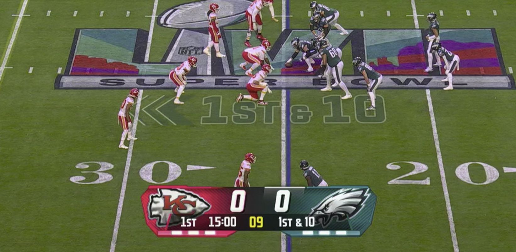
On Sunday, Fox Sports debuted an all-new, redesigned score bug during Super Bowl 59. A score bug is, as defined by Wikipedia, a “digital on-screen graphic… displayed… during a broadcast of a sporting event in order to display the current score and other statistics.” Fox’s score bug has been center-aligned for years to accommodate vertical videos posted to the internet, and I generally liked the network’s old design for myriad reasons. The new one breaks everything good about its predecessor, and I think the reasons for criticizing it are more complicated than the innate nature of humans to dislike change. For context, here are the two items in question — first new, second old:
 Fox Sports’ new score bug, first debuted during Super Bowl 59.
 Fox Sports’ old score bug, first debuted during Super Bowl 58.
For me, every score bug on television must meet the following criteria:
- It must have high contrast. Black text on a white background is preferred, but white text on black is also acceptable.
- The font must be in boldface with clear, sans-serif numerals.
- It must emphasize color to differentiate teams rather than flags or logos, which are indiscernible or hard to decipher from faraway distances or odd angles.
- It must occupy as little vertical and horizontal space as possible while maintaining a large font size.
- It must clearly emphasize which team or player has possession of the ball at all times.
Fox’s old chyron accomplished most of these objectives well enough for my liking. The numbers were white on a black, gradient background, which was great — a remarkable change from tennis score bugs, which are tiny with bad contrast. The logos of the teams were surrounded by their colors, which made it easy to check the score without looking too hard. It was clear enough which team had possession by the white line that appeared above the score. And perhaps most importantly, the score bug was compact while retaining readability, which made it less distracting while providing ample utility. My only complaint was that I felt the design looked too busy, almost like it was made for the 2010-to-2015 era of user interface design. I don’t think there was a doubt in any designer’s mind that the Fox chyron could do with bold gut and redo.
So, on Sunday, the update came, and it was horrendous. From the moment I laid my eyes on it, it looked like it wasn’t rendered properly or that half the chyron was missing. The timer in the center with the translucent gray background is by far the laziest design I’ve seen on national television in recent history, and while I think the contrast between the text and background is acceptable, I at least think the corners should be rounded. And Fox practically gave up when designing the numbers, which are aggravating beyond belief. It’s not the size that bugs me; it’s that they have no background color at all. It might be that I’m especially persnickety about contrast, but the subtle gradient on the numerals isn’t enough for me. They should have a color background or, even better, a near-pitch-black surface like Apple TV+’s Friday Night Baseball score bug.
I actually think Apple’s score bug nails it, albeit I think it could do with more color to differentiate between teams. (Jason Snell at Six Colors has good images on his post about Friday Night Baseball from a few years ago.) The numerals are bold and clear, the graphic isn’t too large, and it uses varying amounts of transparency to guide the eyes to the most important information first. It perfectly exemplifies my biggest gripe with Fox’s new chyron: it’s laid out unnaturally for English readers. English is read left to right and top to bottom, and thus, the most important information in any graphic should be at the top left because that’s where our eyes are most inclined to look first. Because Fox’s new score bug is so large, it’s unnatural to begin at the center; I start reading from left to right. Suddenly, the score bug isn’t so glanceable anymore. Apple’s design maximizes design versatility by center-aligning information at the top.
The new Fox chyron has no information density or architecture whatsoever; it’s entirely unclear what someone should pay attention to at just a glance. The team names are highlighted in their colors, but that’s not the most important part of the bug: the score is. The score and teams have no continuity; they’re almost on separate lines due to the horizontal line gap. The only way to read the new graphic is from left to right: Kansas City, 0, 1:49 remaining, second quarter, 17, Philadelphia. A good score bug should place the scoring information first, at the top, hierarchically: Kansas City, 0, 17, Philadelphia. The current down is important in football, but nothing trumps the score, which must always reign supreme. The layout of the new score bug is too horizontally focused, which has the unfortunate side effect of making the graphic too large. It’s almost always easier to lay text out vertically than horizontally to preserve screen real estate — it’s just a more compact layout.
There are elements of the new design that I appreciate, like the letters representing the teams over the logos that casual viewers don’t seem to remember, or the highlight color behind the down number to instantly relay which team has possession, which is significantly more readable than the previous design. But mostly, I believe the few strengths outweigh the numerous shortcomings: the layout is awful, it’s lacking in contrast, and the minimalist design just doesn’t fit with the theme of the broadcast. On the third point: I contend the previous score bug was too flashy and carried too much 2010s aesthetic, but the new one is arguably worse. It reminds me of iOS 7, when Jony Ive, Apple’s ex-chief designer, flattened all of the life out of iOS and made the operating system scream monotony. Again, minimalism isn’t a bad thing: look at Apple’s Friday Night Baseball chyron for an example. But the hard 90-degree angles and boxy backgrounds aren’t elegant or tasteful and are too bland for my liking.
Perhaps I’m asking too much from a mediocre sports broadcaster, but it’s evident that the new design is a significant regression from the previous version. I don’t think Fox should eliminate the new design, however. Here are my proposals to improve the existing design, ranked in order of importance:
-
Place the scores at the top and everything else one level below the main data. The old chyron accomplished this perfectly: Use translucency and color to separate the two levels and establish a hierarchy.
-
Use gradients instead of solid color blocks. The entire score bug should be one continuous piece, not floating tiles hovering over the field with hard, uninviting corners. Use a large enough rounded rectangle with gradients for the team’s colors, being sure to keep the initialisms over the un-discernible logos.
-
Retain transparency where it’s needed. The colors can be slightly translucent so long as they don’t impact contrast. Prefer solid-colored numerals over gray gradients, but use translucency in the background to make the score bug less conspicuous overall. The current version, again, has two floating tiles of color suspended in mid-air. It doesn’t look like a chyron — it looks out of place.
Interface design is difficult, and even Apple took years to perfect iOS’ design post-iOS 7. But the way Apple addressed iOS 7’s shortcomings was by slowly incorporating shadows, depth, and textures into its operating systems in the coming years. Notably, this wasn’t a pivot back into skeuomorphism as much as it was an introduction of basic digital-first materials in software design. The Dynamic Island’s rounded corners and whimsical animations don’t necessarily model a real-world object, but they add character to the operating system after crossfades and harsh transitions took over in 2013. macOS 11 Big Sur re-introduced rounded corners after macOS 10.10 Yosemite removed them, creating a stoic, business-like design. iOS now uses three shades of certain system colors — primary, secondary, and tertiary — to designate importance.
Fox’s new score bug is an iOS 7-style pivot from the textual design of the previous graphic. That sets it up for a long career in the 2020s, but Fox needs to bring humanity back into the design, incorporating curves, hierarchy, depth, and texture into a more pleasing, sensible chyron. Describing a score bug like this might seem inappropriate for such a simple, almost unimportant element when the primary focus should be on the game, but it’s important to make information glanceable when so many people need to look at it for hours. The best designs are the ones that go unnoticed except for when they change, and Fox’s latest design is too distracting and attracts too much attention. A score bug should be subdued and easy on the eyes, and the new one is anything but.
Britain Reportedly Forced Apple to Add Advanced Data Protection Back Door
Joseph Menn, reporting exclusively for The Washington Post:
Security officials in the United Kingdom have demanded that Apple create a back door allowing them to retrieve all the content any Apple user worldwide has uploaded to the cloud, people familiar with the matter told The Washington Post.
The British government’s undisclosed order, issued last month, requires blanket capability to view fully encrypted material, not merely assistance in cracking a specific account, and has no known precedent in major democracies. Its application would mark a significant defeat for tech companies in their decades-long battle to avoid being wielded as government tools against their users, the people said, speaking under the condition of anonymity to discuss legally and politically sensitive issues.
Rather than break the security promises it made to its users everywhere, Apple is likely to stop offering encrypted storage in the U.K., the people said. Yet that concession would not fulfill the U.K. demand for backdoor access to the service in other countries, including the United States.
The office of the Home Secretary has served Apple with a document called a technical capability notice, ordering it to provide access under the sweeping U.K. Investigatory Powers Act of 2016, which authorizes law enforcement to compel assistance from companies when needed to collect evidence, the people said.
It’s already possible for governments around the world — including the United States, via the Federal Bureau of Investigation — to subpoena Apple and receive access to an entire user’s Apple account, including their photos, text messages, and iPhone backups, as long as the account doesn’t have Advanced Data Protection enabled. Advanced Data Protection, introduced in December 2022 after years of setbacks due to government pressure, effectively hands the user the encryption key to their Apple account; in the case of traditional Apple accounts, Apple stores a second copy of the encryption key on its servers. It’s a hassle to enable Advanced Data Protection, mainly because it requires storing safely a 35-character recovery key, which can be used to decrypt the data in the event a user loses access to all of their Apple devices, which usually store the keys. Most users don’t turn it on because if they lose that recovery key, Apple can no longer let them into their account.
Still, though, privacy-minded users like myself choose to enable Advanced Data Protection for added security. I’ll never be anywhere without my iPhone, and I’ve used the same passcode on it for years, so it’s burned into my muscle memory. If I were to lose my iPhone and my house with all of my Apple products in it burned down on the same day, I’d probably have bigger problems than being locked out of my Apple account. What’s more likely is that some hacker gets access to my Apple account credentials or designs a social engineering ploy to cajole Apple Support to reset my password — Advanced Data Protection shields against both plausible scenarios. And, perhaps most importantly, the government can’t subpoena Apple for any of my data. It’s not like I have anything to hide, but I don’t want the government to ever gain access to my private information. With President Trump’s FBI, subpoenas into political antagonists are about to become much more common, and I’m protected against that threat with Advanced Data Protection.
The British government isn’t happy with its citizens living a private life away from the government’s eyes, though — or, perhaps even worse, any citizen in any country having any semblance of privacy. Since when do British laws apply outside Great Britain (and Northern Ireland)? I’m confident Apple won’t back down to the British, just like it stood up against the FBI’s incursion after the San Bernardino terrorist attack, but I’m unsure how it’ll deal with the demand to subpoena every account worldwide. What right does Britain have to enforce its law on another country’s soil? That’s like a U.S. police officer going to England and arresting a kid for drinking at 19. If the British are fighting an international criminal scheme, that’s great — work with the countries the suspects are in and obtain a warrant through their federal law enforcement. If the foreign nation can’t get access to a user’s data because it’s encrypted, so be it, but just because one country wants access to its citizens’ data doesn’t mean encryption should be banned from the planet.
Apple won’t give Britain a back door into Advanced Data Protection — that’s impossible without tossing a secret encryption key to the government right before locking a user’s account down. But even if nothing happens — as I suspect it’ll go down — this is a dangerous precedent for a Western democracy. If Britain gets even a sliver of what it wants, it opens up the floodgates for the regulation-thirsty European Union and fascist, Elon Musk-led, lawless U.S. kleptocracy. The Trump administration openly and gleefully defies court orders with a direct constitutional precedent — who is to say it wouldn’t immediately demand Apple unlock millions of Apple accounts owned by Democrats because the British also got their way in?
Apple isn’t even allowed to discuss this dictatorship-esque coercion by the British government, and if it wasn’t for leakers within either Apple or the Home Office, the public would never know about the incursion. That’s genuinely frightening. At a time when people’s lives are in danger due to a rogue Western political administration wreaking havoc on a country that used to paint itself as the arbiter of democracy, Britain is sending a message across the pond that being China-like is acceptable. This puts the data of millions of Europeans and Americans at risk. It tests the limits of government so unnervingly and despicably. Encryption is a fundamental human right, and when Western democracies eliminate people’s right to free expression, citizens should fight back with force. (And enable Advanced Data Protection, regardless of where you live.)
On the Advent of ‘Timeline Apps’
Federico Viticci, writing at MacStories:
I think both Tapestry and the new Reeder are exquisitely designed apps, for different reasons. I know that Tapestry’s colorful and opinionated design doesn’t work for everyone; personally, I dig the different colors for each connected service, am a big fan the ‘Mini’ layout, and appreciate the multiple font options available. Most of all, however, I love that Tapestry can be extended with custom connectors built with standard web technologies – JavaScript and JSON – so that anyone who produces anything on the web can be connected to Tapestry. (The fact that MacStories’ own JSON feed is a default recommended source in Tapestry is just icing on the cake.) And did you know that The Iconfactory also created a developer tool to make your own Tapestry connectors?
My problem with timeline apps is that I struggle to understand their pitch as alternatives to browsing Mastodon and Bluesky (supported by both Tapestry and Reeder) when they don’t support key functionalities of those services such as posting, replying, reposting, or marking items as favorites.
Maybe it’s just me, but when I’m using a social media app, I want to have access to its full feature set and be able to respond to people or interact with posts. I want to browse my custom Bluesky feeds or post a Mastodon poll if I want to. Instead, both Tapestry and Reeder act as glorified readers for those social timelines. And I understand that perhaps that’s exactly what some people want! But until these apps can tap into Mastodon and Bluesky (and/or their decentralized protocols) to support interactions in addition to reading, I’d rather just use the main social media apps (or clients like Ivory).1 To an extent, the same applies for Reddit: if neither of these apps allow me to browse an entire subreddit or sort its posts by different criteria, what’s the point?
I really enjoyed Viticci’s piece, a link post to an article from David Pierce at The Verge covering The Iconfactory’s new Tapestry app. The concept of “timeline apps” (thanks to Pierce for the phrase) has been floating around in my head for a few months now since the release of the new Reeder, a subscription product that combines Bluesky, Mastodon, RSS — really simple syndication — podcasts, and more into one timeline. The new Reeder was such a departure from the previous RSS-only version that it required me to look at it from the perspective of someone who was new to RSS and couldn’t quite grok the point of it when social media already serves as an excellent, oftentimes personalized link aggregator. The chronological timeline-style nature of RSS makes it a convoluted solution for the vast majority of people, so Reeder is a perfect middle ground between chronological timelines and social media algorithms.
I really wanted to try the new Reeder, and I even subscribed to it for a month to give it a shot, abandoning my beloved NetNewsWire for a few days to see what it was like. I found myself less confused after my flirt with the idea but disheartened simultaneously. I really like Reeder and Tapestry — they’re gorgeous apps designed by talented independent developers with a knack for good design. Yet, I just have no place for them in my life. I use RSS to read the news in a chronological, unsorted format where I can pick and choose what I want to read. If I ever want to see what everyone else is reading, I can go to Bluesky or Threads, which are amalgamations of everything people I follow are into. To check what’s trending — or if I’m in a pinch and really need what’s important — I check a site like Techmeme or Political Wire by Taegan Goddard. Timeline apps don’t fulfill either of those needs well enough for me. They look like social media but aren’t as personalized as Bluesky or Threads.
And, as Viticci writes, if I see a social media post, I’ll probably want to like it or reply. Timeline apps are read-only, which makes sense from an RSS standpoint, but it waters down social media for me. In my eyes, the news and social media are related but separate media sources, and I appreciate viewing them discretely in their own bespoke apps. There’s a reason I avoid following news sources on social media, with the exception of Techmeme and The Verge because I typically check social media before RSS and need critical news on my timeline. Timeline apps are sub-par social media clients because they’re designed to bridge the gap between feeds and stories. They’re meant for an audience accustomed to feeds and stories in one app.
Yet I keep coming back to timeline apps because I find them delightful. I don’t want RSS and social media to be in one, but I do want an RSS reader with a smidgen more organization than only folders. Ultimately, I do enjoy social media and don’t begrudge my time on it, unlike some other RSS users, and replicating that experience with hard news would be an interesting concept. Tapestry nails the user interface of a lightweight “catch-up-and-leave” app so well, which makes sense coming from the company that made Twitteriffic, the ultimate app to look at while waiting on the toaster. To me, RSS is a sit-down experience where every article is meant to be opened and read, whereas social media often turns into mindless scrolling. There’s nothing bad about mindless scrolling in moderation, and Tapestry understands this.
When an item is tapped, Tapestry doesn’t just open the full article, unlike traditional RSS client. It displays the headline, a hero image, and the description provided by the RSS feed. For instance, a New York Times article will display the author-written blurb at the top of the page. (If a description isn’t provided, the app clips the article’s text after about 500 words.) If I want, I can tap the article one more time to open it in the in-app browser, just like social media, but if I choose to save it for later or disregard it entirely, there’s no pressure on me to indicate so, i.e., there’s no read/unread marker. Tapestry is just a timeline of links and shorthand clips of text. It’s not meant to be an RSS reader, but it’s so much more than social media. It’s uncannily reminiscent of Google Reader and the heyday of short, link blogs.
I love Tapestry and Reeder so much. Reading requires at least some attention, but social media scrolling doesn’t because it removes the pressure of having to do something with what someone has just read. I guess I’m reading the news on social media, but it doesn’t feel like I’m reading down the list of the going wrongs in the same way RSS does. Tapestry is an RSS reader that addresses what’s occasionally my biggest gripe with RSS: how boring it gets. I find it such an amazing app for wasting time.
That’s also exactly why I can never find a use for it: I need RSS for my job. I find stories to write about using RSS; I don’t use social media for that. Tapestry can never negate my need for a proper, NetNewsWire-like RSS solution, and it’s not good enough to replace any of my plethora of social media apps. Plainly, I have no use for it. No matter how much joy it gives me, I can’t find a place to squeeze it in. I realize this is a shameless first-world problem — and believe me, I feel shame in writing about it — but it’s a problem I’ve been trying to solve for a few months. It’s not Tapestry or Reeder’s fault — it’s my fault for having a rigid media consumption diet impossible to break away from. Does it work for me? Yes. But I also suffer from shiny object syndrome, and the fresh, hot bits are way too enticing for me to ignore.
Even if you don’t plan on using it, give Tapestry a shot. It’s free in the App Store.
Elon Musk’s ‘Department of Government Efficiency’ Operation is a Coup
A large assortment of New York Times journalists, reporting Monday in a piece titled “Inside Musk’s Aggressive Incursion Into the Federal Government”:
In Elon Musk’s first two weeks in government, his lieutenants gained access to closely held financial and data systems, casting aside career officials who warned that they were defying protocols. They moved swiftly to shutter specific programs — and even an entire agency that had come into Mr. Musk’s cross hairs. They bombarded federal employees with messages suggesting they were lazy and encouraging them to leave their jobs.
Empowered by President Trump, Mr. Musk is waging a largely unchecked war against the federal bureaucracy — one that has already had far-reaching consequences.
Mr. Musk’s aggressive incursions into at least half a dozen government agencies have challenged congressional authority and potentially breached civil service protections.
Top officials at the Treasury Department and the U.S. Agency for International Development who objected to the actions of his representatives were swiftly pushed aside. And Mr. Musk’s efforts to shut down U.S.A.I.D., a key source of foreign assistance, have reverberated around the globe.
The reporters continue:
Since Mr. Trump’s inauguration, Mr. Musk and his allies have taken over the United States Digital Service, now renamed United States DOGE Service, which was established in 2014 to fix the federal government’s online services.
They have commandeered the federal government’s human resources department, the Office of Personnel Management.
They have gained access to the Treasury’s payment system — a powerful tool to monitor and potentially limit government spending.
Mr. Musk has also taken a keen interest in the federal government’s real estate portfolio, managed by the General Services Administration, moving to terminate leases. Internally, G.S.A. leaders have started to discuss eliminating as much as 50 percent of the agency’s budget, according to people familiar with the conversations.
Perhaps most significant, Mr. Musk has sought to dismantle U.S.A.I.D., the government’s lead agency for humanitarian aid and development assistance. Mr. Trump has already frozen foreign aid spending, but Mr. Musk has gone further.
USAID is now dead, with Secretary of State Marco Rubio assuming the top role in the organization. Thousands of foreign aid programs are completely gone, especially in South Africa, where Musk is from. Musk works as a “special government employee,” according to Karoline Leavitt, the White House press secretary who doesn’t even know the White House’s official position on some of the most consequential executive actions. (“The binder is in my head,” she says, referring to the binder of files press secretaries typically carry around.) This “special” access essentially gives him access to everything in Trump’s Washington, which is completely psychotic. “Special government employees” are only part-time consultants who offer experience from their own fields. They don’t have the right to fire whoever they want for fun on a Saturday.
Over the weekend, Musk waltzed into the Treasury Department and demanded access to the entire payment network the federal government uses to issue grants and loans. The entire thing. Treasury Department officials, who are career workers and not political appointees, and thus who can’t be fired by the president or any of his advisers, rejected Musk’s offer. They were placed on administrative leave the next morning. The same went for USAID, which Musk called a “criminal organization” for some ridiculous reason, probably because it gives money to anti-apartheid efforts in South Africa, which Musk, a noted neo-Nazi, staunchly rejects. Either way, both departments are now under full control by Musk.
It’s worth noting why this is specifically a coup and not just a deranged, rogue administration hellbent on destroying the United States from the inside. (It is, but that’s not relevant here.) The White House — also known as the executive branch — has absolutely zero discretion over federal spending. None, nil, null, naught, nothing, nada. If Congress passes a law that tells the president to spend money on something, that money must be spent that way. (Trump’s refusal to obey this core tenet of the American government caused his first impeachment in 2020.) The president, nor anyone who works for him, cannot disobey the law that Congress signed. He can veto a budget Congress passes, but he can’t violate the law. Appropriations are laws like any other statute passed by the legislature. Here’s Article I, Section 9, Clause 7 of the Constitution:
No Money shall be drawn from the Treasury, but in Consequence of Appropriations made by Law; and a regular Statement and Account of the Receipts and Expenditures of all public Money shall be published from time to time.
That statute isn’t ambiguous in the slightest. The laws are made by Congress, and no money can be appropriated without its approval. When the president wants to, say, suspend arms sales or foreign aid to a country on suspicion that it has broken the law or conditions placed on that aid, he may do so, but he must notify Congress if he pauses sales for 90 days or longer. This is the rule for everything in the federal government: While the executive branch enforces the law, it does not make the law. By turning off the USAID spigot, which was authorized by Congress months before Trump made his return to the Oval Office and Musk got his fingers on the federal government, the Trump administration is in blatant violation of not only the law Congress passed which appropriates funds to USAID, but also the foundational document of this government. This is entirely unconstitutional, and it’s being undertaken by an unelected billionaire bureaucrat who hasn’t even signed the ethics papers required to be a government employee.
Musk, who has no qualification nor right to be in the government whatsoever, came in with his billions and started firing people for no reason. Nobody has the right to fire these people other than career officials themselves. No political appointee can fire a career worker due to a law called the Civil Service Reform Act, passed in 1978. Civil workers are in a different class from political appointees associated with the administration, and Musk has no right to fire them or place them on leave. This is a coup, plain and simple — an unelected, unauthorized, unwelcome psychopath with a boatload of money is waging war against the United States and misusing tax money collected by Congress to enrich himself.
Musk has total, unfettered access to the coffers of the U.S. government. He can shut the whole thing down, change how money is distributed, or even worse, turn off programs he doesn’t like and use the remaining money to pay his companies. He controls the Treasury Department, for heaven’s sake. This is a brazen attack on the fundamental sovereignty of the United States. An immigrant from South Africa has infiltrated our country’s money supply and is using it to enrich himself without the knowledge or approval of the president, who’s too busy waging a trade war with Canada and Mexico to be bothered with anything Musk is doing. The people in charge of our country’s most important assets are 19-year-old college freshmen who named themselves after male genitalia on LinkedIn. (But saying that on X results in an immediate account suspension, which is illegal.) Here’s a story from some reporters at Wired, titled “A 25-Year-Old With Elon Musk Ties Has Direct Access to the Federal Payment System”:
A 25-year-old engineer named Marko Elez, who previously worked for two Elon Musk companies, has direct access to Treasury Department systems responsible for nearly all payments made by the US government, three sources tell WIRED.
Two of those sources say that Elez’s privileges include the ability not just to read but to write code on two of the most sensitive systems in the US government: The Payment Automation Manager (PAM) and Secure Payment System (SPS) at the Bureau of the Fiscal Service (BFS). Housed on a top-secret mainframe, these systems control, on a granular level, government payments that in their totality amount to more than a fifth of the US economy.
And here’s another story about how Musk’s lieutenants at DOGE have access to people’s Social Security numbers from Caleb Ecarma and Judd Legum at Musk Watch:
Several of Elon Musk’s associates installed at the Office of Personnel Management (OPM) have received unprecedented access to federal human resources databases containing sensitive personal information for millions of federal employees. According to two members of OPM staff with direct knowledge, the Musk team running OPM has the ability to extract information from databases that store medical histories, personally identifiable information, workplace evaluations, and other private data. The staffers spoke on the condition of anonymity because they were not authorized to speak publicly and feared professional retaliation. Musk Watch also reviewed internal OPM correspondence confirming that expansive access to the database was provided to Musk associates.
The arrangement presents acute privacy and security risks, one of the OPM staffers said.
Among the government outsiders granted entry to the OPM databases is University of California Berkeley student Akash Bobba, a software engineer who graduated high school less than three years ago. He previously interned at Meta and Palantir, a technology firm chaired by Musk-ally and fellow billionaire Peter Thiel. Edward Coristine, another 2022 high school graduate and former software engineering intern at Musk’s Neuralink, has also been given access to the databases.
This is a complete hostile takeover of the federal government, much like Musk’s haphazard acquisition of Twitter back in 2022, except this time involving the most important collection of individuals in the world, bar none. This isn’t a social network — this is people’s livelihoods. Tens of millions of people rely on food stamps and Medicare to survive. Hundreds of thousands of businesses — including Musk’s own — elected favorable members of Congress to pass appropriations laws that would benefit their companies. Millions of Americans voted election after election to ensure their voices were heard. This is how a democracy works. Trump, but more especially Musk, is tearing down the fabric of American democracy. We live in an autocracy now controlled by an unelected billionaire who broke into the federal government in violation of every single foundational document this country was built upon.
I fully realize I sound insane writing this. How could the first and strongest democracy in the world break so quickly in just a few weeks? I feel crazy. I feel like a crank who’s lost their mind. I cope with that feeling by writing about my thoughts in a not-totally-rambling way. I hope everyone reading this finds a sliver of sanity and clings to it for dear life.
Apple Scraps 1st Iteration of AR Glasses Despite Meta’s Orion Demo
Mark Gurman, reporting for Bloomberg:
Apple Inc. has canceled a project to build advanced augmented reality glasses that would pair with its devices, marking the latest setback in its effort to create a headset that appeals to typical consumers.
The company shuttered the program this week, according to people with knowledge of the move. The now-canceled product would have looked like normal glasses but include built-in displays and require a connection to a Mac, said the people, who asked not to be identified because the work wasn’t public. An Apple representative declined to comment.
The project had been seen as a potential way forward after the weak introduction of the Apple Vision Pro, a $3,499 model that was too cumbersome and pricey to catch on with consumers. The hope was to produce something that everyday users could embrace, but finding the right technology — at the right cost — has proven to be a challenge…
The decision to wind down work on the N107 product followed an attempt to revamp the design, according to the people. The company had initially wanted the glasses to pair with an iPhone, but it ran into problems over how much processing power the handset could provide. It also affected the iPhone’s battery life. So the company shifted to an approach that required linking up with a Mac computer, which has faster processors and bigger batteries.
I was initially puzzled by this report until I read the paragraph about how the device was intended to be connected to an iPhone, similar to how Apple Vision Pro connects to an external battery back. That product has been rumored for years, and I remember briefly touching on it in an article before Apple Vision Pro launched in 2023. Apparently, Apple’s design crew decided to make it Mac-dependent later in the process, which Gurman cites as one of the key reasons the project was canceled. In that April 2023 article, I wrote:
This product feels like a stepping-stone to the future that Apple is actually working on and believes in, which is AR glasses. That product has real potential — potential where it’s the only product you’ll have to carry and potential for ambient computing. Imagine glasses with Apple’s own, in-house LLM built-in that can guide you throughout your day, wherever you are — essentially, an Apple Watch turned up to 11.
Until a few days ago, I was still under the assumption that Apple Vision Pro was a mere stepping stone for an eventual AR product that ran visionOS but was connected to either an iPhone or an external compute puck — and I was correct until Apple decided to can the project. I don’t think Apple will ever discontinue the Apple Vision Pro line of virtual reality headsets because AR glasses inherently can’t be immersive, and Apple has already invested time and money — though perhaps not enough — into creating 3D, 180-degree immersive experiences for visionOS. They won’t disappear, and there will be multiple generations of Apple Vision Pro.
But AR glasses could be what the iPad was to the iPhone. Initially, the iPad ran iOS, just like the iPhone, and the two products largely functioned the same. They were just meant for different circumstances: the iPad is a sit-on-the-couch kind of lounge computer, whereas the iPhone is fundamentally an on-the-go internet communicator. They’re not mutually exclusive purchases. I could see a future where people own both a pair of Apple AR glasses and an Apple Vision Pro for home use — they would serve separate markets but run the same operating system.
If Gurman is to be believed — and I’ve been burned by not trusting his reports before — all of this has gone with the wind. Apple is no longer working on any imminent AR product whatsoever and is instead focusing its extended reality efforts solely on a low-cost Apple Vision product. Gurman, in typical fashion, doesn’t explicitly say that, but it’s understood that the Mac- or iPhone-connected AR glasses are a predecessor to an independent set of eyewear, à la the Meta Ray-Ban specs. Nobody believes Apple Vision Pro will tote the battery pack forever; it’s just a temporary measure to reduce the headset’s weight until Apple can figure out how to bring it into the main computer.
Similarly, I don’t think the AR glasses will forever require being tethered to a Mac. Gurman likens Apple’s now-defunct project to the Xreal One, a set of clunky glasses that mirrors a Windows computer desktop in AR, but I think Apple’s product would’ve just relied on the powerful M-series processors of modern Macs to handle visionOS processing. It’s practically impossible to fit an M2-like chip in the frame of slim glasses, so Apple would have to outsource that computing somewhere to run a full-blown operating system. But while Gurman’s outlined challenges are mostly true — it’s unintuitive, requires the purchase of a separate device, etc. — I think it’s a good first step to ship by 2027.
Last September, Meta demonstrated its AR glasses prototype to select members of the media, called Orion. It, too, offloaded computing to a little compute puck tethered to the glasses and also required users to strap on a highly engineered wristband to detect hand and finger movements even when out of the cameras’ view. I brushed it off as impractical because that’s largely true, but more importantly, I said it didn’t matter what Meta showed in a highly controlled media environment because Apple was already at work on a real product that would ship soon. Now, I can’t make the same point. Apple is, once again, behind, and if it doesn’t ship something by the end of the decade — recall we’re already more than halfway through — its winning streak is over. Apple Vision Pro is undeniably an embarrassing flop, and it needs to catch up quickly.
I’m not saying Apple doesn’t have any plan to make AR glasses ever in its future — as indicated by Sunday’s Gurman report in which he said Apple “explored making smart glasses that would rival the digital Ray-Bans offered by Meta” — but the first stage in that journey has been canceled. It needs to move quickly instead of canceling projects that were already moving. The Mac-connected AR glasses would’ve been a great middle point and something to ship in just a few years. But now, Apple has no plans for real hardware, rather focusing its efforts on conceptual software. That’s a troubling development.
I’m quite frustrated with Apple as of late. Apple Intelligence is an abysmal disaster in the headlines for ridiculous summarizations of simple news stories. Apple Vision Pro, its product of the decade, is too heavy and has zero compelling content for users. The iPad’s software is still lackluster with no rumored improvements. The company has no plans for the future other than a midrange slim version of the next iPhone, and its chief executive is cozying up to fascists while still being faced with the wrath of a 10 percent tariff on all Apple products.
Here’s Apple’s situation as of February 2025: iPhone prices will increase by at least 10 percent in September, the last leg of Apple Intelligence in iOS 18 is still not even in beta, the full-blown large language model is set to come out in spring 2026, iOS users are lambasting Apple Intelligence summaries for being utterly laughable, there’s no plan to update Apple Vision Pro this year or make up for a lack of content, and all of this is happening in a pivotal time for world politics where the president of the United States is starting a trade war with our country’s allies. Who knows what happens to the Chips and Science Act in a few months? What happens to Taiwan Semiconductor Manufacturing Company’s Arizona plant?
The only Apple product I truly find myself excited about is Apple TV+. The second seasons of “Shrinking” and “Severance” are incredible and Apple TV+ storytellers and filmmakers are being nominated for Emmy awards left and right. By contrast, every other product category Apple competes in is a disaster with more helplessness on the way. I’m not saying Apple is dying, but it needs to sort out a strategy for the next four years, after which Tim Cook, its chief executive, must retire to hell. Apple products will become more expensive in the coming months and the company is falling behind in an already bad technology market.
Apple’s three main goals for the Trump administration should be artificial intelligence, AR, and geopolitics. Currently, it’s finding itself falling behind in all three.
DeepSeek, a Chinese AI Company, Crashes the U.S. Tech Stock Market
Samantha Rubin, reporting for CNBC:
Nvidia lost close to $600 billion in market cap on Monday, the biggest drop for any company on a single day in U.S. history.
The chipmaker’s stock price plummeted 17% to close at $118.58. It was Nvidia’s worst day on the market since March 16, 2020, which was early in the Covid pandemic. After Nvidia surpassed Apple last week to become the most valuable publicly traded company, the stock’s drop Monday led a 3.1% slide in the tech-heavy Nasdaq.
The sell-off was sparked by concerns that Chinese artificial intelligence lab DeepSeek is presenting increased competition in the global AI battle. In late December, DeepSeek unveiled a free, open-source large language model that it said took only two months and less than $6 million to build, using reduced-capability chips from Nvidia called H800s.
Nvidia’s graphics processing units, or GPUs, dominate the market for AI data center chips in the U.S., with tech giants such as Alphabet, Meta, and Amazon spending billions of dollars on the processors to train and run their AI models.
DeepSeek’s mobile app launched earlier this month and quickly rose to the No. 1 place on the App Store in the United States. As John Gruber writes at Daring Fireball, it’s telling that this metric led to one of the biggest tech market crashes this decade. But, perhaps noticeably, Apple is not on the list of tech stocks that dropped on Monday; its stock is up by over 7 percent. I think the reason why is quite comical yet probably true: Wall Street doesn’t see Apple as an AI company. It wouldn’t be wrong — Apple Intelligence is a buggy beta mess making headlines for producing inaccurate summaries of important news notifications. I digress.
The panic over DeepSeek is largely psychotic on the tech “analyst” crowd’s part. Silicon Valley tech bros always panic about this kind of thing. As Casey Newton writes for his Platformer newsletter, the two main camps in the AI wars — accelerationists (e/acc) and effective altruists (doomers) — each have something to gain from causing turmoil. Venture capitalists often throw billions of dollars into various other industries that would benefit from a full-on trade war (or armed conflict) with China, and AI doomers are in it to sell solutions to halt the production of new AI. So when the stock market crashes, it’s probably not because everyone will die or Sputnik AI just happened.
I’m minimally concerned about DeepSeek’s impact on the American AI industry. The company’s latest model, R1, is free, open-source software and outperforms ChatGPT-4o, OpenAI’s finest. But that’s not a reason to worry, per se, because competition is always good and only pushes more innovation in capitalist countries. This isn’t a war yet, and I highly doubt it will turn into one anytime soon because China is significantly resource-limited. Nvidia’s stock went for a ride on Monday because Nvidia chips aren’t allowed anywhere near China per the Biden administration’s rules on chip exports — President Trump hasn’t rolled them back despite Nvidia asking him to — and investors who don’t know a thing about how neural processors work thought China did something incredible.
China, in fact, didn’t do anything worthy of awe. It did what it’s best at: propagandizing Americans. This stock market crash was Beijing’s plan all along. It worked for years post-ChatGPT to build a great large language model that would run on its own cheap chips and wow foreigners, causing them to panic-dump Nvidia stock long enough for the market to die and a new president to lift export restrictions in an attempt to salvage the economy. This is still a possibility because Trump is an oligarch-loving moron who knows less about AI chips than a second grader and would do anything to please billionaire donors, but the goal isn’t to outdo the United States in AI just yet. ChatGPT o3-mini, OpenAI’s next model rumored to be the best yet, isn’t even out until February at the earliest.
DeepSeek doesn’t have any juice. It can’t answer simple questions about President Xi Jinping of China or the Tiananmen Square massacre, and neither does it even allow sign-ups anymore because the Chinese state propagandists funding the project don’t know how to keep up with the massive influx of new users. DeepSeek’s models aren’t AI models — they’re state-funded media made to grab attention and headlines. (I guess it’s working.) DeepSeek doesn’t have to worry about pleasing investors or paying employees because the Chinese state takes care of the bill. It’s not a real company doing genuine business. I’m unsurprised Wall Street hasn’t caught on because only the world’s delinquents belong there, but it’s painfully obvious: no model of this caliber can run for free. Nothing is free in the world except when it’s being subsidized by one of the largest spreaders of propaganda in the world.
I’m sure the stock market will bounce back in a few days. But rich oligarchs, fearmongers, and Chinese propagandists will continue to have an uncanny amount of influence on our politics in the coming years. This is just Act 1 of that narrative.
OpenAI Launches Operator, a New AI Agent That Can Control a Web Browser
OpenAI, in a blog post last week:
Today we’re releasing Operator, an agent that can go to the web to perform tasks for you. Using its own browser, it can look at a webpage and interact with it by typing, clicking, and scrolling. It is currently a research preview, meaning it has limitations and will evolve based on user feedback. Operator is one of our first agents, which are AIs capable of doing work for you independently—you give it a task and it will execute it.
Operator can be asked to handle a wide variety of repetitive browser tasks such as filling out forms, ordering groceries, and even creating memes. The ability to use the same interfaces and tools that humans interact with on a daily basis broadens the utility of AI, helping people save time on everyday tasks while opening up new engagement opportunities for businesses.
To ensure a safe and iterative rollout, we are starting small. Starting today, Operator is available to Pro users in the U.S. at operator.chatgpt.com . This research preview allows us to learn from our users and the broader ecosystem, refining and improving as we go. Our plan is to expand to Plus, Team, and Enterprise users and integrate these capabilities into ChatGPT in the future.
One thing I noticed while watching OpenAI’s live stream announcing Operator is that the company truly thinks this is the next paradigm of artificial intelligence. I agree, to a certain extent, since the emphasis seems to be less on the large language models powering some of the optical character recognition and reasoning required to make decisions — i.e., where to click, how to click, and where to enter text, essentially how to use a computer — and more on the synchrony between the vision and reasoning aspects of the model. Operator needs to understand not only how a computer works but also the relationship between concepts, and that’s only possible with a natively multimodal model. It was obvious this was where ChatGPT 4o was headed when it was announced last spring.
To achieve true multimodality, OpenAI developed a new model that works with 4o: Computer-Using Agent. (Fire whoever named this.) I’m at least a little surprised GPT-o1 isn’t involved at all in this project, as I’d think that the LLM would require advanced reasoning capabilities to make decisions, but while o1 literally writes its thoughts out to provide an answer, CUA does the same through reinforcement learning — a technique in machine learning that trains a computer on how to do something by correcting its mistakes along the way and giving it rewards. It seems primal — like how someone would train a dog by giving it treats — but it works since humans also tend to perform better if given rewards. It’s reflected in the training data: when people compliment each other, the resulting outcome is almost always more favorable.
Instead of thinking through a problem by writing detailed explanations for each step of the process (o1), CUA does it natively since it’s been pre-trained on how to use a computer. The LLM does the work of reasoning through what a user means and how to get there, and the reinforcement-powered parts take over the rest. It’s a clever mechanism that perfectly articulates why AI scaling will never stop: LLMs aren’t the best of AI. LLMs are extremely proficient in manipulating prose since they have a lot. It’s like how traditional computers are fantastic calculators — they think in numbers and thus can compute even massive ones with ease. LLMs think in words (tokens, pedants) and can produce them the best. But when they’re given numbers — or worse, images — they fail spectacularly because they can’t put a picture or numbers into a black box and get another picture or calculation, like how they do for language. They need to convert that picture into words they can understand first.
Words make up a substantial portion of humans’ communication and work. Writing emails, sending text messages, producing reports and slides, and reading the news all involve words and, for the most part, only words. But humans also work with their hands and use their eyes to help. That’s why graphical user interfaces came to be — not everyone knows how a command line works, but everyone can grok the basic idea that files are in folders. GUIs are a digital metaphor for the real world, and the world doesn’t use words — it’s heavily reliant on understanding the visual relationship between physical objects through our five senses. LLMs are atrocious at this, but vision models have potential.
Using a computer, a GUI, requires proficiency in both visual and text processing, and that’s where CUA shines. But OpenAI’s spiel about how Operator is the best thing since sliced bread ignores that using a literal GUI computer made for people isn’t the best way to do most things online. GUIs were made because they’re the easiest for humans — “GUIs are a metaphor for the real world” — to use, but they aren’t even nearly the most efficient way for computers to interact. Application programming interfaces are the way computers speak to other, unrelated machines, and they’re the best way to craft agentic experiences. If Operator could make an API call to Trivago, the travel-booking website, instead of navigating to its website and clicking buttons as a person would, it could probably set up a reservation in seconds. It would still require AI to choose what API calls to make based on a user’s request — weights! — but it wouldn’t require the technological prowess Operator possesses.
But, alas, Kayak doesn’t have an API, and neither do hundreds of thousands of internet services humans access online. So, we’re stuck with Operator doing computer-like things in a human-centric world. The idea reminds me of humanoid robots, an imperfect solution to completing real-world tasks. Ford doesn’t employ thousands of humanoid robots to build cars on an assembly line — it builds a robot for each part of the car-making process. Operator is a humanoid robot working an assembly line, making me believe its existence is rather short-lived. To do tons of things on the web, Operator needs to pass Captcha tests designed to keep robots off the internet. Operator passes them with ease, which is impressive on its own. But why are we implementing Captchas just for robots themselves to pass them? Robots passing Captchas aren’t the future, and neither is Operator, which is a (crucial) stepping-stone to something much, much bigger.
Maybe that explains the ridiculous, comical $200-a-month price for entry, which is too high for even me to be interested.
What’s Old is Thin Again
Wes Davis, reporting from Samsung Galaxy Unpacked for The Verge:
Samsung just teased the Galaxy S25 Edge — the new ultra-slim entry into the Galaxy S25 lineup. The phone isn’t out yet, and Samsung hasn’t provided any details, but now we know it’s real. And we have pictures.
Like pretty much every phone, it’s a thin silver slab. It’s got two cameras on the back, rather than the three cameras you’d get with other S25 phones. The Edge is rumored to measure just 6.4mm thick, but my colleagues Allison Johnson and Vjeran Pavic, who are on the ground at Galaxy Unpacked and took the below photos, weren’t able to actually hold or measure the device to confirm.
We’re trying to get closer so we can show perspective, but the place is mobbed with people. There’s a lot of excitement about this phone. By comparison, though, the regular Galaxy S25 is 7.2mm thick. So, it’s… even thinner.
So apparently, 2025’s overarching phone theme is thinness, which reminds me of 2014 when Apple debuted the easily-bendable-to-the-point-of-ridicule iPhone 6 Plus. News outlets (Bloomberg) have been pretty relentless in saying Samsung “beat Apple to the market” with the Galaxy S25 Edge, but the phone isn’t even out yet. Apple is rumored to announce a slim iPhone later this year at its annual September event, and Samsung provided no release date for its thin phone. If I had to guess, that’s because it doesn’t exist.
Each of The Verge’s shots in the article shows the phone with a beige, swirly (figure eight?) wallpaper and nothing else. There is no software interface or any other identifiable features, probably because it doesn’t even have a processor to run software on. From what I can tell, it’s just a plastic replica with a screen attached and connected to some computer in the back. The S25 Slim isn’t real — it’s just a publicity stunt to “beat Apple at its own game.” Research and development on the product has presumably started, but Samsung doesn’t have a single functioning prototype of it yet. Typical for Samsung.
Samsung always follows in Apple’s footsteps, almost to its own chagrin. The company rarely ever has new features that haven’t been blatantly copied off of some other company’s flagship product. So this time, it wanted the news cycle for itself — in other words, the marketing department got control over the reigns for a bit. There’s always been daylight between the Samsung engineering teams — who make the second-most popular smartphones in the world — and the marketing team, whose focus is solely on making a fool of itself every September. When Samsung ridiculed Apple for removing the power adapter from iPhone 12’s box, it did the same just a few months later with the Galaxy S21 line of phones. When it teased Apple for removing the headphone jack in 2016, it followed right along just a few years later. It’s constant.
Samsung’s marketing team is slowly coming around to realizing the world has caught on. I can’t believe it took so long after Samsung literally copied the orange accent of the Apple Watch Ultra on its high-end Galaxy Watch Pro last year. So this time, thin is in, and Samsung quickly whipped up a 3D-printed block of metallic-looking plastic to get ahead of the curve. It’s so unsurprising and yet so shockingly blatant — how the world’s No. 1 smartphone manufacturer can, time and time, get away with copying Apple to such a high degree. I can’t tell if it’s overconfidence, malicious intent, or both.
About the name: I would bet every dollar to my name that Samsung’s marketing executives mulled over calling it the S25 Air, mirroring Apple’s rumored name for its thin phone, but (rightfully) decided against it for copyright reasons. In haste, they came up with “Galaxy S25 Edge,” borrowing the “edge” moniker from the “waterfall edge”-style S7. “Edge” used to mean something — users would be able to swipe from the side of the phone up toward the main display to invoke a control panel of sorts, similar to the new Control Center in iOS 18, for easy access to certain apps. Samsung ditched the Edge a few years ago because people hated it, and it doesn’t look like the S25 Edge has one either. But, alas, the phone is still called the Edge. Never change, Samsung.
Apple Modifies Notification Summaries in iOS 18.3; Now Enabled by Default
Chance Miller, reporting last week for 9to5Mac:
Apple released iOS 18.3 beta 3 to developers this afternoon. The update includes a handful of changes to the notification summaries feature of Apple Intelligence.
The changes come after complaints from news outlets such as the BBC. Two weeks ago, Apple promised that a future software update would “further clarify when the text being displayed is summarization provided by Apple Intelligence.”
Here are the changes included in iOS 18.3 for Apple Intelligence notification summaries:
- When you enable notification summaries, iOS 18.3 will make it clearer that the feature – like all Apple Intelligence features – is a beta.
- You can now disable notification summaries for an app directly from the Lock Screen or Notification Center by swiping, tapping “Options,” then choosing the “Turn Off Summaries” option.
- On the Lock Screen, notification summaries now use italicized text to better distinguish them from normal notifications.
- In the Settings app, Apple now warns users that notification summaries “may contain errors.”
Regarding that note about Apple Intelligence being a beta, here are Apple’s official iOS 18.3 release notes:
For users new or upgrading to iOS 18.3, Apple Intelligence will be enabled automatically during iPhone onboarding. Users will have access to Apple Intelligence features after setting up their devices. To disable Apple Intelligence, users will need to navigate to the Apple Intelligence & Siri Settings pane and turn off the Apple Intelligence toggle. This will disable Apple Intelligence features on their device.
So, in iOS 18.3, Apple Intelligence is no longer in beta.1 But I don’t think the distinction really matters much at all because Apple’s marketing wouldn’t lead anyone to believe Apple Intelligence is anything but a well-built, reliable piece of software. Here on Earth, the truth is far from Apple’s rosy picture painted on billboards across America. Beta or not, Apple Intelligence’s notification summaries are comically unreliable, factually incorrect, and straight-up grammatically awkward (see the headline of this post for an example).
The British Broadcasting Corporation complained to Apple over the holidays because Apple Intelligence incorrectly summarized a BBC headline about Luigi Mangione, the suspect in the UnitedHealthcare chief executive’s killing. The software said Mangione committed and only displayed a small glyph to the right of the blurb indicating that it had been written by artificial intelligence; the BBC app’s logo, however, was prominently displayed next to it, leading readers to believe that the fabricated summary was really from the BBC.
Apple’s response to the debacle was that Apple Intelligence was in beta, but by making it an opt-out feature — i.e., enabling it by default for the millions of iPhone 16 users in supported countries — Apple removed that (debatable) cover it could hide behind. Apple Intelligence isn’t in beta, and it hasn’t been for months — slapping a “Beta” label on it in Settings doesn’t change the fact that it’s heavily advertised when setting up a new compatible iPhone. Removing it further negates any possible excuse for Apple Intelligence summaries not being completely accurate.
It’s not like large language models are bad at summaries. In fact, they’re fantastic at them because LLMs are trained to synthesize the next most logical word in a sentence. When given a snippet of text, they boil it down to some weights, find what other weights correspond to the numbers originally given, and spit out a summary. This is what LLMs are best at. As an experiment, I tried running some botched Apple Intelligence summaries through ChatGPT — both the less-expensive, faster model and the latest 4o one — just to see how a reputable model would do, and ChatGPT aced the text. Its summaries were reliable, short, and grammatically correct.
I’d love to look at the prompt Apple is feeding its so-called foundation models before adding the notification’s content. I presume it’s in some organized data format, not plain text, but that should be fine for a model specifically trained on thousands of summaries. Even low-quality models fare well in summarization tests because this isn’t too difficult of a task for an LLM. I believe Apple’s models — no matter how low-quality they may be to run quickly enough so as not to create a delay from when a notification is sent from a server and when it’s displayed on a user’s device — aren’t what cause Apple Intelligence’s downright disturbing summaries.
The model’s context alters its ability to summarize a notification significantly. For instance, this is how I’ve been prompting ChatGPT to create notification summaries:
Your job is to summarize notifications. A user has received multiple breaking news notifications from The New York Times app. The first one is from 12:56 p.m. and reads, “Eighteen states sued to block an executive order that seeks to deny citizenship to babies born to unauthorized immigrants in the United States.” The latest one is from 4:29 p.m. and reads, “Pete Hegseth’s former sister-in-law made a sworn statement to senators that the secretary of defense nominee was abusive toward his second wife.” Summarize these notifications, with the most importance given to the newest notification, in a maximum of 20 words.
ChatGPT responded with this:
Defense nominee accused of abuse; 18 states challenge executive order denying citizenship to children of unauthorized immigrants.
I wish I could see what Apple Intelligence would’ve cooked up, but I can’t since The New York Times is a news app, and Apple Intelligence summaries are now disabled for them (temporarily, according to Apple) in iOS 18.3. (This is yet another update to address the BBC’s concerns.) Either way, after months of using Apple Intelligence on all my Apple devices, I’m certain it wouldn’t do even half as good as ChatGPT.
Apple Intelligence struggles with two main categories of notifications: short ones that don’t need summarizing and threads of long notifications with details. When presented with a short notification, Apple Intelligence, like any other LLM, just makes up information to fill its character limit. (You can see this in an example Miller posted on Bluesky.) When the software is given tens of notifications from different times and plentiful details, however, it doesn’t understand the contextual difference between a notification sent two hours ago versus a minute prior.
This is most noticeable in delivery notifications, where the status of an order is changing with each notification. Apple Intelligence doesn’t know how to process this, and its insistence on using semicolons to separate notifications into distinct parts creates nonsensical, useless summaries. For instance, three notifications that tell a user that their order is about to arrive, that it’s here, and that they should tip after it’s been delivered turn into one sloppy mess, and Apple Intelligence comes up with, “Order on the way; delivered; rate and tip.”
LLMs speak English well, and with a smidgen of context, iOS could do a much better job. I — a human who writes for a living — would discard the “order on the way” message entirely and summarize the notifications by writing: “Your order has been delivered at [time]. Rate and tip.” There’s no need for semicolons, but because summaries don’t display when each individual notification was sent (tapping on it expands them all but closes the summary), a timestamp could be helpful. If given the time, context, app, and notification title, Apple Intelligence could do this in just a few seconds.
For now, Apple Intelligence summaries aren’t even remotely ready for prime time. I understand the frustration within the company — it needs to iterate to get ahead of OpenAI and Google, and it needs to do so quickly — but shipping incorrect notifications to millions of people is a terrible way of achieving strategic goals. People’s iPhones are lying to them, and Apple can’t even accept minimum fault for its faulty software. The italicized text doesn’t make it clear to me that a summary is generated with AI — it just looks like a sloppy, out-of-place design. Does Apple use italics in any other part of the software? Perhaps that’s why it was implemented here, but it just looks awful and relays little to no information without already knowing italics mean Apple Intelligence.
Instead, I recommend Apple replace the app icon with an Apple Intelligence logo and minimize the icon to be in the lower left corner, almost like iMessage notifications, where the Messages app’s icon is displayed in the corner of a contact’s profile picture. Ultimately, the content displayed on the screen is from Apple Intelligence, not whatever app sent the notification, so that should be obvious. If Apple doesn’t like putting its name on these summaries, perhaps it should reflect why it’s so hesitant. Is it not confident in its software?
One more frustration: Apple Intelligence must stop summarizing spam text notifications. I got one about a toll I allegedly forgot to pay from a random iCloud email address, and Apple Intelligence perfectly summarized it — threat and all. People have asked me previously how I expect AI to detect a scam message, which is an insane question. ChatGPT has the world’s knowledge compacted into one text generation machine, and to think an LLM can’t use that knowledge to detect a scam and choose not to summarize it is ridiculous.
People have an inherent trust in Apple’s products. If Apple summarizes a notification incorrectly — or even worse, marks a scam email as a “priority” in the mail app — people are likely to believe that. “Well, Apple said it’s real, so it must be.” We’ve been teaching people for decades to check if an email or text is really from Apple, Google, the bank, etc., and these summaries are from Apple. Why shouldn’t users trust them? I brought up this same point when Google told its users to put glue on their pizzas last year: If a company has built its reputation around being an arbiter of facts, why is it suddenly acceptable to forgo the truth in favor of shoddy technology?
-
I’m catching flak for this since Apple Intelligence is still labeled as a beta in iOS 18.3. Here’s the dictionary definition for the phrase “beta test”: “a trial of… software… in the final stages of its development carried out by a party unconnected with its development.” Apple Intelligence is a now-shipping-by-default feature of iOS. It’s not a trial by any definition of the word “trial.” People aren’t trying anything; they cannot make the choice to opt in. No matter what Apple calls it, Apple Intelligence is no longer in beta. ↩︎
TikTok’s Temporary State of Limbo
Elizabeth Schulze, Devin Dwyer, and Steven Portnoy, reporting Thursday evening for ABC News:
The Biden administration doesn’t plan to take action that forces TikTok to immediately go dark for U.S. users on Sunday, an administration official told ABC News.
TikTok could still proactively choose to shut itself down that day — a move intended to send a clear message to the 170 million people it says use the app each month about the wide-ranging impact of the ban.
But the Biden administration is now signaling it won’t enforce the law that goes into effect one day before the president leaves office.
The TikTok and ByteDance ban law is set to go into effect on January 19, just a day before President-elect Donald Trump’s inauguration, so the decision not to enforce the law for one day appears to be a way for President Biden to deflect blame onto the new administration. The president-elect submitted an amicus friend-of-the-court brief to the Supreme Court a week ago asking the court to issue a stay on the law before the Trump administration takes control, but it’s unclear if the high court will capitulate to Trump’s request — the court’s website says decisions are expected to be issued Friday at 10 a.m., so it might become clear then.
But based on oral arguments last week, the situation doesn’t look good for TikTok. Before Biden’s plan was reported Thursday, I was entirely certain TikTok would be unavailable in the United States for at least Sunday due to a memorandum from the company stating it would shut down operations preemptively a day before the ban is set to take place, including for existing users. (The law only states Apple and Google must remove adversary-owned apps from their app stores; it gives no directions to TikTok directly.) Now, TikTok seems to be in a temporary, weekend-long state of limbo. The company could choose to take the app offline on Sunday to plan regardless of Biden’s intentions because it doesn’t want to break a law written by Congress, or it could scrap the idea and place its hopes and dreams in Trump’s hands.
I wrote last April, when the law was passed, that I found the probability of TikTok being banned “still thoroughly unlikely” because I thought Biden would win the election. I maintained that prediction (about TikTok, anyway) internally through the election campaign, but now that Trump is the next president, I’m really unsure. Trump is a very unpredictable politician with no clear sense of direction or policy, and he could suddenly choose to enforce the law from Day 1 to act tough on China. His amicus brief could just be an attempt to dupe China into thinking it has a friendly man on the inside, or he could be entirely serious after attributing part of his electoral success to TikTok. All bets are off in Trump’s second term, and I reckon TikTok is fully conscious of that.
By choosing to defy a law from Congress because an outgoing president — and incoming rabble-rouser — promised in words only, TikTok would be taking an extraordinary risk in a country whose government has never been kind to it. That’s why my personal take is that TikTok chooses to voluntarily summon some scare screens this weekend, encouraging users to lambaste their lawmakers and disregarding Biden’s vague politically motivated promise. That prediction could change in mere hours based on what Trump and TikTok say in a game of press releases, but I think it’s sensible for now. TikTok was betting on the Supreme Court giving it a reprieve up until last week when oral arguments seemed to indicate the justices were firmly on the government’s side, so now its strategy — from what I can tell — appears to be to work out some deal with Trump.
As I wrote about Meta’s week of chaos, the only way to do business in America under Trump is to bend the knee and kiss the ring. Shou Chew, TikTok’s chief executive, appears to be doing just that — he’s scheduled to be seated in a position of honor alongside Elon Musk and Mark Zuckerberg, two other social media executives vying for Trump’s blessing. Earlier last year, I firmly believed TikTok’s fate lay in the courts; now, the company’s bets are all on Trump 2.0.
I would love for my April prediction to be proven correct — that TikTok never really gets banned. But in my defense, it was made at a very different time in American politics. Biden still hadn’t dropped out of the race, First Amendment lawyers all believed TikTok had a case in front of the Supreme Court, and Democrats still had a chance to control both houses of Congress. Anything could’ve happened on the campaign trail, and the law could’ve been moot right after November. It’s still my firm belief that if Vice President Kamala Harris won the election, she would’ve gotten Biden to issue an extension for TikTok’s divestment and then probably killed the law in springtime budget negotiations. But, alas, that future never came true, and chances are, TikTok will choose to voluntarily take itself offline in just a few days.
But on that last point, Hank Green, a famous YouTuber and TikTok creator, (correctly) wondered on Bluesky earlier Thursday why TikTok would, on its own volition, throw its creators under the bus when it could still run the app for the hundreds of millions of Americans who already have TikTok installed from before the ban. The answer is straightforward: TikTok is a psychological operation from the Chinese government to wreak havoc in American politics. TikTok wants its users to get riled up and effectively play defense for the Chinese Communist Party since none of the hundreds of millions of U.S. TikTok users have to register as foreign lobbyists. It wants to actively encourage its users to make life hell for American politicians. It’s a brilliant strategy. Here’s what I wrote about this information war in April:
Naturally, if TikTok vanishes in a year — a prospect that I think is still thoroughly unlikely — Americans will solely place the blame on their government, not on TikTok or China. And that point of contention between Americans and their government is exactly the reason why China doesn’t want to divest TikTok. The Chinese government wants power and strength; it wants to change the way Americans perceive it across the Pacific. This bill just gave China a brand-new, effective strategy. Nice work, Washington — you’ve been outsmarted by Beijing again.
Because the U.S. government is so comically useless that it can’t even write a national data privacy law, China won yet another part of this communication war. The biggest threat to the United States is not China, Russia, North Korea, or Iran — it’s the half of this country that refuses to participate in any governance whatsoever for its belief in strictly reactionary politics. Millions of Americans are falling prey to literal Chinese propaganda on Red Note (Mandarin Chinese: Xiaohongshu) — a Chinese-sanctioned version of TikTok where fan cams of Chinese police officers beating up civilians are galore and the search term “Tiananmen Square” is banned — because the U.S. government doesn’t understand how to write laws its citizens are interested in obeying.
The surge in traffic to Red Note can’t just be attributed to Western tankies being some of the most imbecilic human specimens on the planet. The United States, the stalwart of capitalism around the globe, is equally responsible.
Mark Zuckerberg’s Week of Being an Insecure Opportunist
Meta’s virtue signaler-in-chief has lots to say
Mark Zuckerberg, Meta’s founder, posted a long thread on Meta’s Twitter copycat, Threads, about updates to Meta’s content moderation policy, beginning a busy week for Meta employees and users alike. Here are my thoughts on what he said.
It’s time to get back to our roots around free expression and giving people voice on our platforms.
Great heavens.
1/ Replace fact-checkers with Community Notes, starting in the US.
As many others have said, I have never seen Meta fact-check posts that truly deserved fact-checking. It put a label on my thread saying Trump would win the election after the failed assassination attempt in Butler, Pennsylvania, but I’ve never seen a fact check implemented where it mattered. Community Notes, on the other hand, is phenomenal — albeit a stolen idea from Twitter’s Birdwatch, now X’s Community Notes. But the Zuckerberg of four years ago wouldn’t have decided to scrap fact-checking entirely — his instinct would’ve instead been to double-down and improve Meta’s machine learning to tag bad posts automatically. Meta is a technology company, and Zuckerberg has historically solved even its biggest social issues with more technology. To go all natural selection, “every man for himself” mode rings alarm bells.
Meta’s platforms suffer from severe misinformation, though probably not worse than the cesspool that is X. Facebook is inundated with some of the worst racism, sexism, misogyny, and hateful speech that consistently uses fake, fabricated information as “evidence” for its claims. President Biden’s administration admonished Meta — then Facebook — in 2021 for spreading vaccine misinformation; the president said the company was “killing people.” Twitter proactively removed most vaccine misinformation in 2021, but Meta sat on its hands until the Biden administration rang them up and asked them to take it down as it interfered with a crucial component of the government’s pandemic response. (More on this later.)
2/ Simplify our content policies and remove restrictions on topics like immigration and gender that are out of touch with mainstream discourse.
It’s hard to tell what Zuckerberg means from just this post alone, but Casey Newton at Platformer describes the changes well:
For example, the new policy now allows “allegations of mental illness or abnormality when based on gender or sexual orientation, given political and religious discourse about transgenderism and homosexuality and common non-serious usage of words like ‘weird.’”
So in addition to being able to call gay people insane on Facebook, you can now also say that gay people don’t belong in the military, or that trans people shouldn’t be able to use the bathroom of their choice, or blame COVID-19 on Chinese people, according to this round-up in Wired. (You can also now call women household objects and property, per CNN.) The company also (why not?) removed a sentence from its policy explaining that hateful speech can “promote offline violence.”
So, “out of touch with mainstream discourse” directly translates to being allowed to say “women are household objects.” Here’s an experiment for Zuckerberg, who has a wife and three daughters: Go to the middle of Fifth Avenue and shout, “Women are household slaves!” He’ll be punched to death, and that’ll be the end of his tenure as the world’s second-most annoying billionaire. But on Facebook, such speech is sanctioned by the platform owner — you might even be promoted for it because Zuckerberg seems keen on bringing more “masculine energy” to his company. That’s not “mainstream discourse”; it’s flat-out misogyny.
This is where it became apparent to me that Zuckerberg’s new speech policy — which, according to The New York Times, he whipped up in weeks without consulting his staff after a retreat to Mar-a-Lago, President-elect Donald Trump’s home — is meant to be awful. It was engineered to be racist, sexist, and homophobic. It wasn’t created in the interest of free speech; it’s a capitulation to Trump and his supporters. The relationship between the president-elect and Zuckerberg has been tenuous, to put it lightly, but the new content policy is designed to repair it.
Trump has threatened Zuckerberg with jail time on numerous occasions for donating millions of dollars to a non-profit voting initiative in 2020 to help people cast ballots during the pandemic. (Republicans have called the program “Zuckerbucks” and have ripped into it on every possible occasion.) Facebook deplatformed him after his coup attempt on January 6, 2021, after he spread misinformation about the election results that year, and that enraged Trump, who vowed to go after “Big Tech” companies in his second term. Trump now has the power to ruin Meta’s business, and Zuckerberg wants to be on his good side after noticing how Elon Musk did the same after his acquisition of Twitter. The “Make America Great Again” crowd values transphobia and homophobia like no other virtue, so the best way to virtue signal1 to the incoming administration is to stand behind the systemic hatred of vulnerable people.
I wouldn’t consider Zuckerberg a right-winger; I just think he’s a nasty, good-for-nothing grifter. He’s an opportunist at heart, as perfectly illustrated by Tim Sweeney, Epic Games’ chief executive, in perhaps the best the-worst-person-you-know-made-a-great-point post I’ve ever encountered:
After years of pretending to be Democrats, Big Tech leaders are now pretending to be Republicans, in hopes of currying favor with the new administration. Beware of the scummy monopoly campaign to vilify competition law as they rip off consumers and crush competitors.
The second Washington flips to Democrats, Zuckerberg will be back on the “Zuckerbucks” train once again, standing up for democracy and human rights in name only. In truth, he only has one initiative: to make the most money possible. The Biden administration has made accomplishing that goal very difficult for poor Zuckerberg, and it hasn’t stood up for American companies after the European Union’s lawfare against Big Tech, so the latest changes to Meta’s content moderation are meant to curry favor with violent criminals in the Trump administration — including Trump, himself, a violent criminal. So, the changes aren’t about adapting to social acceptability; rather, they conform to MAGA’s most consistent viewpoint: that all gay people are subhuman and women are objects.
3/ Change how we enforce our policies to remove the vast majority of censorship mistakes by focusing our filters on tackling illegal and high-severity violations and requiring higher confidence for our filters to take action.
Word salad, noun: “a confused or unintelligible mixture of seemingly random words and phrases.”
4/ Bring back civic content. We’re getting feedback that people want to see this content again, so we’ll phase it back into Facebook, Instagram and Threads while working to keep the communities friendly and positive.
During campaigning season, Adam Mosseri, Instagram’s chief executive and head of Threads, said politics would explicitly never be promoted again on Meta’s platforms because it was inherently decisive. Threads was founded with the goal of de-emphasizing so-called “hard news” in text-based social media, much to the chagrin of its users who, for years at this point, have been begging Meta to flip the switch and stop down-ranking links and news. But now that the election is over and the new administration will begin to highlight its propaganda, Zuckerberg has a change of heart.
Again, Zuckerberg is an opportunist: If he can position Facebook — and Threads, but to a lesser extent — as another MAGA-friendly news outlet, along the likes of Truth Social and X, chances are the new administration will start to give Meta free passes along the way. During Trump’s first term, Twitter was the place to know about what was happening in Washington. Trump’s team never gave information to the “mainstream media,” as it’s known in alt-right circles, instead opting for the Twitter firehose of relatively little editorialization. If Trump tweeted something, Trump tweeted it, and that was it; case closed. Zuckerberg wants to capitalize on Trump’s affinity for text-based social media, and the re-introduction of politics (i.e., “civic content”) aims to appeal to this affinity. If he’s good enough, Trump might throw Zuckerberg a bone, choosing to give Meta some of his precious content.
5/ Move our trust and safety and content moderation teams out of California, and our US content review to Texas. This will help remove the concern that biased employees are overly censoring content.
Meta has had fact-checkers in Texas for years, but Texas is as Republican as California is Democratic, so I don’t think the “concern” makes even a modicum of sense. Again, this is a capitulation to Trump’s camp, which perceives “woke California liberals” as out of touch with America and biased. In reality, there’s no proof that they’re any more biased than Republicans from Texas. Additionally, unless Meta is outsourcing content moderation to cattle fields in West Texas, cities in the state are as liberal — or even more liberal, as pointed out by John Gruber at Daring Fireball — as California, so this entire plan is moot. For all we know, it probably doesn’t exist at all.
I say that after reporting from Wired on Thursday claims sources in the company say “the number of employees that will have to relocate is limited.” The report also says that Meta has content moderators outside of Texas and California, too, like Washington and New York, making it clear as day that it’s just more bluff from Zuckerberg to appease the hard-core anti-California MAGA crowd.
6/ Work with President Trump to push back against foreign governments going after American companies to censor more. The US has the strongest constitutional protections for free expression in the world and the best way to defend against the trend of government overreach on censorship is with the support of the US government.
He’s not the president yet, but the last part of the final sentence makes Zuckerberg’s intentions throughout the whole thread strikingly obvious: “with the support of the U.S. government.” This entire thread is a love letter to the president-elect, who, in four days, has the power to bankrupt Meta in a matter of weeks. He controls the Federal Communications Commission, the Federal Bureau of Investigation, the Federal Trade Commission, and the Justice Department — he could just take Meta off the internet and call it a day. He could throw Zuckerberg in prison. There aren’t any checks and balances in Trump’s second term, so to do business in Trump’s America, Zuckerberg needs his blessing.
After his word salad thread on Threads, Zuckerberg did what any smooth-brained MAGA grifter would do: join Joe Rogan, the popular podcaster, on his show to discuss the changes. Adorned with a gold necklace and a terrible curly haircut, Zuckerberg bashed diversity, equity, and inclusion programs — which Meta would go on to gut entirely — defended his policy that allows Meta users to call women household objects and bully gay people and gay people only, and lamented that his company had too much “feminine energy.” And he bashed Biden administration officials for “cursing” at Meta employees to remove vaccine misinformation, but that’s the usual for Zuckerberg these days. The Rogan interview — much like Joel Kaplan, Meta’s new policy chief, going on Fox and Friends to advertise the new policy — was a premeditated move to promote the idea that hateful speech is now sanctioned on Meta platforms to the people who would be the most intrigued: misogynistic, manosphere-frequenting Generation Z and Millennial men.
The Rogan interview — which I, a Generation Z man, chose not to watch for my own sanity — is a fascinating look at Zuckerberg’s inner psyche. Here is Elizabeth Lopatto, writing for The Verge:
On the Rogan show, Zuckerberg went further in describing the fact-checking program he’d implemented: “It’s something out of like 1984.” He says the fact-checkers were “too biased,” though he doesn’t say exactly how…
Well, Zuckerberg’s out of the business of reality now. I am sympathetic to the difficulties social media platforms faced in trying to moderate during covid — where rapidly-changing information about the pandemic was difficult to keep up with and conspiracy theories ran amok. I’m just not convinced it happened the way Zuckerberg describes. Zuckerberg whines about being pushed by the Biden administration to fact-check claims: “These people from the Biden administration would call up our team, and, like, scream at them, and curse,” Zuckerberg says.
Did you record any of these phone calls?” Rogan asks.
“I don’t know,” Zuckerberg says. “I don’t think we were.”
But the biggest lie of all is a lie of omission: Zuckerberg doesn’t mention the relentless pressure conservatives have placed on the company for years — which has now clearly paid off. Zuckerberg is particularly full of shit here because Republican Rep. Jim Jordan released Zuckerberg’s internal communications which document this!
In his letter to Jordan’s committee, Zuckerberg writes, “Ultimately it was our decision whether or not to take content down.” “Like I said to our teams at the time, I feel strongly that we should not compromise our content standards due to pressure from any Administration in either direction – and we’re ready to push back if something like this happens again.”
“Ultimately it was our decision whether or not to take content down.” So, by Zuckerberg’s own admission, it was never the Biden administration that forced Meta to remove content — it was on Zuckerberg’s volition after prompting from the administration. This was backed up by the Supreme Court in Murthy v. Missouri, where the justices, back last June, said that the government simply requested offending content to be removed. Murthy v. Missouri was tried in front of the Supreme Court by qualified legal professionals, and Zuckerberg, for a sizable portion of the Rogan interview, lied through his teeth about its decision. This has already been decided by the courts! It is not a point of contention that the Biden administration did not force Meta to remove content; doing so would be a violation of Meta’s First Amendment rights.
Back to Zuckerberg’s psyche: This sly admission, like many others in the interview, is a peek into Zuckerberg’s blether. His nonsense thread is a love letter to the Trump administration written just the way Trump would: with no factual merit, long-winded rants about free speech and over-moderation, and no substantive remedies. I always like to say that if someone tells blatantly obvious lies, it’s safe to assume even the less conspicuous claims are also fibs. That, much like it does to Trump, applies perfectly to Zuckerberg — a crude, narcissistic businessman.
As I wrote earlier, Zuckerberg got his great idea after observing how Musk, the owner of X, got into Trump’s inner circle. Musk and Trump are notoriously not friends; Trump a few years ago posted about how he could have gotten Musk to “drop to your knees and beg.” Nevertheless, Musk is one of Trump’s key lieutenants in the transition, giving Zuckerberg hope that he, too, can get out of the “we’ll-throw-him-in-prison” zone. Tim Cook — Apple’s chief executive who donated $1 million to Trump’s inaugural committee and is set to attend the event January 20 — got his way with Trump in a similar fashion, posing with the then-president at a factory in Austin, Texas, where Mac Pro units were being assembled in 2019. (Those old enough to remember “Tim Apple” will recall the business-oriented bromance between Trump and Cook.) Cook is doing it again this year, making it harder for Zuckerberg to fit in amongst his biggest competition. His solution: Get Trump to hate Apple. Here is Chance Miller, reporting for 9to5Mac:
Zuckerberg has long been an outspoken critic of App Store policies and Apple’s privacy protections. In this interview with Rogan, the Meta CEO claimed that the 15-30% fees Apple charges for the App Store are a way for the company to mask slowing iPhone sales. According to Zuckerberg, Apple hasn’t “really invented anything great in a while” and is just “sitting” on the iPhone.
Zuckerberg also took issue with AirPods and the fact that Apple wouldn’t give Meta the same access to the iPhone for its Meta Ray-Ban glasses.
Zuckerberg, however, said he’s “optimistic” that Apple will “get beat by someone” sooner rather than later because “they’ve been off their game in terms of not releasing innovative things.”
Miller’s piece includes a litany of great quotes from the interview, including Zuckerberg’s seemingly never-ending aspersions about Apple Vision Pro and iMessage’s blue bubbles. In response to the article, Zuckerberg posted this gold-mine foaming-at-the-mouth reply on Threads:
The real issue is how they block developers from accessing iPhone functionality they give their own sub-par products. It would be great for people if Ray-Ban Meta glasses could connect to your phone as easily as airpods, but they won’t allow that and it makes the experience worse for everyone. They’ve blocked so many things like this over the years. Eventually it will catch up to them.
Wrong, wrong, wrong. Again, never put it past a liar to lie incessantly at every opportunity. As I wrote in my article about Meta’s interoperability requests under the European Union’s Digital Markets Act, Apple already has a developer tool for this called AccessorySetupKit, with the only catch being that the tool doesn’t allow developers to snoop on users’ connected Bluetooth devices and Wi-Fi networks, which wouldn’t be so great for Meta’s bottom line. So, for offering a tool that doesn’t allow Meta to abuse its monopoly over smart glasses and social networks to harm consumers, Apple gets hit with the “sub-par products” line. As an example, Apple’s biggest software competitor is Google, which makes Android, and Google never calls Apple products sub-par. As a businessman, calling a competitor’s product “sub-par” is just a sign of weakness.
But this weakness isn’t coincidental. Apple is facing one of the biggest antitrust lawsuits in its history, and Trump — along with Pam Bondi, his nominee for attorney general — has the power to halt it instantly the moment he takes office. If Zuckerberg can get on Trump’s good side and paint Apple as a greedy, anti-American corporation in the next few days before the transition, he hopes it can outweigh Cook’s influence on the house of cards just long enough for the case to go to trial.
And besides, Meta hasn’t invented anything other than Facebook itself two decades ago. Its largest platforms — Instagram, WhatsApp, and Meta Quest — were all acquisitions; its new text-based social media app, Threads, is a blatant one-for-one copy of Twitter’s 16-year-old idea; its large language model trails behind ChatGPT, its content moderation ideas are stolen straight from X’s playbook; and its chat apps use Signal’s encryption protocol. Meta is not an innovator and never has been one — every accusation is a confession. But, again, none of this logic is at the heart of Zuckerberg’s case or is really even relevant to analyze the brazen changes coming to Meta’s platforms.
The Rogan interview — along with the major policy changes on Meta platforms announced just about a week before Trump’s inauguration — was a strategic, calculated public relations maneuver from Zuckerberg and his tight-knit team of close advisers. He and his company have a lot to gain — and lose — from a second Trump administration, and so does his competition. But Zuckerberg, along with the wide range of tech leaders from Shou Chew of TikTok to Jensen Huang of Nvidia, understands that the best way to remain at the top for just long enough is to take down the competition and play a little game of “The Apprentice.”
In the end, all of this will be over in about a year, tops. In the Trump orbit, nothing ever lasts for too long. It really is a delicate house of cards, formed with bonds of bigotry and corporate greed. While Zuckerberg may be on Trump’s good side leading up to the inauguration, he might be bested by Musk’s X or Chew’s TikTok, both of whom are in desperation mode. Only one can win: If TikTok does, Zuckerberg is out of the tournament; if Zuckerberg wins, Musk makes the embarrassing walk back to the failure that plagued the first X.com. And if Zuckerberg wins, this country is in for a hell of a ride. Make America sane again.
Solar, Monitors, and Chatbots: The Best of the CES Show Floor
The interestingness is hiding between the booths
 The show floor of CES 2025. Image: Media Play News.
On Tuesday, doors to the show floor opened at the Consumer Electronics Show in Las Vegas, letting journalists and technology vendors alike explore the innovations of companies small and large. Over Tuesday and Wednesday, I tried to find as many hidden gems as I could, and I have thoughts about them all — everything from solar umbrellas to fancy monitors to new prototype electric vehicles. While Monday, as I wrote earlier, was filled with boring monotony, I enjoyed learning about the small gadgets scattered throughout the massive Las Vegas Convention Center. While many of them may never go on sale, that is mostly the point of CES — spontaneity, concepts, and intrigue.
Here are some of my favorite gadgets from the show floor over my last two days covering the conference.
Razer’s Project Arielle Gaming Chair
 Image: Razer.
Razer on Tuesday showcased its latest gaming-focused prototype: a temperature-controlled chair. Razer is known for whacky, interesting concepts, such as the modular desk it unveiled a few conferences ago, but its latest is a product I didn’t know I needed in my life. Project Arielle is a standard-issue mesh gaming chair — specifically, Razer’s Fujin Pro — equipped with a heating and cooling fan system placed at the rear, near the spine. The fan pumps either hot or cool air through tubes that travel through the seat cushion and terminate at holes in the cushion, controlling the seat’s temperature.
The concept has multiple fan speeds and, in typical Razer fashion, is adorned with colorful LED lights. The prototype functions similarly to perforated car seats found in luxury vehicles, such as early Tesla Model S and X models, but connects to a wall outlet for power; it does not have a battery, meaning that if the cable is disconnected, the temperature control will no longer function.
I think the idea is quite humorous, but it does have some real-life applications in very warm or cold climates. It’s less of a gaming product as much as it is a luxurious, over-engineered seating apparatus. Because of how over-engineered the product is and how difficult it ought to be to manufacture reliably, chances are it will never see the light of day and become available for purchase. But concepts like these make CES exciting and interesting to cover.
GeForce Now Support Coming to Apple Vision Pro
 Image: Nvidia.
Nvidia, after its jam-packed keynote on Monday night, announced in a press release that its GeForce Now game streaming platform would begin supporting Apple Vision Pro through Safari. The company said the website would begin working when an update comes “later this month,” but it is unclear how it will function since GeForce Now runs in a progressive web app, which Apple doesn’t support on visionOS. I assume the Apple Vision Pro-specific version of the website omits the PWA step, which would require some form of collaboration with Apple to ensure everything works alright.
As I have written many times before, Nvidia and Apple have a strained relationship after the 2006 MacBook Pro’s failed graphics processors. But it seems like the two companies are getting along better now since Nvidia now heavily features Apple Vision Pro in its keynotes and works with Apple on enterprise features for visionOS. I’m glad to see this progression and hope it continues, as much of the groundbreaking technology best experienced on an Apple Vision Pro is created using Nvidia processors. Still, though, it’s a shame there isn’t a visionOS-native GeForce Now app that would alleviate the pain of web apps. Apple’s new App Store rules permit game streaming services to do business on the App Store, so it isn’t a bureaucratic issue on Apple’s side that prevents a native app.
Technics’ Magnetic Fluid Drivers
 Image: Panasonic.
Technics, Panasonic’s audio brand, announced on Tuesday a new version of its wireless earbuds with an interesting twist: drivers with an oil-like fluid inside between the driver itself and voice coil to improve bass and limit distortion. According to the company, the fluid has magnetic particles that create an “ultra-low binaural frequency,” producing bass without distortion.
This is the kind of nerdery that catches my eye at CES: Most earbuds with small drivers typically have to prioritize volume over fidelity to compensate for the minuscule apparatus that makes the noise. As volume increases, the driver reaches its capacity — the maximum or minimum frequency it can produce — quicker. The magnetic fluid drivers aim to broaden this threshold to 3 hertz from the typical 20 hertz at its lowest, therefore producing better bass with low distortion at even high volume levels.
It’s only a matter of time before reviewers evaluate Technics’ claims — the earbuds go on sale this week for $300, $50 less than Apple’s AirPods Pro, the gold standard for truly wireless earbuds. They support Google’s Fast Pair protocol for auto-switching and easy pairing, à la AirPods, have voice boost features like Voice Focus AI to improve call quality, and customize active noise-cancellation for each ear. But these features are standard for flagship earbuds — it’s the driver fluid that makes them compelling.
Movano’s Health-Focused AI Chatbot
 Image: Movano.
Movano, the little-known smart ring maker, announced on Tuesday a new artificial intelligence chatbot trained specifically on medical journals to provide correct, appropriate answers to medical questions. Movano claims the chatbot, EvieAI, is only trained on 100,000 peer-reviewed journals written by medical professionals and cross-checks information with accredited medical institutions like Mayo Clinic before producing a response. The company says the chatbot answers medical queries with an astonishing 99 percent accuracy, but it did not give a demonstration to members of the press.
My first instinct upon reading Movano’s press release was that WebMD, the easy-to-understand medical answers website, has finally met its first real AI competition. I still believe that to be the case, but chances are many people are more likely to trust a website with a byline over an AI-generated answer. And all it takes is one flub for EvieAI to be entirely wiped off the market and for Movano to never be trusted with AI again because the stakes are so high in medicine. I can see the tool being helpful for summaries and those “Click for Help!” chat pop-ups on some medical websites, but I still don’t think it should be trusted.
I do think AI chatbots will eventually advance to the point of reliability, but the lack of trustworthiness isn’t due to a shortage of reliable information on the internet — it’s because chatbots don’t know what they’re saying. This is an inherent limitation of large language models, and the only way to solve it is by building a helper bot that fact-checks the main language model. Even ChatGPT isn’t that sophisticated yet, so I doubt EvieAI is. Fine-tuning the scope of available training data does give the chatbot less information to make mistakes with, but ultimately, all the model knows how to do is break down words into tokens, do some pattern matching, and convert the tokens back to prose again. Narrowing the total amount of tokens reduces the likelihood for bad tokens to be generated, but it’s still a black box.
Honda Zero
 Image: Honda.
Honda on Tuesday announced two more concept vehicles to join its Honda Zero lineup of fully electric autonomous cars, first unveiled last year at CES. The two models follow in the footsteps of last year’s concepts, except Honda is more bullish on selling them, with the company stating it will begin production of the two vehicles “by 2026.” (It did not offer a concrete release timeline.)
Honda’s two new models, the Honda 0 SUV and Honda 0 Saloon, feature an unusual, strange, Cybertruck-esque design with boxy edges, flushed door handles, and no side mirrors. The Honda 0 Saloon almost is reminiscent of a Lamborghini Aventador, with a sloping hood, but appears like it’s straight from the future. Neither vehicle looks street legal, and no other specifications were provided about them or their predecessors from last year.
Honda, however, did provide some details about the cars’ operating system, which it calls Asimo OS, named after the company’s 2000s-era humanoid robot. Honda was vague about details but said Asimo will allow for personalization, Level 3 automated driving, and an AI assistant that learns from each driver’s driving habits. Honda plans to achieve Level 3 autonomy — which allows a driver to take their hands and feet off the wheel and pedals — by partnering with Helm AI as well as investing more in its own AI development to teach the system how to drive in a large variety of conditions. The company said the Level 3 driving would come to all Honda Zero models at an “affordable cost.”
I never trust this vague vaporware at CES because more often than not, it never ships. Neither of the vehicles — not the ones announced a year ago, nor the ones from this year — looks ready for a drive, and Honda gave no details on what it would do next to develop the line further. As I wrote on Monday, CES is an elaborate creative writing exercise for the world’s tech marketing executives, and Honda Zero is a shining example of that ethos.
BMW’s New AR-Focused iDrive
 Image: BMW.
BMW, known for its luxury “ultimate driving machines,” announced an all-new version of its iDrive infotainment system centered around an augmented reality-powered heads-up display. Eliminating the typical instrument cluster, the company opted to project important driving information on the windshield itself, communicating directions and controls via an AR projection on the road. The typical infotainment screens still remain below the windshield, accessible for all passengers, but driver-specific information is now overlaid atop the road to limit distractions.
The new system is scheduled to appear in a sport utility vehicle later this year built on BMW’s Neue Classe architecture, which the company first announced at CES 2023. But the choice to digitize previously analog controls in a vehicle beloved by many for being tactile and sporty is certainly a bold design move — and I’m not sure I like it. The dashboard now looks too empty for my liking, missing the buttons and dials expected on a high-end vehicle. Truthfully, it looks like a Tesla, built with less luxurious materials and with no design taste. As Luke Miani, an Apple YouTuber, put it on the social media website X, “Screens kill luxury.”
I also think that while the AR directions are handy, the overall experience is more irritating and distracting than typical gauges. The speedometer should always be slightly below the windshield so that it is viewable in the periphery without occupying too much space in a driver’s field of view. The new system looks claustrophobic, almost like it has too much going on in too little space. I’ll be interested to see how it looks in a real vehicle later in the year, but for now, count me out.
Delta’s New Inflight Entertainment Screens
 Image: Delta Air Lines.
Delta Air Lines, at a flashy press conference at the Las Vegas Sphere Tuesday evening, announced updates to its seat-back entertainment and personalization at its 100th anniversary keynote. The company said that it would begin retrofitting existing planes with new 4K high-dynamic-range displays and a new operating system, bringing a “cloud-based in-flight entertainment system” to fliers.
Delta also announced a partnership with YouTube, bringing ad-free viewing to all SkyMiles members aboard. The company announced no other details, but it’s expected that the inflight system will include the YouTube app in retrofitted planes. The new system also supports Bluetooth, has an “advanced recommendation engine,” and allows users to enable Do Not Disturb to notify flight attendants not to disturb them.
Delta said the new planes would begin arriving later this year but had no word on updates to WI-Fi, including Starlink, which its competitor United Airlines announced late last year would be coming to its entire fleet in a few years. I still believe Starlink internet is more important than any updates to seat-back entertainment screens, as most people usually opt for viewing their own content on personal devices.
Anker’s Solar Umbrella
 Image: Anker.
Anker announced and showcased on the show floor this week an umbrella made of solar panels for the beach. The umbrella, called the Solix Solar Beach Umbrella, has a new type of perovskite solar cells that are up to double as efficient as the standard silicon-based cells found in most modern solar panels, according to Anker. Perovskite cells can be optimized to absorb more blue light, which explains how Anker is achieving unprecedented efficiency.
The Solix Solar Beach Umbrella connects to the company’s EverFrost 2 Electric Cooler, which also comes equipped with outlets to charge other devices using the solar power generated by the umbrella. The umbrella charges the cooler’s two 288-watt-hour batteries at 100 watts, which can then power devices at up to 60 watts through the USB-C ports. Anker plans to ship the cooler in February and the umbrella in the summer, with the former starting at $700 and the latter’s price yet to be determined.
I’ve never seen a perovskite solar panel before, so the umbrella caught my eye for its efficiency. Typically, solar-powered outdoor gear isn’t worthwhile because it doesn’t generate as much power as connected devices use — it’s more suited for long-term solutions like a home during the day when nobody is using power and the batteries can charge. But the perovskite cells change the equation and make Anker’s product much more compelling for long beach days or even camping trips since the umbrella can be used as practically a miniature solar farm to power the company’s batteries, even in low-light conditions.
LG UltraFine 6K
 Image: LG.
LG announced over the weekend and showcased on the show floor a 6K-resolution, 32-inch monitor to compete with Apple’s Pro Display XDR. The product ought to have tight integration with macOS, similar to LG’s other UltraFine displays, which are even sold at Apple Stores alongside the Studio Display. Due to its resolution, the monitor has a perfect Retina pixel density, just like Apple’s first-party options, making it an appealing display for Mac designers and programmers.
The display is an LCD, however, and is the first to use Thunderbolt 5, which Apple’s latest MacBooks Pro with the M4 series of processors support. I assume the LCD display — which is bound to be color-accurate, like LG’s other displays — will drastically lower the cost, making it around $2,500, similar to Dell’s uglier but similarly specced offering. LG offered no other specifications, including a release date.
I assume this monitor will be a hit since it would be the third 6K, 32-inch monitor on the market — perfect for Mac customers who want perfect Retina scaling. The Pro Display XDR isn’t expected to be refreshed anytime soon, and some people want a larger-than-27-inch option, leaving only Dell’s the only option, which is less than optimal due to its design and lack of macOS integration. LG’s UltraFine displays, by comparison, turn on the moment a Mac laptop is connected or a key is pressed, just like an Apple-made display. LG’s latest monitor also looks eerily similar to the Pro Display XDR, leading me to believe it’s intended for the Mac. This is one of the most personally exciting announcements of CES this year.
Sony Honda Mobility’s Afeela
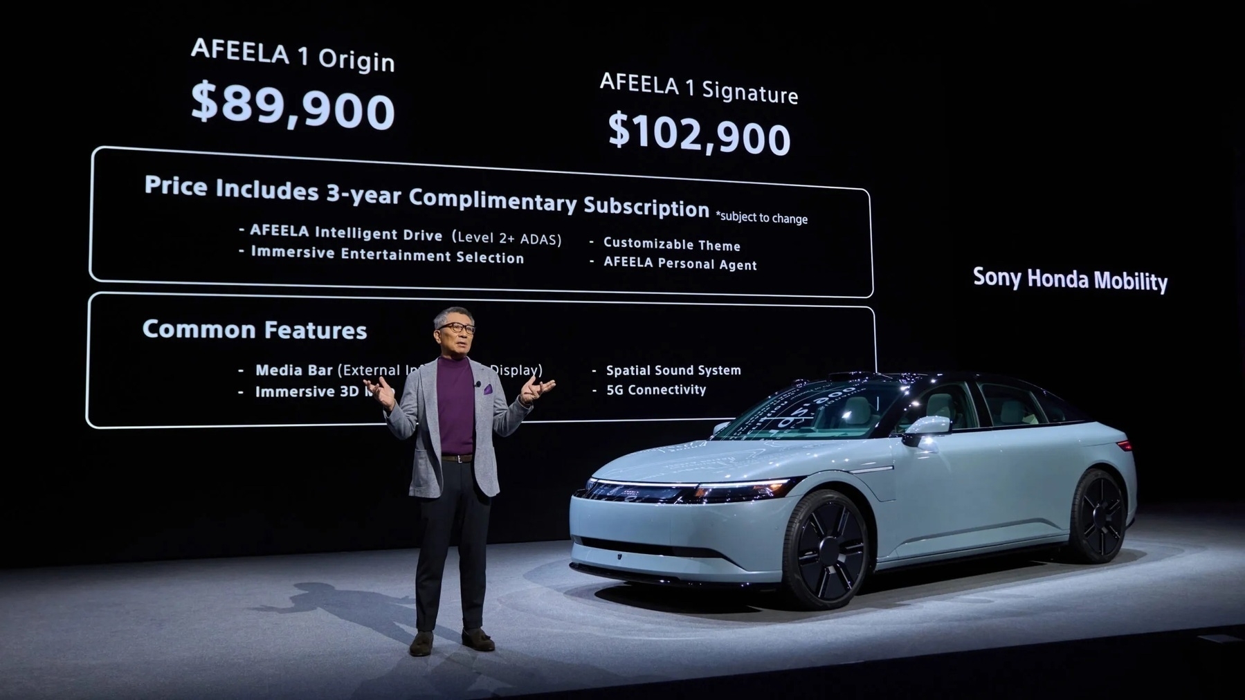 Image: Sony Honda Mobility.
Sony first announced the Afeela electric vehicle in collaboration with Honda at CES 2023 but offered no details on pricing, availability, or specifications for two years while teasing the car’s supposed self-driving functionality and infotainment system. Now, that has changed: the venture announced final pricing for two trims as well as availability for the first units.
On Tuesday, Sony made the Afeela 1 available for reservation. The regular trim is $90,000, and the premium one is $103,000, with three years of self-driving functionality included in the price. (How generous.) Reservations are $200 and fully refundable, but interestingly, they are only limited to residents of California, which Sony says is because of the state’s “robust” EV market. The rest of the contiguous United States also has a robust EV market, and the vehicles are assembled in Ohio, which leads me to believe the limit is because Sony can’t produce enough vehicles for the whole country.
But I think that’s the least of the company’s problems. The $103,000 version is the first to ship, with availability scheduled for sometime in 2026; the more affordable $90,000 trim is scheduled for 2027. This realistically means early adopters will opt for the more expensive trim, which is truly very expensive. $100,000 can buy some amazing cars already on the market, and the Afeela has nothing to offer for the price. It is only rated for 300 miles of range, and the company provided no horsepower or acceleration numbers. It’s also unclear if the car has a Tesla charging port for use with the Supercharger network or if it’s stuck with a traditional combined charging system — commonly known as CCS — connector.
Sony provided no timeline for when the vehicle would come to the rest of the United States, which leads me to believe that the entire venture is a pump-and-dump scheme of sorts: sell under 100 vehicles only in California in 2026, cancel the 2027 version, and shut down the project by the end of the decade. That way, Sony and Honda both lose nothing, and nobody buys a car that doesn’t work. The entire deal seems incredibly unscrupulous to me, knowing the fact that the company is opening two “delivery hubs” in Fremont and Torrance, California, where interested customers will be able to take test drives. The whole thing seems like a proof of concept rather than a full-fledged vehicle.
If I were a betting man, I would say that the Afeela will never become a true competitor in the EV market — ever.
The CES show floor was certainly more exciting than the press conferences from Monday, but there’s still a lot to be uncovered. That’s not a bad thing, or even unexpected, but it’s something to be cautious of when following the news out of CES closely. I still stick to my opinion that this year’s show is one of the most boring in recent years, but that doesn’t mean everything was bad.
AI, GPUs, and TVs: A Diary From CES 2025 Day 1
Maybe CES has hit rock bottom, after all
 CES 2025 began Monday in Las Vegas. Image: The Associated Press.
On the first day of the Consumer Electronics Show in Las Vegas, I completed my usual routine: I tuned into the big-name press conferences, took notes, caught up on social media reactions, and repeated until the news ran out and the sun set over the valley. CES hasn’t been about consumer technology as much as it has been about vibes, thoughts, and marketing for a while, but that is the inherent appeal of the show as it stands. In a fragmented, messy media environment, it is hard to get a gist of what the people who make the technology think sticks.
People often correlate marketing with greed: that companies only market products that are the best for them, not us. That is a true but incomplete assertion because marketing executives are of low intelligence. Spending an enormous amount to advertise congestive heart failure doesn’t make it any the more appealing because people generally do not want their heart to fail. That might be a humorous and irrelevant example, but marketing executives and consumers aren’t stupid. The colloquial expression, “You can’t polish a turd,” expresses this succinctly. If something is being marketed heavily, it is almost certain that it is viewed positively amongst the target audience.
CES isn’t about heart failure or marketing strategies; it is about generative artificial intelligence for the second year in a row. The AI boom hasn’t died, and I don’t think it ever will because it’s popular amongst the marketing crowd. It is OK to quibble about the popularity of generative AI — in fact, it’s healthy. But you can’t polish a turd. Money doesn’t grow on trees — if generative AI never stuck, technology’s biggest week wouldn’t be enveloped by it in the way it has been. “Big Tech” firms know better than to waste a free week in front of the media.
As I began looking over my notes, I tried to search for a theme so I could build a lede with it. But it quickly struck me that if a $3,000 supercomputer by a processor company was the most intriguing product I saw at the world’s largest technology trade show, perhaps CES has lost its fastball. These days, CES is emotionally cumbersome to cover because of just how much it has dwindled in recent history. There is an adage in the tech journalism sphere that nothing at CES is real and that it’s all a marketing mirage for the media. But now, the problem is that CES is almost too genuine to the point where a trade show that once was known for surprise and delight turned into a sea of monotony.
Last year, at CES 2024, generative AI was relatively new, and that made it genuinely exciting. It’s correct to contradict the rosiness with a brief reminder that the number of times “AI” was uttered during each keynote was nauseating, but it isn’t like this year was any different. Silicon isn’t exciting anymore, and all the industry decided to offer for 2025 was silicon. Intel, Advanced Micro Devices, Nvidia — they’re all the same, ultimately. I bet any “analyst” reading that last sentence is now suffering from an aneurysm because it’s a gross oversimplification of the entire silicon industry, but it’s true. Silicon suffers from the same stagnation smartphones did four years ago. New neural processing cores and ray tracing have never been the bread and butter of CES.
Similarly, every smart home product felt like beating a dead horse. Matter promised to be a smart home standard that made most accessories platform-agnostic, meaning they could be used with Google Home, Apple’s HomeKit, and Amazon’s Alexa all at once. (It’s not to be confused with Thread, which is a mesh networking connectivity protocol, not a standard.) But with the influx of Matter products in recent history, it isn’t the lack of adoption that bothers me, but reliability. The platform agnosticism was only rolled out about a year ago and still is unreliable, with Jennifer Pattison Tuohy, a smart home reporter for The Verge, calling it “completely broken” in late 2023. Since then, Matter has improved, but variably.
And CES, for better or worse, always seems to have the most televisions than any trade show by far — reliably. But this year, the main attraction wasn’t new display panels or considerable improvements to picture quality, but Microsoft Copilot in LG and Samsung TVs. Again, it’s hard not to believe the industry is headed in the wrong direction. CES in its prime existed to showcase the gadgets nobody would ever buy — think rollable phones and see-through televisions. But the politics of making maximum profit per dollar spent on constructing fancy exhibitions seems to have watered down the spontaneity that once brought reporters to CES. Marketing executives aren’t stupid, but as the day went by, I kept wishing they were.
Still, I worked through the pain and my misgivings about the show to compile a list of some of my favorite finds from the first day of what I feel will become a grueling three days of press conferences going over incremental product updates. The resulting chronicle is one of incremental updates, somewhat surprising numbers, and a story of marketing and consumerism hiding between the lines.
Intel
 Image: Intel.
Anyone with even a slight modicum of knowledge about the current state of the silicon industry knows Intel is in hot water. It spun off its foundry business due to dwindling profits, abruptly fired its technically minded chief executive over those dwindling profits, and has been consistently behind in every market for years. Its chief competitor, Advanced Micro Devices, is running laps around it in nearly every important benchmark; Nvidia makes its graphics processing units look like toys; and it lost its most important business partner, Apple, four years ago. Intel, by any objective measurement, is doing awfully, both morale-wise and economically. After its CES 2025 announcements — and the subsequent ones from AMD and Nvidia — its stock price fell to its lowest since the firing of Pat Gelsinger, its prior chief executive.
Yet, the company is still making moves, though perhaps in the wrong direction. On Monday, it announced a line of processors called Arrow Lake, meant to be the successor to its Raptor Lake series, announced at CES last year. The Arrow Lake processors Intel announced Monday are meant for gaming laptops from the likes of Asus, not Copilot+ productivity-oriented PCs. (Lunar Lake, Intel’s bespoke AI chip, will still be used in the latter category for the foreseeable future.)
Intel claims Arrow Lake’s gaming variants offer 5 percent better single-threaded performance and 20 percent improved multithreaded over its Raptor Lake processors from last CES, and Arrow Lake models will ship with Nvidia’s 50-series graphics cards, adding to the performance increases. Other, non-gaming-focused laptops will use the H-model processors, and Intel claims their single-threaded performance will be up to 15 percent better. Other variants, like the U-series for ultra-low power consumption, were also announced.
The 200HX series, used in gaming laptops, won’t ship in products until late in the first quarter of the year, the company says, while the 200H and 200U chips have already begun production and will be in laptops in just a few weeks.
I say Intel’s announcements are heading in the wrong direction because they don’t follow the pattern of every other hardware maker at CES. If anything, Intel should’ve one-upped its announcements by announcing a successor to Lunar Lake, its AI chip line, to compete with AMD and Nvidia, who juiced their announcements chock-full of AI hype just mere hours after Intel’s keynote address. That isn’t to say Intel’s presentation was entirely full of duds; the company also announced Panther Lake, its series of 1.8-nanometer processors using its 18A process, is shipping in the second half of 2025. But when Intel is reassuring analysts it’s not leaving the discrete GPU market and advertising a 4 percent increase in the PC market year-over-year, it’s hard to have any confidence in the company. Intel is directionless, and that became even more apparent at CES.
AMD and Dell
 Image: AMD.
AMD’s keynote, similar to Intel’s, was off. For one, it didn’t bring out Dr. Lisa Su, its charismatic chief executive, to deliver the address. And it didn’t announce Radeon DNA 4, its next-generation GPU platform that powers the Radeon RX 9070, its latest GPU, onstage either, leaving it for a press release. Detractors online believe this is due to Nvidia’s announcements, while others think the lack of interesting announcements was due to Dr. Su’s absence. Instead, the CES presentation focused on its latest flagship processor, mobile chips, and new partnership with Dell.
The company announced the 9950X3D, its highest-end processor with 16 cores on the Zen 5 architecture, its latest. AMD claims it’s “the world’s best processor for gamers and creators,” with an 8 percent performance boost in games over the last-generation 7950X3D and a 15 percent increase in content creation tasks, such as video editing. But perhaps the most ambitious claim is that the processor is 10 percent faster than Intel’s latest, the Core Ultra 285K. These claims are yet to be tested, as the processor — along with its lower-end counterpart, the 12-core 9900X3D — will be available in March, but they seem respectable at first glance.
AMD spent most of its time, however, announcing its new lineup of mobile processors, called the Ryzen AI Max series. Both the Ryzen AI Max and AI Max Plus have AMD’s most powerful graphics, with up to 15 CPU cores — just like the 9950X3D, but in mobile form — 40 RDNA 3.5 compute units, and 256 gigabytes-a-second memory bandwidth. Together, AMD says the AI Max Plus beats Apple’s mid-range M4 Pro processor, announced late last year, yet probably with worse heat management and power consumption. Both Ryzen AI Max chips consume up to 120 watts of power at their peak, but AMD isn’t giving any details on thermal performance, as it most likely varies drastically between laptop models. The processors are Copilot+ PC-compliant and begin shipping in the first quarter of 2025, with the first computers being from Asus and a new HP Copilot+ mini PC, similar to Apple’s Mac mini.
Perhaps AMD’s strangest announcement at its press conference was its new partnership with Dell, a company that historically has always shipped Intel and Nvidia processors in its ever-popular laptops. To accompany the news, Dell announced it would overhaul its naming structure, ditching the XPS, Latitude, and Inspiron for three new variants: Dell, Dell Pro, and Dell Pro Max. The names are a one-to-one rip-off of Apple’s iPhone naming scheme, but it didn’t stop there — in addition to the three variants, each one has three specifications: Base, Premium, and Plus. This results in some extraordinary product names, like Dell Pro Max Plus, Dell Premium, and Dell Pro Base.
 Image: Dell.
The internet has been ablaze with comedy for the past day, but seriously, these names are atrocious. Not only could Dell’s product marketing team not ideate a new branding strategy, but it chose to copy Apple’s worst naming scheme and then make it worse. Proponents of the new names say they make more sense than “Dell XPS,” where XPS originally stood for “Extreme Performance System,” but the new names just don’t logically connect. Dell Pro Base is a better product than Dell Premium, for instance. It’s a completely unintuitive, embarrassing system, destroying decades of brand familiarity with one misstep. Truth be told, it embodies the fundamental problem with CES.
Qualcomm
 Image: Qualcomm.
Qualcomm, Intel’s biggest foe, launched a new Copilot+-capable processor meant to power cheaper so-called “AI PCs” below $600. The processor, called Snapdragon X, has eight cores and a neural processing unit that performs 45 trillion operations per second, or TOPS. The processor joins the rest of Snapdragon’s Arm-based computer processor lineup; it’s now composed of the Snapdragon X, Snapdragon X Plus, and Snapdragon X Elite. The company says the processor will begin shipping in various devices from HP, Lenovo, Acer, Asus, and Dell in the first half of 2025.
The Snapdragon X will make Copilot+ PCs their cheapest yet, though Windows on Arm is still shaky, with many popular apps broken entirely or running in Compatibility Mode. Still, however, the chip will shake up the budget laptop business, putting Intel and AMD on their toes to develop cheaper Copilot+-capable processors. Currently, the only chips based on the x86 instruction set — the one used by Intel and AMD — are cost-prohibitive and flagship, which isn’t ideal for schools or corporate buyers.
The processor is built on Taiwan Semiconductor Manufacturing Company’s 4-nm process node, bringing “two times longer battery life than the competition,” according to Qualcomm. I haven’t seen any laptops at CES with the Snapdragon X chip yet, but I assume they’re coming in the next few months.
Samsung
 Image: Samsung.
Samsung on Monday re-announced much of what it said last year at CES: AI, AI, AI. The company is bullish on AI in the smart home, emphasizing local AI processing and connectivity between various Samsung products, including SmartThings — its smart home specification — and Galaxy devices. The story is much of the same as last year, but the difference lies in semantics: While last year’s craze was about the technology itself and generative experiences, Samsung this time seems more focused on customer satisfaction, much like Apple. Whether that vision will pan out into reality is to be determined, but it sounds appropriate for the AI skepticism climate the world appears to live in currently.
Samsung calls the initiative “Home AI” — because, of course, everything deserves a brand name — and it evoked a half-futuristic, half-dystopian future of the smart home. For one, Samsung didn’t mention Matter in the AI portion of its presentation. It did eventually, in a separate, more smart home-oriented section of the keynote, but the omission seems to allude to the fact that Matter is flaky and unprepared for generative AI. Many of the things Samsung wants to do require a deep tie-in between hardware and software. For example, one presenter gave a scenario where a Galaxy Watch sensed a person couldn’t fall asleep and automatically set the thermostat to a lower temperature. That’s more than just the smart home: it’s a services tie-in. Dystopian, yet also eerily futuristic.
Samsung also emphasized personalization in its vibes-heavy and announcement-scant conference but put the ideas in terms of AI because CES is a creative writing exercise for the world’s tech marketing professionals. (See the beginning of this article.) Voice recognition and user interface personalization stood out as key objectives of the Home AI initiative — a presenter showcased an instance where a user, with high-contrast mode enabled on their smartphone, spoke to their dryer, which recognized their voice and automatically activated its own high-contrast accessibility settings. Whether that fits the new-age definition of “AI” is debatable, but it’s a perfect example of the Home AI initiative.
In a similar vein, Samsung finally announced a release date for its Ballie AI robot, which for years has promised a personalized AI future in the form of an adorable spherical floor robot with a built-in projector and speakers. Ballie was first demonstrated five years ago at CES 2020, but Samsung updated it at 2023’s show before even releasing the first generation. Now, Ballie is powered by generative AI — because of course it is — but retains much of the same feature set. Think of it as a friendlier, smaller version of Amazon’s Astro, a 2021-era robot that ran Alexa and cost an eye-watering $1,600. Ballie, like Astro, has a camera for home security but runs on SmartThings, allowing users to toggle other parts of their smart home via the robot. Ballie is shipping in the first half of the year, according to Samsung, but the company provided no concrete release date, price, or specifications.
Samsung also announced the successor to the company’s popular The Frame television: The Frame Pro. The Frame, for years, has been regarded as one of the most aesthetically pleasing televisions, not in terms of picture quality, but when it is turned off. The Frame can cycle through art and images and comes in a variety of finishes to complement a space, almost as if it’s an art installation rather than a TV. But The Frame has been plagued by software features, has mediocre image fidelity — it only has a quantum dot LED whereas most other TVs in its price range have organic-LED displays — and doesn’t get as bright as other LED TVs Samsung sells because of the anti-reflective coating, which helps display art more naturally.
 The Frame Pro. Image: Samsung.
The Frame Pro, by contrast, aims to address some of these issues. It now features a nerfed mini-LED display, which provides a boost in contrast and brightness since it splits the display panel into multiple local dimming zones. This way, only one part of the television can receive light while the other parts are completely off. The catch is that The Frame Pro’s display isn’t a true mini-LED panel, where the zones are spread throughout the display. (Every MacBook Pro post-2021 has a mini-LED display; to test it, go to a dark room, open a dark background with a white dot in the center of the screen, and observe the visible blooming behind that dot. That’s mini-LED’s dimming zones in action.) Instead, The Frame Pro has these dimming zones at the bottom of the screen, controlling the brightness vertically instead of in a grid pattern across the display.
I am sure this will provide some tangible difference knowing how bad the picture quality of the original Frame is in comparison to other high-end televisions, but I don’t think it will fully alleviate the pain of the matte display, which causes considerable color distortion and results in a washed-out picture. The Frame Pro also has a 144-hertz refresh rate, but because of Samsung’s abominable stubbornness to support Dolby Vision, it only has HDR10+, Samsung’s proprietary high dynamic range standard. Modern set-top boxes like the Apple TV support it, but content is scarce and not nearly as well-mastered as Dolby Vision. Really, The Frame Pro is still a compromise, and without a price, I’m unsure if the new features make it a better value over the equally compromised Frame.
Samsung’s announcements, while repetitive, were a good breath of fresh air after a packed morning full of processor updates. But none of its new products, unlike some other CES presenters’, has release dates, prices, or even concrete feature concepts. The entire address was one large, lofty, vibes-based presentation. I guess that fits the CES theme.
LG and Microsoft Copilot
 Image: LG.
LG began its announcements on Sunday, launching its 2025 television lineup infused with AI. But unlike tradition would call it, the AI wasn’t image-focused. There were modest improvements to AI Picture Pro and AI Sound Pro, but for the most part, it centered around Microsoft Copilot coming to webOS, with LG even going as far as to reprogram the microphone button to launch the AI assistant. A chatbot is built into the operating system, too, and the remote is now dubbed the “AI Remote.” (It’s worth noting Samsung is also adding Copilot to its TVs as well, though much less conspicuously.)
LG hasn’t detailed the Copilot integration yet, without even going as far as to add a screenshot to its press release — all the company has said is that the functionality is coming to the latest version of webOS with the new line of TVs, but with no release date. It’s unclear what Microsoft’s OpenAI-powered chatbot would do, but LG’s own bot would take the lead for most queries, with Copilot being used to look up additional information, says the company. Again, I’m unsure and skeptical about what “information” refers to, but that’s par for the course at CES.
It all circles back around to my lede, nearly 3,500 words ago: CES is an elaborate marketing exercise; sometimes, it delivers hits and otherwise duds. But there’s clearly some kind of pent-up demand for such a product, so much that both Samsung and LG partnered with Microsoft — which hasn’t created anything remotely close to television software in its entire corporate history — to integrate an AI chatbot within webOS and Tizen. It really is unclear what that pent-up demand entails, but what makes this year’s CES so odd is that the companies presenting this year don’t seem to be eager to showcase their latest technology freely. Intel, AMD, and Samsung have all disappointed with their announcements this year.
Either way, color me hesitant to welcome Copilot on my TV anytime soon.
TCL
 The TCL 60 XE. Image: Allison Johnson / The Verge.
TCL kept its announcements to a minimum at CES this year, launching a new Android phone called the TCL 60 XE that can switch between a full-color and e-ink-like display with just the flick of a switch at the back of the device. The feature is called Max Ink Mode, and it uses TCL’s Nxtpaper display technology to toggle between the two modes. Nxtpaper isn’t an e-ink display, but it mimics the functionality of e-ink through a standard LCD. The LCD has a reflective layer that eliminates backlight glare and diffuses light, thereby faking the matte, dull e-ink look without rearranging pigment particles using electricity. Because Nxtpaper is just a special LCD, it still operates like a normal screen until the switch is flipped, which changes the appearance of Android.
The TCL 60 XE, otherwise, is a typical Android budget phone, with a 50-megapixel rear camera, 6.8-inch display, and “all-day battery life.” No other specifications were given, but the product is promised to begin shipping in Canada by May and in the United States later this year. (It is exclusive to North America.)
TCL also announced a new projector, called the Playcube, which is an adorable cube-shaped modular device. No other details were provided, however, probably because it is most likely just a concept. But the Nxtpaper 11 Plus, the company’s next-generation tablet, did get more specifications: it features an 11.5-inch display built on Nxtpaper 4.0 and a 120-hertz refresh rate. Nxtpaper 4.0, according to TCL, uses improved diffusion layers to offer better sharpness and brightness. However, no pricing information and release date were issued by TCL in its press release.
TCL is always a vendor I enjoy hearing from at CES, mostly because it doesn’t have the bandwidth to put on its own extravagant events. While typical for the company, the Max Ink Mode really was intriguing to look at. TCL, however, didn’t introduce its full TV line at CES this year, which is atypical for a company that always seems to offer the largest screens at some of the lowest prices. It did preview a mini-LED one, however, but provided no other specifications or pricing.
Matter and the Smart Home
CES typically brings a plethora of smart home devices, and in recent years, it has become a breeding ground for Matter and Thread appliances. But as I said earlier, Matter continues to be an unreliable standard for most important smart home accessories, with frequent bugs and connectivity issues plaguing the experience. Still, though, this CES has been high on hardware products and less focused on the Matter protocol itself, unlike the last few years. Here are some of the gadgets and announcements I found most intriguing.
Ecobee launched a cheaper smart thermostat to join its lineup of what I think are the best HomeKit-compatible thermostats, alongside the Matter-enabled second-generation Nest Learning Thermostat. The new one, which costs $130, has all the smart features of the premium models but lacks a few bells and whistles, such as the air quality sensor. It can be paired with Ecobee’s SmartSensors, sold separately, but doesn’t support Matter, which Ecobee promised to do in 2023. (It still supports Google Home, Amazon Alexa, HomeKit, and Samsung SmartThings, so take Matter’s omission with a grain of salt.) I think it’s the best smart thermostat for beginners just getting acquainted with a smart home.
HDMI 2.2 brings 4K resolution at 480-hertz with 96 gigabits per second of bandwidth. The new protocol, developed by the HDMI Forum and called Ultra96 HDMI, also includes a latency indication specification to allow connected devices to communicate with each other and compensate for lag. The HDMI Forum intends for it to mainly be used for audio receivers and says that it performs better than HDMI-CEC, which enables the same cross-device communication in the current HDMI 2.1 specification. HDMI 2.2 cables will begin shipping later this year.
Schlage, the renowned door lock maker, announced a new ultra-wideband-powered smart lock with a twist. While some smart locks use Bluetooth Low Energy and near-field communication to communicate — such as Schlage’s own Encode Plus lock, which works with Apple’s home key — Schlage’s latest, the Sense Pro, uses the ultra-wideband chip in certain smartphones to detect when a user is nearing their door lock and automatically unlock it for them. This is possible due to ultra-wideband precision; the technology is used in Apple’s Precision Finding feature, proving its reliability. I don’t think pulling out my phone and holding it against my door is very cumbersome, but this could potentially be useful when my hands are full. The company says the Sense Pro will be available in the spring.
 The Schlage Sense Pro. Image: Schlage.
Aqara is launching a 7-inch wall-mounted tablet and home hub combo it calls the Panel Hub S1 in addition to the Touchscreen Dial V1 and Touchscreen Switch S100, three unintuitive names for products that aim to act as souped-up light switches. The devices can be installed in lieu of light switches to control smart home devices connected via a home’s local Thread and Matter networks. This is the promise of Matter: interoperability so that any device can tie into a smart home ecosystem without connecting to one of the big three platforms. Each device features a touchscreen, but the Panel Hub S1 has the largest. It reminds me of Apple’s rumored HomePod with a screen, except perhaps much cheaper. The Dial V1 has a scroll wheel to control devices, and the Touchscreen Switch occupies the space of one switch with a screen for more details. All three products are shipping in the first quarter of the year.
 Image: Aqara.
Google announced Gemini is coming to third-party TVs via Google TV, the company’s smart TV software that certain TV manufacturers like Hisense pre-install on their devices. Gemini previously was confined to the Google TV Streamer, Google’s latest set-top box that replaced the Chromecast to much chagrin last year, but now the company is bringing it to all Google TV-enabled televisions. I think this makes more sense than Copilot because Google TV in and of itself is a streaming platform with its own recommendation engine, so Gemini could answer questions about certain items or recommend what to watch.
The Star of the Show: Nvidia
 Nvidia’s Project Digits.
Nvidia’s Monday evening presentation was perhaps the most exciting, hotly anticipated event of the day. The keynote attracted attention like I have never seen in recent CES history, with nearly 100,000 people tuning in on the live stream and 14,000 attending in Las Vegas — 2,000 above the capacity limit of the arena. Nvidia, after the launch of ChatGPT and its subsequent competitors, quickly rose to become the most valuable technology company due to its GPUs used for AI training. At CES, the company announced its latest gaming GPU line, the RTX 50-series, as well as other AI-focused processors.
The RTX 50-series GPUs are powered by Nvidia’s Blackwell processor architecture. The new highest-end card, the RTX 5090, can perform up to 4,000 trillion operations per second, 380 ray tracking tera floating point operations per second (10 to the 12th power), and has a 1.8 terabytes-per-second memory bandwidth. The company claims the 5090 is two times faster than its predecessor, the RTX 4090, in gaming tasks thanks to so-called tensor cores — components of the card reserved for AI processing — and the next generation of Nvidia’s deep learning super sampling, or DLSS, AI-powered upscaling.
But perhaps the more awe-inspiring part of the keynote is when Jensen Huang, Nvidia’s chief executive, said the RTX 5070 — currently the lowest-end card in the lineup — matches the RTX 4090’s performance in most tasks. For context, the 4090 is currently the most performant graphics processor in the world and takes up an enormous amount of volume in a computer case, but if Nvidia is to be believed, the lowest-end, smallest card in its flagship lineup now matches its performance. That’s bananas.
Nvidia announced pricing for the new cards, too: $2,000 for the RTX 5090, $1,000 for the 5080, $750 for the 5070 Ti — a slightly upgraded version of the 5070 — and a mind-boggling $550 for the 5070. The highest-end 4090 from last year cost $1,500, meaning new buyers can save $1,000 and get an equally performant card. This feat has even made Huang claim that his company’s processors are defying Moore’s Law, a concept in computer science that states the number of transistors in a processor doubles every two years. I am unsure if such a bold claim is true, but either way, Nvidia’s latest processors are incredible, and Huang mentioned many times during the keynote that it wouldn’t be possible without AI, which now does all the heavy lifting in upscaling.
The company also announced a plethora of large language and video models designed to generate synthetic training data for new, smaller models. The language models are based on Meta’s Llama 3.1 and are called the “Llama Nemoneutron Language Foundation Models,” and they are fine-tuned for enterprise use and generating training data. Nvidia calls the video model Cosmos, and it says it is the first AI model that “understands the real world,” including textures, light, gravity, and object permanence. (Nvidia Cosmos was trained on 20 million hours of video to achieve this, but I wonder where the video came from.) Both models aim to help Nvidia achieve infinite AI scaling by feeding smaller models data generated by the advanced ones. For instance, Huang said Nvidia Cosmos could simulate “millions of hours on the road” with “just a few thousand miles” to feed a self-driving computer because not every simulation can be created in the real world.
This composed the overarching theme of Nvidia’s presentation: scrape the entirety of human knowledge and use it to generate more. But I have always thought of this strategy like AI inbreeding, as crude as that may sound. If the quality of training data is poor, the output also will be, and the vicious cycle continues until the result is nonsensical. Each pass through a model adds distortion — it’s like children playing a game of telephone. But Huang says that this is the reason AI has no wall — whether he and his company should be believed is only a test of time. But while Nvidia Cosmos and the Nemoneutron LLMs are available for public use — and open-source on GitHub — they are aimed at enterprise customers to run on Nvidia processors to develop their own models.
To create these models, Nvidia needed a lot of compute power, so it built a new supercomputer architecture called Grace Blackwell, powered by “the most powerful chip in the world,” according to Nvidia. The processor, which has 130 trillion transistors, is not intended for purchase, but Nvidia scaled down the architecture to Grace Blackwell to a Mac mini-sized $3,000 supercomputer available for consumers. The supercomputer, called Project Digits, is the “world’s smallest AI supercomputer,” according to Nvidia, and is capable of running 200 billion-parameter models. The computer is powered by the GB10 Superchip and features 128 GB of unified memory, 20 efficiency cores, and up to 4 TB of storage, together achieving one petaflop of performance.
The announcement of Project Digits and Grace Blackwell was probably the most exciting part of Monday at CES. The promise of a personal supercomputer has always been elusive, and this time, it genuinely appears as if it will be available soon. Nvidia says Project Digits will be available for purchase in May, and the RTX 50-series in the first half of 2025.
The first day of CES is always packed, but this year’s conference felt off. Much of it felt like a rehashing of last year’s show. Perhaps that’s much me, but the vibes are underwhelming.